Author Archives: Wenyu Qu

Task 8

This is the end of Research and Communication Skills module. After doing every task during 9 weeks, I have learned a lot in some aspects.


Start from making appreciation of the short film the Terminal Bar I learned about the importance of combination between background music and handover from a frame to another another frames. The photos in this film are changing-over, appear and go following the beat of background music. What impressed me most was that at the last part of the film, the photos appear in a form which is like a phantoscop. It is really interesting.


I learned about what I can use for reference through the comparison of two artworks from task 2. Because work to find the similarity and connection between two artworks can inspire me to get a new point. Furthermore, the designers working method is like a guide which I can follow by.


The research of counter culture from the 1960s to the 1970s bring a great impact to me, because I have never known about this period of history before. The The scope of knowledge is expanded. I realized that artworks are link with everything in our lives. It can relevant to politics or other problem in society and influent the development of society. The posters about counter culture used the bright, vivid color with exaggerate collocation. That remind me how powerful the color composition is and push me to deep think it again.


What is more, I am quite interested in a part of postmodernism which is the visual culture of hip pop. One of the typical method for creat this style of artworks is collage. It remixed many kind of elements in an image. I have created an artwork about hip pop before, now I have more developing idea after research.


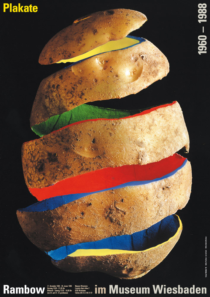
The most enjoyable task is task 7 Publish and Perish. Because compare with dry facts of history, this task allowed me to do some research that I want to do. During looking at a lot of interesting works, it helps me found my favorite discipline which is graphic design. These beautiful design bring me visual enjoyment. Gunter Ranbow also impressed me in the way he works. He finds inspiration of artworks in life and takes some common themes in his life as creative elements, plus artistic treatment, so that he has some other symbolic meanings. I would like to catch the useful points if the special personal style of work for those designer which I have researched.


The most important factor in working is critical thinking. It pushed me to constant reflection and exploration through a series of researching and the ability of critical thinking is improved gradually. It is positive. I realized that a graphic designer is that kind of occupation workers, they will be some social things condensed into a visual symbol by morphological changes, marking and code, which has become a kind of political, economic, religious and cultural movement value of things, and in order to show any subject.

Task 7


This book was made by Irma Boom which was commissioned by Chanel. The 300-page book has no ink—each of the crisp white pages is embossed with a drawing or quotation, because this special printed way concentrate on a sense of touch. It’s clean, understated and ephemeral, and somehow still totally engrossing. The book allows us to see the new meaning of the book in the digital times, the active role of the designer in the publication process as well as the need for a new kind of printed book. Irma Boom reinvents the traditional book. It is hard to imagine any other individual following her footsteps, since the digital revolution entirely changed the world we are living in, but it would be interesting to observe where the journey of the printed book will continue next.

In Gunter Rambow potato series poster, each picture is to show the theme of potato, different is the treatment of potatoes. He peeled, twined, cut, colored, and piled up… There are some similarities between the different forms of composition, which is the combination of the potato profile and the color of the block in the composition. Contours and colors are the most expressive elements in a painting

Gunter Rambow said that Poetry, art and literature are what people can feel every day. It’s everywhere. People can find it as long as they look at it.His works fully reflect the fancy imagination of lanburger, and no one will think that potatoes can split up and show the effect of space on the plane.


Ikko Tanaka designed the first advertisement for Muji, a poster printed on a kraft paper, and the branded hue of Muji. The first impression of customers is important to a brand. He used a typical picture in Japanese historical dramas, which emphasized the “right conclusion”. It was illustrated holding a brand sign with emphasis on Muji. He held the idea of simplicity and neat created a new aesthetic form. Moreover, He protruded a specific thing in the advertising picture to introduce the idea and guide people to read more information on the poster.


References

http://milkbottle.today/wp-content/uploads/2016/04/chanel-2013.05.07_Paris_No_5_Culture_Chanel_0674_HI-RES-1.jpg


http://www.gunter-rambow.com/Poster/80er/1988_06_Wiesbaden1.jpg


http://www.muji.com/img/flagship/huaihai755/archive/koike_img02.jpg


Task 5

The artworks of the counter culture developed more from the 1960s to the 1970s. Sometimes they are called underground publications because those comics and magazines can get in the psychedelic stores which sale goods such as marbles, cigarettes, tie dyed fabric and books.


Mylar Chamber image used by Life magazine, 26 December 1969, in its special issue to mark the end of the 1960s. The image illustrated a section on drugs which stated that ‘few came as close to explaining the euphoric distortions of hallucinogenics’ as Cohen. I am interests in the light and shadow in this photo, and combining the color, it really looks like a hallucination. It seemed to express the freedom, the self-indulgences and relevant to one of the core spirit of  the counter culture. Similarly to Dickens, it could be said that counterculture of the 1960s marks for some the best and the worst of times at the same time.


The second image is the cover of an album called Cheap Thrills which is one of the famous work related to the counter culture. It published in 1968. The cover was drawn by underground cartoonist Robert Crumb. Using comic form as a cover is clever, because the readable of characteristics is easy to pass message and information. In at least one early edition, the words “HARRY KRISHNA! (D. GETZ)” are faintly visible in the word balloon of the turbaned man, apparently referring to a track that was dropped from the final sequence. The words “ART: R. CRUMB” replace them. A variation of the title on the cover is used as the logo for the Cheap Thrills record label, owned by British DJ HervĂ©.


The third image I chose from Oz (No.3 May 1967) which is a successful underground magazine. It is 3 page Martin Sharp foldout What Beautiful Eyes She Has with Revlon Invents Wet Lipstick on the reverse. The color of the poster is the typical of that period, bright, vivid,making a sense of psychedelic.


According to Musgrove (1974), the counter culture expresses the dissatisfaction with the prevailing culture or social system, and influences the way of life through the impact of cultural shock, so as to make the system change. This is the meaning and value of that period.


References

Musgrove, F., 1974. Ecstasy and holiness: Counter culture and the open society (Vol. 530). Taylor & Francis.


Images


https://i.guim.co.uk/img/static/sys-images/Guardian/Pix/pictures/2011/5/12/1305210097754/Ira-Cohen-2-001.jpg?w=880&q=20&auto=format&usm=12&fit=max&dpr=2&s=6da


https://upload.wikimedia.org/wikipedia/en/9/9e/Cheapthrills.jpeg


http://ro.uow.edu.au/cgi/viewcontent.cgi?filename=0&article=1002&context=ozlondon&type=additional


Task 4

What is the meaning of authenticity? Authenticity means the quality of being genuine or true. It is a quite abstract word. However, the standard of judging authenticity is not unique. The judgments of authenticity are not same in different people because they are subjective analysis (Heidegger, 1996 and Newman, 2012). I believe that evaluating an authentic artwork should know about what is the effect of the artwork bring to the world.

For example, there is one kind of china called the Ge Kiln which is one of the most famous china from Song dynasty. It is pretty rare, mysterious and precious in the world. There are many poems praise its beauty. However, people made some imitations of it in the Ming Dynasty, the Qing Dynasty and the period of the Republic of China. Although they cannot compare with the real one, they are also worth a great value. Because the craftwork of them is admirable. Some of the imitations are really exquisite. It can be regard as a special “authentic”.

As far as contemporary practice are concerned, it is really difficult to create a truly artwork which is original entirely. In the process of create, it need research some of the famous artworks and refer them to support the work. Therefore, there is no absolute authenticity contemporary practice. Authenticity might means form a personal style of work, special work method or any other things it can be.

References

Newman, G. E., & Bloom, P. (2012). Art and authenticity: The importance of originals in judgments of value. Journal of Experimental Psychology: General, 141(3), 558-569.

http://dx.doi.org/10.1037/a0026035

Heidegger, M. (1996). Being andtime. State University of of’Human-Computer Studies, 45. 185-213.


Task 3

In the modern world, technology becomes the necessity in our lives. We can’t produce some certain artworks without digital device. For instance, photographing, making movie, and music producing. There is a quote saying that technology is the mortal enemy of art. Some people think that the nature of the true art will be ignored resulting in people overly relying on technology. Although it is true that technology may limit our imagination and creativity to produce art works, technology is an essential complement of art.


As far as I am concerned, technology could be a helpful tool for art if being used appropriately. Nowadays, technology and art are interpenetrating (Huws, 2006). For example, some of the software for image editing such as Illustrator, InDesign, and Photoshop can fix the inadequacy and of a photography and make it wonderful and attractive. Meanwhile, it brings artworks various of impossible through the developed technology. If there is no progress of technology, we cannot enjoy the CG art or hologram or some of artworks with an amazing technic. According to Monro (2008), with the development of the convergence between emergent art and scientific development, technology could be the good complement if we use it as a tool to express and enrich art works in a better way.


To sum up, I do not agree with Rodchenko’s concept. I think technology is not the mortal enemy of art but the appropriate complement. In the future, the continuous improvement technology is beneficial to advance artwork as well.


Huws, U., 2006. Nature, technology and art: the emergence of a new relationship?. Nature, 33(1).

Monro, G., 2008. The Concept of Emergence in Generative Art. Sydney: University of Sydney.


Task 2

The first piece of artwork I chose is from the artist Ludovic Balland, who is a graphic designer comes from Swiss. I think what attracted me to know more about Balland was that his style seems to be influenced greatly by Swiss Style graphic design. Some of covers are composed of a collection of graphics, and it is important to use stacked graphics to represent different layers in his artworks. His own approach to typography and experimental design is really unique and exciting. Moreover, the typeface and the management of the different sizes of the context in this book is also interesting. This image is one of a page of the three-volume catalogue series Teaching Architecture which is designed by Balland. It is only used black, white, grey and the bright color yellow to make a strong visual impact.


In contrast to this image I chose another piece of Graphic Design by Shigeruo Fukuda, which is the poster design of the Fukuda Shigeruo Poster Exhibition in 1987. The color using in these two artworks is similar, dark color black and bright color yellow. The contrast between large yellow and black silhouette makes the whole picture strong visual effects. But it is more concentrate on the space interpenetration in Fukuda’s artwork. It is shown that 4 different angles of view of the person sitting in front of the table. It caused space interpenetration with simple lines and surfaces. There is an important meaning to create the weaken of space consciousness in the visual expression.

Task 1

The short film Terminal Bar is a documentary made by director Stefan Nadelman, which won the 2003 Atlanta Best Short Film Festival Jury Award.


The Terminal Bar is located on the cross of Eighth Avenue and 42 street. Stefan’s father Sheldon Nadelman was a bartender at Terminal Bar from 1972 to 1982 in New York. At that time, Sheldon bought an old camera from a guest. In his spare time, he took a lot of photos of the passengers and customers who walk through the bar and streets. It accumulated 25 million black and white shots for 10 years, and hung on the wall one by one. Every picture tells a story, every story is talking about the passions and the vicissitudes of life. They are like witness to the history of the city, and to keep memory of a group of people, record how everything changed over that 10 years.


The comepose type of context and picture in some moment use the form of newspaper, it enhanced the sense of age and storytelling. But I think it did not make a sense of readable, because the context size is small and there are lots of words in a short frame. However, there is a clear narration voice with background music. The background music is bright and the beat is energetic. The photos in this film are changing-over, appear and move following the beat of background music. At the last part of the film, the photos appear in a form which is like phantoscope, which is bring visual enjoyment.