task 1
Terminal Bar (2002) Film. made by: Stefan nadelman. https://www.youtube.com/watch?v=xfWBbZBqYjo
task 2
Bourx (2017) instagram. Available from: www.instagram.com/p/BZZkT7dhYtS/?taken-by=bourx (accessed 18/10/17) E-Gallery.
E. Blincoe (2017) Available from: www.emilyblincoe.com/blog/2017/2/3/on-a-saturday (accessed 18/10/17) Blog/Website
task 3
(keep your friends close and your enemies closer)
Rodchenko, A (1922) manifesto of the constructivists group IN: 100 artists manifestos from the futurists to the stuckists Danchev, A penguin classics.
task 4
Sakimichan Deviant art.
Available from: https://sakimichan.deviantart.com/gallery/ (Accessed 15/11/17)
E-Gallery
task 5
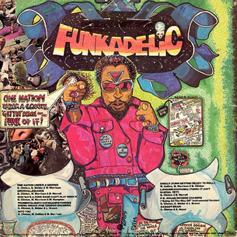
1st image
https://weburbanist.com/2011/03/02/got-it-covered-10-amazingly-artistic-vinyl-album-covers/ (accessed 20/11/17)
2nd image:
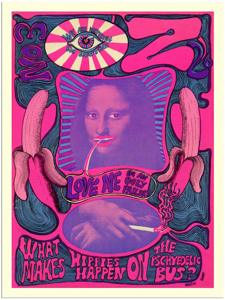
http://www.retrocards.co.uk/prodshow/AP1042___Oz_Number_3__Magazine_Cover_1960s__30x40cm_Art_Print_/AP1042-oz-no3-mona-lisa-magazine-cover-1960s.html (accessed 26/11/17)
3rd image:
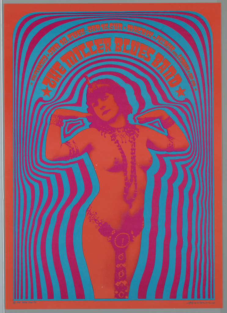
https://collection.cooperhewitt.org/objects/18498023/ (accessed 26/11/17)
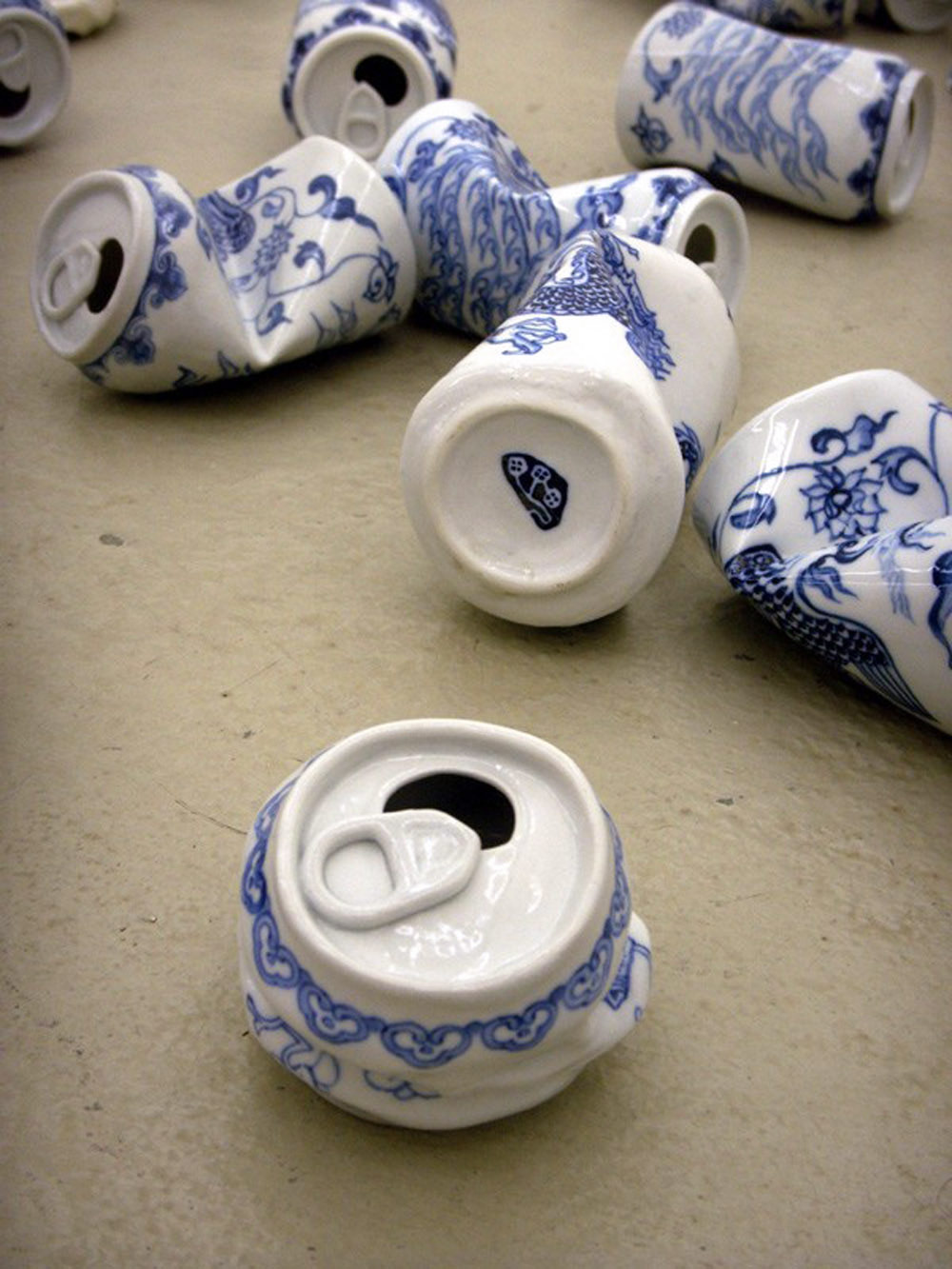
task 6:
1st image:
Lei Xue
http://www.thisiscolossal.com/2017/03/smashed-porcelain-cans-lei-xue/ (accessed 05/12/17)
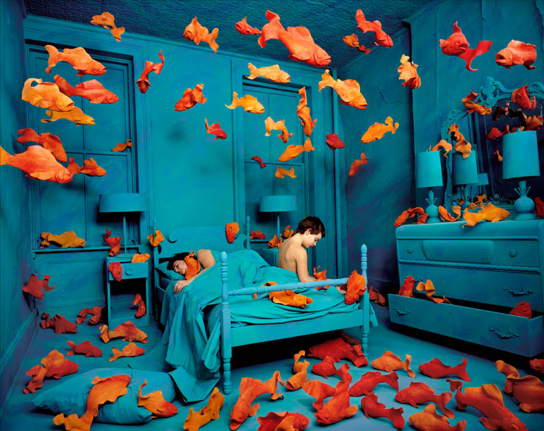
2nd image;
Sandy Skoglund Revenge of the goldfish
https://www.learner.org/courses/globalart/work/242/zoom.html (accessed 05/12/17)
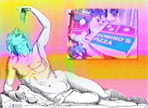
3rd image:
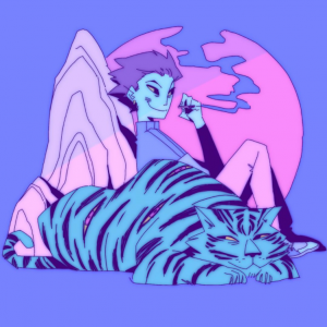
vaporwave
available from https://www.pinterest.co.uk/pin/137852438572630178/ (accessed 05/12/17)
quote:
Beauchamp, Scott (August 18, 2016). What Happened to Vapourwave
Available from http://www.esquire.com/entertainment/music/a47793/what-happened-to-vaporwave/
(accessed: 05/12/17)
task 7:
1 st image: Sachin teng available from:
2nd image:
katsuhira otomo available from https://www.pinterest.com/pin/305541155944910248/ (accessed: 06/12/17)
3rd image:
Tyler Jacobson available from: http://dnd.wizards.com/products/tabletop-games/rpg-products/volos-guide-to-monsters