Author Archives: Rhian Miles

Task 12.

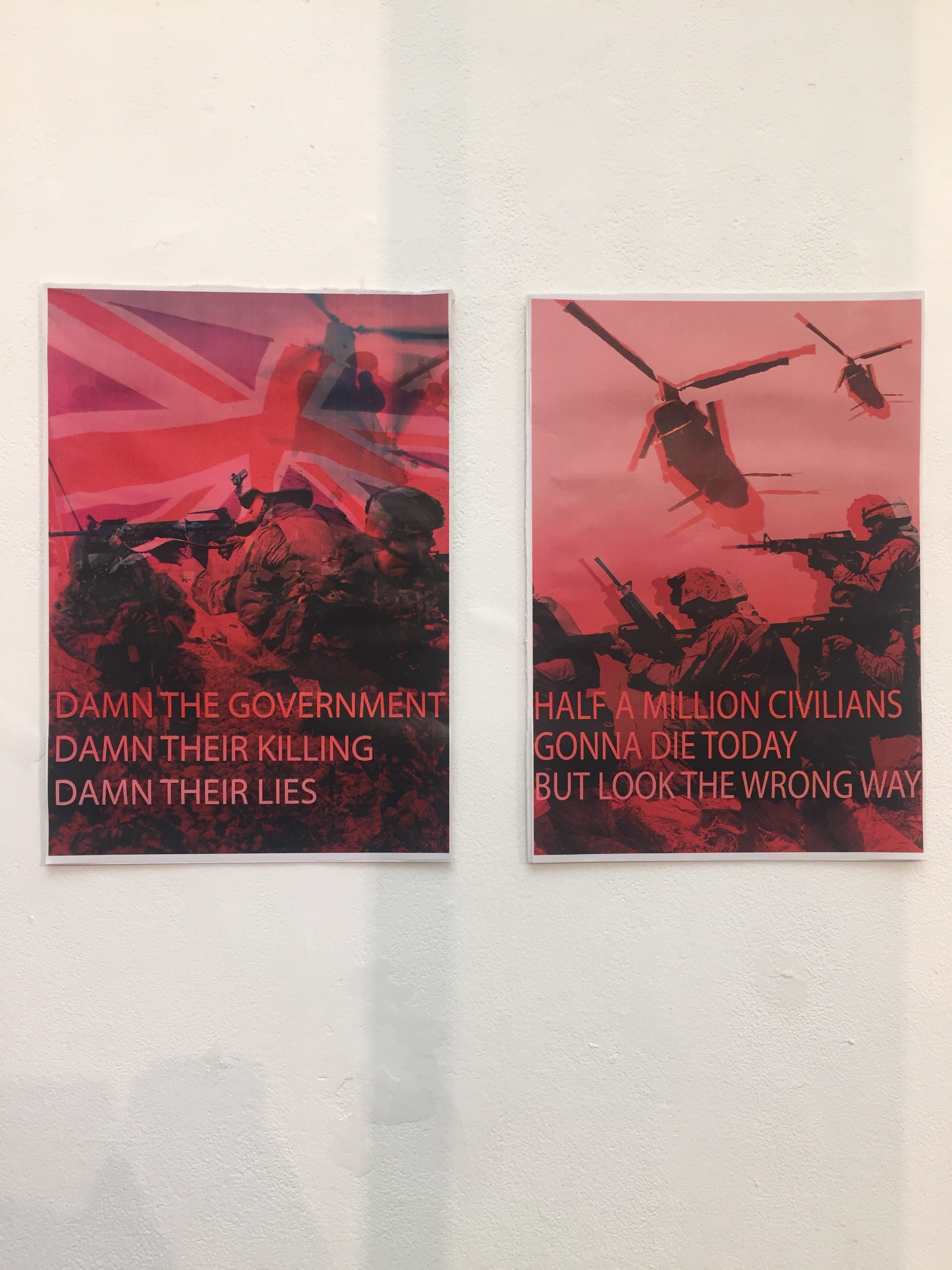
‘Damn the government’ A3 posters. 

When finalising my manifesto piece for exhibition I didn’t fully consider the exhibition space and the possibility of making something large scale to fit in the space. The good thing about my posters is that they can work on a smaller or larger scale. 

Whilst the manifesto exhibition was in motion I kept imagining how much more amazing my posters would look if they were so much larger. If I had the money and resource I would print them A0 so both would take up a whole wall.  

I also like the aspect of them being printed on flowy fabric like chiffon so if a breeze was to enter the room they would move, distorting the message a little. Of course doing this would alter the way the posters look and I would most likely have to change the imagery in Photoshop so it was of higher pigment and less complex so when printed on the fabric it doesn’t lose any of its image. So essentially it would become more of a screen-print than a graphic piece.  

I feel this would make the art piece so much more interesting and add a more contextualised aspect to the curation of the piece. My idea with using flowy fabric is it would remind the viewer of a flag waved proudly when our soldiers  are deployed and returned home.  

Task 11.

I think the content in my posts is well thought out and perceived well, I tried to make sure every task is done to a good enough standard without rambling on too much. The most enjoyable tasks for me were Tasks 1, 4, 8 and 12 as they were broad, and you could do anything you want with them.

I tried to make sure I completed every task weekly so I never fell behind or felt overwhelmed nearing the deadline. I think doing these tasks has helped me get back in to writing for a purpose and made me think about my writing skills more.

I enjoy writing and have tried to enjoy the experience however there were a few tasks that were very hard to write like Task 7 and 9 as there is a lot of information in relation to Art history and Art theory and to have to chop down what you say in to 300 words so you aren’t writing a long essay was quite a difficult process, especially with those tasks because there is a lot of information you could write about.

Overall, I have learned new things from this experience such as being able to review and talk about exhibitions (task 4/5). Learn about interesting art theories (task 7) and talk about my own ideas and work (task 1, 3, 8,10, 12). Art isn’t just about creating work, it’s about knowing the world of art from history to theory, to philosophy and being able to communicate ideas and thoughts in more ways than just visually which this blog has helped me to do.


Task 10.

‘In the negativity and positivity of society, art is born.’

Themes I explore in my work are equality, mental health and women. All these things revolve around myself and society. As a fine artist it is important to not only stay relevant with what is happening around you but also with what context I want my art to be about. When creating an art piece, I am considering these factors and it always usually relates to the negative effect our society has on vulnerable people like women and mental health. I want my art to address these issues in society and shine a light on those people who feel vulnerable and let them know that they are not alone and there is positivity to be found during negative times. 

Task 9.


Jenny Saville – passage – 2004  

Theory: Feminism. 

Jenny Saville’s painting Passage depicts a modern portrait of a transsexual. It is a dramatic expression of a body that challenges traditional canons of beauty. It also considers the artificial construction of the human form. In an interview with Simon Schama, Jenny Saville said: 

“With the transvestite I was searching for a body that was between
genders. The idea of floating gender that is not fixed. The
transvestite I worked with has a natural penis and false silicone breasts.
Thirty or forty years ago this body couldn’t have existed and I was looking for
a kind of contemporary architecture of the body. I wanted to paint a
visual passage through gender – a sort of gender landscape.” 

Jenny Saville is known for beautifully large oil paintings that challenge societies structure of gender. Passage is an interesting contemporary piece that shows an agonizing frankness to the human body whilst also exploring a unique path that society so harshly judges, transvestites. The painting is an interesting exploration in to feminism, not only the equality of female’s bodies but everyone’s body. 

A lot of Saville’s work explores the disparity between the way women are perceived and the way that they feel about their bodies. Passage branches that out even further and makes the viewer feel the confidence of this transvestite. From the beautiful brushstrokes, to the rich cool toned pigments, Saville paints in such a mesmerizing realistic manner almost bringing her paintings to life. Passage explores the traditional romanticism aspect of female painting but with this unique contemporary matter of transgender, she has managed to normalise such a controversial topic in society in such a beautiful way. 

Task 8.

‘Protect me from what I want.’ A beautiful conceptual piece by Jenny Holzer. A piece I came to because of a song of the same title by one of my favourite artist’s; Placebo. A reason I chose this piece of art to appropriate is because I’m using it in my manifesto project currently, but also because the art, the words, they’ve followed me throughout my teenage years and mean a lot to my identity.

The words ‘protect me from what I want’ have always made me think of certain things I want that I know are not good for me, that I shouldn’t delve in to. Corrupt fantasies we all have, temptations we tease but know will end up being our downfall and then even our epitaph.

Which was my mindset whilst creating my appropriated piece, a piece that incorporates how I feel about this text in representation to myself. I layered images of myself in Photoshop to create an almost double exposure image of myself that comes across ghostly as if I’m not fully there, as if my mind is not fully there which is how I feel most of the time, thinking about things that I shouldn’t. I used the colour red as a powerful symbol of danger, as if you should stay away, I should stay away from these corrupting thoughts. The contrast of cyan was a happy mistake whilst messing around with layering effects but I thought it worked aesthetically and compositionally.

Overall, I think it’s a very interesting art piece that conceptually says a lot about myself.

Task 7.

STEINBERG, L. (1999) From Other Criteria IN: HARRISON, C. Art in Theory, 1900-1990. An Anthology of Changing Ideas, United States: Blackwell, 948-953.

Leo Steinberg’s ‘From Other Criteria’ is a short essay talking about the way certain people view art and how particular styles of art made presently are not necessarily seen as ‘art’ in comparison to known artists such as Picasso and Warhol.  In this essay he uses the artist Robert Rauschenberg, and compares his strange pieces of work to shed a light on how not all art has to be a neat little painting or at least an aesthetically pleasing piece of work. He references this type of work style as the ‘flatbed picture plane’ and summarizes the essay by saying “It is part of a shakeup which contaminates all purified categories. The deepening inroads of art into non-art continue to alienate the connoisseur as art defects and departs into strange territories leaving the old stand-by criteria to rule an eroding plain.” Basically, saying that art made because the artist wanted to make it, is seen interesting and more worthy today than that of the artists who produced work in the modern art period and that the standards of criteria of what people view as art has changed from that of the early modern art era.

SERRA, R. (1999) From the Yale Lecture IN: HARRISON, C. Art in Theory, 1900-1990. An Anthology of Changing Ideas, United States: Blackwell, 1124-1127.

Richard Serra’s ‘From the Yale lecture’ is an extract taken from the artist’s Yale lecture in which he talks about his site specific built artworks that are seen as uncanny and controversial. He says in this lecture: “The work does not enter into the fictitious realm of the ‘master’.” And that he is “not interested in art as affirmation or in art as manifestation of complicity.” Essentially, he is making a dig at the attitudes of modern sculpture and how the teachings of the masters are that sculptures should be beautiful Michelangelo pieces of work made from marble, unlike Serra’s curved bent pieces of metal.

You can see the similarities are quite distinct in each of the short writings, whilst both Steinberg and Serra are talking about different elements in Fine Art, they are both saying the same thing. Late Modern art and now Contemporary art should be made because the artists want to make what they want to make in their own creative space. Contemporary artists shouldn’t have this almost burden over their head of having to work in a specific manner because that’s what the masters of art taught.

The Tate modern is an example that you can appreciate the art movements and masters of art whilst also appreciating the crazy creativity and uncanny use of materials that contemporary artists of today explore in their work.

Task 6.

The Art of Seeing.

I know a lot of artists, myself included, when creating an art piece will use imagery that has only come from their brain or an image in a book or online. Francis bacon is quite known for this, he didn’t like to socialise or sit and paint a person with them in the room, so he would use photographs.

I don’t think there is anything wrong with this, however in some ways I do feel it limits the painting. Maybe because the life likeness doesn’t feel quite right as you were looking at the 2d rather than the 3d or the experience with it feels uninteresting as there’s no story behind it.

But imagine if there was


My new mode of practice is the art of seeing, as in real life with your own eyes. Take yourself out of your imaginary bubble for a second, look at an object, a real object, a cup maybe. Yes, it looks boring, but really look at it, the shape, the curves, the colour. Now use your imagination with that actual object, a colourful abstract painting maybe? Or a sculpture using the curves and lines like those in that cup? Suddenly your thought process and mode or working has been opened, anything in the real world can enrapture a thought, a sense, a creative idea.

Branch out, take it further, go outside. The whole world is constantly moving and so is your brain. Don’t limit yourself to imagery from photos. This mode of practice might take you somewhere new and exciting, you might be looking at a flower outside and see a fascinating Insect that you’ve never seen before, that might inspire you in new ways and add an element of background to your art.

Task 5.

Mark Rothko, Red on Maroon, 1959 

On level 2 of Tate Modern London wound in with an exhibition called ‘In the Studio’ you come to a very dimmed lit room with these massive paintings of red and black, known simply as the Rothko Room. To some, you walk in and it’s just a dark room full of very odd abstract paintings that seemingly have no effect nor effort, to others the room is a thing of beauty. 

There are a few different Red on Maroon’s in the room but the one I want to specifically talk about is located to the far left as you walk in to the exhibition space. It captures your eye because whilst it is still quite a large painting, it’s not as large as the others in the room but it stands out the most to me because of the extraordinary pigments you can see even from across the room. 

The piece I’m talking about is an 8-foot-tall canvas with a very dark brownish red background that near the centre is almost a very dull saturated red that looks as if the pigment was scraped down to get to that colour like it is worn away, sun damaged almost. Then in the centre of that background is a bright red lipstick coloured rectangle that has a rough edge to it, like the hue has bled out to try and merge with its background. 

I think to most people, they don’t see what’s so amazing about his work. Just a red rectangle on top of a dark red background. But as a huge Rothko fan, never seeing his work before was breath-taking to me and as an artist to see how much effort went in to these abstract paintings really makes them feel more than what they look like.  

There is something about seeing this piece in person than in a photo that is pleasurable, when you’re up close you feel a sense of mesmerisation, something about the rich tones on the canvas capture your gaze and you feel the urge to stand there gazing for what feels like hours as if there is nothing or no one else in the room, a feeling you don’t get from a photo of a painting.  

Task 4.

Wade Guyton – Das New Yorker Atelier, Abridged. – Serpentine Gallery:

Das New Yorker Atelier, Abridged is a fascinating contemporary exhibition showing the modern world of technology and communication. It deals with the boundaries between the digital realm and our physical reality, as well as the speed and frequency with which we access, register and document information. The exhibition reminded me of Cildo Meireles’ Babel, 2001, at the Tate Modern. Similar ideas on modern technology, the overwhelming amount of communication we receive and how overbearing it can be on the mind.

Guyton’s work is a series of large-scale paintings as well as smaller works on paper that are made using computers, inkjet printers, scanners and iPhone cameras. The exhibition is curated beautifully to make all the pieces seem like one single body of work. That body of work being the production of mass produced media in an almost fabricated way, the canvas’ are pixelated and abstract as if we are reading the digital images wrong or at a slow speed. The smaller works are pixelated images and pages of news articles and magazines that have been run back through the printer with messy ink spills and disorientated drawings.

As you walk around the exhibition space taking in the information around you, you get an overwhelming sense of the technology we encounter in our daily lives and the impact that media has on our thoughts and feelings. The long tables with images of pixels and media outlets and the huge abstract and pixelated canvas’ suddenly bare a weight in your brain about the scarily overwhelming sense of media in our life. It’s almost like entering a room in your brain where it is trying to process this information.

Overall the exhibition is a wonderful experience that shines a light on the sight to mind process of taking in media with the ever-changing world of technology. Not only pointing out the fascinating way we all take in this information and how technology is constantly growing but also showing us the negative, scary aspect of communication overload and the impact on us mentally and physically.

Task 3.

RenĂ©e Cox – Hot-en-tot Venus, 1994 [photograph]  

In the image Hot-en-tot Venus you see the subject is Renee Cox herself completely naked apart from oversized prosthetic versions of breasts and a butt that are tied around her with string. Cox is posed in a way that is showing her body off with these fake implants that she is wearing, her gaze is striking almost worrisome as if she is daring you to look at her but almost like she doesn’t want you to at the same time. A very powerful image with positive and negative connotations. 

Positive connotations in that the image itself is very powerful and striking, she is showing body confidence to be able to show off 90% of her body, even though the 90s were more accepting of women doing these things in a non-sexual way like 10 years prior, women are still sexualised to this day, so for this image to hold a deeper powerful message without being sexualised is amazing. Which brings me to the negative connotations of what I think the image stands for, the boob and butt add-ons are clearly much larger than Cox’s own, held up in a perky manner a light on what society considers a man’s ‘ideal’ body based off of many modern day magazines and bias blog posts, which sheds a light on why her face seems so tense yet sullen and her pose is almost an intimidation of a pose made to show of her body as if just by her glance she is saying ‘am I perfect now?’ 

When you look in to the context behind this image it becomes an even more powerful photograph about the extraordinarily shocking histories of human exhibition. The photograph is a reference to Saartje Baartman, a Khoisan woman who was objectified as an interesting curiosity and exhibited in Europe in the 19th century, as the ‘Hottentot Venus’. To me, Renee shows us the power of humiliation and inequality this woman endured as well as shedding a light on the horrific slavery of black men and women and even more contemporary issues such as the way women are sexualized by their bodies still to this day.Â