
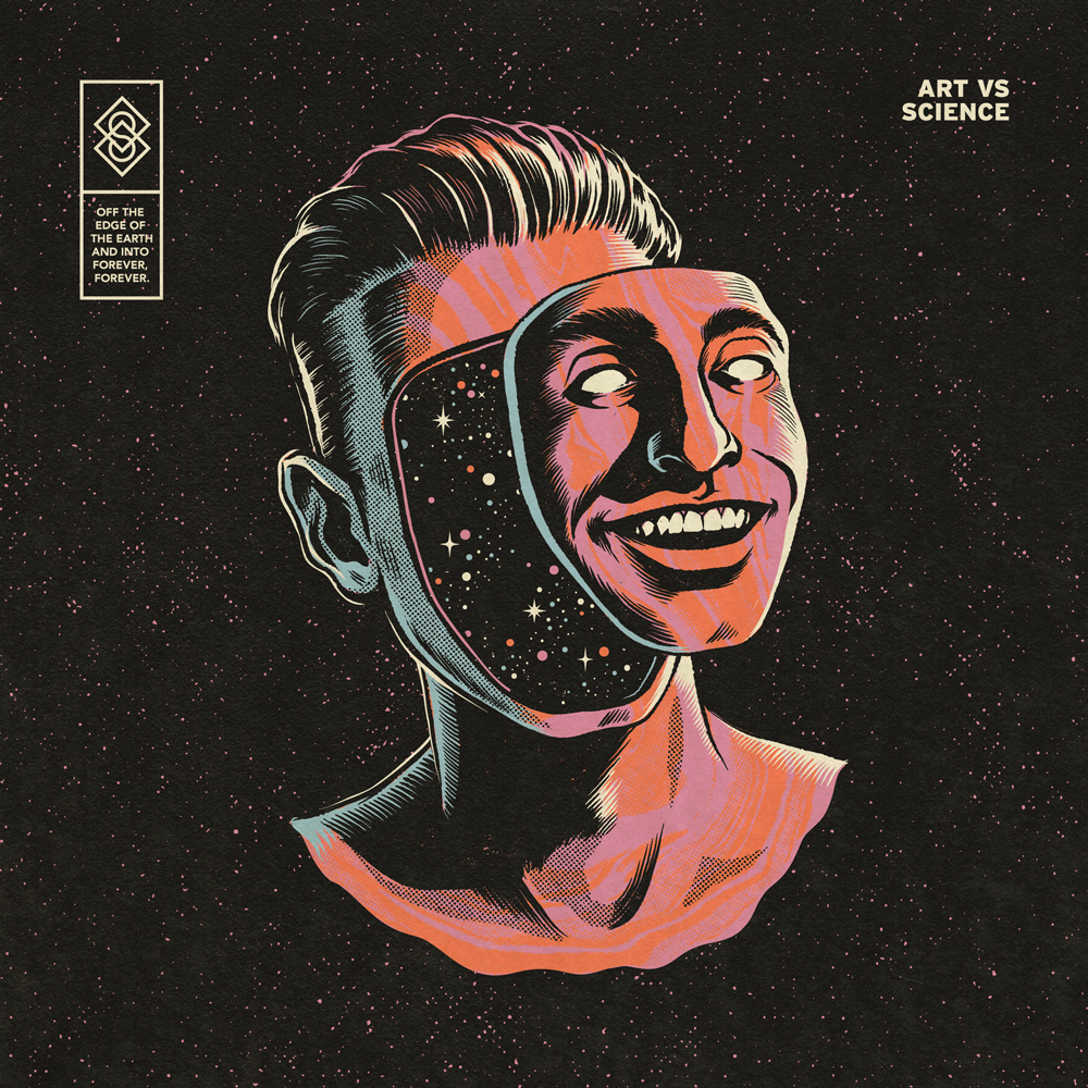
Andrew Fairclough is a Graphic Designer that mainly creates Album covers and musician iconography. His style revolves around the pop art design of comic books, although like in comic books he brushes over reality and imaginary but I think he does it in a much more thought provoking way. A lot of his work has cosmic aspects to it such as stars and space being incorporated and some pieces have things fusing together as if in a Sifi film. Fairclough has done artwork for a few bands such as the pop punk band ‘Blink 182’, a more obscure band Art vs Science and a band called ‘Arkells’. The tone of voice in his artwork usually appeals to the more recent generations but it also to the generation growing up with reading graphic novels so the style speaks across a wide audience varying in age and of course the audience who enjoy the genre its self.
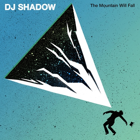
My comparison to this is a piece crated by Martin Fewell, a reasonably successful graphic designer who’s previously worked with Coke Cola, Ministry of sound and many other top brands. I chose the artwork he designed with DJ Shadow for his album cover and in addition, helped with his tour visuals. I thought the two albums have very different styles but follow simplistic designs, I quite liked how they both have block colours but incorporate various colours in a minimal sense, using either an airbrush effect or splashes. Both leave reality behind and create a scene that’s quite absorbing and eye catching.