Author Archives: Xingzhu Luo

Summary

Throughout the Research and Communication Skills module, I have changed to explore the history of art, the connect with culture, social and political issues, such as Counter Culture and postmodernist,  and also know how it developed through the years.

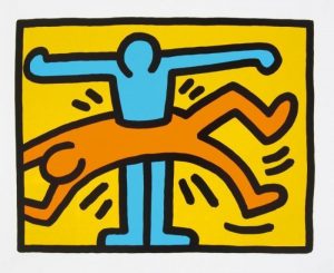
This course lets me realized the life form and thought of the time how powerful influence on design, when people design work, they can’t only focus on their work, also should see other people work more learning their creative thinking, to understand a more diverse culture. Because others artworks always can inspire people to get a new point. There have lines in the Pirates of Silicon Valley ‘Good artist’s copy, great artists steal.’ This is a quote from Shakespeare. This way’ s creation is similar to incremental innovation. But what we learn from others works like a lot of different points, when the day we want to do some design, they can be our power and form a complete image.

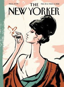
With a deep research, I learned and saw the movie about Christoph Niemann who is one of my favorite designers. I love the way he combines the real thing to complete his illustrate. One of the New Yorker covers I like is designed by Christoph Niemann. It is a woman takes the subway and comes out of the subway. These two cover were connected wonderfully with the woman motion. Christoph Niemann good at use the combine of life supplies and drawing to create designs which also means two different texture form an image. Combining two different things into one picture and creating the visual impact is the things I interested in. I want to explore the plane composition in the design. Also, the attitude of life is also what we can learn. We can look for beauty at every moment and every place of life, instead of only thinking about how to work when we design.

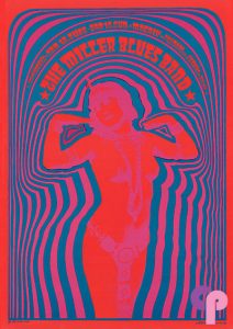
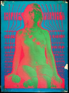
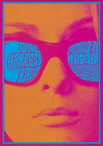
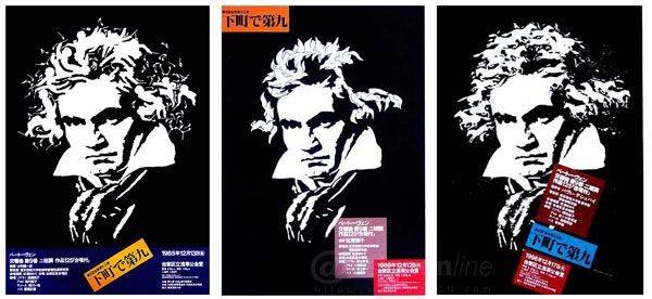
The psychedelic expression is also the point I am into and want to learn. The word of psychedelic always appear in the postmodernism, it was also a kind of life culture and thoughtful feedback, because, after world war II, the doubts about life and the yearning for freedom came to people. When I am looking at the pictures which were designed in that moment, I feel yearning. Victor Moscoso is a designer I know who is good at psychedelic design between 1960s-10970s. I like these because it gives me visual pleasure, I even do not need to think a lot to understanding what the design means but I can feel it. Thought the color in the poster is bright and exaggerated. The use of the color composition is thought carefully by the designer.

The Research and Communication Skills course is a way to push I learn about the old design and others design that is a good way to study. It let me have a deep thinking with other artwork. In my opinion, I can always learn their idea design and find the way I interested. I want to find a balance in the picture, whatever is the plane composition or color composition.

Publish or Perish


The first time I know Christoph Niemann is a media which introducing New Yorker. The first picture I got is the New Yorker cover from Christoph Niemann, it is for the 90th-anniversary issue. He always draws handing at first. In this picture, we can see the texture has the feeling of ink painting or crayon painting. The woman on the cover seems like an Asian woman, I think this texture can combine different feeling together. The color most is warm with different shades of orange and pink. Different color can make the poster has rich layers of feeling. The green-grey was interspersed in the warm color and interspersed illustrate. The artwork makes people feel peaceful and warm.

The second picture is Fukuda used Beethoven’s head as the basic form to carry out the replacement of the elements. Fukuda Shigeo is a Japanese designer. Looking at these works from a distance, you can know who is the character in the poster. But when we look at the hair part of him, it’s made up of different graphic elements. Here, notes, birds, horses and other graphics but these elements are not related, bur show the rich image from the designer. I like this poster because this poster shows different element how to keep a balance on the whole thing.

Gunter Ram bow always said ‘Poetry, art, and literature are something people can feel every day. It’s everywhere. People can find it just by looking at it.’ He uses different texture to get the visual difference and combined with the processing of art, but it always has the other different deep meanings. Leland design lots of poster about potato which he considers to be German national culture. His potato poster is not about the potato itself, but about the magic of creative and visual effects. He cuts the potato and uses different and bright color to show the division of space. The black background makes the potato and its inside color have a strong combine. Through the superposition of contour line and color, the color makes different space to us, and the whole relationship with the part forms some deep space.

Postmodernism


It is considered that the disorder or dissection is an important feature of postmodernism (Hassan). Wolfgang Weingart’ s artwork can totally show the characteristics of the postmodern art. The first image has many messy letters. It seems like the center of postmodernism, they are suspicious, negative and contradictory, they are also free. But if we watch the poster carefully, we can see the words are arranged in a particular order. The end of the letter is well arranged in a straight line, so that the color blocks formed by each word are arranged in a neat line, forming a line with no lines. For these reasons, he doesn’t use a line to limit and layout but the poster makes people feel neat.

The second image is from David Carson. He has many artworks that are presented in a college. ”For artists, innovation may mean picking and picking from old things,” says Venturi. In fact, this is the basic creation method of postmodern architects. As well as designing posters, designers can collect different elements and put them in the artwork. Such as this poster from David Carson, we can see some photography which was cut out and some illustrates. The thing I like most is that he uses many different fonts, but the whole thing doesn’t feel very messy. The opposite, because of the appropriate superposition of different elements makes the poster look very layered and more abundant.

I got the final picture from Keith Haring. His artworks

 often appear in lots of places, have a kind of intricate pattern, and the patterns are full of composition, often without perspective or texture, but with many symbolic feelings. I interested in the simple pattern, clean line and bright color in his artworks. He combines the characteristics of street art in his works. I like the movements of two people in this picture. It feels unrealistic, but it can stimulate my imagination. Thought the image is very simple and clean, it still expresses a rich emotion. The image is simple, people don’t need to think a lot 

but also show the postmodernist characters, not depth, freedom, and pane.

Hassan, I. (1987). The postmodern turn essays in postmodern theory and culture.

Venturi, R. (1977). Complexity and contradiction in architecture (Vol. 1). The Museum of modern art.

Counter Culture

Represented by the World War II of the 20th century for people suspected of modernization for good reasons. The cold war, environmental pollution, resource depletion, the nuclear threat, population expansion and so on composing a gloomy picture of the 20th century. In 1960s-1970s, people’s minds are no longer repressed and many different styles of the painting appeared.To meet the needs of mass consumption, postmodern art appear with no certainty, no sense of depth, and the latter. (J. F. Lyotard)

The first picture is Miller Blues Band from Victor Moscoso, he was the minority people who accepted formal art education. He transformed the abstract harmony of color theory into a hallucinogenic contradiction. I like the lines he used to surround the characters and text. It also has many different changes between the line, as the lines near the character are breadth but the one far from is thin. The color overlay lets the poster design some color block and the line bring the thickness.

The second thing I like is the color he chose, his color always called as psychedelic color. Because the color is bright and dizzying so we can just enjoy the visual stimuli from the poster. Also, the character is a real people from the photography. Color is superimposed on each other such as which color is on top, which in the next, the visual perception of the audience is precisely taken care of, and several high purity colors to achieve balance state on the vision. For example,  the woman in the poster has two different colors, but these color are similar and make the character color as a whole thing and stand out on the poster. It also is a combination of two different texture, but also make the photograph turn into the plane. And his paintings greatly influence the aesthetic style of the 1960s and 1970s.

The postmodern artworks always bring the reader a lighthearted feel and make people think it is sensibility. People don’t need to think what is the meaning of these posters. Because they are a symbol of freedom, the postmodern is the product people doubt the reality after time accumulates. 


Lyotard, J. F. (1984). The postmodern condition: A report on knowledge (Vol. 10). U of Minnesota Press.

Strange Days in Victor Moscoso’s 1960s and ’70s Psychedelic Drawings

Authenticity and Modernism

Is it possible to be truly authentic?

Authentic means being real and original. To different people, the meaning of authentic is different because authenticity is part of human feeling and the identify of meaning (Hegel 1977). People give different standards of authenticity through their own experiences and reflections (Heidegger 1996).  A completely original artwork seems is not exist, the others project surround us will always influent us. So in my opinion, truly authentic is nonexistence.

The immature designer will copy from others, but the successful artist will take ideas from others. Copy can’t help us improve the things we design. The artwork which copied from other places will lose the real meaning it exists. For example, we have copied from the famous artwork, such as Van Gogh. China even has a village, all people live here copy Van goth’s work to earn money, but they aren’t famous even can’t earn enough money. Only copies are unhelpful for designers.

Other artist projects can inspire us and help us find a character we want when we create a work. That’s why lots of designers need to do some research to start work. People could improve the standard of beauty when they find the work they like. Learning other people’s works is not only for the immediate design needs but also for the accumulation. The thing we absorb will finally be our thing and form ourselves style.

When we want to take something from others artwork, we can’t focus on superficial expressions. Because it may make us limited to a mode of thinking. The most important thing in the artwork is not the technology but the thought.

Hegel, G. W. F., & Miller, A. V. (1977). Phenomenology of spirit.

Heidegger, M. (1996). Being andtime. State University of of’Human-Computer Studies, 45. 185-213.

Technology is the mortal enemy of art 

Technology is the mortal enemy of art

Technology is not the enemy of art. Oppositely, they exist side by side and play a part together. Gustave Flaubert said ‘Art and science always meet at the top of the mountain.’

It is true that we have a lot of ways to draw and take the place of hand-drawing. Such as using the computer software. In fact, I think the feeling that using the digital board is completely different to traditional art. It doesn’t have the natural texture when we use pencils to draw in the paper and also limits artist establishing the direct interaction.

However, the technology also promotes new field to express art, such as net.art, new media art, New Aesthetic and post-internet art. Whitechapel Gallery held an exhibition called Electronic Superhighway (2016-1966) for artists to think about how to cope with the evolution of technology.  The exhibition name comes from the video artist called Nam June Paik. He created the world in 1974 to introduce the fast development of technology and some ‘traditional’ art is out of style.

Art also can promote the development of technology. For example, Edward Ihnatowicz is an engraver and artist. He exhibited SAM (Sound Activated Mobile) at ‘Cybernetic Serendipity’ in London in 1968. Da Vinci, the most famous man who was not only an artist but also was a successful scientist. He drew the first robot design is based on his extensive knowledge of human anatomy accumulated through drawing.

Therefore technology and art can help each other. The designer needs to balance the way use technology to help designer molding the project.

Benthall, J. (1972). Science and technology in art today (p. 59). Thames and Hudson.

Compare two image

Dynamic elements’ is one of the biggest company which drawing CG caricature in China. They always use Photoshop to draw pictures with digital board. Because the jitter correction in Photoshop is not as good as SAI, people always use a method called impasto to draw. Dynamic elements are no exception. This picture I want to introduce because it has a good color matching. When we enlarge the picture we can find small brush stroke on the place which has reflective. The brush stoke makes the girl’s skin has texture and also make different color has a good fuse. The image has a strong comparison between color. The color always has high-lightness and high-pureness, with the black background It displays strong visual impact.

‘Ghost blade’ is oneof my favorite comics which drew by Wlop. All frames are chromatic and tridimensional, so every image needs lots of time. But the most admirable thing is that the ‘Ghost blade’ has a unique style of painting and Wlop only use the free brush to draw the comic. The things I appreciate is that he always retains the brush stoke, and the characters in his comic have special and beautiful eyes without a lot of detail.

To compare two picture, they all are tridimensional, have a solid structure. But the way the author draw and form structure are different. In my opinion, ‘Ghost blade’ needs more technology to draw. Because use brush stoke to expression structure is difficult as the author need to know clearly about the human body structure.

Terminal Bar

Terminal Bar is a small movie made by Stefan Nadelman (2002). This movie records a change of bar between 10 years, has a strong compare between old and new thing. The feature of the movie is the processes involved in using photography create a short film. Some frames are layout lots of same photography which let me a link to pop art, because they both copy and paste a picture multiple times in a moment.

But I think the best movie has similar performance method was made by DuĆĄan HanĂĄk, called the picture of the old world which was made in 1972. These two movies both use the black-and-white photograph to display. The terminal bar has lots of different typesetting, making it more interesting, but a good movie is not only formed by good technology, but also the atmosphere and the meaning of the rendering. The terminal bar doesn’t have a suitable background music or pause to fit with pictures together. However, the picture of old world does a  really good work, at the beginning of the movie old granny’s melodious voice reinforces our feelings of the pictures.

But the way Stefan Nadelman layouts the pictures offer an Interesting and diverse composition. We can use two pictures with small differences and a quick conversion through two diagrams, even the picture is stationary similar as we turn the pages of the book quickly it could form animation. We could create the illusion of a dynamic picture in the brains. Secondly, zooming in a picture and moving pictures as a long take also is a way to show them as a movie. These element help photography have some change and become interesting, because the photography will be dozens of seconds on the screen.