Author Archives: Katie Huxford

A Summary Of What I Have Learnt

Throughout this semester of Research and Communication Skills, I have learnt how art and design has progressed and developed. Each week, I have enjoyed learning about the different eras within the history of design, from ‘Art Deco’ to ‘Post-Modern’ and contemporary graphics.

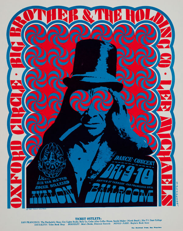
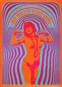
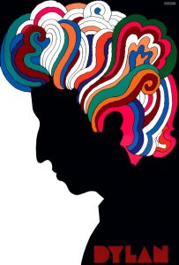
(Big Brother and the Holding Company, 1966)

I found week five onwards particularly interesting due to the development of technology in design. I feel that this factor has aided the rapid progression of computer based graphics, such as in the counter culture artwork of Victor Moscoso and Milton Glaser. Studying and researching their work for my blog was useful as it has inspired me as a practitioner to experiment with bold, vibrant colours and contrasting, psychedelic shapes.

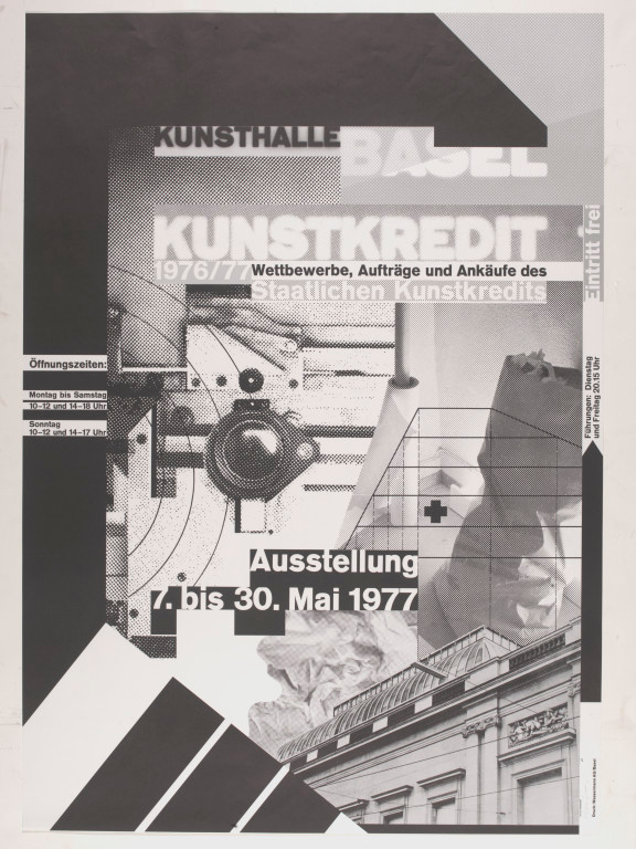
(Kunsthalle Basel Kunstkredit, 1976)

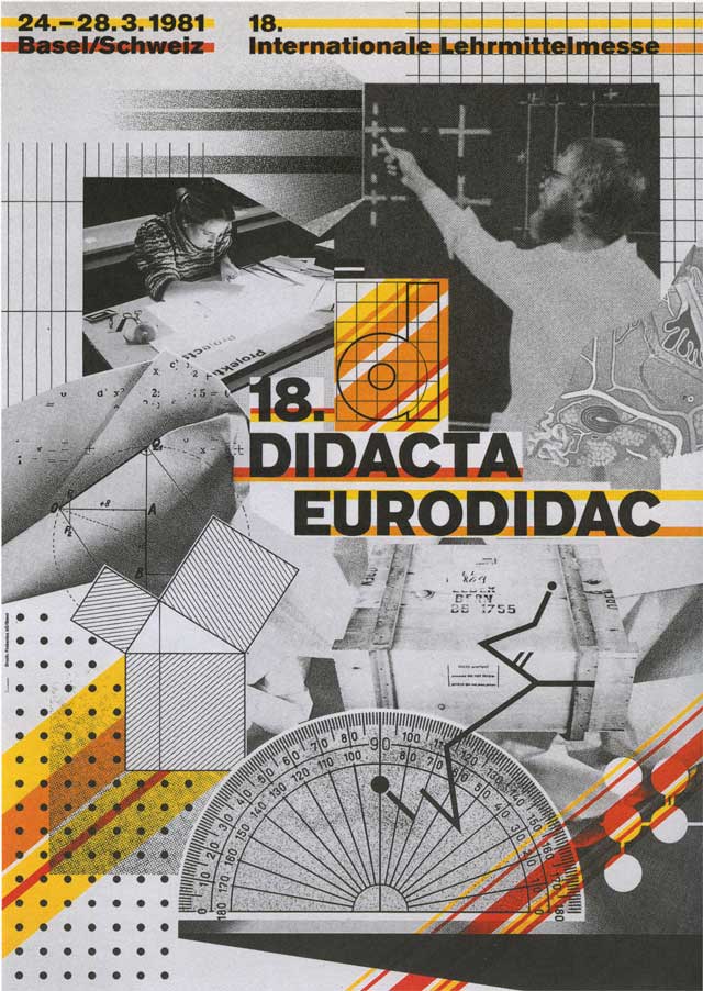
During the research tasks, I also found myself attracted to the work of internationally known, Swiss designer and typographer, Wolfgang Weingart. I like how he uses grid systems to structure his work and am also interested in his slightly abstract approach to typography. I feel that in his work, Weingart uses type as a tool to shape image and meaning. As a fan of typography myself, I find his final pieces compelling to look at due to both their effortlessly refined presentation and yet also striking complexity.

(Plant Lady, n.d.)

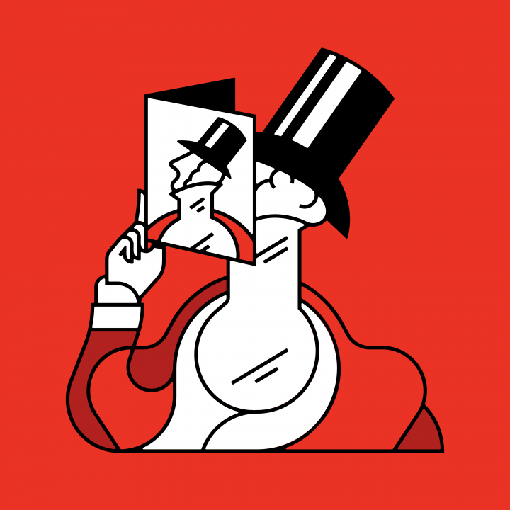
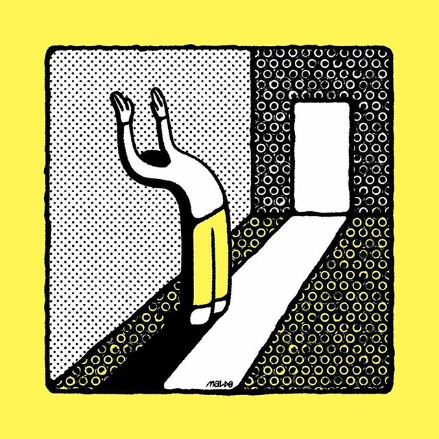
My favourite task was probably the most recent, in which we were allowed to choose three separate designers of our choice to talk about in relation to our own work. I enjoyed this task the most as I felt I could strongly represent my personal interests as a designer and discuss other artists who I feel have influenced me in my own practise. The three designers who I chose to look at were Tim Boelaars, Maldo and Rob Bailey. All three of these currently specialise in graphic design, however there is an illustrative feel to all of their work which attracts me.

The weekly tasks have also helped me to come to a conclusion regarding which pathway I wish to continue with in my degree. Throughout the weeks of research, I feel I have been mostly drawn to typographic styles of working and as a result have decided to pursue the Graphic Design pathway. This is not to say that within this particular pathway I can not experiment with photography, illustration and motion design. The Research and Communication Skills tasks have taught me that in the field of Graphic Design, all these skills are necessary to progress as a practitioner. I can incorporate elements of all of these specialities throughout my continued work as a Graphic Designer. Futhermore, I can also use the knowledge gained throughout these past weeks of Research and Communication Skills to improve existing work and the work that I create in the near and distant future.


Image 1- Big Brother and the Holding Company. (1966). [image] Available at: https://transpersonalspirit.wordpress.com/2012/11/10/psychedelic-poster-art-victor-moscoso/ [Accessed 2 Dec. 2017].

Image 2- Big Brother and the Holding Company. (1966). [image] Available at: https://transpersonalspirit.wordpress.com/2012/11/10/psychedelic-poster-art-victor-moscoso/ [Accessed 2 Dec. 2017].

Image 3- Plant Lady. (n.d.). [image] Available at: https://robbailey.studio/shop/ [Accessed 2 Dec. 2017].

‘Publish or Perish’

(Illustrations of Eustace Tilley, The New Yorker, n.d.)

The work of graphic designer Tim Boelaars is simplistic yet striking. Boelaars is based in Amsterdam and his work largely revolves around icons which portray messages. He uses simple lines and usually a carefully selected, minimal palette of colours to make his work pop and stand out. One piece of Boelaars’ work that has particularly caught my eye in the past is his interpretation of Eustace Tilley, the iconic dandy of ‘The New Yorker’ magazine. I believe that this work captures the history of the original image, whilst still portraying a modern message which connects to a contemporary audience. On his website, Tim quotes that he strives to ‘make things that are simple and striking and strong enough to feel like forever’ (Tim Boelaars, timboelaars.com). This is exactly what gives his work substance. It brings together new and old techniques to create design that both tells a story and is durable.

(Walls, 2017) 

A second artist who I wish to discuss is ‘Maldo’. He is an illustrator from Prague who works in a conceptual way. I am especially drawn to his work due to his bold approach at shaping design. Similarly to Boelaars, Maldo uses a restricted colour scheme throughout his work, usually consisting of only two or three different tones in each piece. This technique really appeals to me, as it strips back the facade to reveal a story behind each piece. To replace colour, Maldo often uses patterns to create texture in his work, which I believe also helps us to connect to and appreciate the simplicity of his design.


(Two Men, Rob Bailey Studio, n.d.)

The third designer I have chosen to look at is Rob Bailey. I first encountered Bailey’s work through the social media site ‘Instagram’, and was instantly drawn to his effective, minimalistic style. He uses stripped back shapes, usually layered on top of one another in flat colour to create images of people and objects. His modest approach to design really appeals to me, especially in some of his pieces which hide hidden social and cultural messages. He subtly explores issues such as homosexuality and social expression in his work that are sometimes hard to recognise at first, but when seen tell a story through just one simple image.

Image 1 and Quote- Illustrations of Eustace Tilley, the iconic dandy of The New Yorker. (n.d.). [image] Available at: http://www.timboelaars.nl/the-new-yorker [Accessed 29 Nov. 2017].

Image 2- ‘Walls’. (2017). [image] Available at: http://www.maldo.me/ [Accessed 29 Nov. 2017].

Image 3- Two Men, (2017). [image] Available at: https://robbailey.studio/ [Accessed 29 Nov. 2017].

Post Modernism

(David Carson Magazine Work, n.d.)

Post Modern designers have throughout history used factors such  as deconstruction, doubt and reference to create their work. This can be exemplified by the work of David Carson in particular. I first encountered Carson’s work when studying him at A Level and my opinion of his work is satisfactory. What must have been revolutionary in its time, due to the deconstructed use of layering type over image, to me now seems dated from a contemporary eye. Carson uses lots of inspiration in his work from his passion of surfing (Anon, 2017), which makes his work personal to observe. However, his use of distorted layout, ‘mixes of vernacular typefaces and fractured imagery’ (David Carson (Research), 2014) causes the audience to beg whether Carson’s creativity is abstract genius or just damn hard to look at.

(Marilyn Diptych, 1962)

The second image I would like to discuss is Andy Warhol’s postmodern ‘Marilyn Diptych’ (Marilyn Diptych, 1962) composition. The piece has become globally famous due to its brash, bold use of colour and ‘pop art’ style. I was this use of contrasting colour that particularly stood out to me when I visited the Tate Modern in London last year. Warhol’s work combines two relatively old design techniques, collage and screen print, which particularly appeals to me. I like how the simple repetitiveness of the composition somehow creates a striking and sophisticated form.


(18th Didacta/Eurodidac, 1980)

The final artist that I would like to present is Wolfgang Weingart. Weingart became famous due to his internationally known graphic design and typography. One piece in particular that I favour, is this poster (18th Didacta/Eurodidac, 1980), which I believe has really contributed to revolutionise typography as an art form. Like Weingart, I too share a passion for type and so his work is massively influential in my own practise. I especially like how Weingart’s work is constructed of many bold elements, yet if deconstructed the composition would seem incomplete and unharmonious.

I believe the work of all these post modern designers reveal aspects of modern design that are still frequently used in contemporary practise today. However of all three, I favour Weingart’s work the most, due to its complexity of design that I feel was ahead of its time.


Image 1- Anon, (2017). [online] Available at: http://www.davidcarsondesign.com/t/work/magazine/ [Accessed 27 Nov. 2017].

David Carson (Research). (2014). [Blog] Workflow. Available at: http://kjohnsonsalami1.workflow.arts.ac.uk/david-carson-research [Accessed 27 Nov. 2017].

Image 2- Marilyn Diptych. (1962). London: The Tate Modern.

The Andy Warhol Foundation for the Visual Arts, Inc. / Artists Right Society (ARS), New York and DACS, London

Image 3- 18th Didacta/Eurodidac. (1980). [Worldformat Poster] Concention on teaching aids, film layering.

AIGA | the professional association for design. (2017). Wolfgang Weingart. [online] Available at: https://www.aiga.org/medalist-wolfgang-weingart

Counter Culture Images

(Psychedelic Poster Art: Victor Moscoso, n.d.)

Victor Moscoso is a graphic designer, famous for his psychedelic music  posters, underground comix and advertisements in San Fransisco during the mid-late 20th century. Many of his compositions look like optical illusions, which is what I think makes them appear so interesting as works of art. His process of working is said to have turned ‘traditional colour theory on its head’ (transpersonalspirit, n.d.) by creating evocative, vivid, erotic, patterned posters designed for the newly emerged psychedelic culture of San Fransisco in the late 1960’s.’ 


(Bob Dylan’s Greatest Hits, 1966)

The next counter culture image that I have decided to look at is ‘Bob Dylan’s Greatest Hits’ poster, designed by Milton Glaser in 1967. Glaser’s also psychedelic style of work has already playeda hugely influential part in my ongoing journey as a practising designer. I first studied his work as part of a research project in my A Level graphics course and especially fell in love with his use of bright colours in this particular composition. I feel that these colours successfully contrast with the stark black silhouette of Dylan’s face, which makes the overall piece both simplistic yet entirely sophisticated in its design. I also believe that this well executed contrast between vibrant colours and simplistic shapes represents Milton’s  artistic style perfectly. 


(End Bad Breath, 1967)

As well as establishing his own design company, in 1954 Glaser also co-founded ‘Push Pin Studios’ with fellow budding designers, Seymour Chwast and Edward Sorel. Chwast’s poster ‘End Bad Breath’ (1969) is the final counter culture image that I have chosen to discuss. It is similar to Glaser’s work, in the sense that Chwast’s style could be described as relatively simple to the untrained eye. However, it is the political, social and moral backstories behind Chwast’s work that interests me most as a designer, as they add a new dimension to each composition that he creates. This particular poster, ‘End Bad Breath’, embodies all things American in an attempt to protest the Vietnam War in 1967. In an interview (100 Years of Design, n.d.), Seymor Chwast described the ‘cliche’s’ and ‘stereotypes’ that occurred during the design process, so in the end he decided to use ‘Uncle Sam’ to represent the ‘liberty’ within New York.

Image 1- Psychedelic Poster Art: Victor Moscoso. (n.d.). [image] Available at: https://transpersonalspirit.wordpress.com/2012/11/10/psychedelic-poster-art-victor-moscoso/ [Accessed 27 Nov. 2017].

transpersonalspirit, V. (n.d.). Psychedelic Poster Art: Victor Moscoso. [online] Transpersonal Spirit. Available at: https://transpersonalspirit.wordpress.com/2012/11/10/psychedelic-poster-art-victor-moscoso/ [Accessed 27 Nov. 2017].

Bob Dylan’s Greatest Hits Poster. (2017). [image] Available at: https://www.miltonglaser.com/milton/#1 [Accessed 27 Nov. 2017].

Pushpininc.com. (n.d.). Pushpin Gallery. [online] Available at: http://www.pushpininc.com/about/seymour/ [Accessed 27 Nov. 2017].

End Bad Breath. (1967). [image] Available at: http://www.pushpininc.com/gallery/posters/ [Accessed 27 Nov. 2017].

100 Years of Design. (n.d.). 100 Years of Design | AIGA. [online] Available at: http://celebratedesign.org/connect/solidarity/key-artifact/end-bad-breath [Accessed 27 Nov. 2017].

Can you be truly authentic?

Defined by the Cambridge Dictionary (Cambridge University Press, 2017), authenticity is the ‘quality of being real or true’. It is therefore fair to say that, to be truly authentic as a practising designer, your work must be original and genuine. However, this then begs the question ‘can you be truly authentic?’

As practitioners in the field of the graphic arts, we are constantly looking at other peoples work with a critical viewpoint in order to aid us in our own design process. We use others artwork as inspiration for our own creative development, by taking their ideas and experimenting further with them, without copying the exact composition of pre existing pieces. We learn from the mistakes of other designers and then use this knowledge along with some creative flare to create our own works of art.

In modern society, with the development of advertisement and new technology, we are surrounded by great design. Is it not normal therefore that we should take inspiration from such art to influence our own creations? The idea is not to copy others work, only to be affected by it. The same concept has also been happening in design for centuries, as Theo van Doesberg (Croation Review, 1931) stated, ‘The new artist does not imitate, he creates. He does not describe, he designs’ and these principles of modernism are still strongly used in contemporary practise today.

Cambridge Dictionary. Cambridge University Press, 2017. www.dictionary.cambridge.org/dictionary/english/authenticity

Theo van Doesberg- Quote referenced from RCS Lecture notes.

‘Technology is the mortal enemy or art’

Rodchenko’s Manifesto of the Constructivist Group states that ‘Technology is- the mortal enemy of art’. I disagree with this statement, as I believe that technology is integral to the development of artistic practises in design.

Take the graphic arts for example. In this field, I view technology as a vital tool in the design process, as computer software is used to edit and enhance artwork in a way that is far superior to the capabilities of hand generated graphics. The technological advances of the past century in particular now allow practitioners to experiment digitally and in a more innovative way.

The more recent invention of the graphic tablet for example has proved especially useful to designers during the creative process. It can also be argued that graphic designers now rely on powerful software such as this to get their jobs done. ‘Complex visual manipulations that used to be laboriously done by hand are now performed easily and quickly on a computer.’ (slideshare.net, 2015)

On the contrary, it could also be justified that great design originates from hand crafted creativity. However, I still do not believe that technology is the mortal enemy of hand illustrated art, if anything it can help to enhance artwork in a way that can not be achieved by hand alone.

As a working practitioner in the creative arts, technology helps me to manipulate and experiment with my artwork and I believe that it is a vital tool to the development of design in our society.

slideshare.net. (2015). Technologies used in graphic design. [online] Available at: https://www.slideshare.net/theboothfairy/technologies-used-in-graphic-design [Accessed 31 Mar. 2015].

Comparing Images

(Scarborough Coast Yorkshire, Great British Railway Poster, n.d.)


The first image I have chosen to look at is by Frank H Mason, a renowned artist and sub creator of the ‘Art Deco Travel era’. Mason is best known for his maritime artwork and designs for the British Railway Posters of the 1930’s. The poster I have decided to focus on is Frank’s interpretation of ‘Scarborough’, which can be found on display at the National Railway Museum. The poster, although produced almost ninety years ago, remains modern and timeless in its composition. This is partly due to the use of retro, contemporary colours which give off a modern tone. Mason’s work is also relatively flat in style, unlike some of his more intricate maritime works of art. This, along with the use of the ‘Gill Sans’ typeface used, further creates a classic and enduring piece.

(24 Hours in Scarborough, Charlton, 2016)

The other work I have chosen to research is by Mandy Charlton, a photographer, writer and blogger from Newcastle upon Tyne. Mandy specialises as a portrait photographer by trade, however it was one of her landscape pieces that caught my eye when reading her ’24 Hours in Scarborough’ blog. This particular photo caught my attention due to how well it captures the essence of Scarborough as a ‘charming coastal town’. It differs to Mason’s piece, as it shows a more recent presentation of the seaside through different medium. The reason the pieces work so well in comparison is that they both portray Scarborough’s quaint ambience that has remained over the last century. Both pieces also influence me in my own work as they both show a sense of timelessness, which I think is important in all aspects of design.

Image 1- charlton, m. (2016). 24 Hours In Scarborough Part 1, Scarborough Sea Life Sanctuary. [online] Mandy Charlton – Photographer,Writer,Blogger. Available at: http://www.mandycharltonphotographyblog.com/ [Accessed 8 Jul. 2016].

Image 2- Scarborough Coast Yorkshire. (n.d.). [image] Available at: http://www.travelpostersonline.com/scarborough-coast-yorkshire-br-vintage-travel-poster-by-frank-henry-mason-1948-537-p.asp [Accessed 27 Nov. 2017].


Terminal Bar

‘Terminal Bar’ is a short film, directed by Stefan Nadelman. Initially it seems like a relatively self evident documentary, however, it is actually an account of events from Stefan’s fathers perspective, through the eye of a lens.

(Terminal Bar, n.d.)

The structure of the film is made up of still photographs, taken by Stefan’s father Shelly Nadelman between 1972 and 1982. These stills act as “a photographic record of New York’s most notorious watering hole” (Terminal Bar, 2002), whilst also providing a social narrative. They not only document the human backstory and personality of every customer who entered the ‘Terminal Bar’ over the decade, but also reveal a very personal account of Shelly’s critical observations on society at this time.

The stills are interrupted throughout by traditional filming, which causes a kinetic juxtaposition between real time and portraits, past and present, black and white and still and motion. Nadelman achieves this by using two frames in one shot, which helps to show the contrasting themes. Alongside this, narrative and newspaper text work in conjunction with each other, which documents the narrative through text and voice.

Later on in the film, a break in the narrative is replaced by music, which creates a kaleidoscopic effect. The kinetic vibrancy of the music at this point is caused by the syncopated visuals which appear in time with the music. The images mimic the beats on screen and this not only makes the film musical to hear but also to look at.

When revisiting the ‘Terminal Bar’, Shelly Nadelman said “If I didn’t document it, nobody would ever know
nothing has changed” (Terminal Bar, 2002). He took time to document it, and his son Stefan took time to document his fathers work through the art of film. I can take inspiration from this by documenting great design and narrating my own design process as I work.


Terminal Bar. (2002). [film] New York: Stefan Nadelman.

Image 1- Terminal Bar. (n.d.). [image] Available at: https://twitter.com/aflashbak/status/772457058188787712 [Accessed 2 Dec. 2017].