Author Archives: Liberty Hodgson

Task 9-

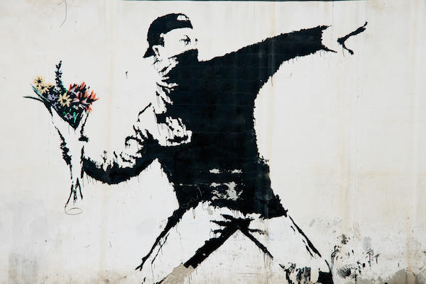
Banksy is a British street artist, working with spray paint his works are scattered across the world, but mostly in London and Bristol. Along with spray painting, he has also been involved in filmmaking and sculpture. With his work touching on political and social issues, he also does add a kind of humor, which leaves his work with an almost wit to it. This image for example shows how we have a huge amount of social issues at this moment it time, worrying more about how people online perceive us rather than the connections we are able to make in person. Which to me is actually a huge part of my growing up, with technology advancing people are more bothered about how they come across on social platforms and spend more time on their phones than actually speaking to each other. Banksy goes straight to the point with his work, not beating around the push or making it seem anything other than what it is. His brutality makes people intrigued as it is exactly how it is, along with this piece he has also done works that are controversial, such as one of a young boy who looks like he would be throwing something like a bottle during a protest of some sort, yet in his hand is flowers. Which is on the humorous side of his work, showing what things could change and how we would all be better off if that was the case, the lightheartedness contrasted with straight to the point means everyone can take something from his work.

http://designtaxi.com/news/393849/Banksy-s-Real-Identity-May-Finally-Have-Been-Revealed/


http://hubwav.com/banksy-posts-walled-off-hotel-official-instagram/
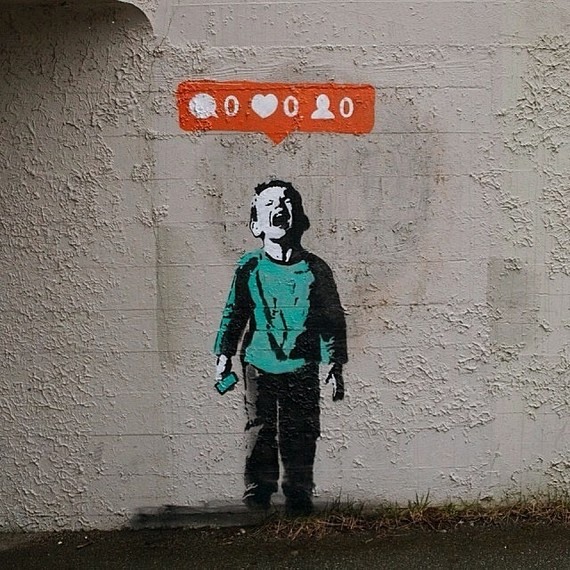
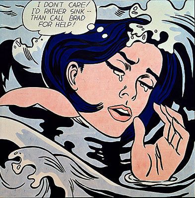
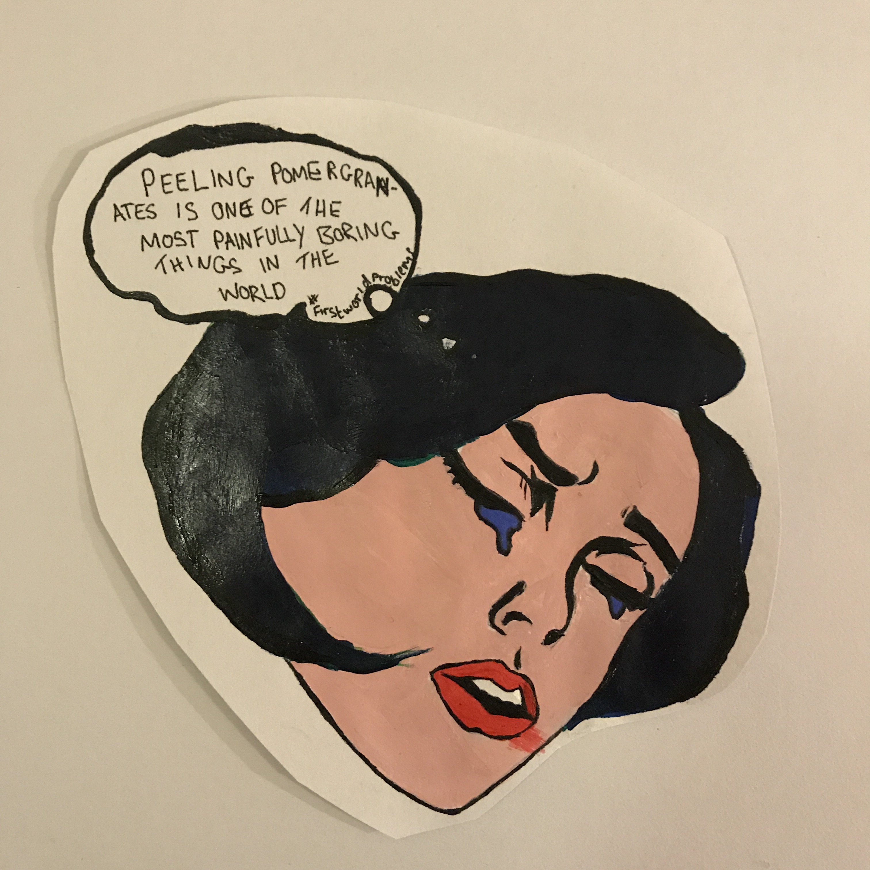
Task 12-

For my Manifesto project  I chose to do mine inspired by William Morris. I worked on A3 and created a boarder which was full of ivy and flowers, I knew the space for the project was going to be large, so I wasn’t sure about creating something too small as I thought it would have been drowned by the surrounding Manifestos. After placing my work up, I realised from where I had done it larger the boarder wasn’t as tight as I would have liked it to be, as I had more space to fill the ivy was loose and you could see gaps of the paper underneath, which isn’t how I wanted it too look.  If I were to change it I would defiantly make it smaller, as that means the illustrations around the edges would not have been so spread out and then it wouldn’t look as disorganised. With the colours as well, the one thing I can always notice is how it’s uneven, which if on a smaller scale I think I would have found it easier to create something that looked a bit more neater. 

Task 11-

Looking back on my blog I have seen my improvement within each task that I have done, with my vocabulary and the way I have gone about the layout of my work. From doing these tasks I have learnt a lot about what I am interested in and drawn too and the range of that is a lot wider than I originally thought, which has also helped within my other other projects to expand my practice. My blog will come in handy in the future with other things, I think it’ll be a really useful thing to have because of the research and information that I have made available for myself.


I have found artists that I wouldn’t have probably not come across, which takes me to different aspects of art within my own practice, as it has given me inspiration to try out new mediums that I wouldn’t have thought of if I hadn’t have come across it. In the future if I was to create my own blog, it wouldn’t be a daunting as I have now had the experience of what it is like to manage my work and make it flow together in a way that I feel comfortable and proud of. If I were to change anything about my blog, I would add more photos of my own work, whether it is large pieces or just small illustrations, I think it would have made it more personal, rather than just a few images and mostly writing.

Task 10-


Gentle

Striking

Different elements

Deep

Fluffy

Personal

Pure

Honest

Layered

Within my work I focus a lot on colour and shape, I would call it abstract above anything else, when first starting uni I was focusing mostly using watercolours and I had never really used any other materials continuously beforehand other than that. Now most over my favourite work that I have done are either mixed media or acrylic paint, which before was something I never felt comfortable doing.

I explore tones and textures of colour, experimenting and seeing what different outcomes I can create also with looking at light and dark within the paintings I create. Acrylic paint is something I have grown to work with purely for the fact you can layer it to create a texture, I think having work that that has a literal feel as well as an emotional one is really important.

For the future I want to start working on a larger scale, exploring if my work has a different feel to it when done on a different scale, I want to challenge myself further to see what mediums work for me and what doesn’t. Katherina Grosse is one of the only artists who does her work on a very large scale and I still feel an emotion towards it, the colours may have a big part of that but I also think it’d due to the fact she uses whole rooms to create her work, not just a painting covering half a space.

Task 5-

Untitled (One Hundred Spaces) is currently apart of Rachel Whitereads exhibition at the tate, created using coloured resin she has moulded the underneath of a chair, which forms into a square objects with all of the different grooves within them due to the different chairs that she has used, you can see from the markings that some of the chairs were worn and old from the maybe not so perfect moulds. With each being different colours you can see a range of pastel tones, making the blocks seem almost transparent and very fragile, they reminded me almost of honey, from where you can see through them but it is hazy and very unclear.


The thing that drew me the most to these was that as a collective from afar you can see how similar they all are, harmonious together, then the close you get you can see each individual groove in the blocks, which makes them all suddenly separate from each other in one way or another. They way they were placed out showed each one for itself, with their spaces between being marked out evenly the show itself was satisfying before even seriously focusing on the main subject itself. After leaving the exhibition this piece always stuck in my mind, it inspired me with my own colours, making me think a lot more about how I wanted my work to compliment with other pieces that I would produce.

Task 4-

Rachel Whiteread, a contemporary artist who works with with a mixture of materials from concrete to rubber, has the most mesmerising sculptures that range from different shapes and sizes. With her exhibition currently up at the Tate, you really get a feel of variety as her sculptures go from very constructive to elegant, due to some things being just complete concrete and have the look of something from a construction site, to then something with the look off jelly from its texture. Whitereads sculptures go from very minimal to larger scales, with her work being sustainable to be inside or out, it shows her versatility to create pieces that can uphold their potential. One thing that really drew me in was the clear sculptures, from looking at them it felt as though you could quite literally touch it and it could fall to pieces, that kind of vulnerability in a sculpture is admiring to me.


Whiteread really uses her skill to create objects that seem very fragile and precious, then contrasts it with with huge, plain objects that are very blunt. With the two opposites being mixed together within one space, it feels that everything you see is completely new and not created by the same person, which for me adds a completely different feel to the exhibition as a whole, you get a taste of something new with everything corner you turn. The colours see very fluid, when you see them all as a whole you can notice that the tones of them and the strength of the colours are all very similar, showing their unison yet the shape shows their differences.

Task 7-

‘Art in Theory’ is a book by Paul Wood and Charles Harrison, first published in 1992 by Blackwell, Leo Steinbergs text talks deeply about ways of working and the how everything was shifting and making people look at different aspects of creating work during that period of time. Explaining artists were moving away from maybe more traditional ways of working and starting to use new mediums, also looking at painting in way that wasn’t so conventional. Steinberg goes on to say that the boundaries of what was accepted as art was changing, ‘ There is no law against hanging a rug on a wall,’ indicating that artists were holding themselves back from possibilities due to what was classed as art and what was not, fear of judgment therefore staying in a safer zone which was known to be accepted.


Richard Serra on the other hand focuses his text mostly on site specific work within his own practice doing sculpture, suggesting that if work is to be placed in a specific area, that’s where it should be created if that is the space it has been sculpted for. Serra talks about his work and personal choices within that, whereas Steinberg concentrates towards practice itself and ways of working, not pointing towards a right or wrong in particular. Serra also explains ‘My works never decorate, illustrate or depict a site’ rather than creating a work then placing it wherever it may end up, Serra is suggesting that his works are created for the soul purpose to just exist in the place of where the work was created for.

Task 2-

PRINCENTHAL, N. (2015)Agnes Martin Her Life and Art, London: Thames & Hudson.


This is a biography on Agnes Martins life as an artist, touching on abstractism and the history of female artists all over America. Nancy Princenthal is a critic based in New York, she writes regularly for ‘Art in America’ in which she is a former Senior Editor for. The book includes images throughout, of different pieces and images of her. The book is written chronologically, talking about Martins life from birth and throughout her career with all of the ups and downs.


From the book you can really get an understanding of Martins personality, her way of thinking and beliefs come across quite strongly from the outset, which I find is one of the most important things about the book because it makes it a lot more personal to the reader. Her take on abstractism was something that really intrigued me, when explaining her method of working she wrote ‘I paint from an image that comes into my mind because I want it’ which is something I was able to relate to, such a simple and to the point sentence was a lot more to me as a lot of my work is abstract and sometimes I find it difficult to put an explanation to it. The way Martin explains it shows that it is a case of more iimagination rather than subject, choosing to create something based of an image in your mind that you think would suit and be effective.


https://www.amazon.com/Agnes-Martin-Her-Life-Art/dp/0500093903

Task 8- Appropriation

Roy Lichtenstein has always been an artist that I have admired, the work he creates is so emotive with the facial expressions being exaggerated, you can always see exactly how the character feeling. On most pieces there is normally a speech bubble as well and most of the writing within them is to do with the subjects being upset over something, either over a man or a situation they are in. The more I thought about it I realised that Lichtenstein could have used that space for writing to get a message out with his work being so popular, rather than something that would just make his work more appealing and I suppose more relatable to the public, but in my opinion mostly to females.

Image result for roy lichtenstein pop art

For this piece I have taken one of Lichtensteins pieces but redrawn and painted it, using different colours but I have still kept the speech bubble. Inside I have written ‘peeling pomegranates is one of the most painfully boring things in the world’ which is a reworded tweet that I came across while researching #firstworldproblems, this was a hashtag that came about on twitter and became extremely popular, an almost joke between people where they would write a first world problem that a privileged individual would have. I wanted to show that what I put into the speech bubble in reality is no better than what Lichtenstein was putting in, they are both on the same level of irrelevance.  


http://www.theartstory.org/artist-lichtenstein-roy.htm

task 6- Modes of practice

Mode of practice –


I was thinking about how making a piece of art is a process, which takes time and all comes together in the end to create something that reflects someone’s imagination along with their style. Whether that’s in the form of a painting, sculpture or mixed media, it always has that process.


I think it would be interesting to use actual living things on paper and watch them develop, whether you watch it decay or grow, for example if you were to have flowers stuck onto a piece of paper or canvas, you would see it day by day fall apart, get mouldy and eventually die and at that point the work would be done. Same goes for food, if you were to put a banana or orange skin onto a piece of paper it would do the same, as well as seeing them decay you would also be able to smell it.


With the growing aspect of it, rather than using paper an idea would be to put seeds and soil into a relatively small glass or plastic container and see them grow in a confined space and see how long it takes for the growth and decaying process to take place. With a lot of art if it’s not appealing to the eye, people normally have a very opposite opinion to it compared to how they’d perceive something that was nothing out of the ordinary. I think it’s really important to admire work that makes you uncomfortable and squeamish as well as pieces that make you happy, because it shows versatility in the different ways art can make you feel.  Â