Author Archives: Jeremy Leggett

Summary

Across the RCS project I believe my writing and critical thinking has improved on many different fronts. I think most evidently has been my ability to communicate my ideas, having been out of practise when it comes to writing; I have found it easier, as I completed more and more tasks, to put my thoughts into writing and utilise different sentence structures and lengths to make more interesting reading and attach more weight to certain points as I make them.

One of the main things that this project has taught me is to look more at a movement, rather than one or two pieces, when it comes to finding inspiration for my own practise. Or even just to use a wider range of images. By utilising this approach not only will it make my inspiration more well rounded and better informed, but also will stop me from taking too much inspiration from just one artist and inadvertently following their style, or approach to their work, too closely. Looking at a movement as a whole – or wider range of images – would allow me to be inspired more by a certain aesthetic or concept. This will prove invaluable when it comes to finding my own voice as a contemporary practitioner.

It has also improved my critical analysis of art and taught me to pick them apart more. Not only have we been picking apart the style of a movement, but the contextual perspectives, audience and opinions of the time. As time goes on and I start to build up a bigger and bigger ‘mental mind map’ of different theories, movements and ideas it will become easier to link together ideas and themes. This will allow me to gain inspiration from a wider range of different sources. Not only that but it will further help me to self-analyse my own work from an increasingly knowledgeable standpoint.

The RCS project has pushed me to include more quotes and existing theories from other practitioners and writers. As well as aiding the ‘mental mind map’ I was talking about before, this process deepens my own thinking and cements any idea that I may have by providing a second, supporting opinion, or maybe having an idea already written down that I couldn’t put into words. It also gives me an opportunity to gain a new perspective, or give me a new idea that I may not have thought of otherwise.

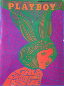
A key reference that I have taken away from this project would have to be Wes Wilson whom I’ve taken great inspiration from. It was interesting to learn that he pioneered the bubble, custom shaped writing that became a staple of the psychedelia era. I find myself trying to include more and more text and I a definitely going to try and incorporate his style because, in my opinion, it fits with the imagery far more subtly than the straight edge text of a font and can be used to add texture and colour to the piece at the same time.

To summarise I think that the RCS project has highlighted how the use of quotes can increase the legibility of my writing and how well I can get my points across. It has also been useful in developing my critical thinking about art and has broadened my knowledge and potential for inspiration when it comes to my own work.

Publish or Perish!

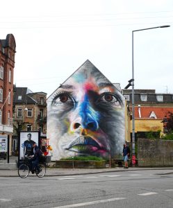
I love this piece by David Walker, whilst it has no specified meaning  I find it to be a celebration of the human face, adding colour and flair to an infinitely recognised image. ‘The truth claim of a resemblance to the person portrayed simultaneously coexists with a claim to the repression of interiority or spirituality.’  (Soussloff, 2006) The scale of his work is also very impressive, I am a fan of working on a large scale, and these images decorate an area, rather than being stuck on one wall in one gallery. It opens his art up to a much wider audience. He makes his pieces in spray paint, which is a fun medium to use, that I want to use more in my own work, and in doing so he is deconstructing the idea that spray paint is a “vandal’s medium”.


The ‘Raft of The Medusa’ by Theodore Gericault is one of my favourite paintings. Being a Romantic painting with has such bold colours and such a striking image. But Gericault went to extreme lengths to make his painting as true to the story as possible. Again, I really like the scale of the piece, the difference here being that Gericault painted in a lot more information, so you see more by looking about the image rather than being impressed by the sheer size of it, but the level of detail across such a large area add to its effect. I did my own version of this piece based on the Paris terror attacks, and I think it came out macabre, I think an artwork is a nice way of creating a memoriam, as well as to capture their story.

I enjoy the work of Mike Giant who makes little black and white graphic pieces.Being a tattoo and graffiti artist aswell he has quite a ‘tattoo’ aesthetic, but rather than just draw the tattoo design itself he is able to put them in place, as if he got to to tattoo them on an actual body. This also allows him to group together different tattoos and things to create an aesthetic for the piece. I think this is a nice touch and find it funny that these designs could easily become tattoos themselves.


Soussloff, C. (2006). The subject in art. Durham: Duke University Press.

Postmodernism

The first image I wanted to talk about is from Shepard  Fairey, who makes powerful, bold pieces. ‘While Fairey does not necessarily label himself as a postmodernist, it is evident that these stickers are highly influenced by postmodernism.’ (Design DiALOGUE, 2017). Being anti-authoritarian by nature, postmodernism aligns nicely with the political stir that this piece made, and I think that is really interesting. Fairey admits that he was just messing around making stencils when making this piece and as not trying to include a meaning, yet the act of spreading them round the city caused a public movement. The simple black and white design means that you take in all the visual information from the piece quickly and the rugged, unpolished effect gives a threatening effect.

This piece by Barbara Kruger, in my opinion, embodies postmodernism, it speaks out through those bold red boxes about not being a sheep, comparing whatever governing body to Adolf Hitler. ‘Postmodernism was a drastic departure from modernism’s utopian visions, which had been based on clarity and simplicity. The modernists wanted to open a window onto a new world; postmodernism’s key principles were complexity and contradiction.’ (Vam.ac.uk, 2017) This piece actively encourages us, the audience, to reject any authority and to think for ourselves, and I think this is an interesting concept to try and deconstruct authority entirely. The message cant be made clearer with such a recognisable figure as a black and white background with her own bold red additions laying over the top.


I like this piece from Ai Wei Wei showing crumpled, porcelain cans. This could be considered postmodern in effect as he brings together two very different classes of object, the ‘useless’ crumpled can, but created with a very fine-painted porcelain. Depending on your views he has either vastly increased the importance of the can, or made the fine china valueless, which is a very postmodern approach to value and wealth in the same vein as the use of distressed material. ‘The Modernists’ ceaseless urge to create something new and the artistic means employed in that effort are regarded from the Postmodernist perspective as automatized, established and obsolete. The fundamental principle that there is nothing new to create
’ (Hatjecantz.de, 2017) shows evidently in this piece, it is recycled subject matter and form, and I find it really intriguing to see porcelain crafted into the sharp, angular shapes of a crumped can, it is a rejection of the norm and a display that rather that work towards reusing empty cans, he’s attaching value to them, against the utopian future of the modernists.

Design DiALOGUE. (2017). Shepard Fairey and Postmodernism. [online] Available at: https://wordpress57027.wordpress.com/2017/04/06/shepard-fairey-and-postmodernism/ [Accessed 3 Dec. 2017].

Vam.ac.uk. (2017). Postmodernism – Victoria and Albert Museum. [online] Available at: http://www.vam.ac.uk/content/articles/p/postmodernism/ [Accessed 3 Dec. 2017].

Hatjecantz.de. (2017). Postmodernism | Art Dictionary | Hatje Cantz. [online] Available at: http://www.hatjecantz.de/postmodernism-5051-1.html [Accessed 5 Dec. 2017].

Counter Culture

Counter culture was born in rebellion against the movements of government bodies and war. The art of the time was designed to spread a message and lived at the same time as the ‘sex, drugs and rock and roll’ mentality, and also took the bright colours from the peace protests, to create the visually complex, powerful, colourful psychedelia movement.

First, I looked towards Santana posters, Carlos Santana was known to use recreational drugs – “I used to take a LOT of LSD,” (Farber and Farber, 2017) – so understandably his album covers and posters are designed with a crazy, experimental feel. I really like the psychedelic effect it makes the piece more interesting. Work such as this requires a longer look, they capture the eye and keep it, until you can work out what is going on. The red over the black creates a high contrast that emphasises the  confusing effect.

Next I looked at the graphic artist Wes Wilson, who pioneered the psychedelic poster. He is known for his fluid fonts that shape around the other objects in the poster, which he combined with the bright, complimentary colours, inspired by the lighting of the music events he was making posters for. “I think what inspired my art was a little bit of both music and the times, and basically, I wanted to do a poster that people liked to look at 
 so it was kind of the combination of a whole bunch of things, and all based on this idealism of ‘things are going to get better” (NPR.org, 2017). I am a huge fan of his work, the simple aesthetic, fluidity of the lines and bold colours capture the spirit of the 1960s and 70s.

I find Wilson’s work relevant to my own practise, I enjoy using a face motif because it is easily recognisable and therefore I find it easier to abstract, I enjoy using bright colours in my work to draw the eye. I am a fan of using typography in artworks, and Wilson has developed such an encompassing way to do so where the font itself adds shape and tone to the piece.


Farber, J. and Farber, J. (2017). Santana recalls days of Woodstock, drugs & music. [online] NY Daily News. Available at: http://www.nydailynews.com/entertainment/music/santana-recalls-days-woodstock-drugs-music-article-1.1994624 [Accessed 2 Dec. 2017].

NPR.org. (2017). Psychedelic Font: How Wes Wilson Turned Hippie Era Turmoil Into Art. [online] Available at: https://www.npr.org/2016/05/13/477900499/psychedelic-font-how-wes-wilson-turned-hippie-era-turmoil-into-art [Accessed 3 Dec. 2017].

Is it Possible to be Truly Authentic?

In my opinion authenticity is subjective. For example, if I were to create an entirely new piece of artwork, different to anything I had seen before, then I could be led to believe that I had created a completely authentic piece of art, but then, the first person I showed it to could tell me ‘oh yeah, that looks a lot like the work of so and so.’ My idea, therefore, isn’t authentic in the art world, but for me it was still an original idea. That is not to say that there is anything wrong with this happening, with the world population at 7.6 billion it is more than likely that a lot of the same ideas are re-used in infinite variations across the world.

‘Necessity is the mother of invention.’ I think this is very true of the artistic community, there is a necessity to find new and creative artworks and trends, as evidenced by the countless art movements. I believe that many of the principles of modernism are relevant to modern practice we should strive to do something new, but with the rich history of art it is hard to create work that is not an imitation of something else. This is becoming increasingly difficult in modern works as we gain inspiration from previous work. To take inspiration from previously existing work is still to create genuine and original artworks, but its authenticity does get dragged into question.

Is Technology the Mortal Enemy of Art?

“Technology is the mortal enemy of art.”

I don’t entirely agree with this statement, I feel that technology is a tool of art such as a brush or a canvas. We live in an age where computer generated art and graphic effects can be used so readily to make new and different artworks that it would be foolish to boycott technology. One of the points made in the manifesto was that once someone has an idea it is easily mass produced and reused across the artistic community. However, plagiarism excluded, I think this is more of an argument for technology; it allows for more artists to experiment and push each ‘breakthrough’.

One argument for this notion would be made by John Berger in ‘Ways of Seeing’ that reproductions, whilst they free up art to a bigger audience, reduce the importance of the original. Also, that with reproductions it takes the image away from its intended setting. I can see that from a constructivist standpoint this would remove from the social element of art that they strived for. But, as we can see with the popularity of galleries there is still an interest in going to see art together and seeing the original version of a piece – the Mona Lisa in the Louvre for example is always a packed attraction, yet the view of it is probably better through a computer screen. Furthermore, with reproductions of art the audience can put together their own gallery of their chosen artworks in their own space, so whilst it removes from the artists intent it adds to the audiences viewing pleasure.

compare and contrast – week 2

For this comparison I have touched on the difference in effect between illustration and photography. I have started with Michael Frith, who illustrates portraits of celebrities and yachts – having been a sailor from an early age. When drawing yachts he uses clean lines to make accurate drawings, from close proximity to the boat to create an effect wherein you could imagine being onboard. Using vivid colours really catches the eye, and his application of watercolour loses the finer details of the painting, creating an especially glorified image of the world of sailing.

Image result for Carlo BaronciniWhen I then look at Carlo Baroncini, who is a photographer who travels the world taking photos of regattas and other sailing events, there is a much different effect. Being photographs, his work is far more detailed and the colours a lot cooler. It is, of course, a much more realistic depiction of sailing and what is involved. However there is still an element of exaggeration in his work because he will want the most impressive photos, which come out mainly in high level racing, but it is a more accurate depiction of what sailing is like.

I find that these two pieces are more similar than just their subject matter, Frith’s work aims at a visually interesting, colourful depiction of life on the water and Baroncini is trying to find the best shots of boats on the water. They are both trying to advertise sailing, Frith just has the luxury of painting to adapt his images, however there comes the argument that Baroncini’s work is more true to the sport.

images taken from:

Yacht – a collection of Michael Frith’s watercolours of the classic fleet of yachts

https://plus.google.com/100597711727186880721

Terminal Bar

Terminal Bar, on the surface of it, is a documentary of Sheldon Nadelman’s 10 year stint working behind a bar in a rough area of New York. The majority of the visual information comes from the black and white portraits that he took of his customers, spliced with video of Sheldon’s commentary. Adding narration taken from newspaper articles about the bar also disguises the true intent of the film, and it is only by the end of the film that the purpose – to draw awareness of the situation, and how many peoples lives were being compromised – becomes clear. By this point however we, the audience, have heard of the lives and struggles of the people that frequented the bar and it cements a strong feeling of empathy. The film ends poignantly with Nadelman returning and alluding that nothing has changed, that it may well have got worse.

The decision to use only still photographs was interesting, it creates an ‘in memoriam’ type effect to the piece, and there was even a section of film with no narrative and only kaleidoscope effect pictures, which served to emphasise how many people must have gone through the bar in just Nadelman’s time alone. This break came after many stories of different people, mixing together shots of the regulars over time and Nadelman’s commentary to emphasise the time factor, that he saw a lot of faces, and repeatedly, in decline. There was also a decision made to include the occasional shot of the surrounding area, still mostly of customers passed out on the street or lying in the gutter, which showed how the stories, Nadelman was telling us, had a wider impact on the surrounding area.