Author Archives: Ryan Wrightson

Task 11/12 – Summary

For this research module we had to partake in the completion of weekly tasks that have proven to be challenging in certain cases but overall have taught valuable skills that could be used for future research. Throughout the course of these tasks I was able to progress my skills in terms of gathering resources from a variety of locations instead of just limiting my findings through the use of using the internet for all secondary research.

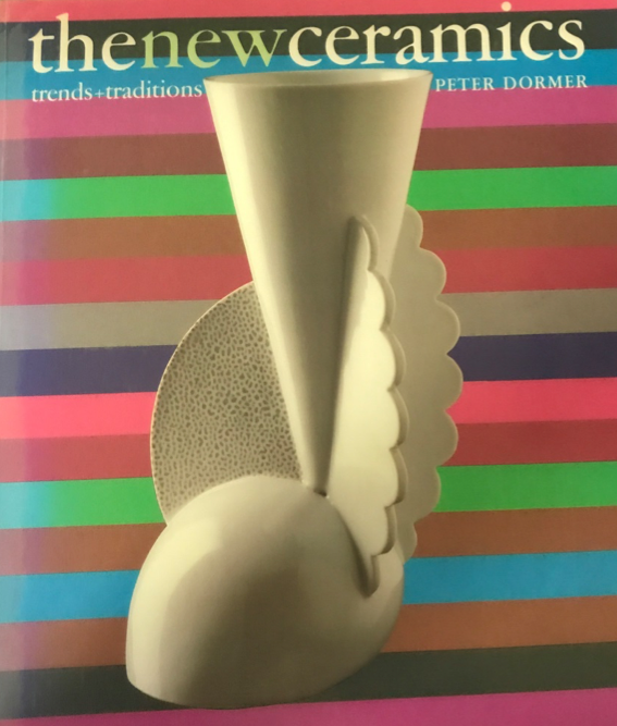
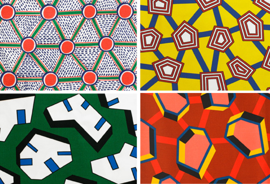
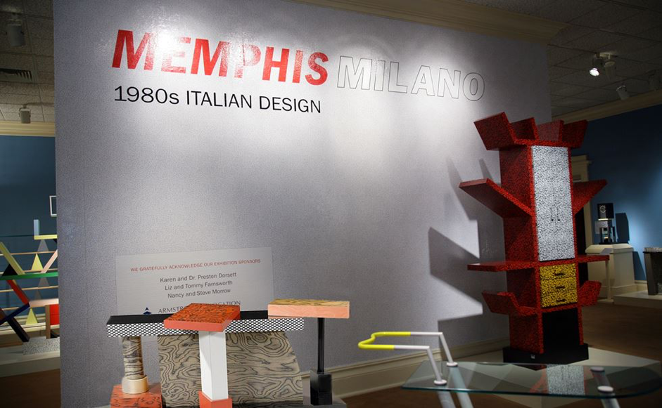
For the first task I collated a total of three images based around my project at the time ā€“ deconstructed pottery. I found this particular task fairly simple to begin with as I already had the starting point, a book by Peter Dormer, exploring modern ceramics. The imagery I chose from this, two striking pieces by Matteo Thun, included a lot of unique shapes and details that allowed me to comment as to why I chose them without difficulty. From here I believed finding a secondary source may prove to be a challenge however due to the unique shapes Matteo Thun created in his work I looked into more abstract artwork and found the artist Nathalie du Pasquier with ease. Further research allowed the link to the Memphis group to be made which led me on to find an exhibition held at The Dixon Gallery fairly quickly which meant that overall for this particular task I didnā€™t struggle as much as I thought I initially would.

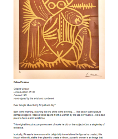
Task 2 required us to focus on the skill of Harvard referencing finding sources that relate from different locations. The hardest part for me was finding a starting point as I wanted to think of an artist that would appear across the three mediums. Once this was decided and I obtained my first source from the library using web cat I found the following sources fairly quickly.

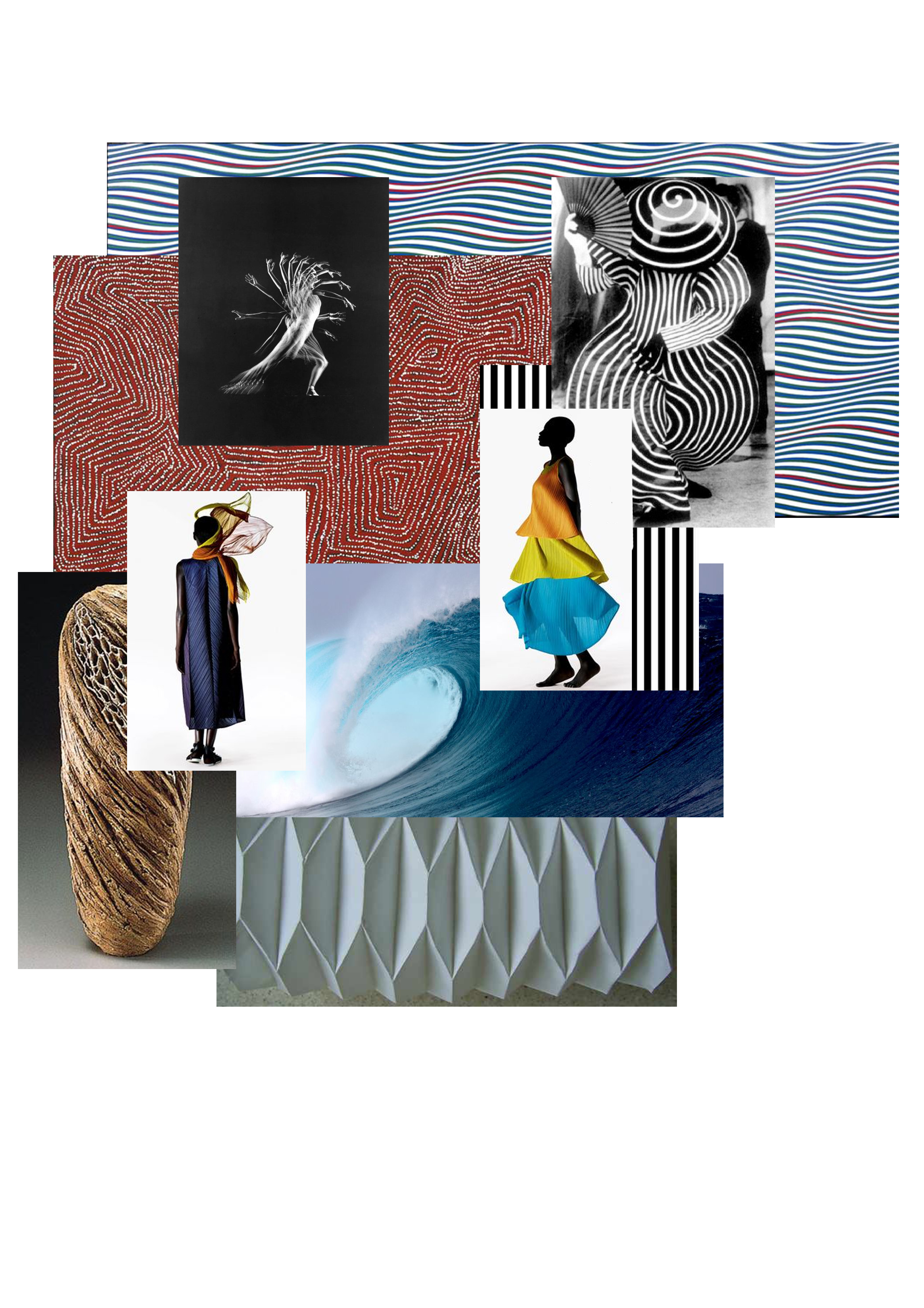
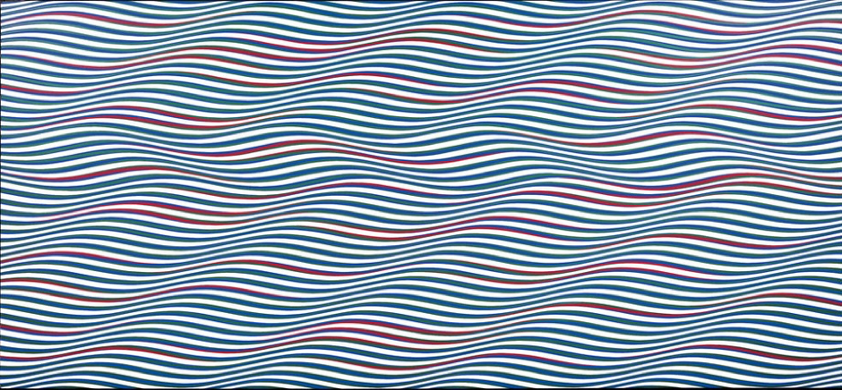
Following this for task 3 we had to create a mood board containing imagery focusing on a specific artist of whom I chose Issey Miyake. The image I chose to evaluate was by a piece by Bridget Reilly which I quickly found quite hard to examine as it was fairly simple in content, however I tried to use my existing knowledge of art techniques to analyse the image further making sure I took apart aspects such as colour in great detail.

Task 4 was probably the task I was anticipating the most as it required the understanding of a literary text followed by our own thoughts and views on what was stated. The passage itself was quite articulate and therefore the overall concept was a struggle to initially grasp. This in effect made the retrieval of further quotes tougher as I was initially unsure what I was looking for. However after reading the text through section by section I slowly seized the overall views and was able to complete the task.

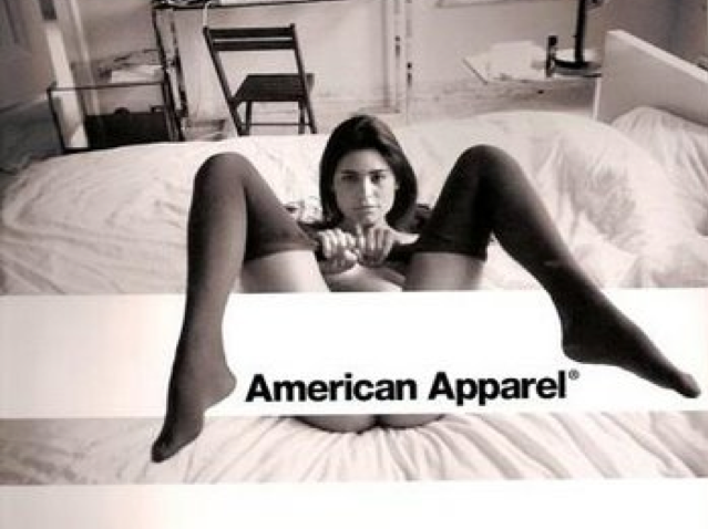
Lastly for task 5 we had to comment on the ethical issues based around a selection of two images ā€“ I decided to choose the American apparel option as I believed I had more to comment on. Overall this specific task was not too bad as I had quite a lot to discuss in relation to ethical issues however for future tasks similar to this I believe I need to reflect upon what I am writing and refine as I go to ensure I do not repeat myself which I initially found myself doing.

Overall I believe that this module has been very beneficial as it has focused on honing in our skills and refining how we undergo specific research tasks. It has increased my confidence in relation to Harvard referencing, using a variety of sources, deciphering texts and making my own judgements corresponding to the analysis of work.

Task 9/10 – Ethical Issues

I decided to analyse the American Apparel advertisement as I believe it is equally as shameful as the Duncan Quinn advert yet many would perceive the other to be worse. American Apparel have had many issues during their time running as a clothing company that eventually led to bankruptcy. The company itself was known for selling good quality clothing with positive ethical values for many years before these disturbing images were released.

The use of younger looking models was a common theme for them and could be seen as a way to promote a younger target market for this company ā€“ a clever promotional decision to boost sales. However when this is contrasted with raunchy imagery it sparks up ethical issues and morals in terms of underage connotations. The majority of the of the image is covered up to disguise the issue and perhaps get round the matter at hand but the open body language that is still on show promotes the idea of submission which on a legal front shouldnā€™t be shown at such a young age – “For at least some of the public, sexual ads represent a challenge to standards of decency and are in a real sense pornographic” (Pollay 1986, p. 28). The adverts themselves fail to focus on the promotion of the brand in terms of the clothing which could in tern have discourage customers to be seen wearing and promoting a brand that is linked to these negative associations. The company started off in 1990 with the selling of t-shirts under the American HEAVY label which is completely contrasted in this image in particular as the model is not seen to be wearing anything from the waist up. Back at the beginning of American Apparel the company proved to be to go to company for good quality, affordable clothing. As an added bonus it was well known that there was no human suffering involved in the production sector of the company stating this way of working would ā€œgive more ethical jobs to more people around the worldā€ which had positive implications that could be a stand out feature for customers ā€“ they would feel like they were doing good by choosing to shopping there. However it then seemed that this gave them a free pass to produce sexually influenced imagery for the advertisement campaigns that left a bad taste in peoples mouth. It completely contrasted the positive values that the company spent so long building up. This unique selling point was also lowered in value when the younger generation valued cheaper clothing over the wellbeing of others which was the introduction of fast fashion. This I believe is where their issues started to arise as with a loss in sales started the shocking imagery which they most likely believed to be desirable imagery for their target audience. However it seemed that they over stepped the mark which in effect pushed away their customer base even more leading to them filing for bankruptcy in 2005.

Analysing the image itself further the use of black and white will add to the sense of seduction that is usually seen erotic films such as fifty shades of grey. Black itself is seen as a dominant colour with white being more innocent and pure so when put together in the right scenario this colour combination will make an image seem much more suggestive. The colour scheme also reduces factors such as colour distracting you which allows the viewer to focus on the detail in the image in much more detail which also making certain parts darker and less visible making it more delicate yet mysterious. The overall set up of the room relates to this more sexual theme that the company was trying to get across with the minimalistic look containing the plain background which due to increased negative space makes the viewer focus on the forefront imagery.

The Guardian. (2017). The new American Apparel: Claims of ā€˜ethically madeā€™ abroad clash with reality. [online] Available at: https://www.theguardian.com/business/2017/nov/12/the-new-american-apparel-claims-of-ethically-made-abroad-clash-with-reality [Accessed 31 Nov. 2017].

Americanapparel.com. (2017) Ethically Made ā€“ Sweatshop Free | American Apparel. [online] Available at: http://www.americanapparel.com/en/ [Accessed 31 Nov. 2017]

Taylor & Francis. (2017) Ethics in Advertising: Ideological Correlates of Consumer Perceptions. [online] Avaliable at: http://www.tandfonline.com/doi/pdf/10.1080/00913367.1994.10673450?needAccess=true [Accessed 31 Nov. 2017].

Task 7/8 – Reflective Writing

I have chosen to read and respond to the text exploring ā€˜Taste, Fashion and the French Fashion Magazineā€™ by Sanda Miller.

The text explores ideas that focus around fashion magazines and how they can be mirrors of their time as well as the importance of art critiques and taste levels in relation to how we view and perceive artwork. Fashion magazines allow the craft to be elevated by presenting it in a different way ā€“ celebrating it for what it is and what people produce. They showcase the most up to date trends including those of different backgrounds and taste whilst also defining what we perceive as tasteful in the fashion world. It moves on to suggest that when we view art we have two main responses ā€“ we recognise the artwork itself and then have our own opinions of the work. Instead of looking for known qualities that make the artwork ā€˜goodā€™ we psychologically created our own taste level for what we liked and therefore question artwork for what it is. Our feelings towards artwork make us question why we like/dislike it and result in taste but if we only have our own thoughts to go on there is not common reasoning (denominator) which needs to be apparent to compare work – critics are therefore introduced to set the denominator.

In the writing it quoted David Hume who stated that ā€˜the great variety of Taste, as well as of opinion which prevails in the world, is too obvious not to have fallen under every oneā€™s observationā€™ (Hume 1965:3). I believe by this he meant how every oneā€™s views on art, and more specifically regarding taste, are different resulting in there being cross referencing between thoughts on pieces of work. In contrast to this Edmund Burke later stated that he believed that the concept of taste is ā€˜no more than that faculty or those faculties of the mindā€™ (Burke 1990: 13) which in effect meant that there are always key points that every individual will pick up on such as the colours used or the overall distinctive shape resulting in taste not being on the individuals own thoughts. Reacting to ideas similar to this Hume acknowledged critics to have a ā€˜delicacy of the imaginationā€™ meaning that different individuals will interpret scenarios and artwork inversely.

When reflecting on this time period James Shelly states that ā€˜the eighteenth-century theory of taste held the judgment of beauty to be immediate; against egoism about virtue, it held the pleasure of beauty to be disinterestedā€™ (Shelly 2009). This contrasts the idea that critics were fair in their judgment of art at this time and how other factors such as technique and context were not taken into account. Instead he belies that ā€˜beautyā€™ was the main and only focus of the work meaning that people just liked or disliked the artwork but there as not a vast amount of opinions as to why this was. Personally I believe that whether it was voiced or not everyone had their own opinions on why the work was successful or not in their opinion as psychologically it is natural to do so. This could have been to do with the idea that fashion was fairly new in the enlightenment period so the idea of voicing your opinion could have been see as incorrect especially if individuals didnā€™t have anything to compare their thoughts to which, like I previously stated, could have led to critics being the denominators. Similar to this idea Nick Zangwill argued that beauty is ā€˜one amongst many aesthetic propertiesā€™ ( Zangwill 2003: 325). From this I get that he believed that something can be seen as beautiful in multiple different ways resulting in different taste levels.

Overall, I enjoyed looking into the concept of taste in the fashion industry and personally believe everyone has their own thoughts in relation to taste and the idea of a critic being a medium creating a neutral basis to base personal ideas off of seems very likely.

Bibliography:

Schellekens, E. and Goldie, P. (n.d.). The aesthetic mind.

Plato.stanford.edu. (2017). The Concept of the Aesthetic (Stanford Encyclopedia of Philosophy). [online] Available at: https://plato.stanford.edu/entries/aesthetic-concept/ [Accessed 22 Nov. 2017].

Barlett, Cole & Rocamora (e.d) 2013, Fashion Media: Past and Present, London: Bloomsbury

Task 5/6 – Visual Research


Monsoonartcollection.com. (2017). BRIDGET RILEY: STREAK 2, 1979 | MONSOON ART COLLECTION. [online] Available at: http://monsoonartcollection.com/bridget-riley/streak-2/ [Accessed 25 Nov. 2017].

Bridget Riley uses colour and shape to create an illusion that makes a flat two dimensional image look 3D. The gradual change in the line is the base of the image making it have a bumpy texture that when layered with the other aspects allows the image to have movement and depth. By using a two-tone colours scheme, red and blue, it allows there to consist of separate parts which in effect adds a foreground and a background creating the depth previously mentioned. The colour red is the first to be seen by the eye which allows the ā€˜foregroundā€™ to be seen initially and ahead of the ā€˜backgroundā€™ which creates this dimensional illusion. When you step back and look at the design as a whole even more shapes are created such as zig zag pattern ā€“ this could be perceive differently making it a conversational piece. The simplicity of the design also allows the focus to stay on the illusion effect instead of being taken away by other contributing factors. Having the piece landscape also enables the eye to travel across the piece, again linking in ith this common theme of movement. Her work has key points and features that relate to those of the ocean such as the rhythm seen in the waves. Getting the aspect of movement across in a two dimensional image is something I would want to try and achieve in my on work whether that be print, weave or knit. This idea of texture and shape is also seen a lot in Issey Miyakeā€™s work but instead of illusions he manipulates the look of pleats. In this recent collection this idea is seen throughout linking it to the elements such as water like Bridget Riley.

Task 3/4 – Academic Integrity and Plagiarism

I started off by finding a book in the library which focused on the theme of life and death in Picassoā€™s work. I chose this book in particular because it showed some correlation to the work I am currently producing as well as the style of work I usually admire which could help give me some background knowledge for future project when conducting this piece of research. The book consists of 133 illustrations which fit under the umbrella of life and death. From this I then decided to search and discover if anybody else had looked into this idea of life and death in Picassoā€™s work and came across an article by Aidan Meller. In the article he talks about one specific piece by Picasso and how it could symbolize Life, Death and Nudity. For the last source, the news article, I found another piece of writing that explores similar themes in yet another part of Picassoā€™s work. This time it was on ā€˜Picasso: Minotaurs and Matadors review ā€“ sex and death in the bullringā€™. Like in the first source the writer explored a few samples of work from Picasso and related back to the theme of sex and death.


Green, C. (2009). Life and death in Picasso. London: Thames et Hudson.

Aidan Meller. (2017). Life, Death and Nudity Explored by Picasso ā€” Aidan Meller. Available at: http://aidanmeller.com/life-death-and-nudity-explored-by-picasso [Accessed 2 Nov. 2017].

Searle, A (2017) Picasso: Minotaurs and Matadors review ā€“ sex and death in the bullring. The Guardian, 28 April.

Task 1/2 – Online Resources

Dormer, P. (1986). The New Ceramics. London: Thames and Hudson.

I started this task looking into different pottery designs focusing on a book, by Peter Dormer, that explores new trends as well as traditions under the umbrella of ceramics. Two pieces that particularly caught my eye were by the artist Matteo Thun labelled ā€˜Cocktail glassā€™ and ā€˜Flower vaseā€™ ā€“ both of which were produced in Italy around the time of 1982. The reason these ceramics caught my eye in particular was because they seemed to break up my stereotypical view and thoughts on pottery being circular, round and smooth in appearance but instead these designs consisted of much more abstract and harsh shapes that were fixed together at a central point. The lack of colour in these pieces allowed the more daring shapes to be the focal point and permitted shadows to be easily seen which added to the various dimensions of these designs. The subtle addition of slight texture meant that the sections of the designs could be broken up showing the different shapes that were used to create the final resulting design.

Merrill Lyons. (2017). Nathalie Du Pasquier. [online] Available at: http://merrilllyons.com/nubert-says/2014/2/1/nathalie-du-pascalier [Accessed 5 Nov. 2017].

Following my previous research I decided to look into designers that shared Matteo Thunā€™s use of abstract and bold shapes which led me to the artist Nathalie du Pasquier. In her work she uses a wide use of texture, colour and unique shapes to produce captivating designs that usually turn out to be statement interior pieces. Nathalie liked to oppose the conventional norm challenging what most perceived as good taste to try and break most peopleā€™s perception of what art and pattern for interiors should look like ā€“ she once stated ā€œForm didnā€™t have to follow function, a telephone could have the shape of a bananaā€. Due to my current rotation being print I would like to get across this idea of bold shapes in my own work, deconstructing the outlined shapes of the ceramics to make them into interesting printed designs.

Design Museum. (2017). Memphis. [online] Available at: https://designmuseum.org/memphis [Accessed 5 Nov. 2017].

With further research I discovered that Nathalie du Pasquier was part of the Memphis art movement that occurred in the 80ā€™s. The Memphis ground was founded in Milan by Ettore Sottsass in 1981 and their focus was to design and create designs ranging from postmodern furniture to ceramics that conflicted the usual designs at the time from 1981 to 1987. There was an exhibition at the Design Museum, 13 April ā€“ 13 July 2014, that showcased this work and has influenced designers work since and therefore is still a big part of the design world today. For example in 2011 Christian Dior showcased aspects of this movement in the fall collection with features such as bold prints with overlaying embroidery topped off with statement geographical shapes used for the headpieces.