Author Archives: Danni Turner

RCS Summary

I found the research and communication lectures highly beneficial to my developing practice and research skills; since completing these lectures I have seen a positive shift in the way I gather and respond to information. By utilising the library resources and conducting research online, I have been able to contextualise my ideas towards each art movement to form relevant arguments.

Jumping from one art movement to another was useful for me, it was interesting to see the ways in which art has developed throughout the time periods, and how much of an impact context can have on the way artists express themselves. In addition to this, I have learnt, from practice, how to form a debate of my own – relating to art and design of the past and present.

From looking deeper into past art movements I have been able to make some unexpected connections with my own work, for example, I feel the post-modern and counter culture era are most relevant to my interests as a practitioner, as I appreciate experimentative and innovative artwork. Only since these lectures have I been able to put a name to these influences.
I have also come to realise that making connections between theory and practice is extremely important. Successful artists have to consider context, purpose and meaning to deliver artwork of a professional standard – as evidenced from history.

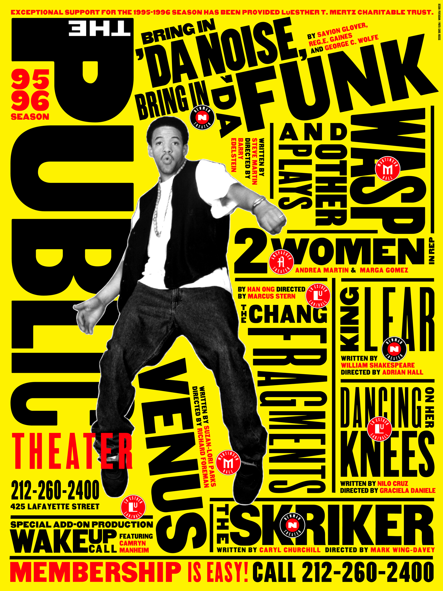
In relation to my interests in photography and graphic design, I have found each lecture relevant in some way. At the beginning of the module I was solely interested in photography, however, from researching the work of graphic designers, I have become inspired by their ability to respond and react to stimuli. David Carson and Paula Scher are among the many designers I’ve been influenced by – I love their experimentative and iconic approaches to design.

I have enjoyed making connections between ideas in writing. I particularly liked exploring constructivism values and the impact of technology – I found this art movement to be quite controversial in its thinking and from researching and constructing an argument against it, I came to fully appreciate the offerings technology gives my practice.

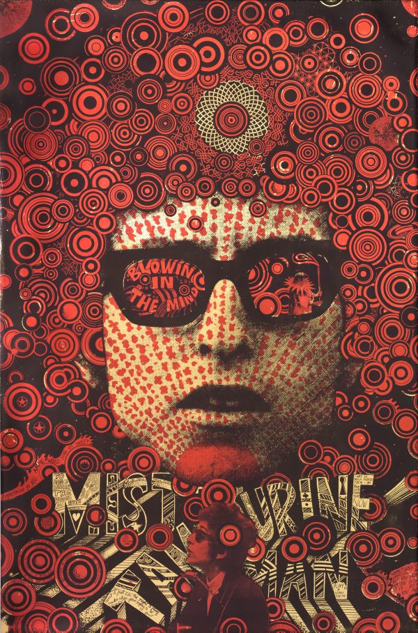
To isolate a particularly significant lecture, I would say I felt most inspired by the ‘movers and shakers’ of the underground era. I found the examples of counter-culture artwork fascinating, both visually and theoretically speaking. Visually – I felt enticed by the psychedelic posters and experimentative collages of Martin Sharp, and theoretically – I felt inspired by the rebellious, defiant attitude of the post-war generation; particularly how their frustration motivated their artwork. I think these underlying motivators are particularly relevant in relation to modern day art.

The film (Abstract: the art of design, 2017) that followed this lecture also impacted my developing interest in graphic design. The film documented the life of designer Paula Scher and I found it very insightful and useful in understanding the requirements of a graphic designer and the ways in which they work to establish ideas. Following this, I went on a personal journey of research to further my understanding of graphic design.

Image result for what youth david carson Related image

Abstract: the art of design (2017) Netflix, 10 February.

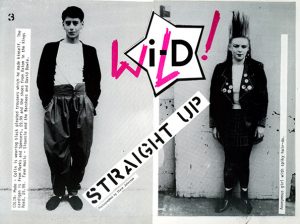
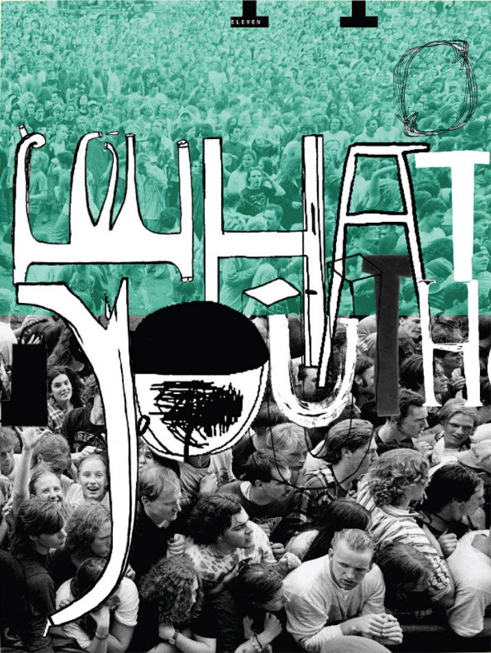
PHOTO ONE: Carson, D. (2015) What youth, issue 11. Available at: https://cdn.shopify.com/s/files/1/1529/3595/products/0011_shop_gallery-1.jpg?v=1483661734 (Accessed: 4 December 2017)

PHOTO TWO: Scher, P. (1995) Bring in da noise, bring in da funk. Available at: https://i.pinimg.com/originals/79/78/ed/7978ed48aa5226ac24f4ce97df8279a1.jpg (Accessed: 4 December 2017)

PHOTO THREE: Sharp, M. (1967) Cream – Disraeli Gears (album cover). Available at: https://dvfnvgxhycwzf.cloudfront.net/media/SharedImage/imageFull/.fRuNAIDV/SharedImage-57470.png?t=1767dea39877c6d345f9 (Accessed: 4 December 2017)

Three Published Images

This week I have chosen three images that convey to me, a story, feeling or connection. The first photograph comes from photographer Olivia Bee (2011) I stumbled across this photograph a year ago, in her book ‘Kid’s In Love’ (2016). I was immediately drawn to this image as it creates a narrative of rebellion and teen spirit. I automatically feel connected to the photograph due to the sex and similar age of the subjects – though an audience of any age can resonate with it, from a shared experience of being a teenager.

As a photographer I have been inspired by Olivia Bee’s approach to taking candid photographs of her peers and I agree with the opinion she voices in her book; “a beautiful photograph is great, but I want them to tell stories” (Bee, 2016). For me, this is what drew me to her initially, the idea that each photograph presented a new subject, a new story to get immersed in – and needless to say her photographs are beautiful alone.

From a recommendation in ‘Kid’s In Love’ (2016) I discovered photographer Ryan McGinley. McGinley began documenting his life through photography before favouring the ‘constructed’ approach. Similar to Bee, his work “retains a sense of freedom” and an “inescapable narrative” (Dazed, 2015). The colours in this image (2011) are stunning and I like the film-style look and vignette effect. The calming nature of the image gives me a feeling of serenity which is juxtaposed by the model’s actions (holding flares) – on the whole I feel the prevalent message from the photograph is to be free and to be bold.

My final image comes from the first issue of I-d Magazine in 1980. Linking to the theme of youth and rebellion I discovered this “stripped-back zine design of cool young kids, doing outrageous things” (Siddall, 2013). I love the use of innovative typography, with the ‘W’ and ‘L’ intersecting the logo to create ‘wild’ – the fragmented, typewriter-style text is also effective in establishing the grunge aesthetic which originally captured my interest. The contrasting and clashing colours of the image are punchy and bold, reinforcing the message to be wild.


Gevinson, T. (2016) Olivia bee: kid’s in love. Aperture; 01 edition. p. 132.

Dazed. (2015) Ryan McGinley’s portraits of American youth. Available at: http://www.dazeddigital.com/photography/article/24965/1/ryan-mcginley-s-portraits-of-american-youth (Accessed: 26 November 2017).

Siddall, L. (2013) Publication: What a treat! A flick through issue 1 of i-D magazine from 1980. Available at: https://www.itsnicethat.com/articles/publication-i-d-magazine (Accessed: 26 November 2017).

PHOTO ONE: Bee, O. (2011) Whose house is this. Available at: http://oliviabee.com/kids-in-love/kids-in-love-2/ (Accessed: 26 November 2017).

PHOTO TWO: McGinley, R. (2011) Purple beacon. Available at: http://www.dazeddigital.com/photography/gallery/19856/4/ryan-mcginley (Accessed: 26 November 2017).

PHTO THREE: I-D Magazine. (1980) Issue One. Available at: https://www.itsnicethat.com/articles/publication-i-d-magazine (Accessed: 26 November 2017).

Post-modernism

Postmodernism was an art movement characterised by doubt, deconstruction and the rejection of established modernist practices. Postmodernist art referenced the work of modernist artists and highlighted the advancement of technology and its uses in different media.

Modernism believed the photograph was a truthful document, postmodernism however, questioned the authenticity of photography and believed it to be a construct, influenced by audience interpretation. Cindy Sherman deconstructs the ideologies of modernism by referencing Hollywood characters through impersonation, in which, “the narrative is not real, but the viewer’s creation” (Robinson, 2011).The chosen photograph is my favourite from her ‘untitled film still’ collection as it reveals to me a strong, implied, feminist narrative.
The camera is positioned pointing up at the protagonist, which creates a sense of empowerment, further emphasised from her crossed arms and look of determination. The image reminds me of an old-fashioned Hollywood poster and I found the symmetrical nature of the image, aesthetically pleasing.

Another postmodernist photographer that inspires me is fashion photographer Nick Knight. I am strongly interested in fashion photography and Knight’s ‘skinhead’ work really captivated me – in particular, this seventies image. There are many things I love about this photograph, one being that it demonstrates attitude and rebellion, without saying a word.
It is trendy and thought provoking, raising the questions ‘who are these people?’, ‘what is there relationship’ – only a powerful photograph can do this. The gritty, hard edge nature of the image also deconstructs what we believe to be beautiful –which is a self-proclaimed aim of Knight’s work (The Independent, 2009). It is the kind of image I can imagine being in I-D magazine – a primary source of inspiration for me.

My growing appreciation for graphic design led me to the post-modernist works of David Carson, known for his “playful yet provoking, design approach” for Ray Gun magazine (Thirstycrow Magazine, 2010). This image encapsulates his famously grunge aesthetic and experimental use of typography – it is visually appealing and stimulating as it is fragmented and deconstructs the modernist norms of design. I am very much interested in editorial design and take great inspiration from his artistically innovative, method of creating.


Robinson, T. (2011) Cindy Sherman. Available at: https://tristonrobinson.wordpress.com/2011/01/27/cindy-shermans-untitled-film-stills-and-postmodernism/ (Accessed 12 November 2017).

The Independent (2009) The fabulous world of Nick Knight. Available at: http://www.independent.co.uk/life-style/fashion/features/the-fabulous-world-of-nick-knight-1809790.html (Accessed 12 November 2017).

Thirstycrow Magazine (2010) Just curious: David Carson. Available at: https://studiothirstycrow.wordpress.com/2010/04/16/just-curious-david-carson/ (Accessed 12 November 2017).

PHOTO ONE: Sherman, C. (1980) Untitled film still 58. Available at: https://www.thebroad.org/art/cindy-sherman/untitled-film-still-58 (Accessed 12 November 2017).

PHOTO TWO: Knight, N. (Unknown) Untitled. Available at: https://i.pinimg.com/originals/37/e4/ac/37e4ac98d585d9f6bc86ca1918c4122c.jpg (Accessed 12 November 2017).

PHOTO THREE: Carson, D. (1993). Untitled. Available at: https://studiothirstycrow.wordpress.com/2010/04/16/just-curious-david-carson/ (Accessed 12 November 2017).

Counter Culture

The counterculture of the 1960’s was a period of time where societal norms and values were broken down. The post war generation were frustrated with issues such as racism and sexism and became rebellious by welcoming sex, drugs and pop music.

Oz magazine was an icon for underground press, it was renowned for its psychedelic covers and feminist manifesto’s which highlighted a cultural revolution (Ramaswamy, 2016). As somebody who is interested in photography and graphic design, I am particularly inspired by the cover of the 27th issue of Oz, titled ‘Pussy Power’. The design initially attracted me as it is highly spirited, lively and colourful. I particularly liked the clashing colour scheme and the bold typography which emphasised the point of ‘women’s liberation’. The photography is empowering as the woman is positioned to be the dominant character with the male being submissive to her power – I found this to be comedic and refreshing. With artistic sensibility this cover can be read as a revolutionary piece of feminist work.

I am also inspired by the underground work of Martin Sharp, a graphic artist who rose to fame in the 1960’s for his iconic psychedelic posters and ‘hippie-fied’ collages. Sharp worked for Oz, and his collage of Bob Dylan captivated me as it is striking and resembles the acid fuelled, rebellious, sixties values. His work traditionally incorporates mixed media, for example, in this image he uses photography and illustration – this resonates with me as a practitioner as I enjoy being experimentative in different mediums.  Sharp’s ‘possession of a mordant satirical wit’ additionally creates a deeper layer of meaning to his work (Poynor, 2013).

My final image comes from Francis Wolff, a photographer for blue note records who “brings visual life to (jazz) musicians” by documenting the creative process of making music (All About Jazz, 2004). I enjoyed the spirit of this photograph as it Is uplifting and demonstrates true passion in a candid setting. The camera is tilted upwards slightly, concentrating on Dexter Gordon and his flashy saxophone – yet the informal dressing room background is in focus, showcasing an improvised vibe which draws parallels with the era and my artistic taste.

Ramaswamy, C. (2016) Return to Oz: the most controversial magazine of the 60s goes online. Available at: https://www.theguardian.com/media/shortcuts/2016/mar/06/return-oz-most-controversial-magazine-60s-goes-online (Accessed 4 November 2017).

Poynor, R. (2013) Martin Sharp: From Satire to Psychedelia. Available at: http://designobserver.com/feature/martin-sharp-from-satire-to-psychedelia/38242 (Accessed 4 November 2017).

All About Jazz (2004) Blue Note Jazz Photography Of Francis Wolff. Available at: https://www.allaboutjazz.com/blue-note-jazz-photography-of-francis-wolff-by-aaj-staff.php (Accessed 4 November 2017).

PHOTO ONE: Unknown (1970) Pussy Power. Available at: https://www.beatchapter.com/oz-magazine-no-26-februarymarch-1970-pussy-power-issue-vertigo-lennonono-roddy-mcdowe-acid-flix-candy-darling-10470-p.asp (Accessed 4 November 2017).

PHOTO TWO: Sharp, M. (1967) Mister Tambourine Man. Available at: https://www.artgallery.nsw.gov.au/collection/works/DA17.1970/ (Accessed 4 November 2017).

PHOTO THREE: Wolff, F. (1962) Dexter Gordon. Available at: http://bandwidth.wamu.org/the-heyday-of-blue-note-records-captured-in-photographs/ (Accessed 4 November 2017).


Authenticity and Modernism

Authenticity refers to something being genuine and original – so therefore, not a copy. In relation to my practice, a piece of art and design could be considered authentic if it is ‘real’ and consequently genuine in that sense.

Paul Strand was a modernist photographer who “changed the face of photography in the early years of the 20th century” (Victoria and Albert Museum, 2016) Opposing the current trend of using photography as a form to imitate art, Strand instead took pictures which were hard hitting and true to life – largely due to the fact the people in the portraits weren’t consciously aware of their involvement.

Strand, 1916

Strand, 1916.

His work can therefore be labelled authentic as he accurately captured “the poignant evidence of poverty among the cultures that crowded the metropolis” (The Met, 2004). Additionally, Strand was an authentic artist as he took art in an original and exciting direction which strayed from the norm of creating photographs that looked like impressionist paintings.

I believe it is difficult to be a truly authentic practitioner, as whilst it is relatively easy to create something that is genuine, it is much harder to create something that is completely original which doesn’t imitate another artist’s work in some way – this is especially true in modern day as graphic artists are largely influenced by previous art movement’s. Despite this, I believe many principles of modernism are relevant to contemporary practice. I think it is especially important to build upon traditional methods of photography and graphic design etc. and that we should all possess a desire to work towards something new.


Victoria and Albert Museum (2016) Introduction to the paul strand exhibition. Available at: https://www.youtube.com/watch?v=pm7CEt2okuc (Accessed 28 October 2017).

The Met (2004) Paul Strand 1890-1976. Available at: https://www.metmuseum.org/toah/hd/pstd/hd_pstd.htm (Accessed 28 October 2017).

PHOTO: Strand, P. (1916) Blind woman. Available at: https://timedotcom.files.wordpress.com/2014/10/image-3.jpg?quality=85&w=431 (Accessed 28 October 2017).


‘Technology is – the mortal enemy of art’


constructivism

Rodchenko, 1924.

Constructivism was an Avant Garde art movement founded in Russia, 1913, by Tatlin and Rodchenko. Constructivism disregarded creating art for ‘art’s sake’ and instead constructed a new form of art which could be described as architectural, experimental and abstract. The movement had a social purpose that “sought to push people to rebuild a utopian society” ( Flask, no date) that contrasted from their current one.


Propaganda came in the form of posters, book covers and advertisements, the production of which, continue to artistically influence graphic designers of today. In the manifesto of the collectivist group, Rodchenko (1992, p. 219) states “technology is – the mortal enemy of art”. Though I admire their policies to push the boundaries of art, I have to strongly disagree with this statement for a variety of reasons.

Technology has the ability to redefine art by giving artists new methods of expression, for instance, photography is a popular artistic medium that allows people to capture the beauty in everyday life. Also, computers and phones are hugely beneficial when it comes to needing inspiration – social media is a great platform for finding, sharing and even selling art, it is easily accessible too.

Technology has the power to enhance traditional forms of art, for instance an illustrator could draw an image and then scan it onto a computer to refine it before making a print. Software such as Adobe Illustrator and Photoshop similarly provide artists new tools and resources to create stunning outcomes that cannot be traditionally made – technology is therefore an asset to art.

Flask, D. (no date) Constructivism : design is history. Available at: http://www.designishistory.com/1920/constructivism/ (Accessed: 20 October 2017)

Danchev, A. (2011) 100 Artists’ Manifestos: From the Futurists to the Stuckists. Penguin, p. 219.

PHOTO: Rodchenko, A. (1924) Portrait of Lilya Brik. Available at: https://bigother.com/2010/03/06/the-dominant-ctd/rodchenko/ (Accessed: 20 October 2017).

Comparing Images

Amanda in mirror

Goldin, 1992.

‘Amanda in the mirror’ (Goldin, 1992) – technically speaking – isn’t an aesthetically pleasing photograph in the sense that it doesn’t adhere to typical photographic techniques such as rule of thirds, and the setup is unpleasant. The tone is dark and the miserable atmosphere is emphasised by the woman’s demeanour – despite being positioned slightly off centre, her sunken eyes draw our attention and she is visibly scowling.

The photograph appears un-staged and due to the angle of the camera, as a viewer we are made to feel like a fly on the wall which is an interesting perspective. Honesty and spontaneity is common in Goldin’s work, however I favour this image as I believe it provides a relatable stance on femininity. The woman is androgynous in style, her hair is greasy, her face is bare and she isn’t posing. There are hints of post-production editing (vignette etc.) but mostly the photograph is raw – it isn’t pretty, but powerful.

PMT me

Cosford, 2016.

Nina Cosford is an artist who similarly creates relatable illustrations of women in their most vulnerable state. Unlike Goldin’s photograph, the illustration (Cosford, 2016) has a humorous feel to it – the ‘woman’s’ facial expressions are comedic, as is the text ‘PMT me’. The colours are warm and soft which contrast with the previous photo – though despite the light-hearted feel of the image, it is similar in that it doesn’t attempt to glamorise femininity. Another difference is the composition; the female is centre focus in the illustration and her flaws are explicitly stated through hand-written annotation rather than suggested.


PHOTO ONE: Goldin, N. (1992), Amanda in the mirror. Available at: https://images.curiator.com/images/t_x/art/db8d705c1258df7dd1ed939373876b57/nan-goldin-amanda-in-the-mirror-berlin-1992.jpg (Downloaded: 16 October 2017).

PHOTO TWO: Cosford, N. (2016), The PMT Me. Available at: https://s3-eu-west-1.amazonaws.com/betty-me/wp-content/uploads/2016/09/30101135/nin-cosford-PMT.jpg (Downloaded: 16 October 2017).


Terminal Bar

Terminal Bar (Nadelman, 2003) is centred on a notorious bar in New York and the many people who are associated with it. The film documents evidence of over a decade, and incorporates text, videos and photographs to take us on a visual journey of discovery. Interviews form a large part of the film and are often accompanied with stills for reference. Similarly, narration is a prominent feature, as are newspaper extracts which aid visual stimulation and provide further context.

Audio and sound effects help give life to the gritty bar, we can hear the murmur of film-rolling between the dynamic sequences and the upbeat, heavy bass music indicates an energetic atmosphere. The film is an interesting watch as it combines old-style aesthetics with a modern approach to filmmaking, linking to the idea of past and present which is a prominent theme. Comparisons can also be drawn from the use of split screen and from visiting old locations mentioned by the narrator.

In my own projects I could use a variety of similar processes to make my work visually captivating, such as using images to support text or perhaps illustrating research. Making comparisons could also be beneficial, for example I might choose to compare my work to other graphic artists or even make comparisons between ‘then’ and ‘now’ as Terminal Bar does.
I would like to similarly develop an individual style of presenting work to follow through my course – making sure to consistently ‘think outside of the box’ and consider the viewer.

Nadelman, S. (2003) Terminal Bar. Available at: https://www.youtube.com/watch?v=xfWBbZBqYjo (Accessed: 9 October 2017).