Author Archives: Yilin Liu

Final Summary

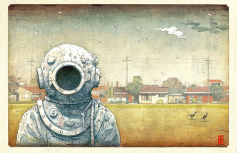
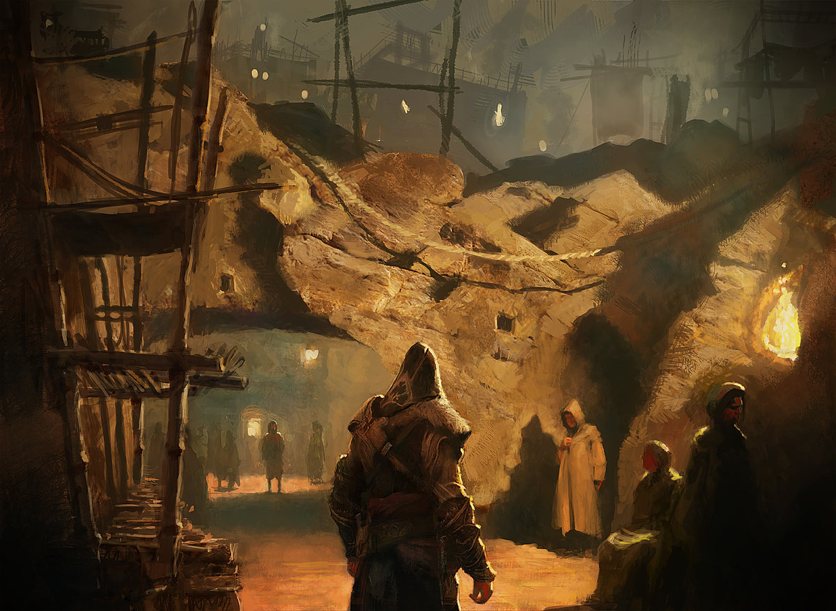
Throughout the writing and research of the blog posts and their topics, I’ve broadened my knowledge in the world of design about areas that I wouldn’t usually look in to, and discovered that I actually find many of them fascinating. I discovered new artists that I am fond of and can learn form that goes outside of my usual style, allowing me to experiment more, such as Gilles Beloeil who uses traditional medium and painting styles for his conceptual illustrations. Before discovering this artist, I’ve always separated fine art and digital concept art, especially for such a commercial instance like video games, as two separate things, but now I see how they could be overlapped and combined to create something beautiful and meaningful.

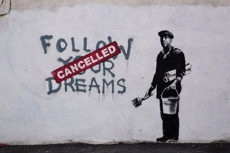
Learning about famous art movements such as Avant Garde and Postmodernism has given me the ability to criticise art from a new perspective beyond aesthetics, and to be able to add deeper meanings into my own pieces of work instead of deciding based on visual appeal and cleverness in the design. It has also given me a deeper appreciation to art and design, knowing that it has the potential and capability to alter the course of social establishment; to create and destroy, which is absolutely astonishing. I’ve never been one to appreciate art that is on the abstract side, due to they’re presumed “pretentiousness” and lack of traditional use of skills and methods, but caring to look beyond the superficial (which is something that I learned from the Modernism movement), I’ve learned the importance of art that ventures outside the convention and mainstream appeal, which is key to the evolution of the art industry as a whole. Prejudice in perception of art is hard to overcome, but I see this as a start to pulling down the inhibitions one naturally has when approaching something unfamiliar.

Exploring new topics in depth also inspire new ideas which has aided my practises to becoming more experimental and wide ranged. It also allows more possible combination of methods and style instead of sticking to traditional formulas. I have also been able to improve some of my transferable research and critical skills, which will be very helpful to my future projects, regardless of the topic. When I needed to find references, image sources and just generally more information about the thing I’ve chose to analyse, I had to make use of every method, especially for works that are obscure with engines such as google reverse searches and google scholar and the library’s resources to obtain the bit of facts that I needed. I realised that on the way I am also exposed to new inspirations that aren’t actually relevant at this time but could be in the future, such as new artists, and blogs like Widewalls that I could go back to in the future.

In conclusion, this project not only exposed me to new ideas, it has also expanded my way of thinking and understanding of the world of art and design, and I can’t wait to see how my works in the future will change and the new directions it can take.


Week 7: Publish or perish

Image Source: [The Visitor by Shaun Tan – Tales from Outer Suburbia ]

This Illustration is for his award winning of-the-walls story book, and I think this shows exactly why. The unusual combination of familiar elements, ie an astronaut and a suburban environment creates a sense of heightened reality to suggest that this is a metaphor as opposed to literal. He uses almost a childlike and storybook style to tell more mature tales, in which I interpret as a sense of solitude and not belonging. He uses a range of colours in a ashy discoloured way that suggests a passing of time, which resembles a 1950’s futurism poster, or perhaps an old children’s novel with the former child owner now grown up, with their former creative mind tarnished?

Image Source: Gilles Beloeil [Assassin’s Creed II artbook]

This is a concept art for the game franchise Assassin’s Creed, however unlike other concept art, this is painted in a traditional medium: oil, and the composition resembles that of a Romantic Era painting of an occurring scene. The artist create a sense of realism by choosing to go with a realistic style, but at the same time creating a sense of mystery and wonder by using a singular ashy colour scheme and the play with light and dark. The painting style is reflective of the time setting of the actual scene which allows the viewer to be drawn in to the alternate reality. The plotting of character’s location and position creates a narrative and serves it’s purpose of potential story telling.


Image Source: Re-imagination of The Martian movie poster by ChungKong Art

I like this poster design because it is a minimalist depiction of The Martian poster. It doesn’t require much graphics to reveal the main plot of the movie. The use of the bright circle both represent the colour and shape of Mars and the lens of a telescope, also the emotional struggle the protagonist is going through. The abundance of space in the frame and the character’s position suggests a sense of solitude and sadness, which is a perfect depiction of the theme of the movie. I really like how the artist use one aspect of the poster to convey multiple ideas and messages instead of making a complex image. This method also adds focus and to the main subject of the film, at the same time still being aesthetically pleasing; this required intricate planning of the poster’s layout.

Week 6: Post modernism

Ugolino’s Room, 1990-1991
acrylic and oil on canvas

Image references; David Salle [Ugolino’s Room] 

This piece of art makes multiple unconventional fusions between styles, colours and mediums. I have always been interested in mixed media but this is the first time I’ve seen a piece of art with such jarring combinations yet somehow comes together well due to the careful compositional planning. The overlays of images, prints and colour creates a sense of distortion, also indicates to the viewer that this is a postmodernist/contemporary work that link together events of very different times, thus inviting them to find the criticism and meaning within the rather complex and chaotic scene. 

Image source [Banksy- https://i.pinimg.com/736x/84/07/8a/84078a3bcb73ef1076856a5a9e34db74–street-art-banksy-banksy-graffiti.jpg] 

Banksy is an artist known for his political commentaries in the form of vandalizing street art, with even his choice of method is considered a crime, which is in itself, already a form of social criticism and symbolic of the fact that what he says is considered “criminal” also in modern society. I like his distinctive style of using minimal colour to convey a succinct and clear message. The use of black and white suggests a sense of cynicism in his artworks with a splash of red suggesting that the only stimulation in modern society is violence. He juxtaposes hyper realistic prints with scruffy lettering which adds reality and dimensions to his statement bringing them more relevant to real life circumstances. 

Image source: [Text] by Matt Swain 

Unlike most postmodernist works, this photograph of the installation is actually quite aesthetically pleasing in its colour balance and ornaments. At first glance it doesn’t appear to be a photograph set out to expose the ugliness of life, due to the pleasant colour scheme, but upon further scrutiny, the room can be seen as dirty, unkept and sketchy even, with the pretty ribbons and vibrant balloons distracting from the background. I like how the image is constructed to be interpreted further, but on the surface it is still a lovely looking set. As said by Richard Mosse, “beauty is the sharpest tool in the box”. This artist understands the audiences’ psychology and made his piece specifically to “lure” viewers, which could also be a criticism in superficiality itself.