Author Archives: Celia Walden

Tasks 11 & 12: Reflective Summary

Over the course of this semester the weekly Research and Communication Skills lectures have taught me to analyse both images and pieces of writing in a thoughtful and reflective manner, as well as how to use online and academic sources to support and deepen my own work and how to reference these sources correctly to ensure my work meets the correct standards of academic integrity.  

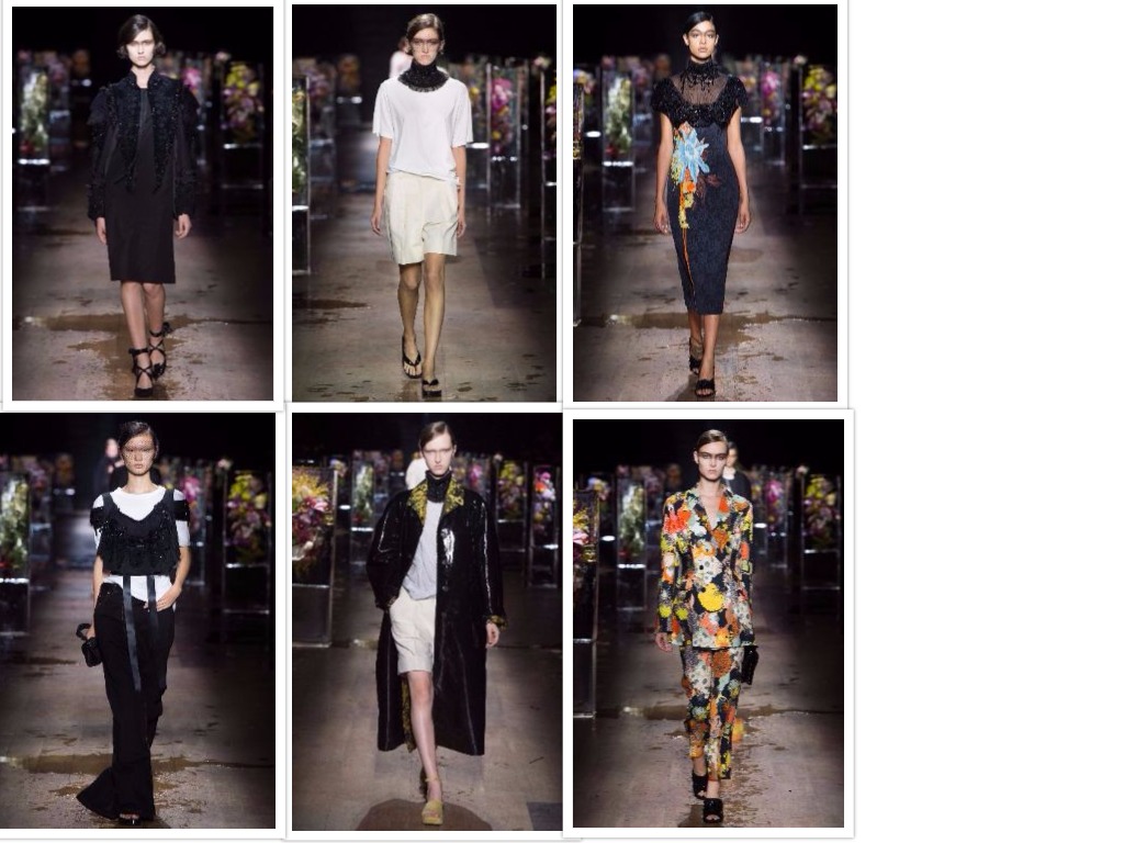
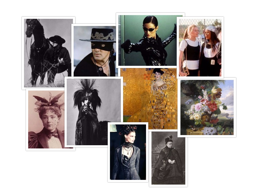
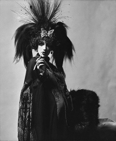
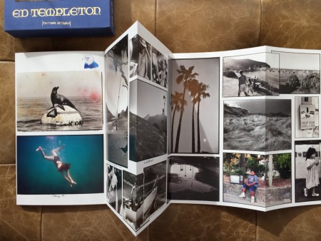
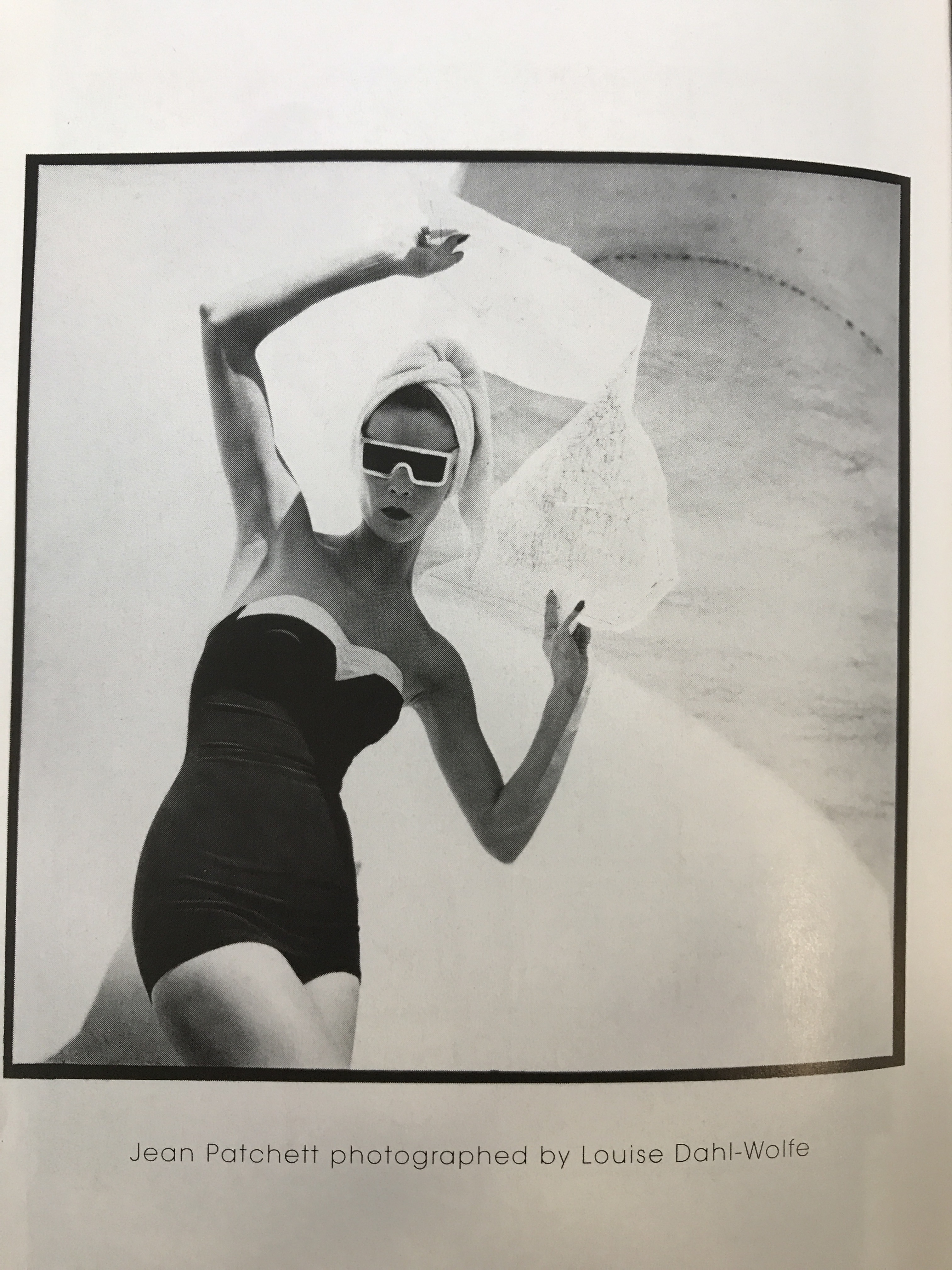
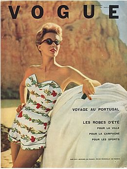
The majority of the tasks were interesting to research and write about, such as the Visual Research and Online Research tasks, as I find broadening my knowledge on any topic is something I enjoy as I then have the knowledge to apply that information to different areas of my work, including my studio work. The Visual Research task, although very time consuming as a result of having to find the designer’s influences, was one of my favourite tasks as I found having to look closely at an image and reading about the context of it really made me think about what was behind the image and what was happening at the time in which the image was taken. I also think that having to look closely at an image will help me with future design work as I will be more inclined to look at the context of an image and not just take it at face value, therefore not only improving my understanding of various topics, but also making my design research more interesting and varied.  

There was, however, some tasks I found more challenging and less enjoyable, but still ultimately beneficial. One such task was the Reflective Writing task in which we had to compare a chapter of a book with additional academic sources we had gathered. I found this task to be the most time consuming as I found it challenging to find appropriate and interesting references to compare with the book chapter. Once I had gathered the references, I then found it challenging to know where it was appropriate and effective to add said reference, and atop of that how to respond to it in a thoughtful and reflective manner. It did, however, encourage me to use the library as well as the internet to find these references, and in the pursuit of an interesting online reference I came across a radio show that I would have never listened to ordinarily but turned out being very thought-provoking.  

I have found that as a result of writing these tasks I have endeavoured to find interesting and unusual sources, whether that be from the library, where as a result of having used it successfully a number of times I now feel confident in using it as a source for finding books and information relevant to all aspects of my work, or from the internet where my search for interesting and different sources has helped me expand my repertoire of useful websites. Therefore, I feel as though my work on a whole has benefitted from the skills I have learnt from writing these tasks, and I am now able to transfer these skills to my studio work, making my design research a good deal richer.  

Tasks 9 & 10: Ethical Issues


In this advertisement by American Apparel we can see a young woman in a bedroom setting, lying on the bed wearing what appears to be nothing but a pair of over-the-knee socks, with the brand’s logo and a broad white stripe preserving at least some of her modesty. The image is overtly sexual which is hardly surprising considering a quick search online revealed many more American Apparel advertising campaigns that are of similar ilk, some even more overtly sexual and some even starring actual porn stars. This image itself could be perceived as pornographic as the angle of the photographer could be seen as the view of a lover taking sexual images of their partner. However, the fact that this seemingly intimate moment is an advert, is published and can be viewed by the general public, gives the feeling of revenge porn or some such; although we know that it isn’t, this is the impression I get when looking at the image, that something private has been made public.  

American Apparel is well known for its controversial advertising, with some of their adverts having been banned in certain countries as they were deemed too sexual and some even “seeming to sexualise a child” (Sharkey, 2015). They certainly do use very young-looking women in sexual poses in their advertising, seemingly thinking that that’s what will sell their product. However, sex does not always sell, as in an interview with The Telegraph Professor Brad Bushman said, “Sex and violence do not sell, and in fact they may even backfire by impairing memory, attitudes and buying intentions for advertised products. Advertisers should think twice about sponsoring violent and sexual programmes, and about using these themes in their ads.” (Bushman, 2015). I agree with this as personally their overly sexually suggestive adverts puts me off the brand and would make me think twice about entering a store and buying their product. The man behind the brand, Dov Charney – atop of his highly controversial advertising campaigns – has been accused several times of sexually harassing his staff and sending them inappropriate messages (Freeman 2017); therefore, it is unsurprising his adverts put forth such a degrading and inappropriate message to his largely teenage customer.  

American Apparel are not the only brand that has relied on ‘sex’ to sell their product, with Calvin Klein having also come under fire for using highly sexualised imagery in their advertising campaigns. Calvin Klein has been quoted as saying, “I’m not selling sex. I’m selling underwear and jeans, and I’m not trying to do it with pornography.” (Farfan 2017) in response to claims he too was using sexualised imagery as a marketing tool. However, I feel as though Calvin Klein’s adverts are not as offensive because they are targeted towards a slightly older market and are almost tastefully sexual and artistic rather than straight up pornographic like American Apparel’s campaigns, and that is why – combined with their younger market- it seems so much more inappropriate for American Apparel to advertise their clothing in this highly sexualised way.  


Task 7 & 8: Reflective Writing


Fashion Media: Past and Present – Djurdja Bartlett


In chapter one, ‘Taste, Fashion and the French Fashion Magazine’, from ‘Fashion Media: Past and Present’, Sanda Miller discussed the role of the French fashion magazine, from its conception in 1672 as an arts and literature magazine featuring “captioned illustrations of fashion, complete with addresses of suppliers” (Blackman, 2007), to something people looked to in order to see what was in style in both fashion and interiors and went on to include not only fashion but also “anecdotes, literary productions, comparisons between French and English fashions, which extended also to jewellery and furniture” (Bidou, 1912). Miller goes on to discuss the subject of taste, where the concept came from and whether “only a qualified observer is in a position to provide a proper verdict of the true standard of taste and beauty” (Miller, 2013). She summarised the fashion magazine as being “truthful mirrors of their time. They have functioned not only as repositories of the progress of sartorial fashion and the most up-to-date social, cultural and artistic developments but also as self-styled barometers of taste.”, which I firmly agree with as you need only look through a modern fashion magazine to see that these points still ring true.

Having read Cally Blackman’s ‘100 Years of Fashion Illustration’ I learnt that the French Revolution caused the publication of fashion magazines to stall in France, leaving the German publication the ‘Journal der Luxus und der Moden‘ (1786-1826) to become the most widely read fashion magazine of that time. England had also caught up with France in the pursuit of fashion, with Heideloff’s ‘Gallery of Fashion‘ (1794) being the most reputable and well-read magazine. With the emergence of fashion magazines, naturally came the question of taste; what was thought of as good taste and what was considered bad taste. After listening to BBC Radio 4’s radio show ‘In Our Time’ hosted by Melvyn Bragg on the topic of ‘Taste’, I learnt of the origin of the concept and how it became synonymous with luxury, extravagance and femininity; with some of the first ideas of taste having come from the court of Louis XIV this hardly surprises me. However, in England where there was no Versailles, there was more dispute on what ‘taste’ actually was. One of the first people to be credited with the invention of the concept of taste was the Earl of Shaftsbury. He “sought to provide a rational foundation for a seemingly subjective, emotional response to the aesthetic experience by postulating a special faculty – taste – which provided a rational basis on which such response could be regarded as universal” (Miller 2013). On ‘In Our Time’ the question whether taste was a birth right also came up, taste being originally associated with wealth and luxury and the rich having been thought of as the tastemakers, however, that is no longer the case with the emergence of high street fashion in even high-end fashion magazines, ‘good taste’ is available to everyone.


  • Bartlett, Cole and Rocamora (ed.) (2013), Fashion Media: Past and Present, London: Bloomsbury
  • Bidou, H. (1912), ‘Introduction’, Gazete du bon ton, November 1-4
  • Blackman, C. (2007), 100 Years of Fashion Illustration, London: Laurence King Publishing
  • BBC Radio 4, (2007), In Our Time: Taste. Available from: http://www.bbc.co.uk/programmes/b0082dzm (accessed 23/11/17)

Task 5 & 6: Visual Research


For this task I chose to look at Dries Van Noten’s SS17 ready-to-wear collection and the influences behind it. His inspiration for this collect comes from a wide range of sources, from films to famous works of art, some of which I have highlighted in the mood board. However, the image I chose to analyse further is an image of Marchesa Luisa Casati, a highly influential woman thought to be at one point the richest woman in Italy. She was renowned the world over for her “unique, peculiar style, sumptuous and noir, her layers and peplums, her masculine references, her fox furs and leopard skins, her endless suitors, her theatrical, feathered head-dressings, her neo-Gothic moods and Oriental embroideries” (Vogue Italia, 2011), all of which has established her as a muse to a plethora of fashion designers including John Galliano and Karl Lagerfeld.  

She is pictured here at a costume ball hosted by Baron Guy de Rothschild. She appears to be wearing an extravagant headdress complete with a plume of feathers that compliments a fur shawl she seems to have draped over her arm. Her decorative dress and abundance of jewellery confirm her as the eccentric, exotic and even controversial woman she was known for being. Her pose, complete with cigarette holder, suggests confidence, poise and class, her wealth and status evident through the composed way she holds herself in this photograph. As a woman of high society in the early 1900s there was no doubt a pressure and expectation of how one should dress, however, her outfit in this image is eccentric and over-the-top, unsurprising really as she was well known for her opulent and often exotic dress sense.  

Therefore, we can conclude that the impression we get of Marchesa Luisa Casati from this image is a true representation of her famed and influential style which has been the muse of many a designer, including Dries Van Noten and his SS17 ready-to-wear collection. 


Tasks 3 & 4: Academic Integrity


I chose to look at street photography for this task, although not directly linked to fashion and textile design, I think it’s important to observe and understand the people in our towns and cities, that these photographers capture so honestly and meaningfully, as much of today’s fashion comes from and is influenced by the everyday man and woman. An example being skate culture and the recent rise in the popularity of skate wear and skate brands among popular fashion. 

The book I found to reference is a beautiful book by Ed Templeton. It is presented in an accordion style and documents his visits to the island of Santa Catalina off the coast of Southern California, in a series of candid but beautiful photographs of the places and people of Santa Catalina. These pictures really capture the carefree vibe Templeton must have experienced whilst visiting. 


I then came across an editorial on street photography on the Open Walls Gallery website. Here they attempt to define street photography, highlighting the flexible nature of this particular genre of photography and its main objective which is to “be a true mirror of society” (Open Walls, 2016). 


My third source, an article on the New York Times website about the skaters of Tompkins Square Park in New York City, documents the importance of the grittier areas of New York, and every major city, that are becoming increasingly gentrified, as a place to keep skate culture and the recognisable style that comes with it, alive.


Tasks 1 & 2: Online Resources


The image that I chose to research is a photograph of Jean Patchett, a leading model in the 40’s and 50’sIMG_E4508, I found in the book ‘Top Model’ by Michael Gross (published in 1995), taken by fashion photographer Louise Dahl-Wolfe in 1953 in Grenada. The image depicts Jean in a black and white swimsuit in the style popular at the time, with graphic sunglasses to match and her hair wrapped in a towel. Searching online for similar images I came across a photo of what appears to be the front cover of ‘Vogue Paris’ from June 1952. The model (unknown) is sporting a swimsuit practically identical in style to the one Jean Patchett is wearing in Louise Dahl-Wolfe’s photograph of her; strapless with shorts and a sweetheart neckline. The fact that this particular style of swimsuit was on the cover of ‘Vogue Paris’ in June 1952 is evidence that this was the “it” swimsuit style of that year, and the fact that Jean Patchett was wearing the same style a year later in 1953 solidifies that this style of swimsuit was set 50sto stay throughout the 50’s.


I then found more information on Louise Dahl-Wolfe from the summary of an exhibition documenting her life and work on the Fashion and Textile Design Museum’s website. On here I learnt of her important role as a female fashion photographer in a field largely dominated by men, and how she captured the independence of the post-war woman in her photography. She worked largely with Harper’s Bazaar from 1936 to 1958, her ties to the fashion industry and fashion magazines meaning she would have most likely come across the edition of ‘Vogue Paris’ displaying the popular swimsuit style she would photograph Jean Patchett in a year later. After reading an article on the ‘Elle Magazine’ website I learnt that in the early 50’s many beaches across Europe attempted to ban bikinis, which were becoming popular in the post-war years as women were shedding the regimented dress of wartime and celebrated their freedom. As a result of the ban, the higher coverage swimsuits came back into fashion, examples of which can be seen in both of my chosen images.

However, they were nowhere near as modest as the “bathing gowns” that were introduced in the 17th century, as I read on www.smithsonianmag.com, the first purpose-made bathing garments being made out of stiff, yellow canvas. Modesty was of the utmost importance in the centuries that followed, swimwear being made out of heavy, opaque fabrics such as wool and flannel and in designs made to disguise the female figure rather than accentuate it. It wasn’t until the early 20th century that more figure-hugging swimwear came into fashion and slowly more and more skin became exposed, culminating in 1946 when French engineer Louis Réard designed what we recognise today as the bikini. His risqué design caused wide-spread controversy and was not an instant hit, the preferred swimwear for the 50’s being the more modest one-piece displayed in my initial picture and on the cover of ‘Vogue Paris’. However, the bikini eventually took off until it became the popular piece of swimwear we see on beaches all over the world today.