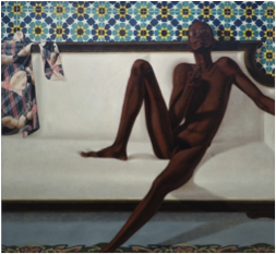
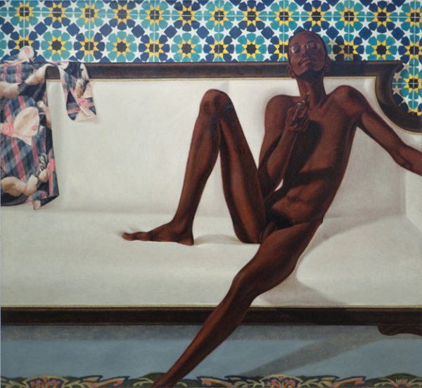
 Created by Barkley L. Hendricks, titled Family Jules: NNN (NO Naked Niggahs). [2.i]
It is a large-scale oil painting on linen, showing a black man, naked apart from a pair of dark round glasses, smoking a hash pipe upon velvet like white sofa. Lying on the left hand side of the sofa lays a printed shirt, in which the print shows a white woman, her face looking towards the male figure. Behind the sofa, a wall decorated with ornate Moroccan tiles. The figures right leg is bent, resting his foot on top of the white sofa, as his other leg stretches out onto the rug below, leaving his left foot cut out of the image. The composition of the image also crops out his outstretched left hand, as well as his left foot. The model is shown looking towards to viewer, with his head slightly tilted to the right, and back. Hendricks has also captured and painting the light reflection within the models glasses.
The use of the white women, printed onto the shirt, looking towards the black figure is one of the subtlest features, in my opinion, of the painting. It complicated the racial and sexual politics both the viewer and the artist portray when looking into the work. I also believe that this piece of work shows beauty of a male figure, as well as his other paintings which show beauty of the human figure itself, painted with care, and strong focus on the materiality of paint, and his exploration of the skin.
During 1960-1970’s, many artists around the period turned African art into idealised images of black figures. Meanwhile Hendricks portraits portrayed black as being beautiful. They stood out/apart from the other artworks displaying cultural representation. Hendricks painting, Family Jules: NNN (NO Naked Niggahs) not only confronts the tendencies to ‘Africanize’ or idealizing black figures, it also stretches upon the reluctance of artists to represent naked subjects, black subjects. His work shows strong atheistic of the nude, and contains realism and abstraction. He explores the work of the black figure as something beautiful, things in everyday life we look past as a whole.
This painting is one of a small series, consisting of four paintings that Hendricks had made, including another model George Jules Taylor. Hendricks pays strong attention towards his title; his choices are based upon how it will represent African American nudes, and how the public will receive them. In doing so Hendricks directly tackles the accepted notion of hyper sexualized black figures that, still to this day, continues to be consumed and codified around the world. His response to these actions,
“If this is what you expect, then this is what I am going to give you”. (Hendricks, 2008,)
http://www.tate.org.uk/sites/default/files/images/fig.1hendricksfamilyjulesnnn1974web.jpg
http://www.tate.org.uk/art/artworks/hendricks-family-jules-nnn-no- naked-niggahs-l02979
http://www.tate.org.uk/research/publications/in-focus/family-jules/hendricks-today

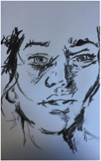
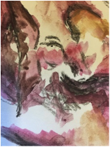
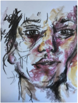
 I have chosen to look into this chalk drawing based off Picasso’s work within my contemporary project. The piece is 210mm x 297mm, a smaller image then most other works in my sketch book. Due to the scale of the canvas the complexity of the distinctive lines and shapes are small. However if I was to expand the scale the detail would increase also.
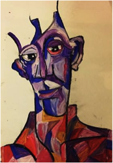