Author Archives: Alivia Osborn

Summary

Research and Communications has shown me a variety of different aspects of all four pathways, whilst incorporating interesting and pivotal aspects of modern design and art history. Not only this, but to delve into the aspects of different art movements, and to see how artists of the time used art to respond to propaganda from war or to express their political views was eye-opening.
Because of the research and knowledge that has accumulated over the last few months, it has allowed me to further stretch my interests of different designers,illustrators and art movements within the design industry world, and how they have also influenced those working in the present day.

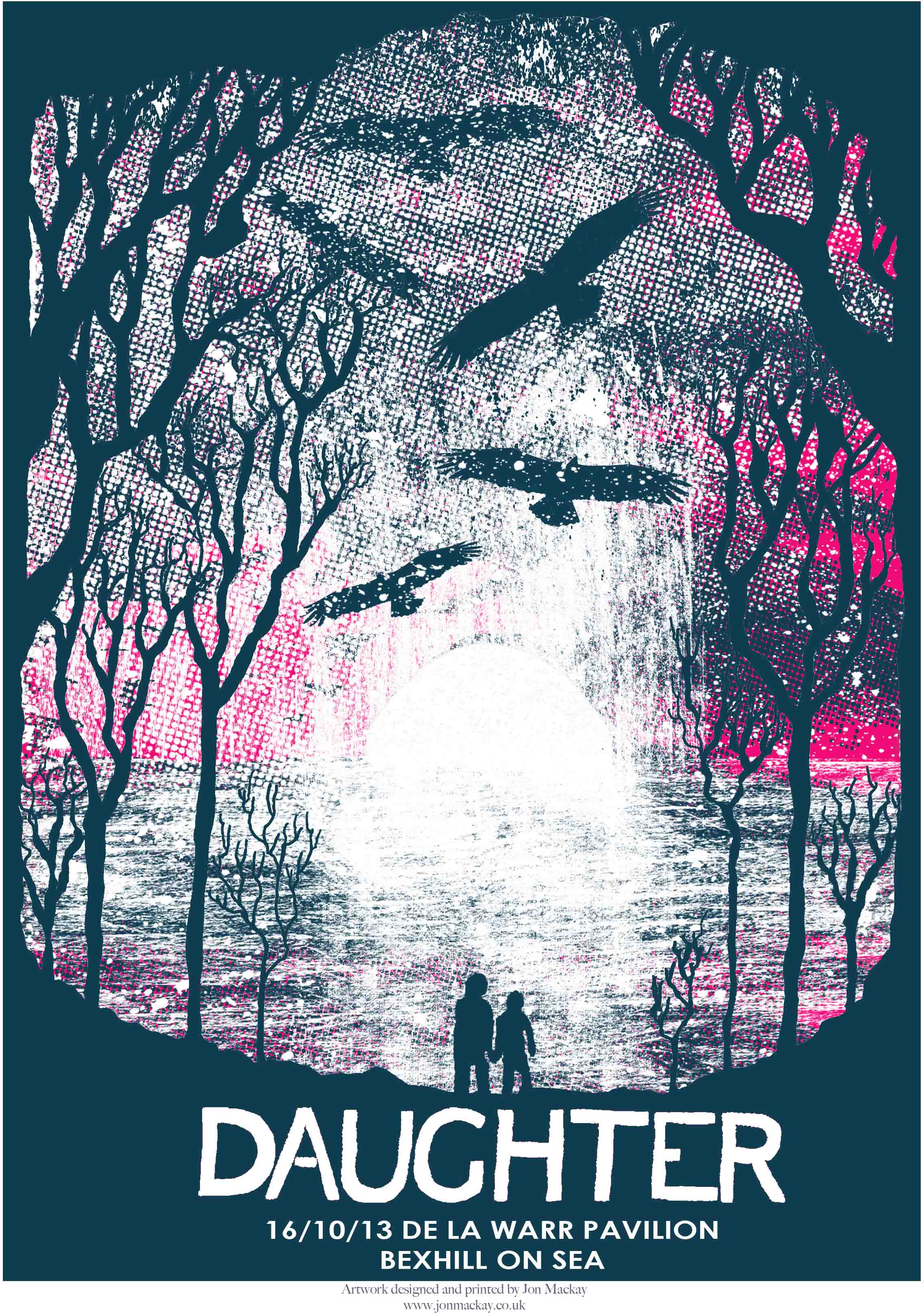
I previously already had an interest in illustration, being particularly interested and drawn to designers such as John M Mackay, who I further researched and analysed within week 2. This project was wholly in my comfort zone, because I was faithfully writing about artists who I had previously touched upon during my a levels.
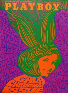
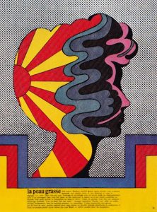
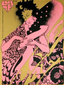
Within week 5, when looking at counter culture, I became very interested in the prints of Hapshash and the Coloured Coat. The colour schemes in which the collaboration used to create psychedelic pieces was intriguing. I found how they used metallic inks within their work to add a sense of depth and beauty to their work an interesting concept. I thought this could be quite interesting within my already 70s themed zine. I felt that the incorporated or even inspiration of Hapshash’s colour schemes and use of repetitive patterns would really emphasise how my illustrations were meant to have a 70s look and feel to them. I thought adding touching of metallic gold to the front cover of the zine could look interesting, as well as using loose movement in shapes to fill my backgrounds, adding a slightly peculiar look to the whole product.

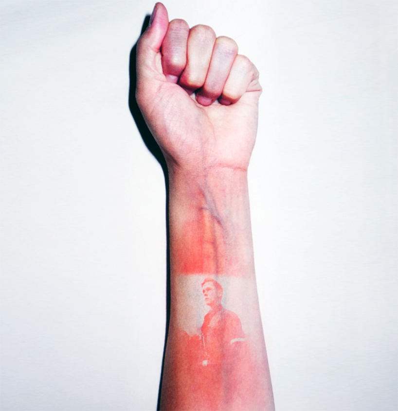
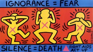
Not only did Hapshash influence my illustration rotation, but I began to edit my photography in a particular way that uses a limited colour scheme and shapes to reconstruct a portrait using two colours and black. I chose carefully what colours I wanted to use because one portrait in particular, a key element to the piece of work was a bleeding nose, which I did not want to be lost within the block black. When looking at how colour and particular shapes can represent and communicate to the viewer a particular emotion or viewpoint within post-modernism, I remembered how Basquiat and Haring used colours and basic shapes to connote to the audience a message. Within Basquiat’s work he used limited primary colours to draw the viewer into the central part of his King Alphonso piece. I did the same by using red to represent the blood.

Overall, research and communications has helped me develop furthermore as a designer because I have been opened up to new movements within the art world, and how they have influenced design in the present day to connote and communicate messages in simplistic ways.

Publish or Perish!

For Lazy Oaf’s’14 summer and magazine launch party, this image was created for the front cover, as well as to be used as a poster to advertise the event.
The aesthetic created for the magazine was deliberately in the same vain as their clothing which has very strong illustrative look to them; for example the shirt the model wears has the same shapes on it that the brand’s logo which is being used as a masthead. The sleek and muted colour scheme which consists of a strong pink and blue to it runs throughout the photograph, from the background, to the shirt and even the washed-out muted colour of the models’ skin, this appeals to their target audience, meaning if you connected with the ad, you’d want to buy their product.

Absolut vodka ran a series of interesting adverts from 1980 till the early 2000s depicting their drink in different scenes.

The ads were created by the New York City Agency, and used no photoshop through the campaign.
The campaign incorporated the brand’s name into each of the different ads. What I liked about the ‘PERFECTION’ ad,was the lighting was used to create angelic lighting to create a halo which also really ties into the colourscheme, because theres its quite monotone, meaning you’re drawn more into the brand’s name on the bottle and the anchoring text.

Illustrator Peter Strain creates original artworks that- in a sense- advertise films. I found his Pulp Fiction piece interesting because he used one illustration of Uma Thurman in black and white, whilst flooding the background. This helps Strain tell a story “through a single image (which)is important (to me) and mixing in typography allows (him) to do that”

I also found it quite interesting how he’s used the reference to Thurman’s misuse of drugs within the film.


Your eye is drawn to what she is doing,because she’s looking down at the table, and as you follow her hands down you can see she’s cutting out the letters of the film in cocaine- this was a clever way to communicate to the audience the film title.


Lazy Oaf Launch and Magazine Cover,

https://www.lazyoaf.com/blogs/story/lazy-oaf-ss14-magazine-launch

Absolut Advertisement:

https://www.buzzfeed.com/copyranter/the-best-of-the-great-absolut-ads?utm_term=.hv1Qg2rpr#.iyomwgKMK

Peter Strain, Pulp Fiction:

http://www.peterstrain.co.uk/ADMIT-ONE-FILM-POSTER-EXHIBITION

Coles, M (2014), Interview: Peter Strain

QUOTE STRAIN: http://www.peopleofprint.com/general/interview-peter-strain/

Postmodernism

Postmodernism essentially contradicts and challenges all aspects of modernism. The artwork created by postmodern artists opposes the “modernism’s utopian visions, which had been based on clarity and simplicity.”


Keith Haring’s ignorance=fear was created to promote awareness of AIDS,


for the activist group, AIDS Coalition to Unleash Power. The three figures represent “see,hear and speak no evil” to show how people refused to acknowledge those who suffered with AIDS.

The use of bold shapes and primary colours creates a visually interesting style of pop art that is prominent to Haring’s work that makes everything very simple, due to the fact you’re not distracted by anything within the piece. The bodies created by simple shapes,clearly show what the figures are doing. This makes you question what the campaign is about because you assume due to its simplicity its aimed at children, when the actual reason promotes a very serious topic, that was coming out as a near epidemic for the time period.

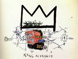
Basquiat’s “King Alphonso” really interested me, once again, because of it’s limited colourscheme. The use of purely primary colours mixed with child-like fluidity to the drawings really drew me in. I found it interesting how Basquiat used colour only in the centre of the piece of work, which your eye is after you see the huge signature crown in which has become essentially a signature for Basquiat, which is seen as a sign for greatness, ‘Even if no one else sees it, he’s a king in his own right.’
I like how the disorderly scribbles in which produce a mind map that sit underneath the crown, they sort of connote how Basquiat knows post-modernism is going to be a
crucial movement within art.

Jamal Shabazz’s Back to the World beautifully documents the subway in quite a contradictory way. Though what is being photographed isn’t seen to be beautiful, the way in which Shabazz captures those going about their daily life in an rough area, “It’s an interesting mashup of the elegance of humanity in spite of the decay of the city and those photographs had a warm, yellowy, upbeat quality to them.”


Jamel Shabazz,back to the world,1980
http://www.jamelshabazz.com  -Young, B

http://www.vam.ac.uk/content/articles/p/postmodernism/


Keith Haring, Ignorance=Fear, 1989

Ignorance = Fear


Basquiat King Alphonso,1983

King Alphonso

Counter Culture

Counterculture was born into a time of austerity due to the cold war.Rebellion was a crucial key to the counterculture movement, “summarised in (embracing) an alternative lifestyle characterized by
, brightly colored clothes, communal living, free sex, and rampant drug use”. The art created represented this hedonistic yet antipathy towards politics of the time.

Hapshash and the Coloured Coat consisted of two graphic designers, Michael English and Nigel Waymouth.

I find it interesting how in the left-hand corner, the same male figure thats in the centre, is posed differently,slightly distorted and in this gold ink. I feel this alongside the repetitive patterns of the flowers and elongated shapes emphasise the psychedelia that strongly influenced the work of this time period.

The collaboration described their work as “a precursor to a sort of graffiti.” which I feel is shown in the colour scheme which solely consists of three colours.

Wes Wilson is seen to be the ‘godfather’ of psychedelic art that emerged
within the 1960s. His most well-known work would be the typeface he created which was heavily used within the 1970s in the psychedelic and counter culture movements. The piece of work which interested me the most that Wilson created was for a playboy magazine cover. I find the way in which the type frames and creates a sense of movement to the central image, but also makes up the body of the girl, i think the use of movement was pivotal to the whole psychedelic movement.

Milton Glaser’s work, though still in the vain and strong within the counter culture movement, this particular piece of work has rather colour palette compared to the work of other artists within the movement, this piece of work compared to Wilson’s playboy cover shows how the colour schemes within the movement, though still bright, did not necessarily have to have that bright fluorescent or metallic look to them. I found this particular piece interesting because of the way in which the movement created by the abstract-esque shapes are all contained within a silhouette of a face.


(1)http://visualarts.britishcouncil.org/collection/artists/hapshash-the-coloured-coat

(1)quoted in Summer of Love Art of Psychedelic Era, Tate 2005, p. 107

Hapshash and the coloured coat-Luv Me Promotional Film Poster,1967: https://paddle8.com/work/hapshash-and-the-coloured-coat/102695-luv-me-films-promotional-poster


Johnson,K Summer of Love:

http://www.coldwar.org/articles/60s/summeroflove.asp


“Technology is the mortal enemy of art” – Alivia Grace

Within Rodchenko’s manifesto,Who We Are, he states that: “Technology is the mortal enemy of art”. This bold statement I feel is rather outdated when speaking about the evolution of art, to completely dismiss the digital side of art I would go as far as to say it’s ignorant. The way in which art and technology is evolving, the two coming together and moving forward shows how the two are not mortal enemies- but come together to create something new and allows art to evolve furthermore.
Without technology, I feel design would become stagnant. As described by journalist Paul Dimmock for inspiredm.com, he described modern designers as those whose “endeavours illustrate that technology has not merely emanated from need but rather that it is bore from our desire to create in new innovative ways.” summing up how most digital artists feel towards the creative industry, and how those within the industry treat the collective.
I personally feel how Rodchenko describes designers as those who merely “point out” and/or “announce” the obvious to their audience is a very ignorant view on design. As Paul Rand said said, about those who work within the design industry are creating something thats “so simple, thats why its so complicated”. If you, yourself struggle to create a simple yet beautiful piece of design, then you need the help of a designer, this also goes for the side of design that uses technology, if you lack the skills or knowledge of the programmes designers use to create their work, you cannot criticise the industry.

Is It Possible to be Truly Authentic? Alivia Grace

Dennis Dutton said “a first good question to ask is Authentic as opposed to what?” what do you define to

be truly authentic in a world where people are not only evolving the ideas of others but struggle to pin point where an original idea came from?

In the Oxford Dictionary, authenticity is described as to be “made or done in the traditional or original way, or in a way that faithfully resembles an original.” This could describe a style of art in which an artist paints; to faithfully follow an art movement or continue to follow faithfully within it’s footsteps would to be authentic to an art wave or a style.

To be authentic within the twenty-first century could be seen as a struggle. Within graphic design, artists who stick true to their style but add their own twist, show true authenticity; for example, Matthew Laznicka. His illustrations are heavily influenced by vintage illustrations, and are true to that form illustration, yet Laznicka found a way in which his art is authentic to himself, by giving the designs a very contemporary feel to them.

I would say the principles of modernism are definitely do hold value within modern design, because they do still influence some designs; take how Apple designs their packaging for their iPhones. The simplicity of the packaging is a pivotal part of Apple’s unique selling point, due to the fact that it gives the customer a ‘sensory experience’ when they open their product. The audience also appreciates the minimalist branding that apple has within their products and packaging, be it the clean white that is used consistently throughout their branding or the adhesive tags and

arrows, printed on clear plastic so the eye isn’t fighting to concentrate on how to open the product, but can easily understand because of the influence that modernism has had on the branding.

Levinson,J (2003), The Oxford Handbook of Aesthetics, New York, Oxford University Press, Oxford Handbooks

Oxford English Dictionary

Matthew Laznicka, http://www.illustrationweb.com/artists/MatthewLaznicka/view

Our first official look at the iPhone X packaging is hidden on Apple’s website

Task Two Comparisons

The first piece of artwork I chose is an untitled piece by Jon M Mackay, that was created for the band Daughter for a specific gig at my local music venue- in which I attended and Daughter bexhill poster jon mackaybought one of the limited edition prints back in 2013.
Mackay’s work is screen printed his design onto A2 paper- only 45 were created. Mackay’s artwork was the first screen print I had ever come across and really drawn me in due to it’s simplistic colour scheme, as well as quite raw look. I found it interesting how only 45 were created, due to the fact that each poster, although similar overall, each has minor imperfections which make them equally all unique and made the show even more special to me. I feel the contrast between the red and black creates so much more depth to the piece.
I also like how Mackay bases his posters off of lyrics from the bands he crafts his prints for.
My second artist that I decided to look at was the photographer Thomas Mailaender. In his series Sunburn, he took negatives from the “archives of modern conflict’s collection” and thomas-mailaender-illustrated-people-designboom-09projected the negatives onto the skin of his models using a UV lamp.
What peaked my interest in Mailaender’s work was how abrasive the photographs- to allow an artist to physically burn you in order to create art sounds ridiculous; yet the results are beautiful and very striking. I think this is where I see similarities in Mackay’s work compared to Mailaender’s, both artists are forced to use a simple selected amount of colour and tone in their work due to the mediums: In Mackay’s work, he must work simple due to the fact he is screenprinting, and the use of limited colour creates striking prints- whereas Mainlander’s work, he has no option but allow the skin to burn into a selection of reds to create his artwork. I really like the idea of simplified colour schemes in work, and I would love to explore this rather than my typical work in which I usually overcomplicate using colour on mass.


Jon M Mackay Untitled-6 Art: https://jonmmackay.wordpress.com

Thomas M Mailaender Sunburn series: http://www.thomasmailaender.com

Terminal Bar (2002) Stefan Nadelman

Stefan Nadelman’s Terminal Bar, documents the photographer Sheldon Nadelman’s work that he created within the bar in which he bartended, during the period of 1972 to 1982. The work consists of 1500 portraits, of those who spend their lives within the Terminal Bar of New York.
The unconventional style of the documentary involves the series of photographs, mixed in with newspaper scans describing the over the years. The documentary is voiced over by Sheldon Nadelman (the photographer) who also doubles up as the bartender who served those who entered Terminal.
Within the bar, an eclectic mix of characters whom which spend their hours drinking from the array of over 200 bottles of liquor, were a peculiar mix from all over the city, varying from actors to sportsmen and cooks, with the overriding common denominator being their sexuality: most men whom which resided within the Terminal bar, were gay. Although Terminal wasn’t specifically labelled as a gay bar, the documentary explores the themes in which the bar merged into throughout its life until its very end, including the closure,which also coincides with the deaths of some who were documented. Due to the personal touch of Sheldon’s connections with those being photographed, his voice-over has a personal tone, which gives the documentary more depth. The way in which each person was numbered, yet Nadelman refers to said person by both their name and number, steps over the line of documentary and the film being a personal recollection of those who came into his life.