Author Archives: Sophie Peach

Summary

Over the past 8 weeks, I have learnt a lot about the history of graphic arts, and have developed many skills during the process, mainly researching into past artists work and seeing how they shaped the graphics arts industry, from Avant Guard to postmodernism.

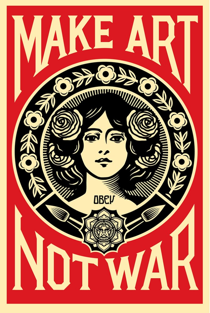
Although when I began this research blog, I had a dislike to the work I was studying, being the type of art that in the past I had disliked in the past I grew to like such as Shepard Fairy’s work that I learnt was more than just branding and a seeming cult type movement, it actually had meaning and was there to try and open our eyes to what’s around us.

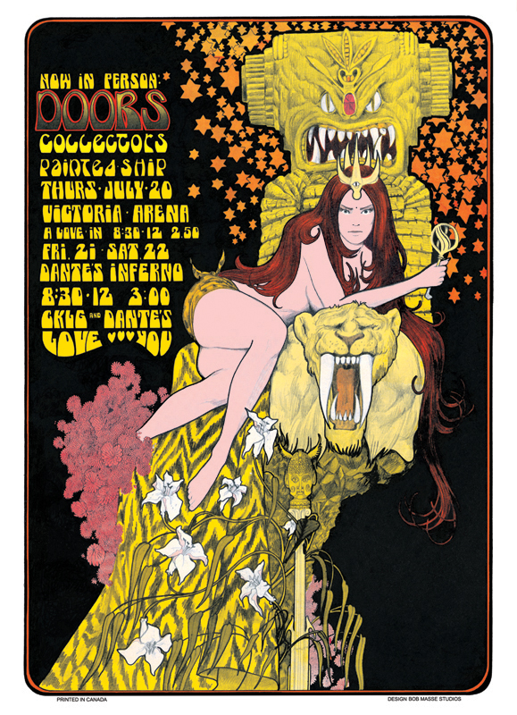
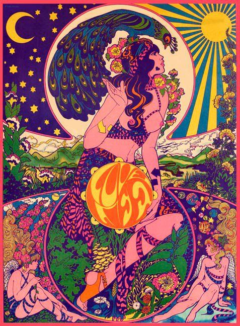
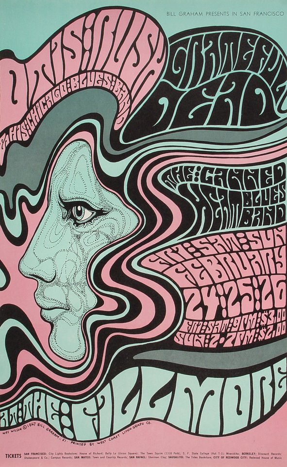
What got me most was the counter culturism, I actually liked a lot of the work involved especially from the psychedelic work of Bob Masse and Bill Graham, i loved the art style and the colours they used as well as the way they use their work to express and provoke society in a sense of rebellion and going against the norm. I love the way they work with bold colours that shouldn’t be seen together, such as yellows next to purples yet it adds to the effect, my favourite artist was Bob Masse who used one of my favourite artists as inspiration, Alphonsa Mucha, an art nouvaue artist who’s art is one of my favourite to look at and I happy to see that someone has taken on his work and made something interesting out of it, by keeping the style of Mucha yet using colours to bring it into the counter-culterism movement. making it elegant and fun at the same time.

I prefered the works where I could explore my own interests, such as task 2 where I compared two images that I liked and had similar relations to my own work. I also enjoyed the publish or perish task of choosing my own images that I enjoyed and wanted to describe and look into more detail about how, I got to look into things I liked and share them with other students on the blog. It also makes me look at things more closely such as how a piece of art is put together, the colour schemes used and why they are used. As well as how they the piece works as a whole and if it completes it’s purpose, a lot of the work I have studied has influenced my own work, and has given me new inspirations and ideas that I can work with in the future with my own artistic career and has made me think about what really goes into a piece and what I’m really trying to say with my artwork, as well as it’s purpose, and makes me want to continue this research further as I progress with my study.

One thing I would do better next time is to research more into my artists and give more analysed reviews, as well as being more organised with posting my blogs and understanding the work more.

task 5 – underground culture

Counter culture was an anti-establishment movement in the 1960’s and 70’s that involved artists creating artworks and comics that spoke out against societal norms by including taboo topics such as sex and drugs.

Bob Masse is a concert poster designer and been designing since the 1960’s his work often imitates the work of Alfonse Mucha’s work and the art nouveau with a psychedelic twist with the vibrant bold colours, artwork such as this piece entitles “doors” from 1967 uses provocative imagery to sell is posters to a mass market and encourage the audience to go see the band his work is advertising.  As a fan of Alfonse Mucha I like Masse’s work because it brings the art nouveau life a new lease of life, with vibrant colours.

‘Love Life’ by Marijke Koger, her work is unique for being a female psychedelic artist with her work not being given the credit as other male artists of the time. Her work is similar to Masse’s work in the way it shows women in a provocative light, with the inclusion of nudity that at the time was most likely seen as outlandish and shocking to a generic audience. The piece flows together, with the peacock and curving to fit within the circle, the figures at the bottom fitting into the shapes makes for a seemingly tight piece that uses colour which equally work with and against each other. The contrast between the sun and moon separated with the circular shows a well organised drawing.

Bill Grahams work was a staple of the underground movement, and is well known for his advertising for rock bands using his skills to incorporate art and words into one piece that works and flows together, with the words moving with the shape of the hair, the text becomes one with the piece, although this piece is different from the others with the way that it uses duller colours yet still uphold the style of the conter-culturism movement and the spirit of the movement.


These artists all appeal to me through their styles, especially with the focus on female figures and their representation.

Reference

Bob Masse. 2017. Bob Masse Rock Posters. [ONLINE] Available at: http://www.bmasse.com/60s.html. [Accessed 5 December 2017].


Publish or Perish

My first published piece is the a single cover for the band Black Honey, all their covers have a classic american 1960’s style to them, they look elegant and the vivid colours that fit the decade and really make the art  covers eye catching and there for work in selling the artists music. All their covers have a similar style there for represent their genre of music as well. The whole piece has been thought out carefully, including where the name goes and the colour choices to all work in unison with one another. 

The film poster for atomic blonde is both simple and elegant as well as sleek and seductive. The black background makes the bright lettering stand out and there for make it easier for the audience to remember the name of the film. This poster brings a sharp contrast between light and dark, with the dark coat contrasting the white of the hair, the pose given is seductive replicating anther film poster, show girls. As well as having more viscous undertones with the gun being held in her hand. I like this poster because of the simplicity yet it draws you in and makes you want to see the film which is exactly what a film poster is meant to do, it also gives it that retro look that fits the setting of the film.

My last piece of published work is the Vikings season 4 poster, I love the design of this poster especially the way the red of the text against the blue background, it stands out so much that you’re attention is drawn to the poster immediately. The blue for the rest of the poster is extremely striking and I find it interesting how the iris’ of the eyes are pale, there’s something that draws you to the eyes and how sinister it looks especially with how dark the poster seems because of the blue. When I first saw this poster I was a put a little off guard with it’s design as it did not match up to previous posters for the series, yet this works as it catches you off guard and makes you remember it’s design and the show.

Reference:

Tobishka. 2017. Vinings Serie. [ONLINE] Available at: https://steemit.com/movie/@tobishka/vinings-serie. [Accessed 4 December 2017].

Rachel Montpelier. 2017. “The Coldest City” Starring Charlize Theron Gets New Name and Release Date. [ONLINE] Available at: https://blog.womenandhollywood.com/the-coldest-city-starring-charlize-theron-gets-new-name-and-release-date-57baa2ad1bc2. [Accessed 5 December 2017].

Pinterest. 2017. black honey. [ONLINE] Available at: https://www.pinterest.co.uk/pin/248260998188459510/. [Accessed 4 December 2017].

Post-modernism

Shepard Fairey

Fairey’s work is world famous, with it being printed on t-shirts, mugs and posters, you can’t escape his artwork. It’s unique with it’s bold use of reds and creams and backs. The use of a minimalist colour palette shows how impact images can be even with the littlest of colour. Within Fairey’s manifesto he describes his movement as an attempt ‘to enable people to see clearly something that is right before their eyes but obscured; things that are so taken for granted that they are muted by abstract observation.’ which in a sense encompasses what postmodernism’s about, looking beyond what you are used to seeing and searching for a deeper meaning. His art inspires a lot of my own especially the way he shades and uses colour and lines in his own work.

Keith Haring

Haring is an iconic artist within the post modernism who wanted his artwork to be widely available to the people, even creating a pop up shop which ‘Haring considered the shop to be an extension of his work and painted the entire interior of the store in an abstract black on white mural, creating a striking and unique retail environment. The shop was intended to allow people greater access to his work, which was now readily available on products at a low cost.’ Haring wanted his artwork not just to be for the elite but for everyone, which is why his artwork is so recognisable.

Jean-micheal Basquiat

Basquiat’s work isn’t a well known as the other two artists yet he has still impacted our world and especially postmodernism, his work is inspired ‘from his urban origins, and in another a more distant, African-Caribbean heritage.’ which can be seen in the use of vibrant colours and the designs of his figures. Basquiat rose to fame quickly within the art community, his work is both a live and intricate and although his painting can come across as messy they are well thought out, intricate as well as being expressive, he used his work to speak out against racism, he also collaborated with Andy Warhol on multiple painting.

Reference:

Jean-Micheal Basquiat. 2017. Jean-Micheal Basquiat. [ONLINE] Available at: http://basquiat.com/. [Accessed 5 December 2017].

Keith Haring. 2017. Keith Haring – pop shop. [ONLINE] Available at: http://www.haring.com/!/pop-shop. [Accessed 5 December 2017].

Keith Haring. 2017. Keith Haring Bio. [ONLINE] Available at: http://www.haring.com/!/about-haring/bio#.Wiiaj0pl9PY. [Accessed 5 December 2017].

Shepard Fairey. 2017. make art not war. [ONLINE] Available at: https://obeygiant.com/prints/make-art-not-war-offset/. [Accessed 5 December 2017].

Shepard Fairey. 2017. Manifesto. [ONLINE] Available at: https://obeygiant.com/propaganda/manifesto/. [Accessed 5 December 2017].

Jean-Micheal Basquiat. 2017. Jean-Micheal Basquiat. [ONLINE] Available at: http://www.theartstory.org/artist-basquiat-jean-michel.htm. [Accessed 5 December 2017].


Technology is the mortal enemy of art

In the Constructivst group’s manifest written by Rodchenko it states that “technology is the mortal enemy of art.” Which I do not agree with this statement as I believe that technology has helped the artistic industry evolve and become something greater helping the industry to move quicker and to produce better quality products, technology has integrated itself into the practice of art in new and exciting ways.

Technology has allowed artists more freedom to create and experiment with new styles and a forms in a shorter amount of time, it also brings possibilities of easily changing and altering images without any major cost such as making a piece all over again, instead you can simply alter a layer or undo an accidental paint brush stroke. Technology and the digital age has allowed artists to create quicker and easier than ever before it’s made the creative industry work smoother and produce more designs than ever before. It has also allowed artists to get their work across to more people from around the world, meaning more people can work and collaborate from across the globe, making the industry become one giant communal centre where artists can share their own work and discovers others, Rodchenko’s manifesto seems to want to halter that development and growth, by turning away from technology and it’s great opportunities and how it can open doors, to new and exciting things. We have entered an age that is certainly technology driven and we should embrace how it can help our art and not see how it can hinder it.

Week 4 – modernism

In the Oxford dictionary being ‘authentic’ is defined by ‘Of undisputed origin and not a copy; genuine.’ This definition brings up ideas of ‘originality’ which has often been disputed in the art world as to whether something is original or if someone has done the same idea before.

In creative writing at Alevel I learnt that no story is truly original and that there are only really 6 narrative structures and each story written is just a different way of looking at one of those narratives. The same can be applied to art, many people can have the same ideas without necessarily knowing of the other works similar to it. We are also often inspired by other works, in fact in education we are told to let other works develop our own and use it as reference, although this helps us as developing artists to learn more about past and present artists, it hinders our artistic growth as we don’t develop any originality but rather we are told to use someone else’s style within our own work making them similar, in this way it becomes difficult to be authentic and original, ultimately authenticity can be found in someone’s work yet it is how the viewer perceives them, and how they interpret their work against some other artists. An artist may think their work authentic yet someone may have seen work like it before and there for not call it authentic.

In conclusion authenticity especially in the art world is all about perception and how someone perceives someone’s art.

Task 2 – Graphic Arts

The first piece of 11386887._SY540_artwork I chose was from the artist Phil Noto, who was one of first artists that got me interested in illustration. I love his unique style when it comes to drawing his figures and backgrounds, the way he uses softer colours and lines to give off a unique comic book vibe that at first I didn’t like but have grown to appreciate and admire.  This image was created digitally yet has a watercolour or pastel feel to it with the softer colours which contrasts the dynamic pose. I also think the way the colours seem to bleed into one another is interesting and unique. Notos artwork certainly stands out on the page and is different to the normal comic book/ illustrative work that I’ve encounter before.

Villentretenmerth


My other piece of artwork is by Anna Podedworna and is artwork of a character from the Witcher series, this particular artwork is used in the Gwent card game and is later on animated with sound, which you can see here. What really interests me about this drawing is how this illustration is turned into a piece of moving artwork, which gives it even more depth and personality to the artwork. I also love the detail Podedworna has used within this piece and the use of colour in which the brightness contrasts the dark significantly. I do hope to do something similar to what has been done here with animating my drawings and making them come to life. There is a lot more detail involved within this art piece as well as the image being sharper and more realistic than Notos artwork.


Terminal Bar

The terminal bar is a film about photos taken by Stefan Nadelman in a New York bar over a ten-year period, documenting the people that came and went into the bar within that time frame. This film also gives us backstories to some of the people who were photographed, giving us stories and depth to the people in the bar, as well as showing the story of the how the bar evolved over time.
The film is made up of still images, yet the editing made these still images flow making it appear as one moving image, making it seem like more of a film. Rather than seeming like a slide show of images, there is also a combination of moving images and video clips of a man talking about the costumers who would visit the bar and share stories about the men who went and worked there. The film goes in chronological order and shows a development of time.
There is a voice over that reads reviews from newspapers about the bar, they give context to the bar and the outside worlds opinions over the bar and it’s development in a staple of gay culture within new York.
One thing that stood out within the film is the music used and towards the end of the film takes prominent status in showing the photographs, as a collage and a kaleidoscope affect. There’s often a strong beat that captivates the audience, engrossing them into the film and its loose narrative.