Author Archives: Megan Carr

Summary

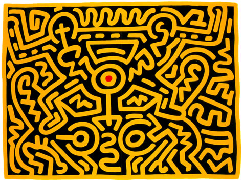
Over the past 10 weeks of the Research and Communication module I feel that I have learnt a lot about past artistic movements, as well as improving my research skills and utilising the resources that were open for me to use. This has greatly improved my research skills and has exposed me to new and interesting works of art that I had previously not seen before as well as refining my analysis skills when looking at artwork from other contemporary practitioners. I have learnt a lot about Graphic Design, Illustration and Photography and how they have evolved and changed throughout the 20th century due to technological advances and shifts in artistic movements such as modernism and counter culture.

I have been able to find connections within my research that have helped me push my analysis of certain images further, linking specific artistic and historical movements such as counter culture to Graphic Design and how it has impacted the way artists have been influenced. The lectures have encouraged me to research deeper into certain topics and choose relevant information to help support my analysis’ of a variety of different artwork, The topics that were discussed in each lecture have been important in understanding the development of illustration and graphic design over the decades and have taught me how to improve my own work as well as inspiring me to try out different methods of working and experimenting with different mediums.

The most thought provoking task in my opinion was the task regarding authenticity, I found it highly interesting researching a variety of opinions towards the matter of artwork being truly authentic. This made me think about my own work and what and where I draw inspiration from, as well as looking at other practitioners work and how they have found their inspiration. Tasks where we had to analyse three images and relate them back to our own work I also found highly interesting as I thought it helped me make more connections between my work and other artists’, as well as improving my knowledge of other artists and how I evaluate their work. I also thoroughly enjoyed researching into how technology has impacted art, I liked forming an opinion towards the matter and voicing it in way that included research to help back up points made.

Overall, I have enjoyed the last 10 weeks as it has opened my mind to different artistic movements and how they have greatly impacted artists and their work, as well as researching into different aspects of art and analysing the work of artists that have shaped the history of art and  have strongly influenced the art scene.


Publish or Perish! – Task 7

Peter Kennard is London based photomontage artist seeking to reflect his involvement in the anti-Vietnam war movement. I chose his poster, Never Again (1983) because I found the subject matter quite interesting, Kennard wanted to inject renewed meaning into images of nuclear war which had become severely clichéd. This photomontage combines a large mushroom-like explosion with the body of a skeleton to reconnect the explosion with its horrific consequences for human life. What made the poster stand out to me was the use of bold yellow lettering almost acting as a plea for peace. Kennard also included the exact dates in which nuclear bombs fell on Hiroshima and Nagasaki, I find this information to be quite disturbing but also raises awareness to these past events.


William Klein is a photographer and filmmaker noted for his ironic approach to both media and his use of strange photographic techniques. I chose Klein’s photo, Gun New York (1955) as I liked the drama within the shot, the framing could be considered as quite threatening due to the barrel of the gun being out of focus drawing your attention to the child’s angry face. The juxtaposition between the two children is intriguing as it is almost a split between innocence and violence. This image has shock factor, no one would really expect a child to be in possession of gun but it raises questions as to whether it is real or fake.


The final image I have chosen is by Typographer Johnathan Barnbrook. I chose this piece of work as I was immediately drawn to the fonts and colours used, the bright neon pinks and blues contrast against each other creating an interesting composition. I also like the cut off point of the poster where ‘Design Ego’ falls off of the page, almost as if its too big to fit.


Peter Kennard, http://collections.vam.ac.uk/item/O100758/never-again-poster-gladwin-peter/

William Klein, http://erickimphotography.com/blog/2013/03/26/10-lessons-william-klein-has-taught-me-about-street-photography/

Johnathan Barnbrook, http://www.barnbrook.net/


Postmodernism – Task 6

Within art, postmodernism was the movement that reacted against modernism which had widely dominated art theory and practices since the beginning of the 20th century. Whilst modernism was mainly based on idealism and championed simplicity, postmodernism was created based on scepticism and embraced a much more complex outlook.

Keith Haring was an American artist whose work grew to an iconic level of popularity due to his colourful, spontaneous drawings and prints. I chose to look at Haring’s print, Growing 3 as I was immediately drawn to the bright yellow upon black, it creates a dramatic atmosphere as well as drawing attention. In my opinion the piece itself is quite complex as at first glance it can appear to be just a cluster of lines and shapes, however on closer viewing the drawing seems to come to life; revealing more recognisable shapes and forms. I find the red dot in the centre intriguing, almost as if it is a deliberate focal point forcing you to start viewing it from the centre and work your way out.

Graphic designer April Greiman designed the poster Your Turn, My Turn for a 1983 symposium in LA, California. Greiman was one of the first designers to embrace computer technology as a design tool which is made clear within her works. I chose to look at her poster Your Turn, My Turn as I liked the muted yellows and blues as well as the composition; the bold title allows for easy reading and each of the coloured shapes lead the eye through the relevant information within the poster.


Shepard Fairey is an American contemporary street artist, graphic designer and illustrator who founded OBEY clothing. I chose this print of Fairey’s called Operation Oil Freedom because I am drawn to the intense amount of detail within the print, in my opinion small details can have a huge impact on how an image is viewed as well as the message that is conveyed. I particularly like the use of bold outlines against the ornate gold details and embellishments as it kind of acts as a juxtaposition between harsh and elegant.


Keith Haring, Growing 3, http://www.haring.com/!/art-work/702#.WihHSORLHIU

Keith Haring research, http://www.haring.com/

Shepard Fairey, Operation Oil Freedom, https://www.thinglink.com/scene/668813642703044609

April Greiman, Your Turn, My Turn,  https://www.cooperhewitt.org/2017/08/30/26363/


Counterculture – Task 5

Counter culture refers to the anti-establishment of the 1960’s-70’s it first developed throughout the UK and US, then dispersing throughout much of the Western world. This cultural phenomenon inspired a wave of rebellious creativity.

The first image I have chosen is from the Magazine, Oz. The magazine collection itself was known as one of the most controversial of its time in the 1960’s using sex and drugs as a shock factor. Within this image I particularly like the use of bright colours which contrast against the harsh black outlines and shadows. I am drawn to the illustrative design and references to popular culture of the 60’s, with the focus being what seems to be a clown version of Mick Jagger, since the Rolling Stones were popular during the 60’s and 70’s it really captures the spirit of this era and embraces the ‘sex, drugs and rock and roll’ culture. ‘The magazine would challenge the establishment, extol the virtues of drugs, sex and rock’n’roll and provoke a landmark obscenity case.’


The second image I have chosen was, from Oz Magazine, I was drawn to this cover as I liked the level of detail as well as the harsh contrast of black and yellow. There is a strong focus on the title, much like the first image, the main subject on the cover is also placed close to the OZ emphasising this. The use of pop culture within counter culture art is very interesting to me as it adds a character to the image making it instantly recognisable to everyone who views it.


The third image that I chose was this ZAP Comix cover, ZAP Comix is an underground comix 
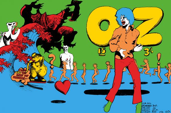
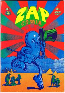
series which was originally part of the youth counterculture of the 1960’s. I was immediately drawn to the intense colours and traditional cartoon style of the 1960’s/70’s, the use of dark blue as an outline and shadow still define the main focal point just as much as a black outline would, keeping to the colour palette. ZAP Comix focussed on psychedelic imagery and had references to sex and drugs much like the rest of counter culture art.


Oz Magazine Covers, http://ro.uow.edu.au/ozlondon/

Oz Mag research, http://ro.uow.edu.au/ozlondon/  and  http://ro.uow.edu.au/ozlondon/

Zap Comix, http://ro.uow.edu.au/ozlondon/ and http://ro.uow.edu.au/ozlondon/


Authenticity – Task 4

Is it possible to be truly authentic?

The Oxford definition of authentic is; of undisputed origin, not a copy. I believe that it is difficult to be considered as truly authentic. As creatives, we constantly draw inspiration from our peers and other sources and use this to develop our work further-it is not copying; however, it is using others work as motivation to produce stronger, more developed work. This use of inspiration and referencing can only go so far before it pushes upon the boundary of being a recycled replica.

‘It’s not where you take things from – it’s where you take them to.’ – Jean-Luc Godard. Since we have been exposed to so much influential artwork I feel that there is a thin line between being honestly authentic and dishonestly authentic, bordering on plagiarism. Which is why, as creatives, we must be careful when drawing inspiration from others work to not use it as a foundation to replicate, but use it as a resource to help inspire our work further.

Modernism was branded as being a deliberate rejection of the past, sparking an interest in new, experimental materials and painting styles. I believe some of the values of Modernism relate to current contemporary practice, artists today are still using aspects of this movement to inspire their works in a genuinely original way.


Oxford Dictionary, https://en.oxforddictionaries.com/definition/authentic

‘It’s not where you take things from – it’s where you take them to.’ – Jean-Luc Godard        https://www.goodreads.com/author/quotes/179794.Jean_Luc_Godard

‘Technology is the mortal enemy of art’ – Task 3

‘Technology is the mortal enemy of art’

Technological advances have allowed art to reach a variety of different platforms enabling more people to create and observe it, without technology art would still be limited to its traditional practices. I disagree with the statement ‘technology is the mortal enemy of art’ as technology has helped push forward traditional practices and have enabled these practices to evolve and flourish into new and innovative works of art. Over the last few decades art and technology have become increasingly tied together; whether it be through a new way of exhibiting work on social media, or creating and experimenting with art on modern software such as graphic tablets and computers.

Technology has allowed artwork to be produced much faster, for example photography and the processes that were involved in developing images has been decreased massively with the drastic development of camera technology; allowing photographers to edit their images and print them in a very short period of time.

It is argued that technology impedes creativity, however I believe that technology strongly influences it, more people are enjoying and appreciating art through the internet and are increasingly involving and immersing themselves within the creative universe. It brings people together and encourages them to create work for others to see.


DANCHEV, A. (2011) 100 Artists’ Manifestos: From the Futurists to the Stuckists, Penguin Modern Classics.

RODCHENKO, A.  Who We Are: a Manifesto of the Constructivist Group


Comparing Images – Task 2

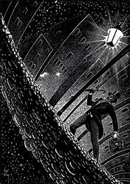
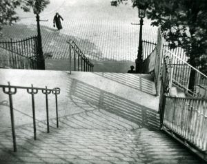
The first image I have chosen is a photograph taken by Andre Kertesz, The Stairs of Montmarte, Paris (1926). I particularly like this photograph as there is a strong sense of perspective which creates a central focal point, the lack of colour also adds contrast emphasising the darker subject matter and shadows; the composition allows the viewpoint to shift throughout the photograph and follow the direction of the shadows. Light plays an important part in the composition of the image as it has distorted and elongated the shadows making unusual patterns appear on the floor, the stairs further distort the shadows breaking them up more and dispersing them further throughout  the image.

The second image I have chosen is an illustration by Virgil Finlay from the book The Angry Street by G.K. Chesterton. Compared to the first image, the subject matter is very similar in regards to public places, however the perspective in this image is much more distorted creating a more dramatic atmosphere. Light and shadow play an important part within both images, making certain aspects of the image stand out more than others. For example, the light in Finlay’s illustration severely contrasts against the black, the white outlines around the subject matter also allow certain aspects of the image to stand out more than others acting as a highlight to outline the image. Similarly, the shadows in both of my chosen images have been distorted in a way which reinforces the composition.


The Angry Street – G.K. Chesterton (1947) Interior artwork by Virgil Finlay.

Andre Kertesz – Stairs of Montmarte, Paris. (1925)


Terminal Bar

For the start of the RCS module we watched a short film called Terminal Bar.

Terminal Bar (2002) is a short documentary film centred around ‘one of the toughest’ bars in New York City, directed by Stefan Nadelman. The documentary presents a series of photographs taken by bartender Sheldon Nadelman, Stefan Nadelman’s father, from 1972 to 1982, the photographs taken are black and white portraits of the bars hard-drinking, gritty regulars each assigned a number which they are often referred to throughout the film-this gives the documentary a very systematic feel and paints a picture of an ‘old’ New York.

The people who appear in the portraits visibly age over the 10 year span that the photos were taken, making the documentary seem more authentic, and the kinetic quality of the documentary creates a fast paced atmosphere which could mirror the environment of the bar in the past. Depth and movement within the film appear to be important as the flow from photograph to photograph is smooth and uninterrupted as they move to the beat of the music this acts as a visual break as the music leads us through the stills making it purely visual.

Towards the end of the documentary, we are shown what was once the Terminal Bar as they revisit the old location, images of the bar from the past and present are shown which evokes a nostalgic atmosphere stating that ‘nothing has really changed’.