Author Archives: Lucy Holliday

Final Summary

Throughout the Research and Communications module, I feel that I have developed many different skills. These will not only help me throughout the rest of my degree, but in the future as well.

One of the most interesting lectures for me was the week 2 lecture about academic writing and critical thinking. It was highly beneficial to learn how to construct a comprehensive essay, that doesn’t necessarily have to be boring. Critical theories were something I had never come across before but I soon realised that they can apply to any kind of work or piece of writing that you look at. I feel that if I use these critical theories when writing essays in the future, I am more likely to write a more interesting, conclusive and relevant essay.

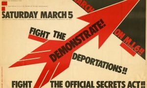
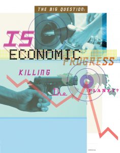
In terms of the regular lecture series, looking through the history of design in chronological order was fascinating. You could really start to see how societal issues influenced designers, and how the contemporary designers took influence from previous ones. This is a skill I can definitely take with me throughout my degree; being inspired by looking at major issues in the world and responding to these in a graphical outcome to make my work current and relevant. I now realise that researching designers both traditional and contemporary is key. There is nothing wrong with taking inspiration from what has already been done and making it your own, this is a key lesson I learnt when responding to the question “Is it possible to be truly authentic?”.

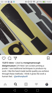
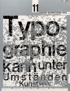
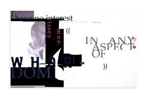
For me, one of the most influential references from the lectures was graphic designer, Wolfgang Weingart. Before the lecture I had not previously heard of him or seen any of his work. After the lecture, I began researching him in more depth. I really began to appreciate his work. His experimental approach towards typography is inspiring, different and something I plan to develop myself in the future, once I have gained more experience. By looking at his work and style, I feel as though it could give me a lot of knowledge in terms of technique and how I approach a typographical task myself.

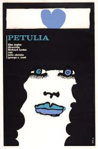
In general, the Research and Communications skills lecture series was something that I found very useful and interesting. Learning about so many different art movements throughout history and the artists and designers that created them, in such a short space of time was invaluable. The series as a whole has provided me with a wealth of references and extra knowledge that I can use in both research and my own work. Without the Research and Communications series, I would not have heard or researched massive movements in history that I found very inspiring such as Underground Culture.

Publish or Perish!

David King was an important graphic designer that worked and produced protest posters/material for the Anti-Nazi and Anti-Apartheid Movements. The image below is his ‘1977 poster for a march against the Official Secrets Act’.

King had always been interested in the Russian Revolution and I feel as though this is reflected in his style of design. The heavy, bold typefaces in capital letters and the colour choices of red and black; his work reflects that of Rodchenko. King’s work gives a powerful message and feeling of strength and resistance that was desperately needed during these times.

During the 1960’s and 70’s, the film industry in Cuba was becoming another way to promote political agenda. Due to the economy, the budgets for posters wasn’t very large. This meant designers were steering away from complex designs and refining them instead. An example of this would be from Eduardo Muñoz Bachs.

The posters that he designed were much more simplistic, often with a limited but bold colour palette, simple typefaces and composition. This created an interesting, new style of poster. The simplicity tells a story of the difficult financial times but creating something new and beautiful because of it.

In a similar way to David King and Eduardo Bachs’ posters, another, more recent poster that tackles a world issue is: “Adbusters: The Big Question, 1999” by Jonathan Barnbrook in collaboration with Adbusters.

The poster was designed for the G8 summit in Seattle. I find the design of this poster very effective. The relevant imagery provides instant associations with world issues caused by the economy. These combined with the carefully considered choice of typefaces work very well to convey the purpose of the poster and the importance of the question being asked. I like how the rectangular areas are broken up by the erratic and plummeting graph line- this makes the poster even more striking.

Researching these posters has made me realise the impact and influence that good graphic design can have on the world. They communicate such important issues and grab the attention that is needed to make change in world.


References:

  • Hollis, R. (2016) David King Obituary. Available at: https://www.theguardian.com/artanddesign/2016/may/25/david-king-obituary (Accessed: 30/11/2017).
  • Hawkins, A. (2015) The beautiful film posters of post-revolutionary Cuba . Available at: https://www.itsnicethat.com/articles/cuban-film-posters (Accessed: 30/11/2017).
  • Barnbrook, J. (2017) Adbusters:The Big Question. Available at: http://www.jonathanbarnbrook.com/work/adbusters-big-question/ (Accessed: 30/11/2017).
  • Barnbrook, J. (1999) Adbusters: The Big Question. Available at: https://i.pinimg.com/originals/1f/30/13/1f30134a0a6ca36be62ad0d7b8bb0ba9.jpg (Accessed/downloaded: 30/11/2017).


Postmodernism

Postmodernism is an art movement that specifically goes against the principles of modernism. Modernist artists looked for definite answers and clarity on the world whereas postmodernists questioned the world and its truths, looking more into personal experience.

This idea of exploring personal experience can be seen a lot throughout the work of Tracey Emin. One of her most famous and controversial pieces is the installation “My Bed” created in 1998. Having seen the piece in real life, it is shocking. It completely goes against the ideas of the modernist movement. It’s messy, chaotic, dark and full of emotion. Although this installation is more fine art than graphic design, the shock factor and controversy is what interests me about the work. I like the idea of making people think strongly about my work which is exactly what she achieves.


Modernist ideas and values were also being rejected in the design world. Take designer Wolfgang Weingart and his experimental typography:

The actual typefaces that Weingart used were very similar if not the same as those used by the modernist designers. What Weingart did however, was to take this perfectly constructed Swiss design and deconstruct it. Putting elements at unusual angles, covering some of the type and layering things up.

“I experiment simply to broaden my knowledge of the vocabulary and techniques of typography. What gives me satisfaction is the practice, not the theory.” (Weingart. W, 1991)

As someone with a passion for typography, Weingart is a great designer to look at. I think it’s so important that we as designers continue to explore the limits and variations typography can provide.


Another designer that goes against traditional layouts and typography is David Carson.

This piece of design was for an interview with the singer Morrisey. He found a quote and took it apart, placing the words all over the page, covering half the face of the artist to look ‘mysterious’. This crazy approach to design completely reflects the ideas of postmodernism- to experiment, to stop conforming to these perfect ideals.

Carson’s experimentation with page layout is something that really interests me and definitely something that would be important for myself to look at as I continue to design.


References:

  • Tracey Emin’s My Bed: TateShots (2017) Available at: http://www.tate.org.uk/context-comment/video/tracey-emins-my-bed-tateshots (Accessed: 16/111/2017).
  • Reputations: Wolfgang Weingart (1991) Available at: http://www.eyemagazine.com/feature/article/reputations-wolfgang-weingart (Accessed: 16/11/2017).
  • Burton, P. (2017) Wolfgang Weingart. Available at: https://www.aiga.org/medalist-wolfgang-weingart (Accessed: 16/11/2017).
  • Butler, A. (2017) Interview with Graphic Designer David Carson. Available at: https://www.designboom.com/design/interview-with-graphic-designer-david-carson-09-22-2013/ (Accessed: 16/11/2017).


Counter Culture- 1960’s and 1970’s

Counter culture was a movement that developed post war during the 1960/70’s. During this time people were looking towards a much more positive future. This was an era of love, drugs, liberation and freedom. This led to new and exciting art and design.

The style of typography that was used changed massively during this era, it became a lot more expressive of the mood and spirit of the time. An example of this would be the work of Seymour Chwast.

These examples of his typography were created between 1964 and 1978. The type looks very psychedelic and fun. I feel as though this is down to the extreme curves, use of multiple lines and repetition. 

Perhaps some of the most iconic images of the psychedelic era were produced by Victor Moscoso. This poster “Neon Rose #2” was produced in 1967 and was extremely popular. I believe this is due to the bold composition and even bolder choice of colours.

“My work was about the craft of putting opposing colours together. It had nothing to do with acid” (V.Moscoso, 2010)

Although poster was made very specifically for the era, as an aspiring graphic designer I can take a lot from his work such as colour theory and composition. 

As society was changing, so was the music and in particular the album artwork. An example of an iconic cover would be “Boston- More Than a Feeling” designed by Paula Scher.

The cover was prooduced in 1974 but even decades after it was produced, people are still fascinated and love the cover. Scher cannot understand why and says that:

“The Boston cover is dumb (…) I am still mystified by how something like that really resonates in culture.” (Scher. P, 2017)

I think it was so successful because of the era it was created in. To a certain extent it is ‘dumb’ but people were interested in the weird and the humorous. The cover is bold, colourful and fun, just like the era in which it was produced.

I feel as though the counter culture movement is a great example of art and design reflecting what is happening in society at the time. The artists took risks but produced work that people loved and needed. I think this is still important to remember as someone in the creative industry today.


References:

  • Seymour Chwast Archive (2017) Available at: http://seymourchwastarchive.com/collection/assorted-typography/?c=1960s (Accessed: 16/11/2017).
  • Moscoso, V. (2010) ‘Victor Moscoso’, Grafik, Issue 181
  • Victor Moscoso (2017) Available at: http://www.victormoscoso.com/gallery1.htm (Accessed: 16/11/2017).
  • ‘Paula Scher: Graphic Design’ (2017) Abstract: The Art of Design, Series 1 episode 6, Netflix. Available at: www.netflix.com (Accessed: 16/11/2017).
  • Heller, S. (2015) The Atlantic, More Than a Feeling. Available at: https://www.theatlantic.com/entertainment/archive/2015/03/the-immortality-of-the-more-than-a-feeling-cover/388739/ (Accessed: 16/11/2017).

Is it possible to be truly authentic?

The definition of the word ‘authentic’ is to be “not false or copied; genuine; real”. The question is though, is it possible for art to be truly authentic?

In my personal opinion I feel that to create art or a piece of design, you have to be influenced by something or someone. In today’s ever evolving society, it’s impossible not to be constantly bombarded with art and design wherever you go. Even subconsciously we’re always absorbing this information.  However, there’s a big difference between being influenced by something and copying something. If you take your influences and create something that has never been done before, then in my opinion, that makes your work authentic.

A quote that reflects a similar opinion is:

“The new artist does not imitate, he creates. He does not describe, he designs.” (Theo van Doesburg, 1931).

Not only does this quote sum up the idea of authenticity, but also the principles of Modernism. To reject the styles of the past and experiment with new materials and ideas to create work that reflected a new, modern society.

I think these principles definitely still hold firmly in today’s contemporary practice. Artists and designers are always looking for new ideas and ways to create work. With so much going on in the world, designers are constantly changing their approach to reflect what is going on in society- just like the Modernist movement.


sources: Modernism, Designing A New World, Victoria & Albert Museum 2006

“Technology is the mortal enemy of art.”

“Technology is the mortal enemy of art.” (Rodchenko, A. Gan and Stepanova, 1922, pg.220). This quote written in “Who We Are: Manifesto of the Constructivist Group” is a very interesting quote to me as an aspiring designer.

This quote was written back in 1922 when ‘technology’ barely existed compared to nowadays. As someone studying graphic design in the 21st century I mostly disagree with the quote, however, I can appreciate where they are coming from. In today’s society, technology is so easily accessible that the possibilities of what can be produced are infinite. I personally have huge respect for how technology has developed the art world. What would’ve taken artists hours/days to complete can now be done so quickly using modern technology.

In contrast to this though, I still really appreciate artists that continue to use traditional tools and methods to produce art such as graphic designer, Anthony Burrill.

Anthony Burrill


In the caption of this video, The Design Museum have quoted Anthony Burrill saying he believes that the methods he uses “gives the work a human feel.” I completely agree with this as I feel sometimes digital work can become very flat and lacking of tiny errors and qualities that make hand produced works, unique.

In conclusion, I feel that the quote “Technology is the mortal of art” is not completely true. Technology has and will continue to benefit and develop the art world. However, I think it’s equally as important that we do not forget traditional ways of producing art and keep using these well into the future.

References:

Danchev, A. (2011) 100 Artists; Manifestos. London: Penguin Books.

Burrill, A. (2017) . Available at: https://www.instagram.com/p/BaBe2s9hYqJ/?taken-by=designmuseum (Accessed: 29/10/17).


Top Girl Studio and Polly Nor

Top Girl Studio is a freelance graphic design studio, set up by Central Saint Martin’s graduate-  Anna Porter. One project that particularly stood out of hers, was the project “iGirl”.

https://www.creativereview.co.uk/new-talent-top-girl-studio/

image found at: https://www.creativereview.co.uk/new-talent-top-girl-studio/

The aim of this project was to look at today’s millennials and their desperate quest for the perfect social media feed and the lengths that people go to, to achieve it. The tone of the project is highly sarcastic yet ironic as Porter admits herself:

“It’s all about how many followers you have and having the perfect ‘feed’ but when we take a step back, its stupid. Yet we all do it, including me. I wanted us to laugh at ourselves because the joke’s on us.”

I feel as though the work is definitely focused more around females from the heavy use of pink, which is stereotypically a feminine colour and the words are phrases you’re most likely to hear a women say.

Similarly, illustrator Polly Nor focuses her illustrations around females and their demons.

http://www.pollynor.com/Babe-You-re-Going-To-Be-Fine

http://www.pollynor.com/Babe-You-re-Going-To-Be-Fine

Her work is a feminist statement on how women are expected to be sexually attractive yet they can’t be sexually promiscuous. She believes very strongly in equality between genders and that

“young girls are being taught that they are submissive, sexual objects for men to leer over, use and control, and led to believe that their value lies wholly in how sexy they are.”

Both Anna Porter and Polly Nor look at feminism and the worries/struggles of a female in the 21st century. Gender equality is still a major issue in society and both of these artists are using their work to successfully promote this issue.


References:

  • Creative Review (2017) New Talent: Top Girl Studio. Available at: https://www.creativereview.co.uk/new-talent-top-girl-studio/ (Accessed: 18/10/17).
  • Carlton, Cajsa. (2015) Interview: Artist Polly Nor. Available at: http://www.coolhunting.com/culture/interview-artist-polly-nor (Accessed: 18/10/17).
  • Polly Nor. (2015) Babe You’re Going To Be Fine. Available at: http://www.pollynor.com/Babe-You-re-Going-To-Be-Fine (Accessed/downloaded: 18/10/17).

Terminal Bar

The short film ‘Terminal Bar’ by Stefan Nadelman was full of different film making processes and effects. Almost the entire film is created from stills of photographs taken by Stefan’s father between 1972-1982. I found this father/son aspect very interesting. It added something personal to the film. The father took 10 years recording something that interested him and then his son recorded the same story but in his own way. Knowing the photographs were recorded over such a long period of time and were such a labor of love, gave the film a sense of passion about the subject which you could really feel throughout the film.

In terms of visuals, the photographs themselves were very striking but when paired with the music, speech, newspaper articles and graphics throughout the film, they became even more so. They began to tell the story and atmosphere of the bar. After a while I forgot that the film was made from stills as the speech overlay from Stefan’s father told the story and described the pictures.

As the pictures were taken over a time frame of 10 years, the chronology throughout the film was a very key theme. These combined with the newspaper articles from the same time period gave a quick history of those 10 years, almost as if you were there. Another interesting aspect of the film was when Stefan’s father re-visited the location of the bar and said that nothing had really changed in the area even though it had been years ago.


References:

  • touristpictures (2013) Terminal Bar. Available at: https://www.youtube.com/watch?v=xfWBbZBqYjo (Accessed: 11/10/17).