Author Archives: Bethany Jarrett

Task 12

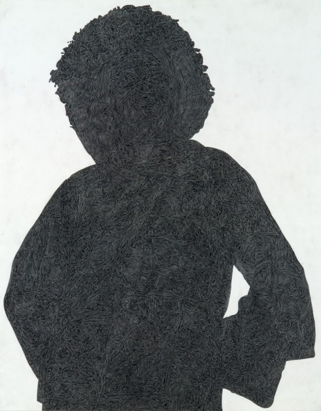
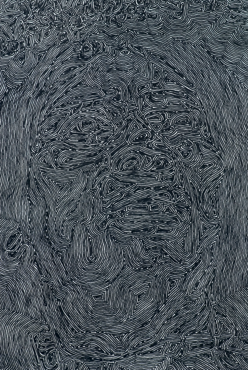
For this task, I am looking at the work from artist Alex Brown, the piece shown above is an ink drawing on paper, size 28×22 inches a little bit smaller than A1. In the first image, you can clearly see the outline of a person which comes across as a silhouette, creating simply the presence of a person. When you look closer to the drawing you can see many details of swirled lines which outline features of the drawing.

Considering this piece is already fairly large I’m going to imagine it on a much larger scale, as though the work was bigger than the viewer. This would create more of a chaos, similar to the effect of Monet’s water lilies, a picture would not do it justice. Brown’s technique of adding detail in such an intricate way would need to be increased, maybe even add to the background or work with the negative space. If you were to do the same pattern in the background, then the person would blend in and the idea of the presence of the person would no longer work. However, blowing this piece up into such a larger work would have a great impact on the viewer, especially when getting close and being able to see all the small intricate patterns within the silhouette of the person.

Task 11

Research and communication skills has got me thinking in ways I wouldn’t usually, with each task testing my abilities and thought processes. Also, applying these different ways of thinking to the projects set and giving me new and exciting insight on ways to develop my practice has helped. Especially when reviewing and reflecting on gallery visits, this has made me think about what I have seen in a different perspective. As well as helping me to apply and think more about the theory behind what I have been creating.

The task to ‘devise a mode of practice’ initially struck me as something which I would struggle with, however after giving it some thought and applying my current practice to the question I soon got very much involved with this task and enjoyed it thoroughly. And so, the blog has been a great way to reflect on my work throughout semester one and to improve my writing skills. Overall I believe that this module has been very helpful and I will continue to write blog posts which link to my work as it is extremely helpful to reflect and think about what I have been influenced by and where my practice is going throughout my development.

Task 10

10 words that represent my practice:

1. Disfigure
2. Organic
3. Distort
4. Mysterious
5. Emergent
6. Flourish
7. Meandering
8. Expressive
9. Figurative
10. Obscure

Image to represent my practice:

My practice is still developing and begging to meander down different paths. I have chosen some words to represent my practice which suggests how it’s changing and where I would like it to go such as, flourish and emergent as it is yet to be defined. However, I am starting to see elements which are reoccurring within my work. I particularly enjoy working with portraiture especially obscuring portraits in an expressive way. Working with different elements including, ink, paint, watercolours, Photoshop (overlaying) and even destruction of imagery. And so, I have also picked words which describe the way I have currently been working.

I have chosen a painting which I created a while ago, when I first decided to do a project on portraiture and experimenting with ways of hiding the face in an organic way. Since then I have come a long way with this single idea, yet it is one which I seem to keep revisiting, testing and developing further. The painting is a self-portrait line drawing using fine liner, then by using free-flowing shapes and inks to create a way of hiding my face underneath this colourful mess. Two topics which I am very much interested in now is identity, how we hide who we are from others and the way we pick up different traits from the people around us. Also, the psychology behind looking at imagery of a face which has been manipulated or drawn on and why that makes the viewer uncomfortable.

Task 9

Aesthetics, we all devise an ideology in our minds of how everything should look, we even have ideas for how the human face should be. Studies have proven that people tend to find a face more aesthetically pleasing when symmetry is involved, so when an image of the face is so deliberately distorted and disfigured how do you think this would make the viewer feel?

Julie Cockburn uses found imagery and manipulates them in different ways, she states “no image is safe after it’s entered my studio.” Cockburn’s piece The Lioness (2014) challenges the whole concept of an aesthetically pleasing photographic image of a person’s face. The geometric pattern used to cut up and mirror different areas of the face could be used as a metaphor, for how we idealize those who have symmetrical features. Yet this face has been mirrored so many times that it is no longer aesthetically pleasing to look at. Cockburn’s image makes the viewer uncomfortable, she has drawn out the person from the photograph and created a character from her own imagination. Also with these fragments, she has destroyed the memory which could have been locked within the image. However, you could suggest that Cockburn is inserting new life into forgotten and mundane images.

Why does looking at distorted imagery of a person’s face make the viewer so uncomfortable? This is a question which I would like to explore within the theory of my work. And it is a question which I believe Cockburn must have raised when creating her pieces.

Task 8 – To Appropriate an Image

Throughout the contemporary project, I have been sticking with a theme of ‘defaced’. By this, I have experimented with different mediums including photography, paint, collage, and drawing. One technique I enjoyed the most is experimenting with different destructive ways to destroy a photographic image, focusing on imagery of faces. Two of my main influences have been Gerhard Richter and Jackson Pollock.

Pollock’s paintings are something I admire, so I decided to appropriate an image of his work into my way of defacing imagery. I wanted to merge his work with my own, to create something organic. To do this I took some of my photographic imagery and some of my drawings, then put them into Photoshop placing Pollock’s image and my own over the top of each other. Then altering the opacity of the top image, thus creating a shadow of a face hidden beneath his colourful flicks and splashes of paint. Almost as though the face is hidden beneath the abstract work of Pollock’s painting. The technique of merging images together is one which I would love to explore further, and so will continue to practice in this style of work and consider the possibility of merging more than two images together, defacing the image of a face so much until the face can no longer be seen.

Task 7

The first text, Leo Steinberg “From Other Criteria” was published in 1972, during the postmodernism error. The text explores the changes in viewing art in your typical gallery setting, seeing the work horizontally rather than in an upright position like a human posture. Steinberg mainly focuses on the work of Robert Rauschenberg and quotes from Jasper Johns that “Rauschenberg was the man who in his century had invented the most since Picasso” Steinberg says that he created a new orientation when viewing works. Throughout this text, artists are named who have influenced this massive change in art. For example, Pollock, and Duchamp.

The second text, Richard Serra “From the Yale Lecture” written in 1990, focusing on the meaning of site orientated works and the difference between them and ones which are corporate funded. The text explores how there is a very definitive line between the two. Serra states how site-specific sculpture “has nothing to do with opinion or belief”, suggesting that this is a completely different type of sculpture compared to making something in the studio. He also firmly states how a piece cannot be made in the studio and then moved to be adjusted to a certain site. Serra goes on to outline how corporate-funded sculptures are like “puppet creators”.

Both texts explore two major changes in the timeline of art, from very different angles. Touching on the way we view art in a gallery and the way we create public sculptures, moving away from the norm of simply creating a painting for a gallery and simply creating a sculpture to support and promote in a public space. Yet both seem to have a mechanical sense to them, Rauschenberg starts to bring his work to life by suspending his 3D pieces in a way we would view a painting for example, when an exhibition came up with the theme of “nature in art” to come away from the abstract paintings being created in that time, Rauschenberg submitted a piece of square grass that hung from a wall. The square suggesting a frame and the grass suggesting nature. He thought out of the box and created a piece which still represented the theme but in a very controversial way.

Task 6 – Devise a mode of practice

During my research for the contemporary project I stumbled across Jackson Pollock and Gerhard Richter, both are well known for their techniques used to create their paintings. Pollock was known as an action painter; this is when the method used to create the painting is more important than the outcome. His style of drip painting using hardened brushes, sticks and basting syringes to apply the paint to the canvas from all different directions caused the action to flow from the instrument into the energy portrayed in the painting. Richter developed a technique where he dragged the paint across the canvas using a squeegee, usually over paintings and photography creating defaced imagery.

I am very intrigued by the way both Pollock and Richter work and so would like to devise my own way of working inspired by these two techniques. The idea of an action painter catches my eye and so does the idea of defacing imagery. Mixing these two together I have come up with a way of working by applying paint using ping pong balls, by covering the balls in paint and then bouncing them onto a large image or drawing. Where the paint goes on this image will be out of my control and hopefully, the splashes and prints from the balls will capture the movement and energy onto the paper, like how Pollock captured this in his paintings. The photograph or drawing underneath will be a portrait, as I am mainly considering how defacing portraits can cause the viewer to be uncomfortable. This is inspired by the way Richter applies paint onto photographs of people.

Task 5

MuseĂ© de L’orangerie Paris: Claude Monet’s Water Lillie’s

Many people have seen a photograph of the famous Claude Monet’s Water Lilly paintings. The series consists of 250 oil paintings, MuseĂ© de L’orangerie houses 8 of the great NymphĂ©as [Water Lillies]. These panels are assembled side by side all of which are the same height but vary in lengths so that they could be hung along curved walls in an egg-shaped room.

The major project inspired by a water lily garden occupied Monet for three decades, he started in the late 1890’s and the project came to an end in 1926 when Monet passed away. The word nymphĂ©a comes from the Greek word nymphĂ©, meaning nymph. The whole idea of this word which was used to give most of the painting’s their names comes from a classical myth. The myth attributes the birth of a flower to a nymph who was dying of love for Hercules.

When looking at a reproduced image of these paintings the viewer does not get an understanding of how the paintings had been composed in such a clever way. Standing in this egg-shaped room is overwhelming, the viewer is submerged by these beautiful oil paintings. Almost as though you are walking through Monet’s flower garden at his home in Giverny, Normandy. Being able to stand so close and see all the small brush strokes and colours which depict the water lilies is astonishing. When in the middle of the room the separate purples, greens, and blues which were so clear when close up, merge into this amazing scenery. The skylight windows create light which floods into the room and depending on the weather changing the atmosphere within. This makes it more surreal to the feeling of looking at what Monet was viewing. The paintings and their layout echo in the orientation of this building. In Monet’s words, his aim was to create “the illusion of an endless whole, of a wave with no horizon and no shore” this was defiantly achieved.

Task 4

Modern Contemporary Museum (Moco Museum) Amsterdam

Andy Warhol and Banksy

The Modern Contemporary Museum created by Lionel and Kim Logchies presented 50 different works from pop artist Andy Warhol and his show: Royalty. Alongside the British street artist Banksy with his unauthorized show: Laugh Now.

This exhibition provides the space needed to show the impact of these artists in a very softening way. The works complement each other in their surroundings of this old townhouse building, with the large windows creating natural light flooding onto the works outlining beautiful shadows from the trees outside.

A clear connection can be made between the works, the bright and vibrant colour pallets used in Warhol’s screen prints and paintings are also visible within Banksy’s work. Both use political and unspoken topics for the inspiration of their works, giving them much more impact. When viewing the two artists so closely together the idea can be questioned as to whether Warhol could have inspired Banksy’s work. And maybe, therefore, the two were put together, suggesting the differences and similarities between contemporary and modern art. Some of Banksy’s pieces occupy a whole wall space within the museum, and even a whole outside room was used to show one of his installations.

When observing the works ‘Campbell’s soup II’ by Andy Warhol with Banksy’s ‘soup can’ pieces, both exhibited within this show. You can clearly make a distinction between the two works in how similar they are. How Warhol’s painting of a typical soup can in his day and time, to the irony of Banksy’s soup can which is Tesco value. Maybe suggesting the idea that most people today can only afford Tesco value. These similarities are highly suggested throughout the show between each artists work.

P1230988 P1230995

Banksy- Flower Bomber                                            Andy Warhol- Love (1983)

Task 3


nl_part14

Nikki S. Lee Part (14), 2002 [photograph]

The image shown above is a photograph of the artist Nikki S. Lee. Lee is a Korean artist and filmmaker, often dressing up as different characters for her projects. The photograph is from her series of images based on the idea of observing people and guessing what their stories could be.

The photograph part (14) portrays a lady sat in the back of a taxi looking quite made up, however she is sat staring out of the window with an expressionless look on her face. The composition of the photograph has cut out the person sat next to her, leaving behind just his arm which is gently placed around her shoulder. Suggesting a relationship between the two. I believe that the expression posed on her face suggests an indifference in the relationship. He could be reaching out to her yet she has shut him off. The fact they are sat in a taxi raises the question of where could their destination be? The light coming in from the back window of the taxi creates areas of bright light and areas of dark shadows within the confined space. The light and the taxi could be creating a metaphor for their relationship. For instance, They could be on a new and unknown journey in their relationship hence why they’re in a taxi.

The whole curiosity of the image is rather intriguing and after looking at the image for not very long many questions can be raised. However, the viewer is not granted the answers to the questions they have. Lee has a recurring theme in her series of photographs named “parts”. The idea of an absent lover, achieving this like she has here by planning the composition so that the male figure is never fully present yet the idea of him is.