Author Archives: Man Fung

FINAL

After the attending ten weeks of research and communication skills lecture and writing responds to each lesson, I found that my research skill and reference skill have approved a lot. I became able to think more deeply and objective while comparing and narrating.

Starting from the first task, we were shown a show film—Terminal Bar, and we need to analyse it after watching. This was the first time for me to watch this kind of documentary film, unlike some perfectly made documentary video, this one is made in a more simple way. However, I think this style fits with the image of Terminal Bar and I found out sometimes imperfect can make something perfect.

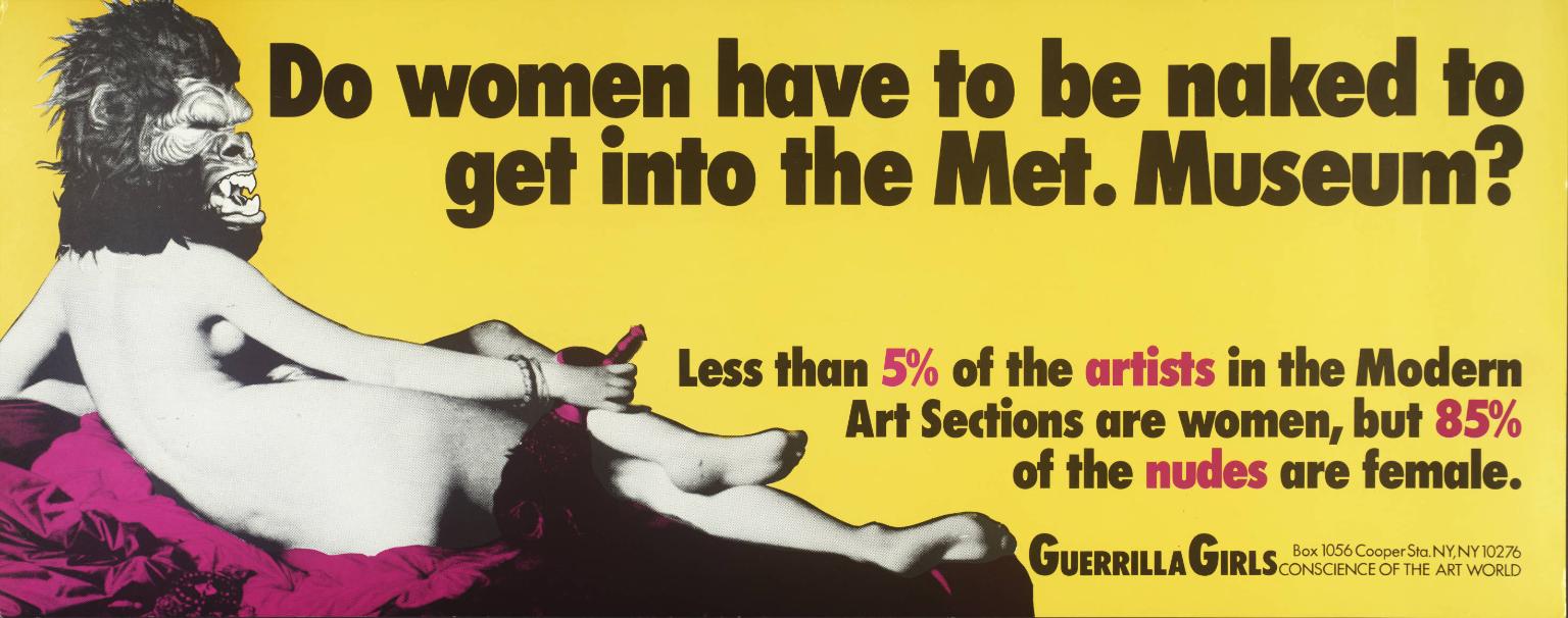
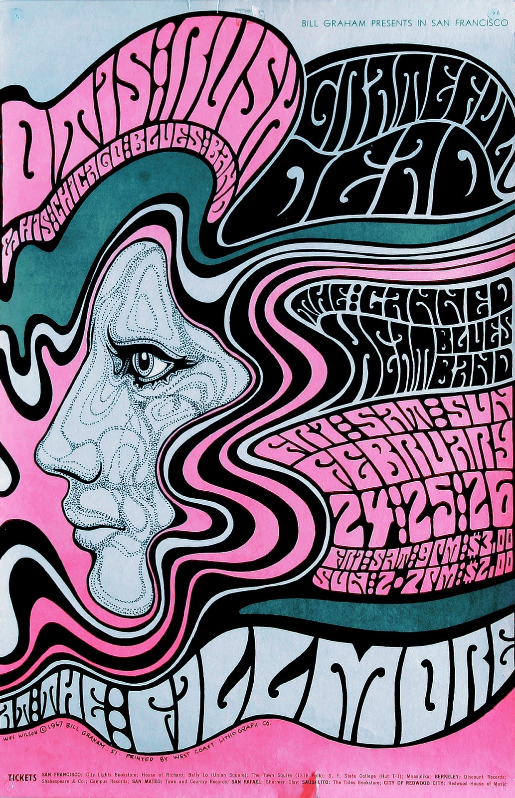
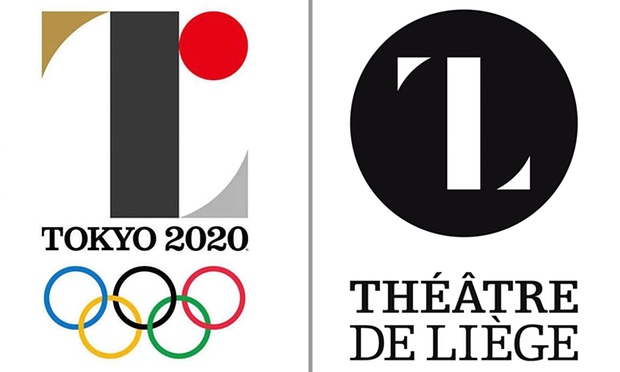
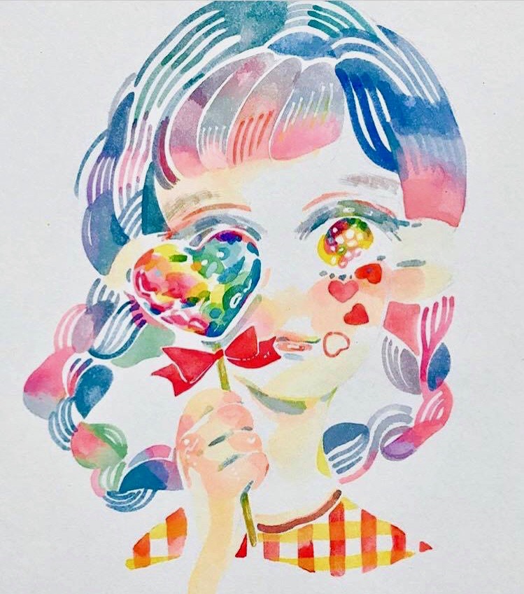
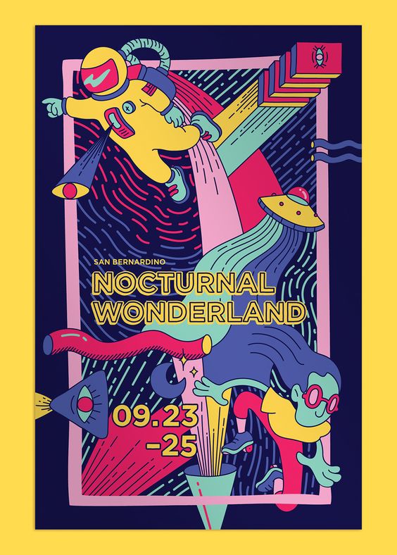
In Task 2, we were told to compare two select work by ourself. Since I always like to search for interesting graphic art on the internet like Instagram and Pinterest, so I choosed two art work from this two social media and try to compare them. Even I love to look at those beautiful art work, I do not really think deep when I look at them, through this analyse process, I paid more attention on the values and the way how the artist produce the work and I think the way how I look at an art work is changing.

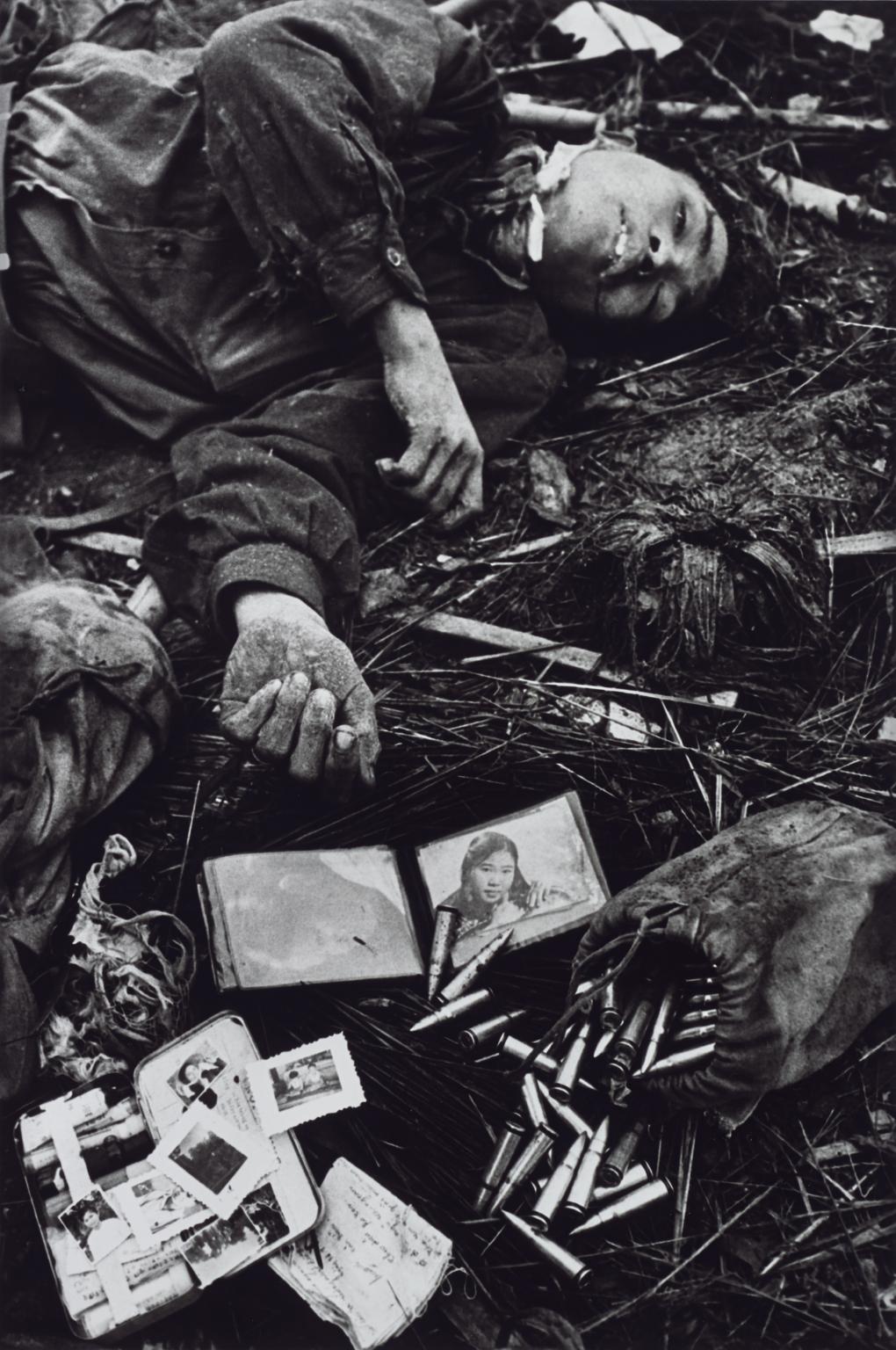
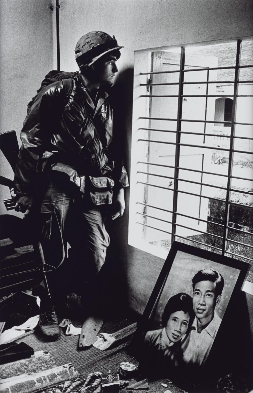
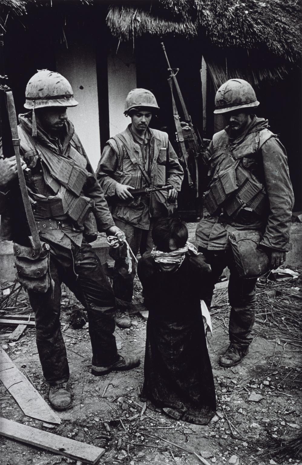
In Task 3 and 4, we were asked two theoretical question, the first one is asking about the influence of internet on art and the second one is about the possibility of being truly authentic. This two issue has always been an unsolved problem in the art world, everyone has their own points of view and while I am doing the research, I can see there is always different voice from different groups of people so I think having an ability of respect others’ idea.

In Task 5 to 7, we watched a Netflix documentary video on each lesson and I really love those videos and got so many inspiration from each of them. The artist in each series having a strong personality and showing their confidence through their work and I think this is what made them became successful and special. Moreover, the way that Netflix made the videos also impressed me a lot, they group the information with a lot of visual effect and made the videos very compact.

Overall, I have tried and learnt a lot of new things from this first semester RCS lecture. I can really push myself to look and analyse things more deeply and also learnt different issue and style in the art world, so I found I really did improved in my research and communication skills.

WEEK 8 : Documentary photography

Documentary photography is a tool to capture a moment and communicate with the people who is looking at it. A successful documentary photo can always tell the story behind even it is just a freeze moment, bringing the viewers travel back to the scenes where the photos were taken.

Don McCullin is a British Photojournalist and is known for his war documentary photography(1). During the Vietnam War which is also known as the Second Indochina War(2), Don was one of the war photographers and he has capture a range of photograph which reveal the ruthless side of wars. I choosed three works out of it. Both of them recounted how war damage the life of the civilian, they have no control of their important things and people and even their life. The photograph of the death young Vietnamese soldier with his possessions is the most shocking photo out of the three of them. The small photo of a girl in his wallet make a big contrast of the situation. It can easily tell that the girl is a very important person of the soldier, however they were being separate forever because of the war. This photo has not only told the story of this young soldier, but also represent a lot of civilians and soldiers which have similar story at that time. The next two photos are related to the ordinary Vietnamese during the war, the one that an American marine inside a civilian house with the couple photo ,and the one that an old Vietnamese civilian was tormenting by the US Marines are also another examples that shown the violence of war.

This series of photograph really brought me to a meditation because of the reality that they showed to me. These photos are way more powerful than any words because they were captured from the real moment of that period. They communicate with the real experience and that’s why they are so influential.

A Young Dead North Vietnamese Soldier with His Possessions 1968, printed 2013 Don McCullin born 1935 ARTIST ROOMS Tate and National Galleries of Scotland. Purchased with the assistance of the ARTIST ROOMS Endowment, supported by the Henry Moore Foundation and Tate Members 2014 http://www.tate.org.uk/art/work/AR01195

The Battle for the City of Hue, South Vietnam, US Marine Inside Civilian House 1968, printed 2013 Don McCullin born 1935 ARTIST ROOMS Tate and National Galleries of Scotland. Purchased with the assistance of the ARTIST ROOMS Endowment, supported by the Henry Moore Foundation and Tate Members 2014 http://www.tate.org.uk/art/work/AR01196

US Marines Tormenting an Old Vietnamese Civilian, The Battle for the City of Hue 1968, printed 2013 Don McCullin born 1935 ARTIST ROOMS Tate and National Galleries of Scotland. Purchased with the assistance of the ARTIST ROOMS Endowment, supported by the Henry Moore Foundation and Tate Members 2014 http://www.tate.org.uk/art/work/AR01199

Reference:
(1) Online: available from https://en.wikipedia.org/wiki/Don_McCullin
(2) Online: available from https://en.wikipedia.org/wiki/Don_McCullin

Photo: (Don McCullin, 1986)

WEEK 6 : Postmodernism

Following the development of art, it was interpreted as different forms in different moment in the history. Modernism was a style that is rejecting the style of at from the art, which is a big change in the definition of art. However, after the term of postmodernism appear in the history, the pointer of the evolution of art had changed again.

Since postmodernism is aiming to question the notion of how art should be and having a freedom to express different ideas. The works usually reflecting the problems from the society and having a deep personality in it. Because of this, postmodernism art has an ability to reveal the diversification of any groups of people in the society. For example, the poster ‘Do women have to be naked to get into the Met. Museum’ is a sample of feminist art, it said even though very few of woman can go into the modern art section but 85% of them are naked, it sharply pointed out the problem of the value of women in the current society. Since women are always used as a sexual element in tradition art, it deconstructed the rigid impression of the way how women appear on art. Moreover, ‘Whaam!’ is an example of comic art in postmodernism, it was created based on an image from All American Men of War, the work leaving an open meaning to the viewer which increase the interaction between them and the painting. To add more, Sandro Chia who is the artist of the work ‘Water Bearer’ having a unique style which his works were mostly about a boy or men with fish. The figures are always searching for something and I think the artist is also trying to reveal some social phenomenon.

In conclusion, following with the development of postmodernism art, the trend of art is requiring more and more personal thought and personality which is not only about making things look pretty and suiting everyone’s taste. Personal think this is a positive change since it can let artist to express their points of view for freely through their work.

Do Women Have To Be Naked To Get Into the Met. Museum? 1989 Guerrilla Girls null Purchased 2003 http://www.tate.org.uk/art/work/P78793

Whaam! 1963 Roy Lichtenstein 1923-1997 Purchased 1966 http://www.tate.org.uk/art/work/T00897

Water Bearer 1981 Sandro Chia born 1946 Purchased 1982 http://www.tate.org.uk/art/work/T03469

Reference:
Tate Modern– Postmodernism

http://www.tate.org.uk/art/art-terms/p/postmodernism

WEEK 4 : Is it possible to be truly authentic?

In the society nowadays, people always pursuing the authenticity and really clinging about it. While in the art world, a similar situation exsit and sometimes hinder artist’s creative thought.

It may be tricky when people talking about authenticity in art. Since copying and referencing can be arguable in an art work, but beside artists, we are all living in the world full of designed work. Poster on the street, videos on YouTube and even decorations at home are always influencing our mind of what designs look like. Also, there are a lot of successful artist’s style are influence by the artists before. So, I think to avoid single reference to other’s work is impossible in this technology society. However, it doesn’t mean that artist and designer can copy other’s work without thinking anything, I think we should always reference by the way other thinks and how they search for ideas. Moreover, it is also important to be honest and show reference if you really used other’s idea or work.

To add more, I think that the meaning of Modernism is to always challenge the grid of something obvious and try to get new ideas. Since the contemporary practice always require something exciting and improvement, so I think the principles of Modernism hold the value in the practice nowadays.

WEEK 5 : Wes Wilson

Wes Wilson is a famous American artist in 1970s, he was a poster designer for rock concert in the 1960s and was known for his psychedelic poster and type (Classic Posters, 2013), the wavy and melting look type style was inspired by the Art Nouveau masters (1). and his work influenced the next generation of designer until now.

The typeface is no doubt the most iconic elements in Wes’s posers, the waving strand of type and cryptic looking made them really suit with the meaning of rock music concert, making them a huge successful at that time. Also, the letters are filled with almost all the gap in the posters, which somehow looks like patterns and shapes and endue the spirit in the picture, I was really impressed by the way he make the type looks like shapes which break the grid of how front usually look like and made them more sensibility. Besides the typeface, the bright colors that he used was also another influential thing in his design. Inside of using harmonious colors, he had choosed to work with very contrast and clashing colors. This made the posters very eye-catching, since contrast colors are much more attractive compare to other colors combination and graphic designers are still using this theory nowadays. Moreover, I think he is a decisive designer, from the way he put colors and shapes courageously, you can tell he is unwilling to be ordinary and a thoughtful person. His work wasn’t just about how things will look good on a surface but also having their own story in each of them. Even though some artist disagree him at that time, but because of his persistence, he created his own style and standing as exemplar for modernism.

In a nutshell, I really like the way Wes Wilson design the front and making them collaborate with the color scheme. He is a designer who design with thoughtful idea and making his work impressibility which encourage me to think out of the grid more often.

Hardly Strictly Bluegrass Festival, Golden Gate Park, San Francisco, CA poster by Carolyn Ferris & Wes Wilson


Wes Wilson, 1965

Wes Wilson, 1965


Reference:

“Wes Wilson”, Classic Posters, Jan 2013

WEEK 3 : “Technology is the mortal enemy of art.”

It is no doubt that technology is a turning point of art development in the art history. It made the form of art became more diversification and popularize which make every stratum can have a chance to find out more about art. However, there is problems happening after technology influenced art.

Because of the convenience of communicate on the internet, art work can be spread out very wide and fast which is great for artist but also lead copying problems at the same time. Copyright has been protected by the law but the problem still existed. Example of it would be the first logo design for the Tokyo Olympic 2020 was accusations of plagiarism (2015). The logo that was blamed as plagiarism was replaced very soon after that. The second down side would be the electronic of art, it is nothing wrong about developing art into a digital way as I have said in the beginning of this article, digital art such as digital drawing can make editing become more easily and faster yet this may cause a risk that forcing artist not to use traditional art supplies. I think it is always very important to work with materials in a manual way which can build up a foundation knowledge of creativity.

Overall, I agree that technology is an important developmental milestone but at the same time, knowing how important is respecting others’ work and paying attention to tradition way of making art is an issue for all the contemporary practitioner.

(Logos compare side by side, BBC News, 2015)

WEEK 2 : Comparing

The works that I choose to compare is an illustration and a poster, they were choosed because I am most interested in illustration and graphic design. Since I always look for inspiration on Pinterest and Instagram, there is a lot of artist that I admire with, these are two example out of them.

The illustration was created by a Japanese illustrator (@ryu1_origin), she had a fantasy style in her work. Most of her work are young girl portrait and she always mixed with several colors but harmonious at the same time. The reason that I choose this work is because I like how the bright and dark color react to each other in it. Moreover, I like how she draw eyes in an unusual way, the eyes were drawn with yellow, green, pink and blue and make it really eye-catching.

The poster that I choose to compare with is made for a huge electronic music festival. Having a same feature with the illustration, a lot of attractive colors were used in it. However, they were not blended which shown a plentiful and alive style. To add more, the theme between these two are very similar too, they both having a fantasy and fictional style.

Overall, they are both inspired work for me and make me think more about how colors influence audience’s thought. Also, thinking out of the grid while matching the theme can make the work become more unique and attractive, be able to communicate more completely with the viewers.

(Instagram: ryu1_origin, 2017)

(Connie Van, Nocturnal Wonderland)

WEEK 1 : Terminal Bar (2002) —- review and analysis

This twenty minutes short film was mostly constructed with black and white portrait, which taken by Stefan Nadelman, the boss manager and bartender in the bar for ten years. Because of this amateur, the original history of one part of New York street in that decade has been well conserve.

Throughout the whole video, the portraits flow with the rhythmical background music, which can attract audiences to keep their attention on it. In the same time, the producer also added the interview of Stefan between the stories and used his voice to narrate to photos, his could give it a more realistic sense from the video.

For me, there is a part of Stefan interview which shocked me a lot—- the people will just step on the bodies that lied on the street. He said” you gonna see these bullies people disappear from the street, the street eats them alive.” This can clearly show how the place with people of all kinds and people just live for themselves. I think personification is an influential way to show a message because it is a much easy way the explain the situation compare with the complicated sentences. It also kind of reflect my inspiration of my work because I always believe that simple things can have big influence.

To sum up, I didn’t watch this kind of film a lot but it change my expectation of it at some point since the music and the story match very well, which gave me the motivation to find out more about the history.