Author Archives: Maisie Critchley

Task 12

For this task I decided to choose a large-scale piece of work called ‘Water Painting’ 1999 by Gary Hume. As it is small on the screen, I tried to imagine what it would look like in the flesh, being 3050 x 2440 x 21 mm.
Moving on, I imagined what the image would look like in real life, but much smaller in scale, such as postcard size. I think the figures would become almost unrecognizable and merge together on the page. This may actually be quite interesting and may even keep the viewer looking for longer as it creates intrigue as you have to unravel the image yourself.
In order to facilitate the transformation, I would place the image in a row with the rest the series of Water Paintings, and scaling them all down so they were all the same size. I would also make the lines of the drawings thinner. This is so that when the image is scaled down, they wouldn’t become too thick and messy, I wouldn’t want the image to lose its primary characteristics of being a simple line drawing. Furthermore, images that are made smaller, tend to lose their main appeal of being big and bold and eye catching. Thus, in order to refrain from losing this trait, I would intensify the colour palette, otherwise the image may look quite dull and unappealing.
On the other hand, if I was to make the image much bigger, billboard size, the lines would have to be made much thicker and brighter. This is so that they do not become lost within the colour of the background which could happen if it was looked at from afar. I think this image in particular would benefit from being much larger as it would almost be like the figures were looking down on society.

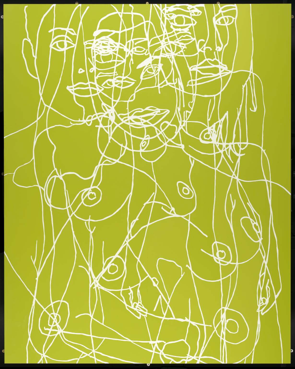
Water Painting 1999 Gary Hume http://www.tate.org.uk/art/work/T07618

Task 11

I have found many of the Research and Communication Skills tasks quite challenging, particularly task 7 to which we had to summarise, reflect and comment on the relationship between two texts. I think I found this task quite difficult because it was such a vast amount of text which I had to read and understand for myself, which was quite daunting. I learned that I had to be very patient with myself for this task, I had to analyze the script and depict the most important aspects for the essay of 250 words. This skill will help me in the future as I will be better at getting straight to the point in my essays rather than adding irrelevant information.
Many of the tasks, such as task 3 and 9 have made me think more openly towards artist’s work that I may not have normally been interested in. Particularly task 3 to which we had to choose out of 4 images given to us and analyze it. I chose RenĂ©e Cox’s Hot-en-tot Venus, 1994 photograph to which I discovered had a very interesting meaning behind it, and the artist herself was a very powerful figure. If it wasn’t for this task, I probably would have never have discovered her work.
The blog has also helped me to become more reflective on my own work as well as when looking at artist’s work which benefits my research for the projects. It benefits me because I tend to discover more about the work than I had before, as I go into more depth in analyzing it. This helps me in my own practice as its good to know how other artists work and what inspires them.

Task 10

  • layered
  • coloured
  • textured
  • bold
  • small-scaled
  • subtle
  • vibrant
  • distorted
  • obscured
  • abstracted

I chose this particular picture because it is a perfect example of my work as a whole, as I have been combining abstract painting and photography. I have chosen these ten words because these are most suitable to describe the picture and the emotional response I have to the piece and other aspects of my work.
I have chosen the word ‘layered’ as I tend to enjoy experimenting with depth using colour, creating layers upon a flat image. I also have been experimenting using different mediums in one image. For example, this image was once just a photo to which I then painted some thick yellow lines down the face in order to hide any emotion. I then photocopied it and made it black and white with blue stripes, I then re-uploaded the image onto my laptop and placed some work by Liu Wei upon the top.
Colour is very important in my work, particularly vibrant colours. I like to see the effects that the same images but of different colours have on the audience. I find it interesting how the difference in colour effects how the viewer perceives the image or what they think the meaning behind it could be.
Furthermore, I have been looking into textures and how different materials effect the image, although this isn’t the case with this image. In other aspects of my work I have been using materials such as cling film and tissue paper to cover the face and distort it. I often photocopy the piece which leaves an image to which can be quite uncomfortable to look at, because it looks as though its more than just a flat surface. Creates an illusion of texture.

Task 9

For this task I chose to look at Gerhard Richter’s 48 Portraits. He completed a series of 48 photographs, and 48 paintings (1972) to which were almost identical. In order to ‘limit the significance of the particular individuals portrayed’ including Albert Einstein and Oscar Wilde, he made the images all black and white, the subjects were all wearing smart attire and were all positioned on the page so that only the head and neck of the subject is included. The paintings created were deliberately soft-looking in order to resemble an un-focused camera and were completed for the German Pavilion at the 1972 Venice Biennale following the artist’s nomination as Germany’s representative. The series is often switched around and rearranged depending on where they are being installed.

Richter often softens and blurs the paintings in order to suggest that something (often the emotion) within the subject is missing or ‘lost in translation’, leaving a ghost-like, hallow figure. The process of blurring the images is a very natural practice and often creates an unexpected result each time. This links very closely to abstract expressionism, in which the paintings look very quick and involve fast, brash, brush marks. Richter however, uses a very particular technique to which he wets the canvas and uses a dry paint brush to apply the paint meaning that the brush marks are often invisible, looking more like a digitally altered photograph than a painting. Due to this, Richter is very difficult to pin down into one category as he works as both an abstract artist and a realistic artist, combining painting and photography.

48 Portraits 1971-98  http://www.tate.org.uk/art/work/AR00025

https://brooklynrail.org/2015/02/art/demystifying-gerhard-richters-gestural-abstraction-painting-in-the-gap-between-abstract-expressionism-and-pop-art
http://www.tate.org.uk/search?q=gerhard+richter+48+portraits
http://www.tandfonline.com/doi/abs/10.1080/17540763.2014.933399?journalCode=rpho20
https://www.gerhard-richter.com/en/art/paintings/photo-paintings/portraits-people-20/48-portraits-5860
https://www.gerhard-richter.com/en/exhibitions/la-biennale-di-venezia-36-esposizione-267
https://en.wikipedia.org/wiki/Venice_Biennale

Task 7

The given text Leo Steinberg (b.1920) from Other Criteria explains how art has changed from being flat and revolving around a classic horizontal image, corresponding with the human posture to no longer being painted for a wall, instead it was art for itself. The flatbed picture plane was once horizontal as it was said they are more natural, harmonizing with an erect human posture. The natural element of this was said to ‘evoke sense data’, meaning that as an audience it would be recognisable and familiar, maybe even relatable as we can see our own form within the image. Even Pollock, an abstract expressionist followed this flatbed picture plane rule. The process of making the work on the floor was just a means to an end, because eventually he would sit the work up on the wall and let the paint take its natural course and drip down the canvas. Even the fact that the paintings were hung upright corresponds with this rule again. In this respect, Steinberg claimed that abstract expressionist artists were still just nature painters. Even artists such as Rothko and Willem de Kooning followed this rule. Steinberg claimed that the biggest change in art was Rauschenberg and Dubuffet. Their work no longer followed the flatbed picture plane rule, it still however hung on walls, but it didn’t correspond with the human form like previous work has. The process of how the painting was made became more important than the composition of the image. According to Steinberg, the tilt of the flatbed picture plane is just as expressive than the shift from nature to culture within subject matter.
In text two, Richard Serra (b.1939) from The Yale Lecture focuses mainly on the practice of sculpture. Similar to how Rauschenberg works, mentioned in the text above, Serra is also a very process-based artist to which the material and industrial quality of the work is more important than the aesthetic quality. Serra doesn’t produce work to be sat in someone’s house and admired, or to just be looked at by gallery goers, but work for everyone to view. He produced work so that it became part of the environment to which it was built in. Serra’s site-specific works cannot be shifted and moved to one place or another like many paintings can, they are ‘inseparable’ from the site, due to the scale, mass and even the social and political elements which was considered in the making of the work. Both Serra and Steinberg talk about the importance of moving forward with art and how it is viewed by the public.

Click to access Harrison_Charles_Wood_Paul_eds_Art_in_Theory_1900-1990_An_Anthology_of_Changing_Ideas.pdf

http://www.theartstory.org/critic-steinberg-leo.htm

Robert Rauschenberg and “The Flatbed Picture Plane”


Task 8

For this task, I wanted to use a piece of work by an artist that I had already looked at for my project so that I could link it into my work. My project is focused on hiding facial expressions in order to create curiosity as to what is hidden beneath or what has been removed from the image. I wanted to withhold the information from the audience by painting abstract images over the top of a photo or placing materials over parts of the face whilst still revealing slight aspects, so for this task I chose a piece of work by Kathryn Andrews. In her work she places two black blocks over a face. There’s a clear juxtaposition between the colourful, flowery, soft image of the person and the blunt, overpowering blocks; clearly stating that something is hidden underneath. I decided that this image would be interesting to overlay on one of my photographs as the effect of the black lines may be different if they are less sharp and less extreme. I chose a photo that I had already worked into as I wanted it to stand out beneath the black and also because paint is very important in my work. I discovered that merging the images worked well as long as the artists’ work was faded more than my piece as I didn’t want my piece so be completely covered. I particularly liked how the two faces created an illusion as they align in some places which is quite interesting and not something I thought would occur. I may take this idea of merging different faces together and develop it further by possibly using more than two different faces all with different expressions and experimenting with how the colours of the images affect the outcome and the overall piece.

Task 6

The mode of practice I have chosen to explore is the process of destruction. I briefly did something similar during college and learnt about Robert Rauschenberg’s Erased de Kooning piece to which he asked Willem de Kooning for an original piece of his work. Rauschenberg was successful and destroyed the art work by completely ‘erasing’ it, leaving just a blank page. He did this by literally rubbing out the ink, the pencil and the paint marks. Thus, creating a whole new piece of art from the destruction of a previous piece.
I could also link Gerhard Richter’s work to this, although he’s not actually ‘destroying’ anything, I think his individual practice and the outcomes are very interesting, particularly, Richter’s portraits. The way he uses his own photos of people, he ruins the idea of a typical photo by spreading paint across them or painting into them to create a blurry decayed image, in some cases.
I want to do something similar with my own photographs that I have taken of different people, however to push the idea further I may destroy them in other ways such as soaking parts of the photo in different liquids such as bleach, water, oil etc and examine the different outcomes. I could also cover them in thick glue or use simple, ordinary mediums found in my cupboard, i could also tear them or cut them up. I could link this to my own personal project by destroying only the faces or the people in the photos. The photos I could use will be specific to my project.


Task 5

I went to the David Zwirner gallery in London and saw a group of paintings by Josef Albers. At the time I had just discovered a love for abstract art and so seeing these paintings really inspired me. I found the compositions of his works especially interesting as he experimented with using all the same rectangular shapes, placing them slightly to the bottom of the canvas but each piece had a different lay out. He combined this with using a varied colour palette for each, exploring the visual results. This meant that the paintings were all very clearly linked yet quite different.
I originally came across Albers’ work through the Tate online and so when I saw them in person I was expecting to see flat paintings with print-like qualities but I was wrong. Instead I was able to see all the tiny, insignificant brush marks and the variations of thick paint and thin paint in different areas of the canvas, whether they were deliberate or not. His paintings were all very sharp and sleek which gave this kind of mechanical essence to them, as it doesn’t really look like a person could have painted such tight straight lines. There’s something about seeing an artist’s work as a collection, in person, it makes you realize the time and effort gone into the paintings, how incredible they are and the skill and mindset used to create them which isn’t something you understand through seeing them online.

https://www.davidzwirner.com/artists/josef-albers
https://www.davidzwirner.com/exhibitions/sunny-side

Task 4

I recently visited the Gagosian gallery, in London, where I saw Richard Serra’s huge scale sculptures. The sculptures were made from plates of industrial sized steel and took up the whole entire room that they were in. In one room were two cylinders of steel and in the other room was a huge structure to which you were able to walk around inside.
Due to the structure being so large and it’s being made from raw industrial material made me feel very small and fragile in comparison. When walking through the tiny corridor within the sculpture it began to get narrower at the top which felt very uncomfortable and quite intimidating as it was almost as if I was being trapped by this incredibly heavy object.
Richard Serra’s work explores how sculptures can be enjoyed both visually and physically, he wanted to create an environment for the viewer and not just create something to look at in a museum. Serra wanted the audience to be part of the art. He often created sculptures in the outside world so they can be viewed by everyone rather than only people who visit galleries, making his work universal but also controversial as he is known to have sued the American government for removing one of his works.
When I first saw Serra’s work they were arguably the most interesting pieces of art I have seen in a gallery, simply because I was so shocked at the vast scale within such a small room and the fact that it’s exactly not what you think of when you think of art; a huge industrial sized sheet of steel. Pictures seen of Serra’s art does not do it any justice, the intense feeling of seeing it in the flesh is lost.

https://www.gagosian.com/artists/richard-serra/artist-exhibitions
https://www.gagosian.com/artists/richard-serra
https://www.gagosian.com/exhibitions/richard-serra–nj1–may-07-2016
https://www.theguardian.com/artanddesign/2016/oct/13/richard-serra-review-nj-2-gagosian-britannia-street-london

Task 3

I chose RenĂ©e Cox’s Hot-en-tot Venus, 1994 photograph to analyse. In this photograph she uses herself as the subject matter. Cox is stood with her body facing to the side with her hands resting upon her hips, she has her head turned looking directly at the camera, straight at the audience. Cox is wearing fake breasts and a fake butt which is tightly tied on to her body using string which is clearly left to be noticed.
The message she is trying to establish is obviously very important to her and her everyday life, which may be why she has used her own body. The artist came out from hiding behind the art, she was now part of the art, which presumably was very empowering for her as a female artist. The fact that, as an audience we are looking straight at the artist, naked, really makes you understand how important the message is as she has bravely stepped out and put herself in this great vulnerable position. It also makes you realize how critical it is that she is not only representing herself, but recognizing other women and reaching out to them by putting herself out there and making it clear that the expectations drawn from the media are truly unrealistic. Cox herself used to be a model and therefore it almost means more coming from her as she is saying that even her own body isn’t media ‘perfect’ either but just embrace it.
The composition of the photograph is very interesting as she has only used a black background, which demands the audience to look at her. She is the only thing that matters at this moment of time. This is a very direct and straightforward way of communicating with the public, Cox is not hiding behind metaphorical nonsense, she is putting what she wants to say out there right in front of you. Literally looking at you straight in the eye. hot en tothttps://artintheblackdiaspora.wordpress.com/2014/05/01/renee-cox-hot-en-tot/
Video of the Week: After Hot-En-Tot: Two conversations with Artist RenĂ©e Cox

Renée Cox: A Taste of Power