Author Archives: Imergen Brar

Summary Blog

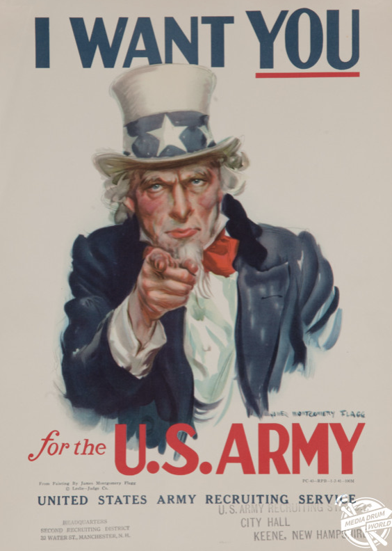
Over the 9 weeks I have learnt more about the history of each pathway and how significant it has been and how is has effected society. Writing these blogs has helped me to develop my understanding of postmodernism and the authenticity of art and photography. Throughout these blogs I concentrated on looking at photography and aspects of graphic design because they interest me the most and there is a slight cross over, as I feel that I can incorporate graphic design into my photography work. Moreover, I have learnt that critical thinking is a very important aspect to this section as it allows you to reflect on an artist work and explain your own interpretation of it and allows you to become a more creative writer. I feel as if these blog posts have enabled me to understand the different pathways more and to progress in my pathway by having a deeper understanding of the origination and the development of certain artists.

Furthermore, I feel as there is a connection with these tasks and the ideas that are developing within my practise as each of the task are broad and you can tailor them to your own pathway, throughout these blogs I used photography and graphic design as well as posters that has small amount of illustration on, I feel as if they all connected as photography is used in all of them, so they all connect and link together. I found that throughout these lectures it was important to keep an open mind as all the pathways link together however, motion graphics was the only one that I didn’t used throughout these, because I found it hard to connect it to my blog post.

Finally, the connection between theory and practise, in the last three blogs set (task 5,6,7) there was a programme that we watched and then used three words to describe different images to use as a starting point, the programmes showed us the different ways artists create there work showing their different theories, most of them started on paper and sketched their ideas out, in the last programme (Abstract The Art of Design S1 Ep7 “Planton Photography”) it showed us that Planton had a specific way of shooting his models and certain cameras that he used for the same shot, everything was the same and that’s the way he works. This would relate to my studio practice is I was shooting the same thing over and over however I feel as If it’s good to change certain things such as the lens or the back drop. There is a significant connection between theory and practise.

“Theory and Practice. There is always a tension between Theory and Practice. These two separate realms are connected through a process of abstraction and application. … To explain this relationship by way of practice, Theory is abstracted Practice, and Practice is applied Theory.” http://words.steveklabnik.com/theory-and-practice

Accessed on: 3/12/17

This quote shows that there has always got to be a theory to produce something beautiful, however sometimes things happen by accident but they are good accidents that become a success.

Publish or Perish

I chose this classic world war two poster as it has a strong message within it. http://www.mediadrumworld.com/2017/01/16/powerful-ww2-propaganda-posters-published-in-a-new-book/

Accessed on: 28/11/17

The message is strong and powerful as the man in the picture is pointing directly at you making the message more intimate making you feel involved. The colours within this poster are the same colours that are in the US flag directing the poster to Americans. When looking at this poster I am directly drawn to his eyes and his finger as they are the centre piece of this poster. “Some of these efforts led to several world-famous designs. Others fell to history only to end up on websites such as this. Regardless, the propaganda effort was in full swing from all sides involved, convincing the masses that it was their individual duty to win the war for the respective sides”. https://www.secondworldwarhistory.com/ww2-war-posters.asp. This poster has a powerful message and also has a story within that has been

Presented to the world.


There is a vulnerable feeling about this image http://www.kickvick.com/77-powerful-photos/

The look in the girl’s eyes are very powerful and mysterious especially as she is holding a ‘candy cigarette’ h

owever, it looks like a real one. I am drawn to the black and white image and the focal point being the girl, as the other objects in the image are blurred, the way the girl is

also positions is in a very mature manner like she has copied the way people stand and the seriousness in her face makes you feel worried. “Sally Mann has used her 8 x 10 view camera to capture in fine detail, among other subjects, images of her children as they mimic andact out social and familial roles in the lush landscape of their rural Virginia home”. http://www.mocp.org/detail.php?type=related&kv=2380&t=objects

Accessed on: 28/11/17

This final image is a picture of two elephants https://www.wimp.com/here-are-some-of-the-most-powerful-photos-taken-in-2014-these-will-take-your-breath-away/

that clearly have a strong connection, as they live for many years and they can form bonds with each other making them have such a strong connection. I am attracted to the black and white filter over the image as it reveals the elephant’s qualities more and defines the age of the elephant. “Elephants are highly social and intelligent creatures and looking at this image I can see this not only with my eyes, but with my soul. Wait, even better, I can feel it! But words are not necessary to describe this photograph for it speaks for itself. It speaks to me in a place deep down, a place far away from the Oxford dictionary. It speaks to my African roots and if at first you cannot hear it speak then keep looking until you do”. https://conservationaction.co.za/media-articles/world-elephant-day-photo-competition-winners/


Postmodernism

“Postmodernism is a late 20th-century style and concept in the arts, architecture, and criticism, which represents a departure from modernism and is characterized by the self-conscious use of earlier styles and conventions, a mixing of different artistic styles and media, and a general distrust of theories.”

(https://en.oxforddictionaries.com/definition/postmodernism)

Accessed on: 28/11/17

This first image is by Garry Winogrand, Apollo 11 Moon Shot, Cape Kennedy, FL, 1969 (https://www.quora.com/What-are-some-examples-of-postmodern-photography)

Accessed on: 28/11/17

This image shows the use of technology and how it has played a massive part in photography for many years and it is used to capture amazing memories and they have been shared with the world. A photograph can show many things and can make you perceive things differently this is what I enjoy most about photography the way you make the audience feel and look at your work inspires you to create more. The thing I like most about this photograph is the people with in it and how casual they look, showing that capturing the moment is so important to remember.


Andy Warhol was a very iconic artist his work included many celebrities such as Marilyn Munroe, the

style of his work is still used today by many people that are inspired by his work. My second image is of 100 coke bottles (http://www.historygraphicdesign.com/the-age-of-information/postmodern-design/1070-andy-warhol) this was a very popular piece of pop art in the 60s as cokewas the trend. Warhol said that whoever the person is and whatever their status in society is “a coke is a coke and no amount of money can get you a better coke”. The repetition of his work attracts me because it is the same thing over and over but the bottles are still interesting to look at. Even when you deconstruct his images because of the repetition the same image is produced at the end of it making his work so unique and successful.

Finally, my third image is a sequence of images by Richard Longo (http://alastair27mancoll.blogspot.co.uk/2013/01/post-modern-photography.html). I am attracted to this image as it reveals body language of the individual. In all three images the model isn’t looking directly at the camera and the different body positions look uncomfortable making you look at the image for longer. These images are very corporate and looking at more of his images they all have the same style, there are three images and all are in suits. This reveals that Richard has a certain pattern to his work and its very peculiar to look at.

Accessed on: 28/11/17

Counterculture

“The Cockettes in a Field of Lavender,” 1970. Photo by Fayette Hauser. Courtesy of Fayette Hauser and MuseuScreen Shot 2017-11-05 at 13.00.01m of Arts and Design.  (http://www.huffingtonpost.co.uk/entry/counterculture-museum-of-art-and-design_us_58beeda6e4b0e6e6ccb52cf2)

Accessed on: 6/11/17

There is always a meaning why society changes and how counterculture meant that there should be a social norm, these rules were broken as they felt that they were a part of a revolution. The image I chose for this is a group of hippies they were called and described as “hippy acid freak drag queens.” You couldn’t tell if they were male or female. The obscurity is what attracted me to this image the framing and the contents such as the gender of the people and the way that they have displayed themselves, the black and white shows more detail and their expressions on their faces are very stern looking making you wonder what they are thinking about.


Screen Shot 2017-11-05 at 13.05.06(http://www.dazeddigital.com/fashion/article/28834/1/how-rags-magazine-shaped-70s-counterculture)

Accessed on 6/11/17

Moreover, image two is a magazine cover with photography within it, this interests me as you can clearly see what the message is supposed to be. The bright colours are eye-catching and the black and white images contrast well against the background. “Rags was the short-lived anti-establishment magazine that defined the countercultural spirit of the early 70s.” by photographer Baron Wolman, along with editors Mary Peacock and Daphne Davis. The weight of the typeface and the small detail in the G there is a small image making you look closer at the magazine cover. At the bottom the word hair stands out as it has hair coming out of it making it look alive.


Lester Lamm and Maureen Sherpa in 1970 (Photo by The Oregonian)

Screen Shot 2017-11-05 at 13.18.42Finally, sensibility is being able to appreciate complex emotions. I feel as this image represents that as hippies and miniskirts came into fashion more and more people caught on because they appreciated the confidence and serenity of the individuals. This couple was described as “the youthful, strong-willed, free-spirited essence of the era’s counterculture generation”.(http://www.oregonlive.com/living/index.ssf/2013/03/couple_whose_photograph_symbol.html).

Accessed on: 6/11/12

The counterculture is represented through these individuals by the style, this fashion was looked down upon, this forced them to segregate. Hippies are associated with love and peace giving this image spirit and meaning. Overall, within these three images there is a clear difference between counterculture and how it has changed people views and these images have impacted society to view one another differently.

Authenticity

The online dictionary’s definition of Authentic is:

Having an origin supported by unquestionable evidence; authenticated; verified. (http://www.dictionary.com/browse/authentic) Accessed on: 31/10/17. Personally, I feel that something can be authentic for only a short period. For example, scientist find out cures for diseases and that is evidence but new forms begin and we are stuck in a loop. Authentic is used too loosely these days as any small piece of evidence can be called authentic taking away the true meaning of the origin even though the definition states that as long as its supported then its seen as authentic.

The online oxford dictionary states that authentic means:

Of undisputed origin and not a copy; genuine. (https://en.oxforddictionaries.com/definition/authentic)

Accessed on: 31/10/17

This definition is slightly different to the precious one as this one states that it should not be a copy and that it should be genuine. However, it doesn’t state if there needs to be evidence and that’s why so many things become authentic just by people saying it and discovering originals.

From this research, to some extent I agree that things can be truly authentic as they have suitable evidence that supports their origin. Such as paintings there are a certain amount that are original and genuine however, the ones that have been modified and modernised that are called authentic i disagree with as they are simply pastiches. Modernism has a big impact on this topic as It has changed the way many people view authenticity moreover; the modern arts are creating their own authenticity as they develop.

“Technology is the mortal enemy of art.”

“Technology is the mortal enemy of art.” (Pg. 220 100 Artist Manifestos by Alex Danchev)

This quote shows that the developing age of technology is shaping the way that we perceive photography. From here on the advancement is only going to get better. Everything we look at is through pixels and technology, we now can read books online and create Photography on the computer taking its humanity and individuality out of it. “WE-ARE THE BEGINNING” (Pg. 220 100 Artist Manifestos by Alex Danchev) this shows that we have forgotten how photography was born and how it has developed over the years, it’s hard for the people to see what they built disappear by technology. Technology is impacting photography in such a positive way as it gives us more equipment to make eye-catching images and processing the images are done in one click. I feel as quickens up the pace of producing photographs when in fact we should all learn the old fashion style. However, this doesn’t give many people the opportunity to spend time developing these images as I think it’s important to learn patience in the dark room and learning how much light to expose throughout this process.


Overall technology is used in everyday life and impacts photography dramatically; it enables us to produce images that can change people’s lives and inspires them to take photos too. The one thing that fascinates me about photography is that no matter what language you speak or where you are from, a simple photograph can stimulate a conversation and therein tell a story.

Comparing Images

Gerhard Richter Photography

https://www.gerhard-richter.com/en/art/overpainted-photographs/rural-landscapes-75/7389-sils-maria-18257/?&artworkid=6&info=1&p=2&sp=32

Accessed on: 20/10/17

The mosPicture2t striking element of this piece is the paint – you are automatically drawn towards it because it is so unusual to see paint on a photograph – in any other situation this photograph would be deemed ‘ruined’ and thrown away. This makes us stop and question why is it so deliberately there. The different colours and textures used, allow your eyes to focus on what’s behind the paint. In this piece the colour draws you in deeper but something makes you stop as you cannot see the real image it shows he covers parts of the image up with paint allowing us to make up our own minds of what the image means. The paint reveals and conceals at the same time. “The smudging makes the paintings a bit more complete. When they’re not blurred, so many details seem wrong, and the whole thing is wrong too. Then smudging can help make the painting invincible, surreal, more enigmatic – that’s how easy it is.”

David Carson Graphic Design

http://www.designishistory.com/1980/ray-gun/

Accessed on: 20/10/17

The first thing that attracts me to this piece is the mirror image and the use of colour, it is a lot like the photPicture1ograph I chose however in this case the paint isn’t trying to cover the image. There is a strong rule of thirds in this poster as there is something interesting in each section such as the type, numbers and images. Even though the words are separated they are still readable it makes your eyes flow around the poster taking in all the information. In the photograph, there is a lot of layering as the paint is spread across the image, in this poster that it also the case the darker colour of yellow attracts you straight away, making these images very similar.

New York City’s toughest

Terminal Bar also known as New York City’s toughest is a capturing short film that tells a story of a Bar on 8th Avenue over a decade (1972-1982). The film is short and to the point, it creates an atmosphere of how life was, going from bar to bar. You are immediately pulled into the film, the intriguing description of the bar and the portraits that teach a lesson or tell a story. Furthermore, the still images are being used as animations simply hypnotise the viewer wanting to carry on watching. The narrators compelling voice makes you sympathise about everyone making a more personal connection with them as each image flashes up and slowly zooms closer into their eyes, you’re directly looking into them and see their pain, their obsession with alcohol and that it took over their lives. The way the narrator calls the individuals numbers shows that they are an object rather than a human being as there are so many and very few names are remembered.

To me Terminal Bar gives us a taste of the old days and teaches us a lesson about drinking as we can see throughout the film the many people that started to deteriorate. The interactive documentary gives us an insight of the day to day lives of African American, Mexican and white men and how the wave of people changed within the bar and it slowly becoming one of the most popular gay bars in New York city. To be continued