
The 60’s to 70’s was a iconic era for many things, famously it was a time for experimentation and fighting for change in the government across the western world. ‘Sex, drugs and rock and roll’ was a phrase that began during that time and all of them were known as topics that were taboo to talk about let alone endorse, which is why the movement was archetypal to the way we think in the present. For example the 60’s was the beginning of the positive progression of rights for different cultures, sexual preferences in the western society and a fast paced peace movement that expanded from one corner of the globe to the other, but most of all and an intensified explosion of colour affected our fashion, homes, lifestyle and largely art, and in nearly all forms such as films, paintings and music.
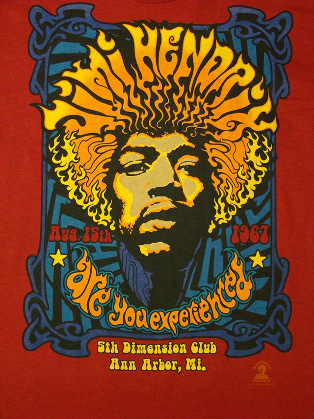
A poster that took my eye that can symbolise the change in the culture of art for me was the 1967 Jimi Hendrix Experience, although it was late 60’s when it was made I still feel that it gives the best idea of how art had developed in that time. A popular style was to have the text manipulated to help create the image in a intertwining form, this poster shows this perfectly with ‘Jimi Hendrix’ forming the iconic afro and created in a way that generates the wavy and frizz of the hair. Text I felt was a key factor of these posters and it was treated in a way, instead of just giving information, its fully incorporated into the main feature of the poster.
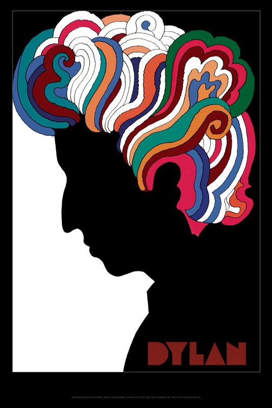
The second poster that caught my eye that was an important piece from that generation was the ‘Dylan’ poster mainly because of how popular it became. Its minimal silhouette highlighted the hair that was iconic to Bob Dylan and after this poster released it opened up this style of minimal art with highlighted key features that has recently come into fashion once again. Milton Glaser had apparently no contact with Dylan throughout the creation of this image yet it still is exceedingly reminiscent of bob Dylan. Glaser was a serial trendsetter through his career because he also made the ‘I love NY’ poster that exploded across the globe that also followed his minimal style.
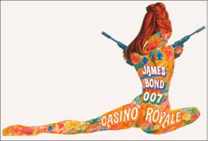
Hollywood took to the approach to colour during the 60’s as well the best representation for me is the James Bond poster advertising casino royal. In true stereotypical Bond style they use a voluptuous woman although similar to the Hendrix poster, the text is used by the main feature and is manipulated to fit into the form of the model.
https://www.artsy.net/article/artsy-editorial-iconic-artists-and-movements-of-the-1960s