Author Archives: Fay Davenport

Summary

Over the last ten weeks I believe my research skills have improved immensely. This is the first time I have used Harvard referencing, which I found difficult to get used to at first. However, with practice during the task of completing this blog, I have got used to the system. From the bibliographies at the end of each of my blog posts, it is clear to see that my research has improved. This is due to the number of references increasing, meaning that my research is more in-depth and considered.

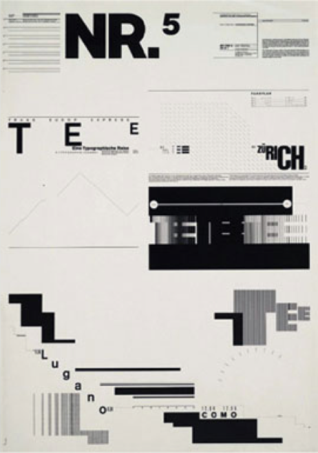
I began to feel more interested and involved with the task’s when we started to study the history of graphic design. I enjoyed learning how the traditions and trends within graphics have changed, from the minimalism of Swiss type such as Helvetica of Modernism, to the bubble lettering technique in Counter Culture. I have noticed clear differences in these periods of time, which have all given me inspiration and opened my eyes into what style of graphics I am most interested in and what I would like to emulate in the future. This includes, bright colours and large compositions of type, such as those seen in the Counter Culture period.

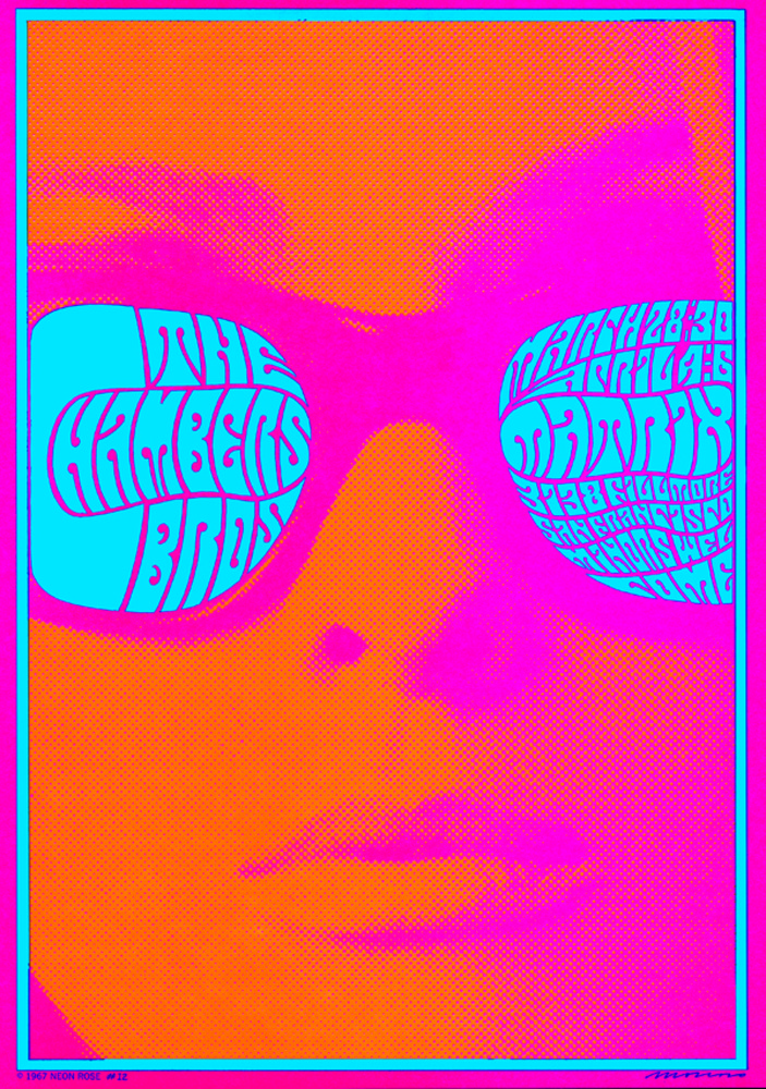
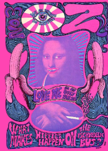
This piece of work by graphic designer Victor Moscoso caught my eye due to the use of bright colours and large scale image of the womans face. This is a poster created to inform the audience about a concert for The Chambers Brothers. However, during my research into counter culture I found type was not clearly readable as it is up to the audience to interact with the artwork if they feel interested enough to read it, instead of the type clearly showcasing the information. I liked the psychedelic feel to the images, which not only represents the time period of the artwork, but also created exciting and new visuals for the audience. People where not used to seeing these crazy shapes and colours, but instead used to seeing grid structured simplistic work. This shocked a culture and created excitement.

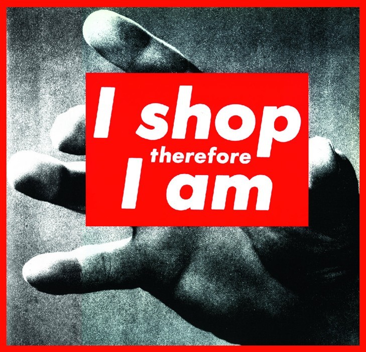
A key task I enjoyed was week 7, Publish or Perish. Whilst completing this task I found it related to my A Level Sociology work, which motivated my research further. The idea of consumer culture and globalization is one that fascinates me. I am interested in graphic design that showcases the idea that as a society we are obsessed with materialism. Social graphic design is one that I wish to look into more as it is a way of sharing an important message or an ideology in a way that captivates an audience.

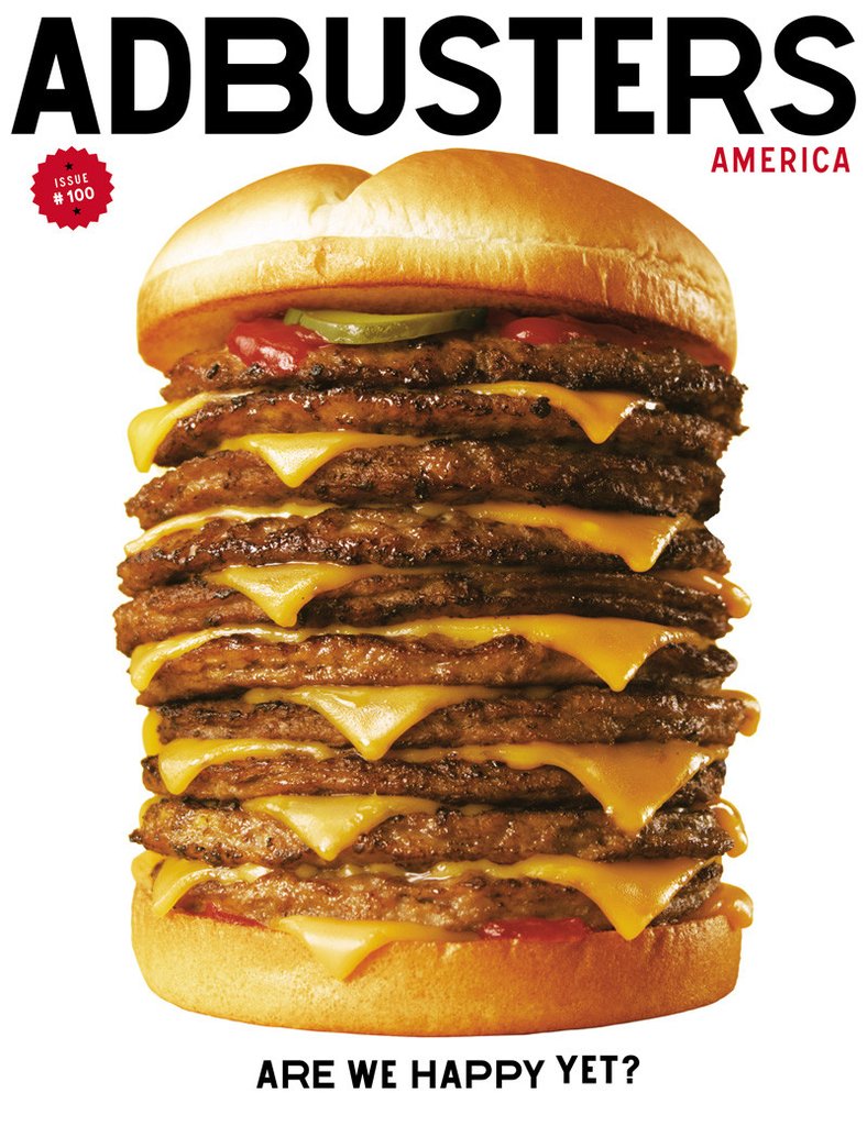
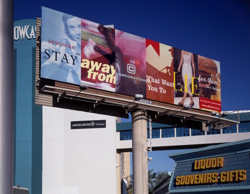
The Adbusters front cover for the 100th issue particularly stood out to me as the idea behind the cover has a lot of meaning. The idea behind the cover is that as a society we always want more. The image portrays a fast food company burger with extra layers. The image is supported by the phrase ‘are we happy yet?’. This displays how we live in a generation of always wanting more and never being satisfied. Being able to convey such a strong message and story with simple imagery and typography is a skill I wish to develop within these next few years.

-IMAGE 1 – Moscoso, V 1967, The Chamber Brothers Poster. Available at https://www.grafik.net/category/archive/victor-moscoso (Accessed on 5th December 2017)
-IMAGE 2 – Adbusters, Issue 100. Available at https://subscribe.adbusters.org/collections/back-issues/products/ab100 (Accessed on 5th December 2017)

Publish or Perish!

The aim of Graphic Design is to convey a message to an audience through the use of typography and image. I have chosen this piece by Barbara Kruger, as I believe she successfully accomplishes this. Kruger is well known for her ‘photo-based images overlaid with blocks of text in a signature color scheme of black, white, and red’ (Wye, 2004 p.244). This piece in particular tells the story of capitalism and consumption, by explaining how we now define ourselves by what we purchase. This piece interests me as I feel as though our society is heavily involved in consumer culture, where it is a ‘norm to enter debt’ (Lury, 1996).

This second image was created by graphic designer and typographer, Jonathon Barnbrook. The image is based on Tibor Kalman’s quote ‘designers, stay away from corporations that want you to lie for them’. Barnbrook has used a range of different advertisements to create a montage, reading the statement. By using a variety of advertisements, the audience believes there are a large range of companies who are lying to us. The work was ‘designed for a billboard
near the 1999 AIGA Las Vegas conference’ (McCarthy 2010), which is obviously a controversial position as many designer’s would see the poster. I think this work is powerful as it enforces the ideology that corporations should not lie to their customers, in order to gain wealth and profit.

My last image is the cover for the magazine Adbusters, who are a ‘not-for-profit, pro-environment organisation’, (Wikipedia 2017). The magazine has connections with culture jamming, which is a ‘tactic used by many anti-consumerist social movements
to disrupt mainstream values’ (Wikipedia 2017). This magazine cover is not a direct culture jam itself, however aim’s show the audience how a company can influence them. For example, the image of the stacked up burger with the question ‘are we happy yet?’, is conveying the message of how much more will we want to consume to make us happy. It makes the audience think about what really makes them happy in life. As quoted by Klein 2000, ‘a good jam
is an X-ray of the subconscious of a campaign, uncovering not a opposite meaning but the deeper truth hiding behind the layers of advertising’, which I believe is successfully shown by this cover.

-Wye, D (2004) Artists and Prints: Masterworks from The Museum of Modern Art, New York: The Museum of Modern Art
-https://www.smithsonianmag.com/arts-culture/barbara-krugers-artwork-speaks-truth-to-power-137717540/?page=1(Accessed on 28th November 2017)
-Lury, C (1996) Consumer Culture, Polity Press
-IMAGE 1 – Kruger, B 1987, I shop therefore I am. Available at http://ucresearch.tumblr.com/post/47883063847/untitled-i-shop-therefore-i-am-barbara (Accessed on 28th November 2017)
-McCarthy, S (2010) We need to redefine the ethical implications of design. Available at http://www.eyemagazine.com/blog/post/whos-responsible (Accessed 28th November 2017)
-IMAGE 2 – Barnbrook, J 1999, Designers Stay Away. Available at http://www.jonathanbarnbrook.com/work/first-things-first/ (Accessed on 28th November)
-https://en.wikipedia.org/wiki/Adbusters ((Accessed on 28th November 2017)
-https://en.wikipedia.org/wiki/Culture_jamming (Accessed on 28th November 2017)
-Klein, N (2000) No Logo. Great Britian; Flamingo.
-IMAGE 3 – Adbusters, Issue 100. Available at https://subscribe.adbusters.org/collections/back-issues/products/ab100 (Accessed on 28th November 2017)

Post Modernism

Postmodernism is a movement within design which is ‘a reaction against modernism
used to describe challenges and changes to established structures and belief systems’ (http://www.tate.org.uk/art/art-terms/p/postmodernism, 2017).

Wolfgang Weingart is said to be the ‘ “the father” of Swiss Punk Typography”(http://www.historygraphicdesign.com/the-age-of-information/postmodern-design/538-wolfgang-weingart, 2017). This style, also known as the New Wave, ‘combined traits of Swiss Modernism, Postmodern contrasts and harmonies and lots of geometric shapes and isometric patterns’ (Heller, 2006). This piece of his work show’s how he broke the traditional traits of Swiss type. He spreads his work over the whole of the page, unlike the neat and precise work of traditional Swiss type. Punk subculture was at it’s prime when Weingart was creating his type. Sociologist Dick Hebdige studied the Punk subculture and stated that subcultural fashions ‘have intentional communications with deliberate rebellious revolting style’ (Hebdige 1979). Weingart can be seen to having the same attitude within his design, he ‘rebelled against the minimalism’ (McCoy, 1990). I like Weingart’s work as he broke tradition and elements of his work are still seen today, such as random positioning and the use of geometric shapes.

Ed Fella is graphic designer who has been named the ‘pioneer of postmodern graphic design’ (Carducci, 2007). He creates posters with bright colours and creative shapes/ fonts. He also, like Weingart, broke the traditions of minimalistic structured design, ‘by battering and mixing fonts, engaging in visual puns and generally violating the tenets of “good design” ‘ (Carducci, 2007). His work shown here showcases his use of vibrant colours. Fella “makes visable the post modernist concept of deconstruction (Caducci, 2007)’, by showing how there is two ways of looking at something; through the use of design.

Keith Harring is a graphic designer who died of AIDS in 1990. His work ‘often addressed political and societal themes’ (https://en.wikipedia.org/wiki/Keith_Haring, 2017), especially promoting the fight against AIDS towards the end of his life. In terms of postmodernism, Harring wasn’t afraid to ‘provoke conversation on controversial topics’ (https://www.kibin.com/essay-examples/an-analysis-of-postmodernism-works-of-artist-keith-haring-francis-bacon-and-barbara-kruger-dx5OjH4Z, 2017). He uses his signature style of ‘heavily outlined figures with no race or gender’ (https://www.kibin.com/essay-examples/an-analysis-of-postmodernism-works-of-artist-keith-haring-francis-bacon-and-barbara-kruger-dx5OjH4Z, 2017). The bright colours used are not only eyecatching but allowed Harring to establish ‘that depicting serious issues could be fun or at least lively when communicated through highly cartoony images and fresh vivid choices of colors’ (http://www.theartstory.org/artist-haring-keith.htm, 2017), allowing him to reveal and promote help towards personal issues within his life.

-http://www.tate.org.uk/art/art-terms/p/postmodernism (Accessed 12th November 2017)
-http://www.historygraphicdesign.com/the-age-of-information/postmodern-design/538-wolfgang-weingart (Accessed 12th November 2017)
-Heller, S (2016) New Wave, New Technology, New Typography. Available at http://www.printmag.com/daily-heller/new-wave-new-technology-new-typography/ (Accessed 12th November 2017)
-Hebdige, D (1979) Subculture: The Meaning of Style. Routledge
-McCoy, K (1990) American Graphic Design Expression. Available at http://www.highgrounddesign.com/mccoy/km2.htm (Accessed 12th November 2017)
-https://en.wikipedia.org/wiki/Wolfgang_Weingart (Accessed 12th November 2017)
-https://en.wikipedia.org/wiki/New_Wave_(design) (Accessed 12th November 2017)
-IMAGE 1 – Weingart, W 1974 Available at http://www.historygraphicdesign.com/the-age-of-information/postmodern-design/538-wolfgang-weingart (Accessed 12th November 2017)
-Carducci, V (2007) Ed Fella Biography. Available at https://www.aiga.org/medalist-edfella (Accessed 12th November 2017)
-https://en.wikipedia.org/wiki/Edward_Fella (Accessed 12th November 2017)
-https://en.wikipedia.org/wiki/Keith_Haring (Accessed 12th November 2017)
-IMAGE 2 – Fella, E http://www.historygraphicdesign.com/the-age-of-information/postmodern-design/538-wolfgang-weingart (Accessed 12th November 2017)
-https://www.kibin.com/essay-examples/an-analysis-of-postmodernism-works-of-artist-keith-haring-francis-bacon-and-barbara-kruger-dx5OjH4Z (Accessed 12th November 2017)
-https://nursingclio.org/2013/12/03/visual-campaigns-against-aids-then-and-now/ (Accessed 12th November 2017)
-http://www.theartstory.org/artist-haring-keith.htm (Accessed 12th November 2017)
-IMAGE 3 – Harring, K 1989, Ignorance = Fear. Available at http://www.printmag.com/interviews/words-and-images-on-ed-fella/ (Accessed 12th November 2017)

Counter Culture

Counter Culture (1960s-1970s), was a “subculture that rejects and opposes significant elements of the dominant culture” (Crossman 2017). Designers decided to break away from the mainstream values that were currently held in Modernism.

Milton Glaser’s DYLAN poster is one of my favourite pieces of Graphic Design. I enjoy the splash of colour against the contrasted silhouette, and the use of his font ‘Babyteeth’. The meaning behind this poster is to showcase the emotions created by Dylan’s music. “The blended colors create vibrancy as they reflect Dylan’s music to his fans” (Errington 2014), this quote displays why Glaser used bright colours against the black silhouetted figure; in order to demonstrate Dylan’s artistic sound. “Glaser’s vibrant style is not only evident in DYLAN but it also evokes the 1960s counter-culture” (Errington 2014), this quote also expresses how the poster is included in the new, forward thinking time in design.

Underground is a term used to describe “publications produced without official approval, illegally or against the wishes of a dominant group” (Wikipedia 2017). Oz is a successful underground magazine, with editor Martin Sharp ‘responsible for art and graphic design’(http://ro.uow.edu.au/ozlondon/). I chose the No.3 May 1967 cover designed by Sharp as I feel it embodies the spirit of Counter Culture. The Mona Lisa painting has been defaced within this cover, creating controversy whilst also giving the audience something they recognize and can familiarize within the cover, maybe creating interest. At the bottom of the poster it reads ‘What makes hippies happen on the psychedelic bus?’. The counter culture scene was linked to the use of psycheldic drugs, and posters etc that had been made within this style tended to give the effect of being under the influence, or had the idea of the image coming to life if looked at whilst under the influence.

Lastly I studied “The Chambers Brothers poster” by Victor Moscoso, one of the big 5 within counter culture. The bubble lettering technique has been used, creating hard to read interesting shapes. In terms of sensibility, I chose this image as I believe the bright colours are influential on the time period. The bright colour’s where used in the postwar years to brighten the city and peoples spirits. This is relevant to my interests as I appreciate the use of bright, contrasting colours within design to gain attention.

-Crossman, A (2017) Counterculture. Available at https://www.thoughtco.com/counterculture-definition-3026160 (Accessed 5th November 2017)
-Errington, R (2014) The Art of Milton Glaser: To Inform and Delight. Available at https://the-artifice.com/milton-glaser-art/ (Accessed 5th November 2017)
-IMAGE 1 – Glaser, M 1966, DYLAN. Available at https://rightearleft.wordpress.com/2015/03/09/milton-glaser-designing-dylan/ (Accessed on 5th November 2017)
-https://en.wikipedia.org/wiki/Underground_press (Accessed 5th November 2017)
-http://ro.uow.edu.au/ozlondon/ (Accessed 5th November 2017)
-IMAGE 2 – Sharp, M 1967 Issue 3 of OZ Magazine. Available at http://ro.uow.edu.au/ozlondon/3/ (Accessed on 5th November 2017)
-https://www.grafik.net/category/archive/victor-moscoso
-IMAGE 3 – Moscoso, V 1967, The Chamber Brothers Poster. Available at https://www.grafik.net/category/archive/victor-moscoso (Accessed on 5th November 2017)
-https://www.theguardian.com/artanddesign/2016/sep/04/revolutionary-artists-60s-counterculture-v-and-a-you-say-you-want-a-revolution (Accessed on 5th November 2017)

Modernism and Authenticity

Authenticity, ‘of undisputed origin and not a copy; genuine’, (https://en.oxforddictionaries.com/definition/authentic, 2017).

Modernism in graphic design can be seen through the creation of the International Typographic Style. This style focused on ‘a high standard of printing’ and ‘a clear refined and inventive lettering’ (Terror, 2009). Helvetica is a typeface designed by Swiss designer Max Miedinger in 1957. This sans serif font is a prime example of how the modernist principles of a clear, readable typeface being the best choice are still held in todays society. Helvetica is a globally known typeface, seen in everyday life from car logo’s to the NYC Subway. Many more companies use Helvetica within their branding, meaning that their logo’s will not be truly authentic.


As clearly seen in the International Typographic Style, Grid Systems also led the modernist movement in graphic design. Grid systems help create ‘meaningful, logical and consistent organization of information on a page’ (Terror, 2009), which was favored by Swiss designers at this time.

Josef Muller Brockmann released ‘Grid Systems in Graphic Design’, sharing his knowledge of grids with the industry.

“Nowadays grid systems are an established tool that is often used by print and web designers to create well-structured, balanced designs”, (Terror 2009). This quote shows how the principles of modernism have left an everlasting mark on graphic design, as grids are a main tool used in industry today, for example in the layout of a magazine.

In the digital age, designers have access to a huge amount of inspiration from external sources. Therefore, it is possible there could be an element of their work that is not an entirely new idea or of undisputed origin.

-https://en.oxforddictionaries.com/definition/authentic (2014) (Accessed 29 October 2017)
-Terror, D (2009) Lessons From Swiss Style Graphic Design. Available at https://www.smashingmagazine.com/2009/07/lessons-from-swiss-style-graphic-design/ (Accessed 29 October 2017)
-http://typedia.com/explore/typeface/helvetica/ (Accessed 29 October 2017)
-IMAGE 1 – Ian C Whitworth, The Times Square subway sign at 42nd Street. Available at https://icwphotography.photoshelter.com/image?&_bqG=38&_bqH=eJwz8kn0CnVxNMnM8rUwCEk1dwrzKzY1C81w9Ay1MjWxMjKwMjQAAivPeJdg53hHPxfbEjUw29Yv0lkbyAwNdg2K93SxDQUp8ypNjDLJ8y_M8DVRi3d0DrEtTk0sSs4AAKHeHTM-&GI_ID= (Accessed on 30 October 2017)
-IMAGE 2 – Jeep [Logo], (2017) Available at https://www.webdesignerdepot.com/2009/03/40-excellent-logos-created-with-helvetica/ (Accessed 30 October 2017)

Constructivism Manifesto, ‘Technology is the mortal enemy of art’

Constructivism was an Avant Garde movement originating in Russia. It focused on art being created for social purposes. This had an effect on Graphic Design, which is created to communicate information to a specific audience.

Within the Constructivism Manifesto created by the main founders Rodchenko, Stapanova, and Gan, it states ‘Technology is the mortal enemy of art’. As an aspiring graphic designer I disagree with this statement, as I can see the importance that software and computers has in industry. The use of software such as Adobe Creative Cloud gives designers endless possibilities on how to edit, create and style their work. In 2016 Adobe are said to have ‘pulled in a record annual revenue of $5.85 billion’, (Cade, DL 2016) showcasing just how popular and widely used the software is.

Social media can be used by designers to gain feedback, share and sell their work. Sites such as Facebook, Instagram and Twitter allow art work to reach huge audiences. Social media and the use of the internet give endless sources for inspiration and research into projects, allowing projects to be deeply studied.

In terms of Graphic Design, within a campaign it is important to understand how your intended audience are interacting with the content. “We can actually analyze digitally the type of content and graphics that are getting more media impressions, more likes, more saves and, ultimately, are more appealing and converting to an audience”, (Norcross 2017). This quote shows how the use of technology helps to create successful graphic design.

-Cade, DL (2016) Adobe Reports Record Revenue in 2016, Made $5.85 Billion this Year. Available at https://petapixel.com/2016/12/16/adobe-reports-record-revenues-2016-made-5-85-billion-year/ (Accessed 21 October 2017)
-Norcross, N (2017) How Graphic Design Is Evolving. Available at https://www.forbes.com/sites/forbesagencycouncil/2017/10/09/how-graphic-design-is-evolving (Accessed 21 October 2017)

Comparing Images

In 2015, Sport England decided to tackle the issue of women in the UK being majorly less involved with sport than men. In association with advertising agency FCB Inferno, they created the ‘This Girl Can’ campaign.

this-girl-can

A bold white type face has been chosen for the logo. The use of the colour white steers clear from gender-associated colour. The bold font signifies the aim of the campaign, to show women they are powerful. The red background is not only visually striking, but forshadows the anger of the woman in the photo who is fighting against stereotypes. The quote ‘A kick right in the stereotypes’, supports Judith Butlers gender performativity theory. Butler said ‘There is no gender identity behind the expressions of gender’ explaining that the way we perform our gender is taught. I believe this links to ‘This Girl Can’ as the reason many women aren’t playing sport could be a social construction.

overexposed-55bfdba3dcb41

Maroon 5’s ‘Overexposed’ album cover art work is a colourful, image-filled collage of illustrations, created by illustrator Young & Sick. I like how the album is crowded full of different images, giving the audience a range of pieces to look at. In addition, the different elements make up a face for the main composition.

In comparison to the previous photograph, colour is extremely important. I believe colour is more important for the album cover as it is created for commercial purpose and must catch the eyes of audiences and potential customers. Whereas the “This Girl Can’ photograph uses words and body language of the models to inform audiences of an issue.

–IMAGE 1 – FCB Inferno 2017, This Girl Can; A Kick Right in the Stereotypes. Available at https://www.sportengland.org/news-and-features/news/2017/february/24/this-girl-can-returns-to-our-screens/ (Accessed on19th October 2017)
-IMAGE 2 – Young & Sick 2012, Overexposed Album Cover. Available at https://en.wikipedia.org/wiki/Overexposed_(album)#Artwork (Accessed on 19th October 2017)

Terminal Bar, Stefan Nadelman

Terminal Bar is a short film directed by Stefan Nadelman, showcasing events from a New York City Bar. The story is told through a series of still images taken over a decade by Stefan’s father, Sheldon Nadelman, the owner of the bar.

The images are kinetic throughout the film, entering and exiting through a visually engaging selection of angles and sizes. The movement and use of zoom into the images, not only creates interesting visuals for the audience but also brings the still images to life.

The film is documented through visual text and speech, by newspaper articles being read a loud. This allows the audience to read along with the words that are spoken. The music is essential in bringing the photographs to life. The theory of thought-beats can be seen, where the movement of the images matches the rhythm of the music.

Smooth transitions are used when introducing new images and articles, creating an easy watch for the audience. In addition to this, images are introduced at the correct time to match the spoken narrative, helping to illustrate the story.

The video of Sheldon Nadelman being interviewed shows his excitement of reliving his time at the bar, through looking at his collection of photographs. This shows the importance of capturing images and how the effect they have has the ability to tell a story forever.

I enjoyed how the film showcases how in our world there are so many people, all with different stories and backgrounds. I enjoy the feeling of being apart of a marvelously fascinating society.

-Touristpictures (2013) Terminal Bar: Official 2002 Film in HD. Available at: https://www.youtube.com/watch?v=xfWBbZBqYjo (Accessed: 12th October 2017)
-https://en.wikipedia.org/wiki/Terminal_Bar_(film) (Accessed: 12th October 2017)
-https://en.wikipedia.org/wiki/Stefan_Nadelman (Accessed: 12th October 2017)