Author Archives: Lilyanna Rigby

Task 11& 12 – Reflective Summary

As our first semester is coming to an end, I feel that Research and Communication Skills has taught me new techniques which I can carry forward into the second semester. Most of the tasks have included researching designers and analysing their work. Through reflecting on established designers, I have evaluated other issues which have arisen. I believe this has allowed me to thoroughly reflect and evaluate my own practice.

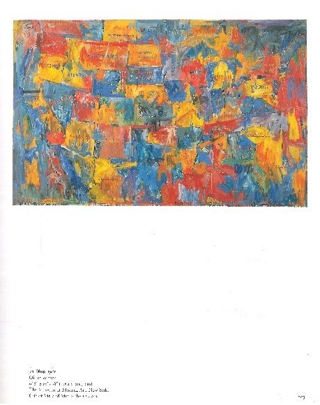
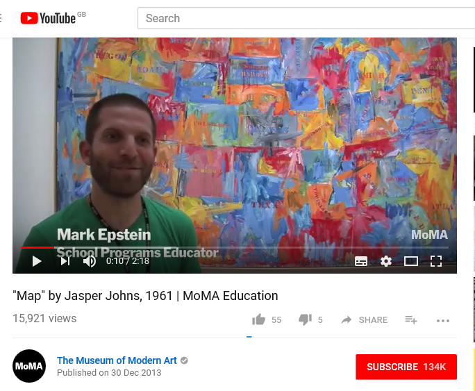
Task 1&2 involved understanding the differences between primary and secondary sources. Once I had understood the differences, I had to find three different types of information. I chose to research into Jasper John’s work due to my project at the time. I found this task useful as, before this lecture, I did not know the difference between primary and secondary sources. Now, I feel that I can conduct research with a variety of resources, to ensure my research is thorough.

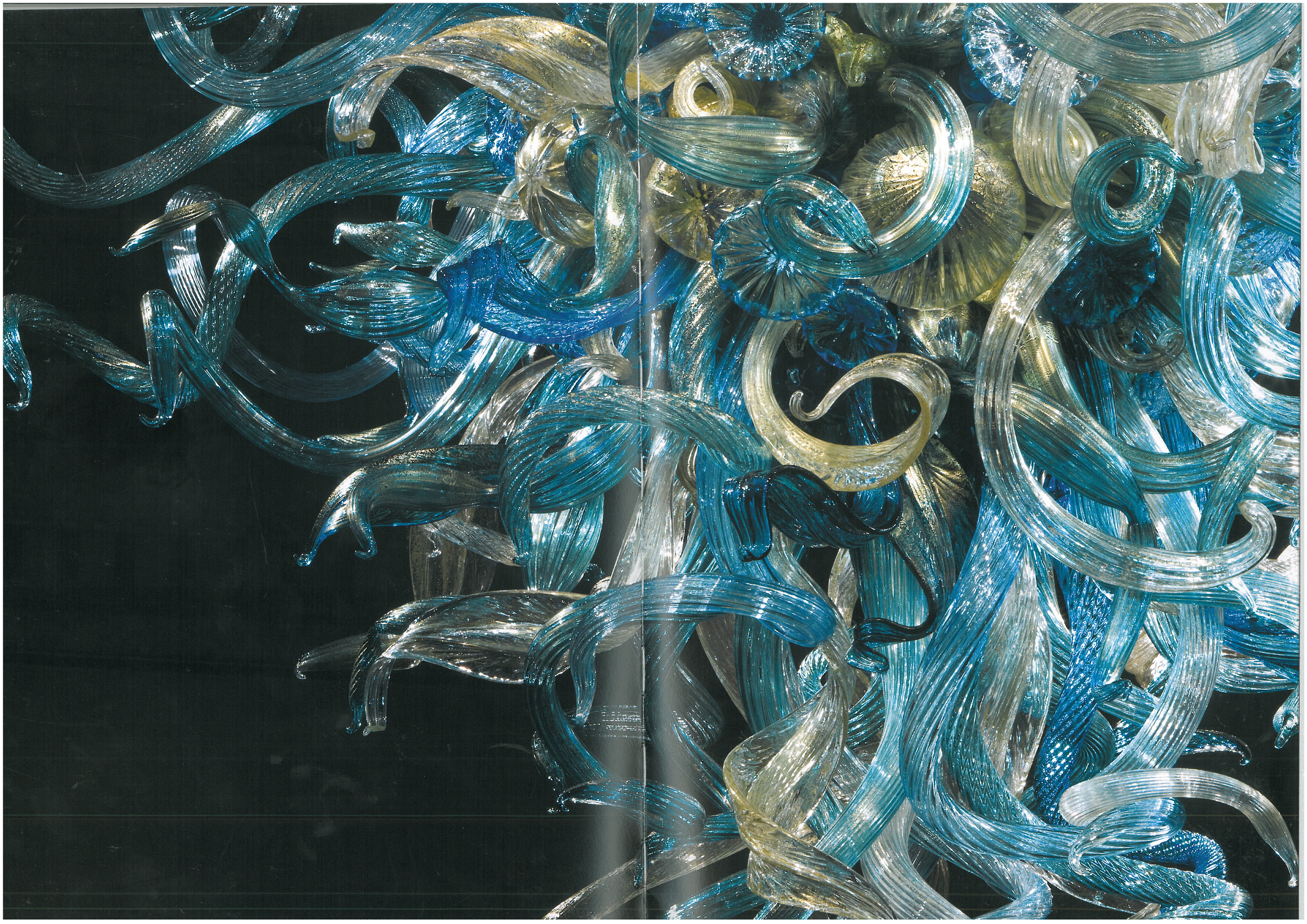
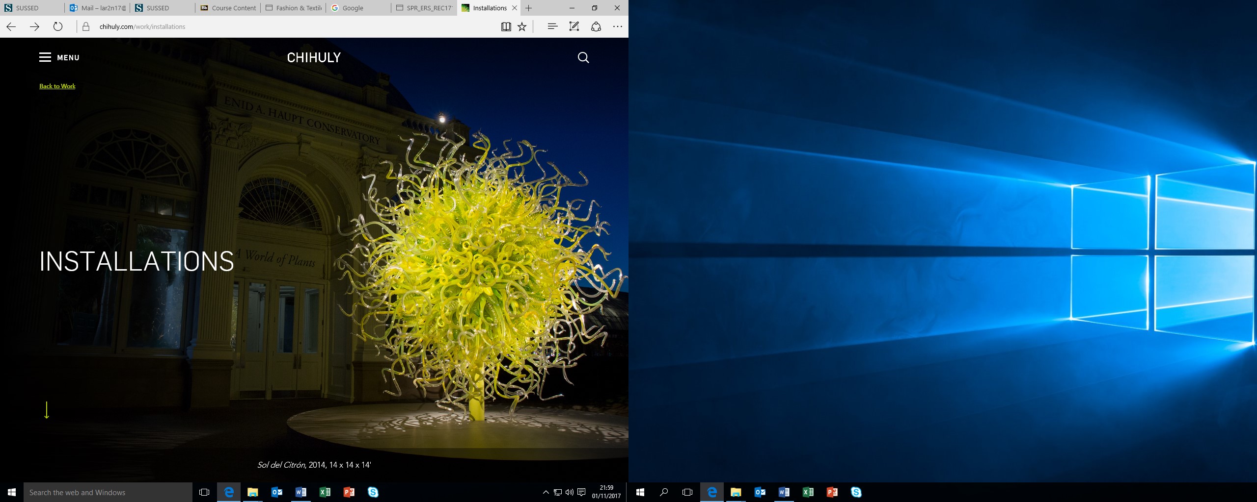
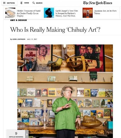
Task 3&4 was based around Academic Integrity and for this, I based the task on Dale Chihuly. I found this task extremely helpful as I expanded my knowledge on a subject which I have found nerve-wracking, due to its seriousness. I feel that after this lecture, I understand how to reference various sources. I feel confident to reference where I have found information, when delving deeper into my research and therefore, enhancing my knowledge.

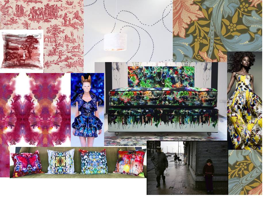
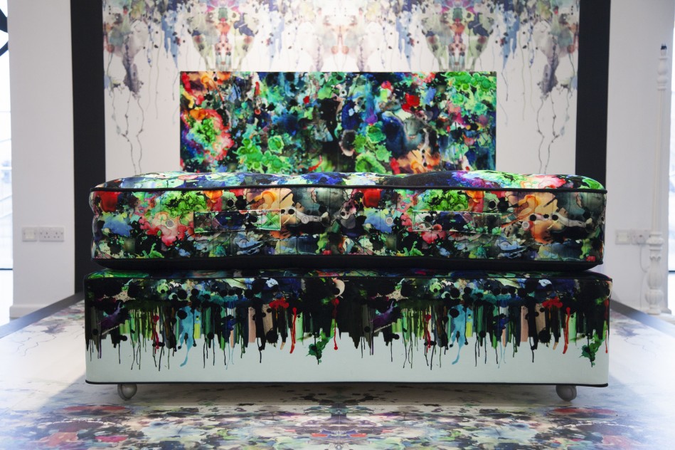
Task 5&6 involved visual research and exploring where, potentially, the designer had gained their inspiration from. I based this task on Timorous Beasties as I find it fascinating how they produce their wallpaper/fabric prints. I enjoyed exploring into potential influences through research into their background. I feel as though this task has broadened my research as, I can explore further and increase my knowledge of different art movements.

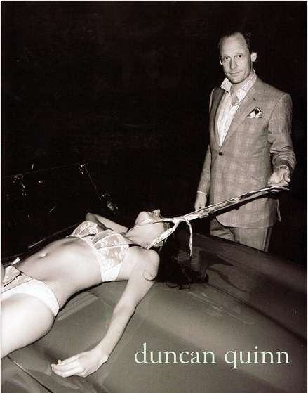
Personally, I found task 7&8 the most challenging. I found it difficult as I was not used to reading academic text and having to thoroughly understand it, in order to write a short essay. However, once I had completed the task, I felt a large sense of satisfaction as I was dreading the task and had put it off for several weeks. This was a huge mistake as it meant that I had to catch-up which added more pressure due to the upcoming deadline. Although I dreaded the task, I feel a sense of accomplishment after re-reading over the chapter until I had fully comprehended the information.

Task 9&10 was my favourite task as I learnt how to argue ethical issues through writing. I felt that the discussion in the lecture sparked debate and I found it interesting to listen to other people’s opinions on the controversial topic.

Overall, to conclude, I believe throughout my first semester, I have gained a variety of skills which I can reuse in second semester and throughout my degree.


Task 9&10 – Ethical Issues

I have chosen the image of Duncan Quinn, whose advertisement caused controversy with the media. The photograph depicts a smug male character, pulling his tie which is wrapped around a dead female, lying on what is presumably his convertible car.

The male character wears a slick, expensive suit by Duncan Quinn, which makes his appearance seem powerful and professional. It is to be assumed that he has removed his tie from around his neck and used this to strangle and detain the woman. When researching the advertisement further, I came across a blog written by Deig. L. 2011, which discusses the concept that the tie is a phallic symbol. Considering this point stated in the blog, I agree that the tie represents phallic power and male dominance. The way the photograph has been taken presents the audience with the impression, that the man has been caught, possibly by Police, as the black background makes the dominant male stand out, as if a flashlight is highlighting his criminality. He seems to be pleased that he has been caught as, it shows the power he has over the innocent woman.

The woman in the advertisement lies lifeless on the bonnet of the car. She has been stripped of her innocence as she appears to have been raped. The woman is photographed in her white underwear, which is known to represent innocence, purity and virginity. The colour white represents cleanliest, which contradicts the blood stained car bonnet. As the female isn’t naked, it could be considered that the advertisement wanted to represent respectfulness rather than, a symbolism of sex.

The advertisers of Duncan Quinn have portrayed the idea their suits provide power and authority. However, this has had the adverse effect as, the advertisement has desensitised the idea of abusive relationships/rape and seems to promote abusive behaviour and sadomasochistic activity.

What effect did Malcolm Barnard want the advertisement to have? When the suit was originally designed, did designers want their suit to be an advert of abusive, indecent, sexual offences? A contradiction to this argument is stated in: “Fashion as Communication” by Malcolm Barnard. It states “the designer, the buyer, the wearer and the audience all contribute to creating and transforming the messages that are communicated by means of fashion and clothing”. In our society now, these images are seen more frequently. I wouldn’t be surprised, if the whole advertisement was created to shock viewers.

The recent trilogy “Fifty Shades of Grey” supports the advertisement as it presents both characters: the dominant, powerful male, and the innocent, pure female. Christian Grey is seen to be a dominant male, who wears expensive, fitted suits, very much like the gentleman in the photograph. Mr Grey seduces Miss Steele, who is transformed from an innocent virgin to a submissive. Like the advertisement, it could be said that Miss Steele was a victim of sexual assault. However, the contrast between the Fifty Shades of Grey dramas, and the advert is that Miss Steele consented to the S&M activities. In contrast, it appears that the woman in the advert has been killed. From the facial expressions of the gentleman, he seems pleased that he has murdered the woman.
Do we have to accept that this behaviour is occurring, whether it highlights a woman’s vulnerability and a male’s dominance?

Bibliography

  • James.E.L (2017) Fifty Shades of Grey. [Online website] Web address: http://www.eljamesauthor.com/books/fifty-shades-of-grey/
  • Winn. S. (2008) Trend Hunter. [Online website] Web address: https://www.trendhunter.com/trends/duncan-quinn-suit-ad-depicting-strangled-woman
  • Deig. L.(2011) Blog post – Suit Up [Blog post found online] https://ldeig.wordpress.com/2011/02/03/assignment-2-suit-up/
  • Barnard. M. (1996) Fashion as Communication London: Routledge.


Task 7&8 – Reflective Writing

I have decided to research further into Fashion as Communication by Malcolm Barnard. The section of the chapter I found most interesting was about etymology. Before reading this section, I was unaware that the word fashion originates from the Latin word, factio, which means making or doing.

The section goes on to discuss the change that has occurred over time, how “fashion was something that one did, unlike now, perhaps, when fashion is something that one wears”. It reflects on how society has changed over time, how fashion now symbolises the perception of an individuals’ personality, rather than the physical process of “making” fashion. An individual’s fashion statement gives an insight into how they are feeling and how they want to express themselves.

Fashion defines the individual and how they want to be perceived by others. The passage discusses that, by the way an individual dresses; their clothing certifies their allowance to be in a certain social group. “Fashion and clothing, that is, may be the most significant ways in which social relations between people are constructed, experienced and understood”. From this quote I have found from the text, it could be said, that fashion is used as a stepping-stone into a social group. Only, by the way in which, an individual dresses, can they be accepted into the social group they desire to be in. This forms our society, how people dress forms groups and different socialisations between individuals from all different backgrounds.

However, it could be argued that in our society today, people aren’t expressing themselves through clashing patterns, colours and trends. Instead, they dress themselves in a way to secure a place in the social group they want to be part of. Rather than communicating their emotions through clothing styles, nowadays, people copy others fashion, allowing themselves to secure their membership into their desired social group.

When reading further into this topic, I read a chapter from the book, “Fashion Brands”. (Tungate, 2012). He discusses how significant fashion is when dividing individuals into social groups. He quotes Vincent Peters, a fashion photographer, “You don’t buy clothes – you buy an identity”. I think this quote epitomizes my argument as in today’s society, in my opinion; fashion has lost its main meaning. Rather than expressing oneself creatively, through crazy, clashing colours and patterns or moving away from the “ideal” woman idea, individuals mirror others, to ensure that they do not embarrass themselves. Today, through so much social stigma and an increase in social media, fashion has become something that only certain, brave individuals wish to publicise and express themselves creatively. In conclusion therefore, I believe fashion has lost its original meaning as rather than creating statements in bold, wacky directions, fashion now is about imitating others to ensure that they are able to be part of a friendship/social group.

Bibliography

  • Barnard, M., 1996. Fashion as Communication. London: Routledge.
  • Tungate, M., 2012. Fashion Brands. London: Kogan Page Limited.


Task 5&6 – Visual Research: Reading Images

Moodboard of 10 visual research references which could have influenced the “Bedsit” collection by Timorous Beasties

Bedsit Collection


I have decided to look at Timorous Beasties’ “Bedsit” collection.

The contemporary print makers studied together at Glasgow school of Art and some of their work depicts their student days whilst studying in Glasgow during the 1980’s.

It could be said therefore, that the designers were inspired by the Art and Craft Movement and, their art school experience. They create dramatic, contrasting prints which ooze with creativity through bold, bright, exciting combinations of colour. Their prints are filled with imagination, craziness and freedom, which is how art schools are perceived.

In the 1980’s, Glasgow was struck with poverty and their “bedsit” collection was inspired by their student accommodation and the general idea of grotty, dirty bedsits.

Their wallpaper print seems simple. From a distance, a single line of pattern runs around the paper however, only when you take a closer look, do you realise the single line is actually insects following each other. The designers wanted to change the “stereotyped” concept of bug-ridden, poor accommodation, to create a response from the audience that shows the prints to be beautiful and luxurious, whatever the subject matter. “That’s one of the things a designer should do out of duty, changing the way that people have preconceived ideas.” Paul Simmons, one half of the brand, wants viewers to change their thoughts, through producing prints which, from the surface, look bold and bright but underneath, have a personal response from the designers experience.

Alexander McQueen’s “Plato’s Atlantis” collection reminded me of the “bedsit” prints due to the bright, bold colours that seem to have a kaleidoscope based print. It could be said that both designers were inspired by what is perceived as ugly and dirty, but is actually beautiful. As McQueen said, ““I think there is beauty in everything. What ‘normal’ people perceive as ugly, I can usually see something of beauty in it”.

Bibliography

  • Anon., 2016. Arts and Crafts. [Online] Available at: www.vam.ac.uk/page/a/arts-and-crafts/ [Accessed 1 December 2017].
  • Anon., 2016. Timorous Beasties: The Devil in the Detail. [Online] Available at: www.vam.ac.uk/content/videos/t/video-timorous-beasties-the-devil-in-the-detail/ [Accessed 1 December 2017].
  • Anon., n.d. Chic Blotch wallpaper. [Online] Available at: www.timorousbeasties.com/shop/wallcoverings/61/chic-blotch-wallpaper/ [Accessed 1 December 2017].
  • Anon., n.d. Movement and Shape | Nyasha Matonhodze by SĂžlve SundsbĂž for Vogue Japan November 2011. [Online] Available at: https://noirfacade.livejournal.com/1013172.html [Accessed 1 December 2017].
  • Art, P. S. o., 2016. Plymouth School of Art Calender. [Online] Available at: https://www.plymouthart.ac.uk/latest/calendar/timorous-beasties-exhibition [Accessed 1 December 2017].
  • Auguste, C., n.d. [Online] Available at: http://www.meublepeint.com/toile-de-jouy.htm [Accessed 1 December 2017].
  • FAFA, 2010. Alexander McQueen Tribute: Top 10 Fashion Moments. [Online] Available at: http://www.tonguechic.com/style-snaps/alexander-mcqueen-tribute-gallery-and-video/ [Accessed 1 December 2017].
  • Gilbert, J., 2016. Raymond Depardon’s stunning photos of 1980s Glasgow to feature in city exhibition. [Online] Available at: http://www.glasgowlive.co.uk/news/glasgow-news/raymond-depardons-stunning-photos-1980s-11318306 [Accessed 1 December 2017].
  • Jeffries, S., 2007. The Writhing On The Wall. [Online] Available at: https://www.theguardian.com/artanddesign/2007/feb/08/design.britishidentity [Accessed 1 December 2017].
  • Packer, S., 2016. In Pictures: Tactile textiles, bugs and bedsits, Timorous Beasties take over The Gallery. [Online] Available at: https://www.plymouthart.ac.uk/latest/blog/in-pictures-tactile-textiles-bugs-and-bedsits-timorous-beasties-take-over-t [Accessed 1 December 2017].
  • Pain, A., 2016. Explosive and Alluringly Beautiful – ‘Bedsit’ by Timorous Beasties at the PCA Gallery, Plymouth. [Online] Available at: https://costumecritiques.blogspot.co.uk/2016/03/explosive-and-alluringly-beautiful.html [Accessed 1 December 2017].
  • Treggiden, K., 2014. [Online] Available at: https://www.we-heart.com/2014/02/25/timorous-beasties-interview/ [Accessed 1 December 2017].
  • unknown, 2016. Artist’s Statement: Timorous Beasties’ Alistair McAuley on creating a Bedsit in a gallery. [Online] Available at: http://www.culture24.org.uk/art/architecture-and-design/art548904-timorous-beasties-art-alistair-mcauley-plymouth  [Accessed 1 December 2017].


Task 3&4 : Academic Integrity and Plagiarism

Burgard.T.A (2008) The Art of Dale Chihuly. San Francisco: Chronical Books

For my current project, I decided to look into the artwork of Dale Chihuly. When researching the artist, I found this book: The Art of Dale Chihuly. The book visually tells the story of Chihuly’s artwork. Each page has full- scale photographs of his work, which are all photographed against a black background. This background further enhances the vivid colours of glass. The book itself is made from good quality, glossy paper which, further enhances the artwork due to each photographs having a “sheen”.

dale chihuly

I further expanded my research on Chihuly by looking at his website. The website has different sections about his life, exhibitions and his work. I particularly like his installation pieces. In my opinion, some of his most successful images of his work have been photographed against a dark background, which further explores and exposes the colours Chihuly has used. I felt confident that his website would not include any biases or non-truthful accounts of Chihuly’s life and work.


article daleFollowing research through different sources, I found an article based on Chihuly and his artwork. I chose an article written by an American newspaper, The New York Times. I chose this newspaper article as it includes interviews with Jeffery Banks, a former colleague of Chihuly. The article seemed non-bias as it includes conversations with someone who knows Chihuly and how he creates his artwork.


Bibliography

  • Burgard, T. A. (2008). The Art of Dale Chihuly. San Francisco: Chronicle Books.
  • Installations. (2017). Retrieved November 1, 2017, from www.chihuly.com: https://www.chihuly.com/work/installations
  • Johnson, K. (2017, August 21). Who Is Really Making ‘Chihuly Art’? Retrieved November 11, 2017, from www.nytimes.com: https://www.nytimes.com/2017/08/21/arts/design/chihuly-glass-bipolar-court-moi.html


Task 1&2 – How to Use Online Resources?

For my first project based on the theme of line, I initially wanted to research colour. I wanted to investigate how coloured shapes intercept and overlap each other, forming patterns in an array of colour.

I wanted to find information based on the American artist Jasper Johns, as he produced vibrant colourful paintings based on various themes. I found a book in the library, “Jasper Johns: A Retrospective” by Kirk Varnedoe, which illustrated his painting, “Map”, created in 1961 (figure 1). The bright painting however, is limited in colour, as only the primary colours of red, yellow and blue are used, as well as introducing small amounts of white and black paint over certain areas.
I furthered my knowledge on the “Map” painting by searching the internet for information. I found the Museum of Modern Art website, where I watched an interview based on the history of the piece (figure 2). The interview implies that Jasper John’s “Map” was painted to illustrate the idea of chaos, as it created was during an uncertain time in America. In 1961, John F. Kennedy became America’s 35th president and the civil rights movement was just beginning, causing a clear distinction of segregation between the states. The concept of chaos is further supported, by the way Jasper Johns’ has painted different states and boundaries. For example, some boundaries were unclear, messy and some, were even missed. The way the paint had been applied also indicates Jasper Johns’ feelings towards the country at this time. It is clear that both sources indicate how the painting illustrates the new and changing country.
Following my initial research, I used the internet to search for brightly coloured fashion in the 60s. I discovered images of vivid mini dresses based on the primary colours of red, yellow and blue (figure 3). During the 60’s fashion, the Pop art era was introducing bold, vivid colours which later turned into polka dots and patterns.

To expand my knowledge of the 60’s colour palette and fashion, I used the internet to search for exhibitions based on my research. I found that the V&A Gallery have an exhibition based on 60s fashion, however, it limited my knowledge as it had little information and photographs (figure 4).

Overall, I have found the internet to be the best area to find information about Jasper Johns and 60’s colour and fashion. The internet was a quick resource and had vast amounts of information from different galleries, articles and imagery. However, to gain a deeper knowledge and understanding of art i.e. the “Map” painting and 60’s fashion, like exhibited in the V&A museum, I would like to visit the exhibitions to see the work in person and develop my own understanding of the pieces.

Figure 1: Page 203, Jasper Johns: A Retrospective. By Kirk Varnedoe.

Figure 1

2

Figure 2

Figure 3: Image taken from: https://vintagedancer.com/1960s/1960s-fashion-womens/

Figure 3

Figure 4: Screen shot taken from: https://www.vam.ac.uk/collections/1960s-fashion

Figure 4


Bibliography

  • Figure 1: Varnedoe, K. (2006). Jasper Johns: A Retrospective. New York: The Museum of Modern Art, New York.
  • Figure 2: 1960s Fashion. (n.d.). Retrieved October 18, 2017, from Victoria & Albert Museum: https://www.vam.ac.uk/collections/1960s-fashion
  • Figure 3: 1960s Fashion: What Did Women Wear? (n.d.). Retrieved December 18, 2017, from www.vintagedancer.com: https://vintagedancer.com/1960s/1960s-fashion-womens/
  • Figure 4: Art, T. M. (2013, December 30). www.youtube.com. Retrieved October 18, 2017, from Screen shot of Youtube clip taken from MoMA: Screen shot of Youtube clip taken from MoMA. https://www.youtube.com/watch?v=wer4F-2qd-Y


Â