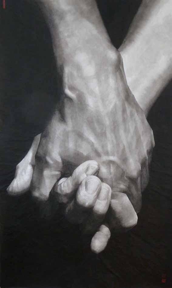
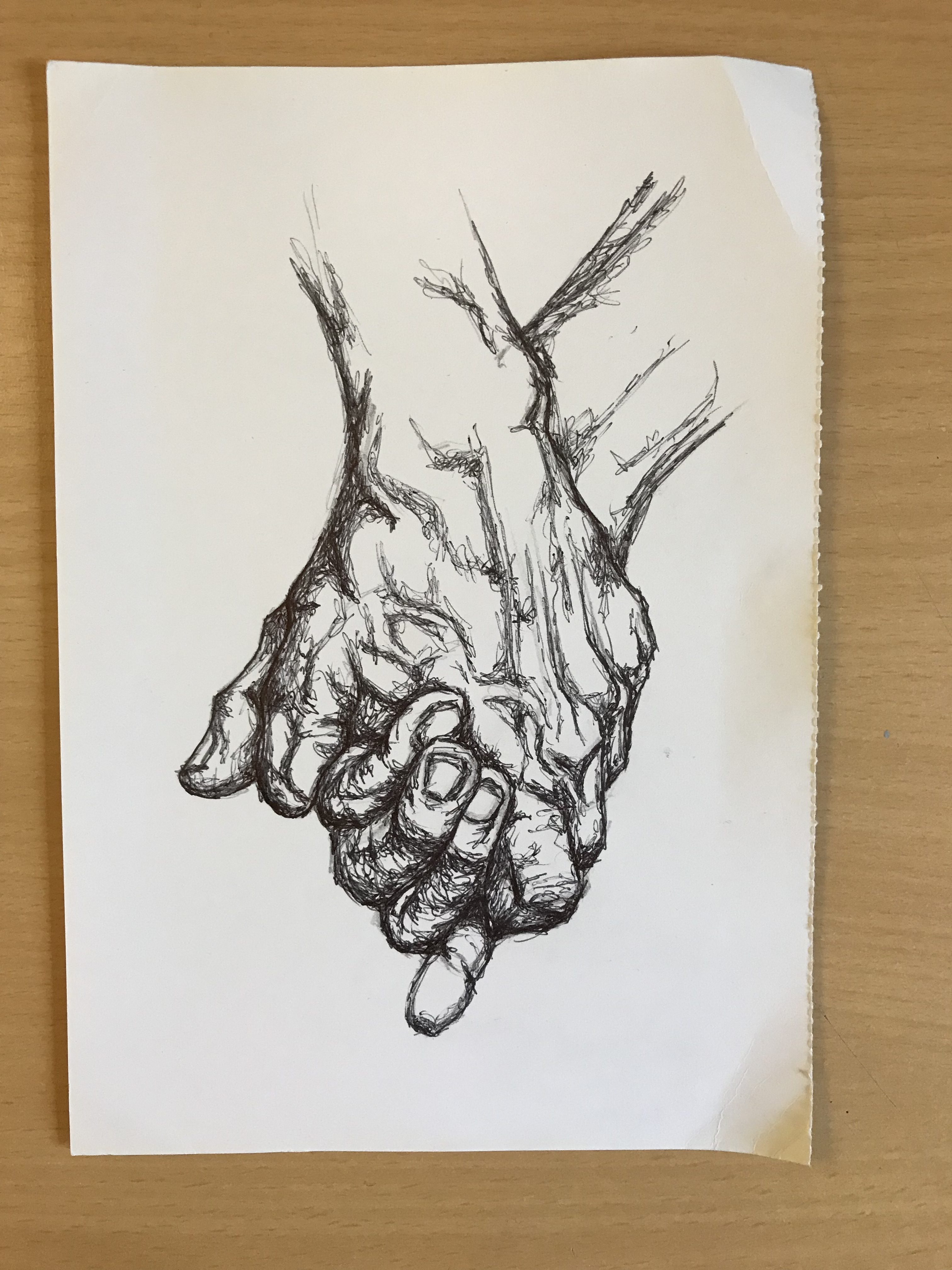
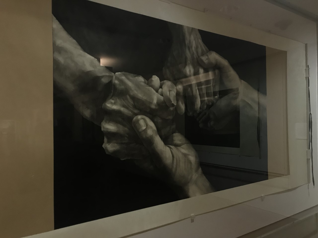
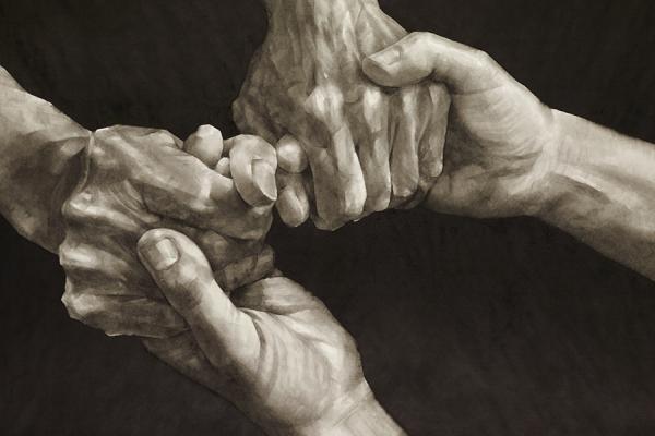
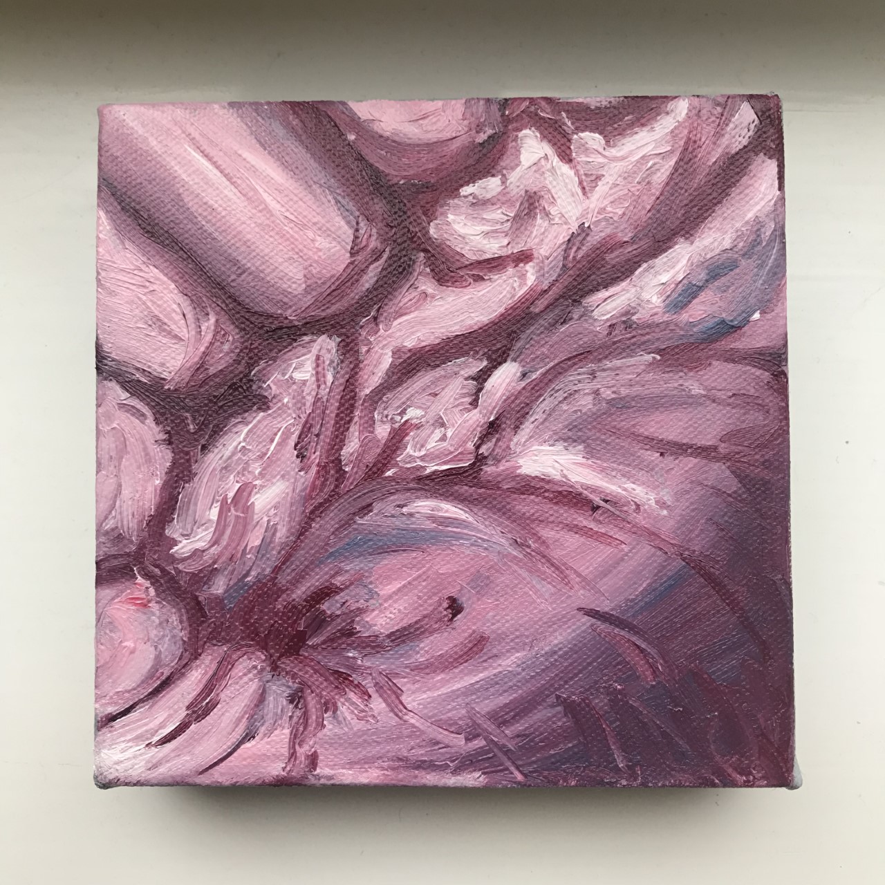
Author Archives: Emilee Parnell

Task 12 – Choose A Piece of Work & Change It’s Scale

Again, Iā€™ve taken this painting from my contemporary project. Originally this painting is from a series of similar smaller paintings, however, if I was to imagine it larger, I would keep it how it is but simply enlarge it to as big as it could be. I think the slightly gross and unfamiliar atmosphere created around the piece would be amplified as it grows in size. The viewer would become almost surrounded by this fleshy piece and possibly start to feel some discomfort with it. I think the subject of flesh for a painting is usually seen in figure/life paintings or the classic nude paintings seen throughout history. Therefore I think audiences have become numb to nude figure being shown in a painting, almost as if youā€™re expecting to see atleast one when visiting a gallery. However, I think the idea taking the body and zooming in so far that it becomes just flesh and at first is difficult to figure out which part of the body it is from, is a fresh and new approach to using the body in art. The viewer could possibly have a more uncomfortable and confused reaction than they would if it was made clear it was a painting of the body. But, again, once they do discover it is from something as simple and common as the human hand, this confusion may go. Whereas, the sheer scale of the piece will always be there to surround the viewer and make a statement.

Task 11 – Summarise Your Blog

Writing this blog has helped wider my knowledge of art history and theories in areas I wouldnā€™t think Iā€™d have found without it. Tasks 2 (consume a book) and 7 (compare the two texts) have pushed me to explore artist theory and the infinite interpretations that can be found in this art world. Task 7, in particular, was one of the more challenging tasks for me because of the sophisticated and wider range of vocabulary that they used. However, after discussing these texts with my classmates I was able to understand what each text was saying and trying to portray. These tasks allowed me to explore theories that I otherwise probably would not have ever come across.

Completing these tasks has not only opened my eyes to new ideas but itā€™s also allowed me to explore the theories and areas that I already have an interest in. Task 9, where we had to apply a theory to contemporary art, allowed me to explore into both the artist Barbara Kruger and feminist theory; both of which were some of the influences for my individual projects. For example, I wrote task 9 at the beginning of the Manifesto project and that tasked pushed me to look into that artist and the meanings behind their work in greater depth. It gave me a better understanding of her work and ideologies; so much so that Barbara Krugerā€™s work was a huge influence for my Manifesto project and that was also the project I felt the most confident in creating.

This blog has also pushed me to experiment in my practical work. In particular, task 6 (new mode of practice), at first seemed very daunting to me as I am used to using the basic mediums of paint, pen and pencil, so the idea of having to create something new was a challenge. However, after thinking about it, this task actually gave me the push to finally get out and experiment with the idea of embroidery, something Iā€™ve recently wanted to experiment with but never had the courage to attempt, and try and work that into my work some how.


Task 10 – Represent Your Practice

Crop. Unrecognisable. Flesh. Zoom. Thick. Wrinkle. Pink. Disfigure. Crease. Squash.

I chose this painting from my contemporary project to represent my practice. It is a painting of a very zoomed in photograph of my hand. I chose this painting because itā€™s subject of flesh, and hands in particular, is something that appears consistently throughout my personal work, whether it is painting, drawing, or even embroidery.

For this painting I used oil paint, which has become my preferred choice of paint to work with in the past years because of the way itā€™s so easy to manipulate, blend and layer. Iā€™ve recently began to experiment with the thickness of the paint I use in my paintings to create texture to my work. This painting is one of my more successful examples of that. Iā€™ve also been experimenting with colours and the decision to choose only one as the main colour, such as blue or pink, and then working within their tonal spectrums; similar to monochrome, which I use in my drawings where it is just black and white. Again this painting is an example of that.

I would like to continue this style of painting and experiment and explore with the idea of zoomed in photographs to the point where they appear almost unrecognisable. The scale of the painting, being a small squared canvas also, for me, almost suggests it has been taken from a larger painting. Therefore if I was to continue this project I would like to do a series of paintings like this one but from different sections of the hand to create this idea that itā€™s some kind of puzzle. Also this idea of taking something so common and beautiful as the human hand/body and turning it into something unidentifiable and almost grotesque is something that I think would be fun and interesting to explore further.

Task 9 – Contemporary Art & Theory

Barbara Kruger, ā€˜I Shop Therefore I Amā€™, 1987

A lot of Barbara Krugerā€™s work deals with post-modern feminism and challenging the current social and political views regarding women and feminism at that time. Kruger appropriates images from magazines and newspapers to use as backgrounds for her graphic, textual pieces. She combines these appropriated images with text, usually a confrontational phrase which challenges the post-modern life.

In particular her piece, ā€˜I Shop Therefore I Amā€™, refers to images of women in the media, mainly adverts designed for women by men. It suggests the belief that women only need material objects to be satisfied. The fact that these advertisements are usually created by men, only furthers the belief that the common assumption about women is that they are very materialistic beings that men can control. It is gender stereotyping and the fact Kruger refers to this in her work Ā is highlighting this wrong and negative ideal surrounding women. It is reinforcing the fact that women are misrepresented in the media and how the ā€˜male gazeā€™ is a dominant feature. It is also highlighting the male dominated industries, who are creating these advertisements and the usual techniques of selling their products.

Bibliography

KRUGER, B. 1987.Ā ‘I Shop Therefore I Am’Ā [Image] – Accessed 23rd November 2017

Available here :Ā http://www.arthistoryarchive.com/arthistory/feminist/Barbara-Kruger.html

Task 8 – Appropriation

Appropriation: ā€œThe deliberate reworking of images and styles from earlier, well-known works of art.ā€

I wanted to combine this task with the work I am currently exploring so I chose to appropriate an image from an artist I am researching into at the moment. I chose the piece ā€˜Journeyā€™ by Qu Leilei, his piece is ink on paper, size 150 x 91 cm. I chose this piece because of its subject of hands, something I have always been interested in and tried to incorporate into my own work somehow. I re-created the piece in my own style with Biro on A5 paper. I used the original piece as a reference for my own drawing in regards to the shadows and tones. I chose this medium because when it comes to my own work, I tend to draw hands in this way. I enjoy the freeness of the ā€˜squigglyā€™ lines as well as the way they layer to create the tones. It takes some inspiration from Henry Moore and his ā€˜The Artistā€™s Handā€ collection. I always try to capture the same emotions in my drawings, the same way Moore wanted in his own work. This free but controlled line expression adds some kind of roughness to the work, that isnā€™t necessarily in Leileiā€™s original piece as that one looks smooth and defined.

Ā  Ā  Ā 

Bibliography

LEILEI, Q. 2013. JourneyĀ [photograph] ā€“ Accessed 25th November 2017

Task 7 – Compare The Two Texts

In this extract ā€˜The Flatbed Picture Pressā€™ taken from his book of essays called ā€˜Other Criteriaā€™, Leo Steinberg mainly focuses on and discusses the idea of the ā€˜flatbed picture planeā€™; ā€˜the horizontal bed on which a horizontal painting surface rests. Steinberg explains that the way artists conventionally hang their work in art history, usually corresponds with the way the human body stands. ā€œThe top of the picture corresponds to where we hold our heads aloft; while its lower edge gravitates to where we place our feet.ā€ This theory is apparent throughout artwork from Renaissance painters to the works of Picasso, Rothko and Pollock. Steinberg goes on to discuss Robert Rauschenberg and heavily focuses on how in the 1950s he began to challenge this ā€˜normā€™. His work no longer followed this ā€˜head-to-toeā€™ correspondence but instead created a new approach. I believe Steinberg wanted more artists to be like Rauschenberg and challenge this norm of the ā€˜flatbed picture planeā€™ and ā€˜head-to-footā€™ theory. ā€œWhat I have in mind is the psychic address of the image, itā€™s special mode of imaginative confrontation, and I tend to regard the tilt of the picture plane from vertical to horizontal as expressive of the most radical shift in the subject matter of art, the shift from nature to cultureā€™. This is why I think he is focusing so heavily on Rauschenberg, as he thinks out of the box and is perhaps the first to ignite this idea of being controversial and creating a non-conventional approach to projects. This is evident his Rauschenberg’s participant in the ā€˜nature in artā€™ project, where he presented a square patch of grass hung on the wall.

ā€œMy decision early on to, build site-specific works in steel took me out of the traditional studioā€. In his Yale Lecture, Richard Serra discusses his site-specific approach to work, explained as creating something influenced by and fitting with the space it will be presented in. He believes that sculptures should be built within that space and not built then altered after moving. Serra then goes on to discuss how his work has maintained a critical presence and was seen as controversial in comparison to traditional workings and corporate created artwork. He believes that artists who submit to these corporate controls are basically giving up their freedom and ability to create meaningful and multi-dimensional work.

Unlike Steinberg, who seems to work in the conventionally studio space, Serra relies upon the industrial sector and is highly influenced by his urban surroundings and environment when creating his work. Steinberg mainly focuses and works with the idea of a flat surface and/or two-dimensional works in the studio. Whereas, Serra breaks from that traditional studio approach and creates multi-dimensional pieces of art. In his text, Steinberg tends to focus on art theory and art history. However, Serra seems very much more contemporary and discusses the more commercial theories and beliefs. Overall, I think Steinberg is very much traditional with his approach and discussions, whereas Serra is more contemporary.

Task 6 – New Mode Of Practice

The mode of practice I would like to explore and experiment with is embroidery. Iā€™ve always been interested in embroidery, after following artists such as Emillie Ferris, with her highly realistic and detailed animal portraits, and Cinder & Honeyā€™s minimalistic creations, Iā€™ve always wanted to try and bring that into my work somehow. Iā€™ve only recently acquired the tools Iā€™ve needed for it and so far am enjoying it immensely. A lot of my work up to now how consisted of mainly either line drawings or detailed paintings. Iā€™ve began to explore texture more within my paintings in the past few years and think that could be something I could explore within the help of embroidery. I thought I could create some interesting paintings by combining these two methods by stitching directly onto a painting to add a new layer of texture. This is similar to the artist Ipek Koprulu who stitches over photographs she has taken. With the thread I can layer and manipulate it quite easily to build texture as well as detail, which is something I try to achieve in my paintings, so by using embroidery as well I could bring it up to a new level.

Task 5 – Single Exhibit Review

ā€˜Winged Victory of Samothraceā€™, approx. 190 BC

Also known as the ā€˜Nike of Samothraceā€™, is a Hellenistic sculpture of the winged female figure, Nike, the goddess of victory. The missing features, such as the head and the arms, adds to the mystery and mythology behind the God; with no face the distinctive figure is now the wings. The motion of the wings combined with the flowing fabric look covering the figure, falling at her feet, gives the work a delicate but powerful atmosphere. It reflects on the mythology as Nike was commonly shown flying down from Mount Olympus. This intensity of movement also adds to the belief that the statue was positioned at the prow of the ship, leading them to victory with the wind flowing past her. This all builds a powerful sense of action and triumph, as well as a delicateness from the fabric.

When I saw this piece back in August, it was positioned at the top of a large staircase, giving it a huge vantage point for the public to see it. I could see it from the opposite end of the long corridor leading up to it; as I walked towards it and climbed the stairs, the intensity and beauty of the piece only grew stronger. Itā€™s placement also allows it to be viewed at different angles, each one adding a new majestic feeling. Front on, I became engulfed in the powerful and triumphant atmosphere it created because of the strong body language the figure was emitting combined with the large wings protruding behind her. From side on however, youā€™re allowed to see the enormity of those wings and how majestic they are. Also you can see the action running through the piece with the fabric as it falls behind her and billows between her legs.

Task 4 – Exhibition Review

Recently I travelled to Oxford for a weekend and explored several museums and galleries. By far my favourite exhibition I came across is Qu Leileiā€™s ā€˜A Chinese Artist in Britainā€™ currently showing in the Ashmolean Museum until April of 2018. This exhibition shows Leileiā€™s progression from ā€œcalligraphic collage to an exploration of a new vocabulary of ink language blending lively brushwork with western techniqueā€. The exhibition took place in a thin but long room in the museum. As you walk through the doorway, youā€™re immediately met with two very large pieces, one named ā€˜Friendshipā€™ (2012) covering the wall on your left, and the other ā€˜The Future Remains in Our Own Handsā€™ (2014) on the wall directly in front. Both of these pieces are ink on paper, and are my two favourite pieces from the exhibition. The subject choice of hands is something Iā€™m interested in as an artist so immediately Iā€™m taking notes and inspiration from his work. The room was also filled with a variety of pieces, all ranging in size, some small sketches and others finished paintings. There was a small section of the room two steps down from the rest, with the walls lined with long, thin pieces of fabric showing Leileiā€™s early calligraphic collage work. It was interesting to see these two different aesthetics and cultures, Chinese and Western, in the same room and the comparisons/developments between them. I later researched Qu Leilei and discovered that we have very similar influences when it comes to our art work, with us both taking inspiration from classical sculpture and Italian Renaissance paintings, and developing that with the beauty and accuracy of figure paintings. All being his primary focus for this exhibition.

Ā 

Bibliography

LEILEI, Q. 2012. FriendshipĀ [photograph] – Accessed 25th November 2017

Available from :Ā https://www.ashmolean.org/event/qu-leilei-chinese-artist-britain


Task 3 – Image Analysis

ā€˜Hot en Tot Venusā€™ – Renee Cox , 1994 (photograph)

The first time I saw this photograph I was instantly drawn to the oversized prosthetic breasts and butt. They seem to be something you could find in a fancy dress shop. I went on then to focus on her face as she is facing the camera; her facial expression suggests to me that she is watching the viewer as you ā€˜gazeā€™ upon her. She draws attention to the power of the objectifying gaze and by looking back at the viewer she pushes that back onto you (the viewer). My initial reaction to seeing this photograph without knowing the context behind it, was that maybe she was trying to hide her real body with these fake prosthetics as if she believes this is what the public ā€˜desireā€™ to see in regards to a female body. However, after looking into the context, I now realise that the real message behind this photograph is much more complex and powerful.

The motivation behind this work was based on research and the discovery of Saartje/Sarah Baartmanā€™s story. Sarah Baartman was objectified due to her large body proportions in 19th Century Europe. That specific audience was fascinated by Sarah Baartman and other ā€˜Khoikhoiā€™ women because they were seen as ā€œdistinct from the ā€˜civilised femaleā€™ of the 19th Century. They were so fascinated that they would pay to ā€˜gazeā€™ upon her as if she was some kind of exhibit, or even negatively, ā€˜a freak of natureā€™. Renee Cox makes very clear and powerful statements about both race and gender through her work. The fact that she uses her own body means that Cox is liberated in her art, as well as her background and appearance. Instead of trying to hide her body, which I originally thought, sheā€™s in fact empowering herself and calling out and criticising how black women are often portrayed in the media today.


Bibliography

COX, R. 1994.Ā Hot-En-TotĀ [photograph] –Ā  [Accessed: 18th October 2017]

Available from : http://www.reneecox.org/hottentot-venue

BLACK FEMINIST ART, 2014. Renee Cox – Hot En Tot [online] – [Accessed: 18th October 2017]

Available from : https://artintheblackdiaspora.wordpress.com/2014/05/01/renee-cox-hot-en-tot