Category Archives: The Tasks

Task 2 – Consume a book

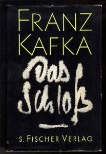
My chosen book to summarize is the novel “The Castle” from Franz Kafka. It is not a book I chose from the library but a book I had. I chose this because it’s closely related to one of my recent works and it’s the only book lately I could read from it’s beginning to the end.

In the novel, the protagonist only known as K is coming to the village but struggles to fit or gain access to the local authorities governing from the castle. Kafka’s protagonist has to face a bureaucratic windmill fight which prevents him to settle down. He can’t start his work even though he has been called there to work as a land-surveyor.

As he tries to get access to the local bureaucracy he learns that the people from the village can’t address the people from the castle and they can’t enter the castle either.

Still, the people of the village holds them in high regard even if they are unsure about what are they doing in the castle so his determination to get access to the castle and to the authorities seeds distrusts in the locals. K is stuck in one place as he can’t progress any further and slowly being alienated.

The castle remains a mysterious form in the background as the book remains unfinished.

Kafka’s death prevented him to finish his novel.

Task 1


Making these pictures was a direct response to the idea that artists need to have money to produce artwork because creating artworks costs
money, which I don’t have only bills.

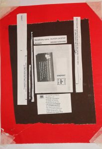
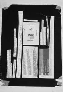
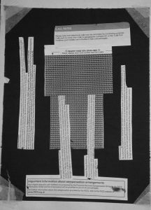
To make these pictures I cut my letters and bills into pieces and made collages from them using paint as a glue. I used my bills or other legal documents I had to send to my potential employers or landlords to find a flat and a job in the UK as it became harder and a more closely bureaucratized task after Brexit.

The pictures represent my frustration with fighting these useless fights with these non- existent figures who only appears to me as email addresses and my fading hope under the bureaucratic pressure.

As I started to work on these collages they naturally became abstractions of the castle from Franz Kafka’s novel “The Castle”.

The Castle’s protagonist only known as K struggles against the local bureaucracy in a way that feels very familiar to me and in a way that I can identify with it. The book remains unfinished because of Kafka’s death so the castle in question remains a mysterious force.

To my surprise what was started out as a way to take out my anger slowly became something conscious and something I was interested in developing. In the future, I am planning to send these pictures of employer targets and then make similar collages from the responses I’ll get to further develop this project.


Post_M0dernism


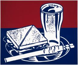
Lichtenstein, R. (1964). Sandwich and Soda. [screenprint on polystyrene] Liverpool: Tate

It’s Roy Lichtenstein’s lesser known works that still appeal to me on a deeper level these days. It’s his simpler illustrations that tackle mundanity and everyday irony more tactfully in my opinion. Pieces like ‘Sandwich and Soda’ are relevant to me and others existing in an era of increasing levels of playfulness and sarcasm being accepted in the art world. What’s also inspiring is what was occurring outside of the single image. By choosing to screen-print this image he could manufacture hundreds of copies thus reaching a wider audience, blazing a trail for artists to come.
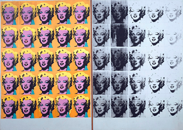


Warhol, A. (1962). Marilyn Diptych. [acrylic on   canvas] London: Tate Modern.

The meaning Andy Warhol’s most famous works, in my opinion are still as pertinent as ever in my opinion. Among those works is the Marilyn Diptych. It was a bold response to the 60s zeitgeist of celebrity culture, a public spirit that never really went away. By deconstructing the image through repetition in two different ways he reveals the meaning it has in the world. “The color contrasted against the monochrome that fades out to the right is suggestive of life and death, while the repetition of images echoes her ubiquitous presence in the media”. His firm grasp on the world around him is something that any designer should aim to replicate in way that’s appropriate for them.
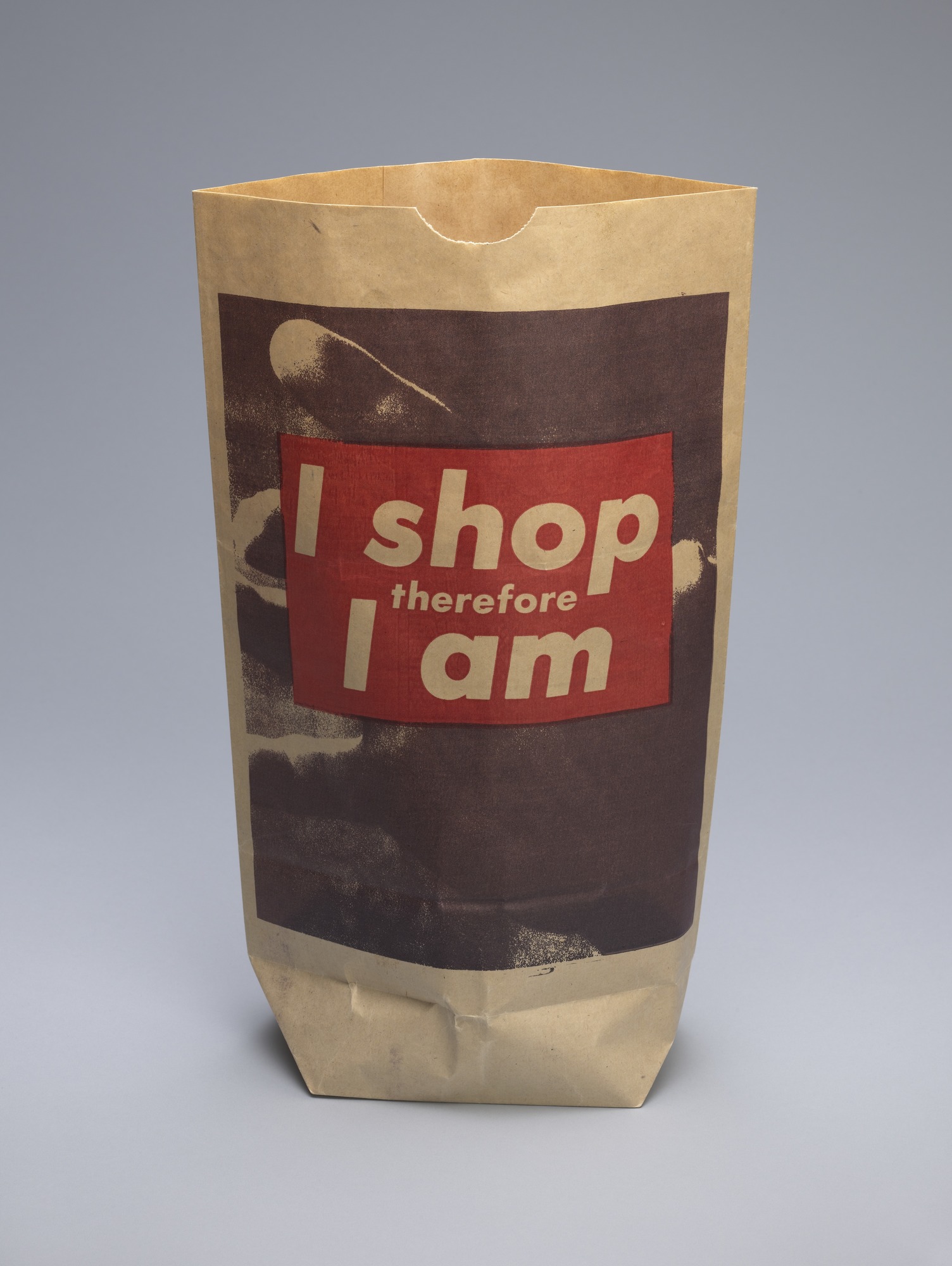


Kruger, B. (1990). I shop therefore I am. [photolithograph on paper shopping bag] New York City: MoMA.

As a work of art from the 90’s I feel that it ‘I shop therefore I am’ by barbara inherently retains more relevance to me as a designer in the 2010’s. Her punchy type and simple graphics combined with found imagery is something that I feel a strong connection with. Because of where she chose to show the design it reveals more about the design itself and what she meant.


Abstract: The Art of Design, S01E03 – Es Devlin: Stage Design. (2017).

Directed by B. Oakes. England: Netflix.

Tate. (2017). ‘Sandwich and Soda’, Roy Lichtenstein, 1964 | Tate. [online] Available at: http://www.tate.org.uk/art/artworks/lichtenstein-sandwich-and-soda-p77811

The Art Story. (2017). Postmodern Art – Modern Art Terms and Concepts. [online] Available at: http://www.theartstory.org/definition-postmodernism-artworks.htm#pnt_1

The Museum of Modern Art. (2017). Barbara Kruger. I shop therefore I am. 1990 | MoMA. [online] Available at: https://www.moma.org/collection/works/64897
Counter Cultural Design – spirit, sensibility and meaning

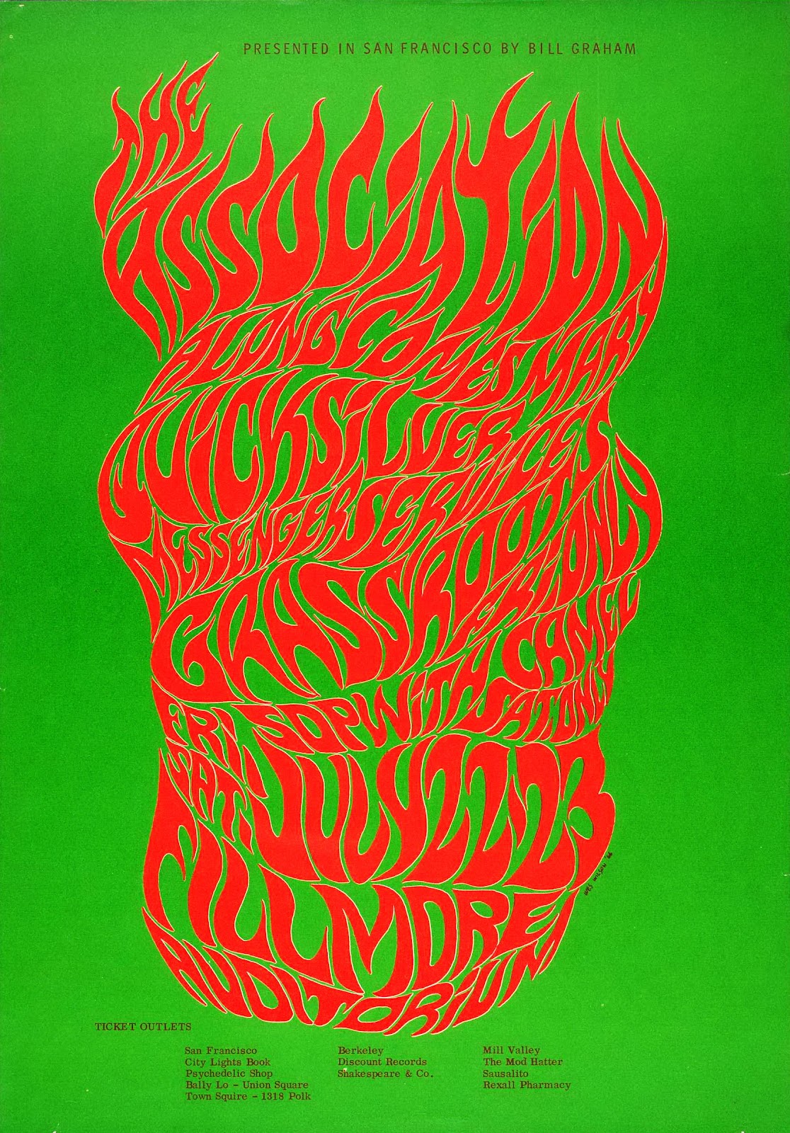
Wilson, W. (1966). BG-18. [screen printed poster] San Francisco

While I could have chosen any number of Wes Wilson concert event posters to make a point of how spirit and sensibility are key to effective graphic design, this one from 1966 perfectly compliments my favourite quote from legend Paula Scher: “Typography is painting with words”. This image embodies what made the psychedelic posters of the 60s and 70s so radical and that is their emphasis on feeling over rational design. As is the case with many of the posters Wilson made for concert promoter Bill Graham as well as with work from his counter-culture contemporaries Victor Moscoso and Rick Griffin, the typography is incredibly expressive, more so than legible. The fiery and free-form lettering evokes a wild sensation and does enough to illustrate the spirit of the advertised concert without any accompanying imagery and that is more important than abiding by traditional design conventions.


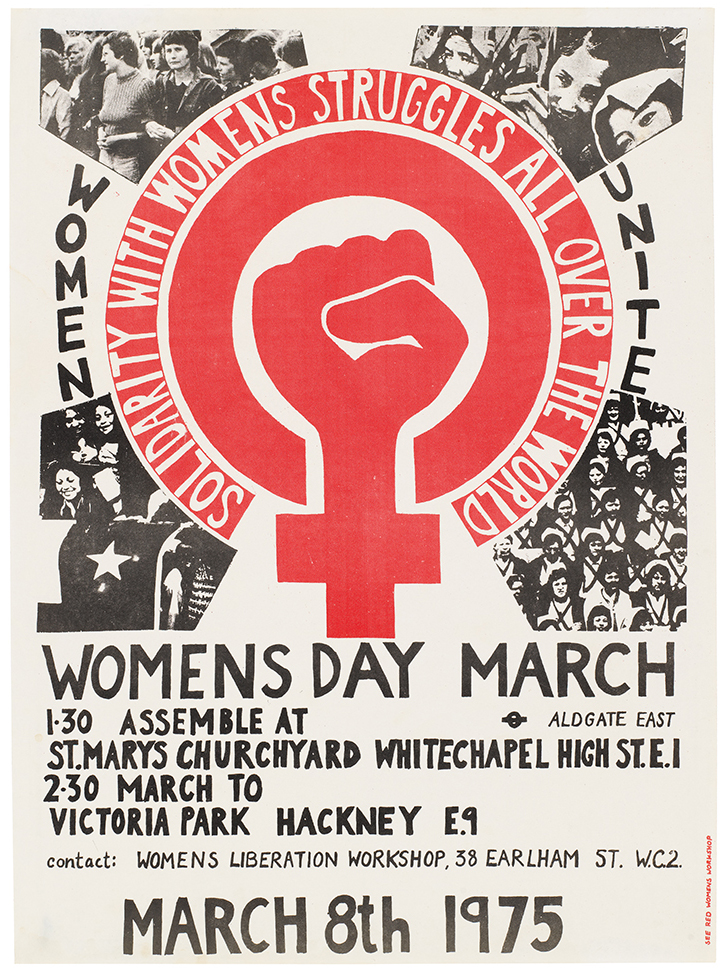
International Women’s Day Poster 1975. (1975). [Litho print poster] London.

This was the first design commissioned by the See Red Women’s Workshop and it boldly champions the grass-roots, populist spirit of the counter-culture movement that was occurring in 1970’s London. It’s imperfect hand-crafted aesthetic is key to it’s benevolent intentions and general sensibility. I believe that if someone sees an image that they believe could have been made by someone that shares their social class or situation then they will feel a natural appreciation towards the work. Though the production values of this poster may not have been a much of a choice at the time, they are what make this poster relevant to me in 2017. The meaning behind the sharp illustration is also a powerful aspect.


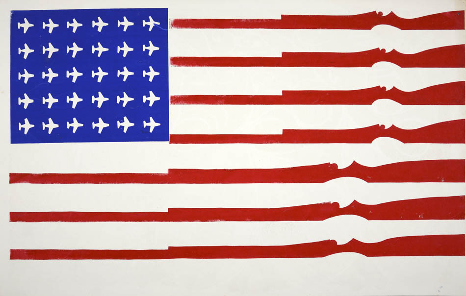
American Flag (untitled). (1970). [Screenprint on recycled calendar] Berkely, CA.

This is a potent image that conveys meaning through little detail and no words. Screen-printed by a student at California’s Berkeley university it conveys their feelings they had towards their country. The artist has vandalised the US flag with American tools of destruction, USAF MiG fighter planes being used in the escalating Vietnam war and national guard rifles, a common sight for many student protesters – “…We would go down to People’s Park and stick flowers in the national guard’s rifles.”


Abstract: The Art of Design, S01E08 – Paula Scher: Graphic Design. (2017). Directed by R. Press. Netflix.

Wes Wilson. (2017). Bill Graham Presents. [online] Available at: http://www.wes-wilson.com/bill-graham-presents.html

Bromwich, K. (2016). Poster power: 1970s anti-Vietnam war art by California students. [online] The Guardian. Available at: https://www.theguardian.com/artanddesign/2016/jan/30/poster-power-anti-vietnam-war-art-berkeley-california-students-exhibition-shapero-modern

Task 12 by Bianca Schmittmann

Hello Kitty by Batya Cavens, mixed media on wood, 48 H x 48 W x 2.5 In

https://www.saatchiart.com/art/Painting-Hello-Kitty/314078/2867610/view

This piece is already rather large and loud, however if it were larger in scale, the likely effect is that it would have a bigger impact on the narrative or even heighten it. It would either be a larger portrait which puts a bigger emphasis on the face, it could be turned into a full body piece adding more to the seen figure or even a scene, or it could even be a public mural on a whole wall since it has very graffiti like features. If I myself made it larger, I would add more characters and features, maybe create a scene to expand and build up the narrative that already exists. The piece is very exiting already because of its playful style, so if it were a mural displayed publicly it would draw even more attention.

Adding more to the scale would just bring it much further and make the piece so much more powerful and fantastic. The possibilities of the different kinds of narratives one can add to this piece are endless and would be still very attractive to look at if it were smaller in size.

Task 11 by Bianca Schmittmann

From all the tasks I’ve been set I’ve realised that not only is art making important and reflecting on choices, but the theory of the art world around me is just as important as a growing artist.

My blog consists of my responses to my own works, reflecting on my choices as well as my opinions and responses on different topics. The tasks have opened my mind to different areas of art that I haven’t thought of beforehand such as appropriation. I feel much better being aware of them and I look forward to continuing to expand my knowledge. Some tasks were new to me and therefore were challenging to approach, but it helped me think in areas and bring up new ideas that could help me evolve myself and my practice.

My favourite task so far was the appropriation task because I had so many ideas for it and I really enjoyed the whole process of creating the piece, making it the most valuable to me. The task which I had most difficulties with was task 7, because I found it difficult to understand the given text, therefore I found it difficult to comment on them. I decided to approach it in a direct way and simply comment upon what I found the most important in the given text.

Task 10 by Bianca Schmittmann

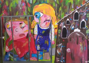
“Colourful narratives which look innocent yet thought provoking or dark”

The image and these ten words are what I think represent my practice. The ten words sum up how I see most of my works (literally). And the image that I have chosen links with my ten words. It is colorful, it’s a narrative from a fairytale which is socially seen as something innocent as they are for children. Most fairytales are originally a lot darker therefore I decided to paint a dark scene yet paint it in a way that it looks innocent and positive, making the piece thought provoking to the viewer.

I have chosen this image, because I think it is one of my most powerful pieces. I love mixing and adding dashes of colour, I love painting narratives and specifically fairy tales and manipulating them into my own. A playful looking piece with a dark story behind it is such a brilliant idea to me. Even though I have started branching into different themes, looking into digital art and looking at more contemporary narratives, right now I still feel that fairy tale narratives are the most important to me in my practice.

Behind the Gingerbread House, Acrylic on wood, 130 x 180 cm.

Task 9 by Bianca Schmittmann

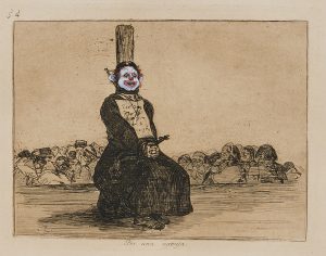
Chapman Brothers – On Account of a Knife, 2003

Jake and Dinos Chapman have created this work by taking an etching done originally by Francisco Goya and basically vandalising/appropriating it. Goya was unable to publicise these etchings at first because they were too controversial for his time. Today these works and works similar in style are still shocking yet they are more widely accepted, because of how our views in art have changed and evolved over the different movements such as modernism in the late 19th century.

The Chapman brother’s works are shocking and are very rebellious in terms of traditional art views and therefore shock even today’s viewers, however this rebellious behaviour in art nowadays, especially contemporary art is no longer such a controversy. If this was done during Goya’s time, it would’ve have been an outrage. Let alone Goya’s collection depicting disasters of war and this piece specifically a priest who was killed as punishment for owning a knife, it is rather dark and shocking. The most shocking factor in my opinion is the choice of replacing the human heads with clown ones and the general concept of vandalising Goya’s work.

http://artobserved.com/2013/06/new-york-jake-and-dinos-chapman-insult-to-injury-at-yoshii-gallery-through-june-29th-2013/1032523_02/

On Account of a knife by Jake and Dinos Chapman, 2003, etching painted on.

Task 8 by Bianca Schmittmann

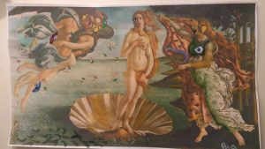
I have always liked “The birth of Venus” by Sandro Botticelli. I decided to appropriate this piece of work by painting features of my own style on top of the existing image. Those features that I painted also resemble the work of George Condo as I work with similar techniques therefore appropriating a second artist in this piece.

This process of painting on top of the printed photograph was inspired by the Chapman brothers and their work on Goya’s etchings. I also wanted purposely shock by vandalising this piece, doing that by painting on top of simple A4 paper. using regular paper also takes away the preciousness of the work. I continued to vandalise the piece by tearing a hole in it. If I could change anything, I would love have done this on a bigger scale.

What makes this new work interesting is that it is a combination of old and contemporary art, realism and cubism. The combination of the two different elements that are obvious makes the work relatively attractive to look at.  This would also trigger the viewer to want to find all the changes/details and carefully observe the whole piece.

The Birth of Venus 2.0, Acrylic on Inkjet printed A4 paper.


Task 7 by Bianca Schmittmann

In the first text of Art in theory, art critic Leo Steinberg talks about Rauschenberg’s approach to having art presented in a horizontal way, shifting from the old masters way focusing on nature into a more cultural way of presenting work.

in 50’s people were still used to always seeing art in front of us (head to foot) and then Rauschenberg had the idea of a flat surface presentation, to look at art horizontally. Steinberg describes that shift as a “radical shift in the subject matter of art” (Steinberg, p.950) which indicates the importance and intensity, following with “a shift from nature to culture” which highlights the big change in ideals and views.

In the second text, due to Richard Serra’s work Tilted Arc being removed from the specific site and destroyed by the government agency, he reveals his perspective of site specific work in a lecture.

Serra referred to his site specific sculptures to “never decorate, but become part of it and restructure the organisation of the site”. (Serra, p.1125) He is very connected with not only the material but the process of creation. The fact that he the site and the sculpture have to be part of each other changes how some people may have viewed sculptures. This links with Steinberg’s words, linking the two in terms of viewing art: stepping away from tradition and into more modern ideas.

bibliography:

Harrison, C., Wood, P., Steinberg, L. and Serra, R. (2002). Art in theory. 2nd ed. Malden, Massachusetts: Wiley-Blackwell, pp.948- 953, 1124-1127.