Category Archives: The Tasks

Counter Culture


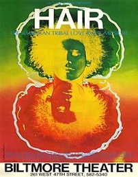
The first counter culture image I chose is the original Broadway poster of the Biltmore theater for The American Tribal Love-Rock Musical- Hair, it is a product of the hippie counterculture and sexual revolution of the late 1960s, several of its songs became anthems of the anti-Vietnam War peace movement. Visually this poster, looks very creative and appealing. The combination of colors totally brings out the spirit of the theme behind the poster which is to promote the musical.


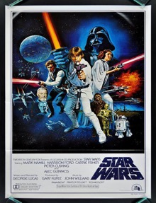
The second poster I chose is the official poster of Star Wars, we can call the posters of Star Wars “a visual history” because there were around eight posters created for the movie in the 1970’s itself, but this is the one which was admired by most of the people. From the placement of the Star Wars logo to the visually appealing background, everything in this poster seems to be perfect. Even in terms of visual mapping, it follows the correct pattern as the visual mapping starts from the upper left corner and ends smoothly to the bottom right. In terms of the colors used in the poster, they totally balance with the theme of the movie and the character placement is also done properly. My field of study being Graphic Design, I am inspired by this design and the fact that this was created in 1970’s as the design approach used in this poster is still used by a lot of designers.


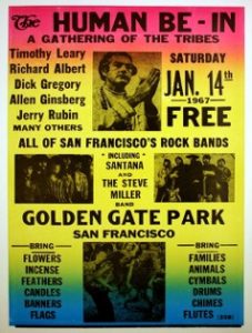
The third image I chose has more of a typographic approach of design, and that is one of my favorite type of design. This poster has different types of fonts and text sizes. The placement of the text is also done in different ways. The main heading that has the text- “The Human Be-In” doesn’t really seem to be placed properly, because visually “the” doesn’t look like a part of the heading. The use of leading in the upper half of the poster seems to be more appealing in terms of designing than the lower half. The background color selection gives the poster a refined look.


https://pin.it/scikxgbn6pr4ic

https://pin.it/5whlu3fprjeach

http://www.vintag.es/2013/01/star-wars-theatrical-posters-around.html

https://en.wikipedia.org/wiki/Hair_(musical)


Task 7 – History of Art

Leo Steinberg in his book of essays is talking about the way the old masters have drawn attention to their work through different devices, illusions, radical color-schemes, certain details and proportions and the different ways of compositions. He also talks about the way this has changed in modernist paintings but seems to come back in post-modernist paintings. He argues that by doing that the old masters not only promoted their own work but also art in general and sucked the viewer’s attention towards art whereas with modernist paintings which is more about deconstructing art as we knew before and by postmodernism these virtues not necessarily consciously but seems to come back to practice.

Most of his theoretical work is focusing on paintings, in contrast with Richard Serra who is a practicing artist, a sculptor with big and robust works, industrial metal structures with little aesthetic appealing to people who are not proficient in arts.

In his private letter’s Serra also mentions the way the old masters have made work although he is more interested in the way their works are constructing and de-constructing the buildings they take place in.

While they are talking about two different things the two ideas are not fundamentally antithetical to each other, in fact, they have many common points. Richard Serra writes that the works of the old masters, their frescos, and namely the frescos on the walls and ceiling of the Sistine Chapel have deconstructed the place, metaphorically destroying it’s walls and abolishing it as a construction.

It is easy to see how Steinberg’s statement applies to Serra’s ideas. By directing the attention to their paintings and creating illusions the old masters are essentially stealing the viewer’s attention. By doing that they distorting space making it into a strange little universe where walls and ceilings do not exist only illusions.

They smartly using the surface to bring out the best from their work, turning it into an interactive painting. The buildings are only buildings from the outside they ultimately function as a painting that you can enter and be a part of at any time.

Is it possible to be truly authentic?

According to me, the easiest way to describe authenticity is that, authenticity is something that is genuine, not replicated or plagiarized. In terms of art, I do not believe that it is possible to be truly authentic. There are various artists who usually use ideas and concepts of other artists and try to replicate the design with a twist of their own and some also try to something that is more relatable to the modern society. But, there is a huge difference between replicating and creating. An artist who replicates other artists work basically shows their studio skills and an artist who creates something from scratch shows their creativity, for example- The replication of Leonardo da Vinci’s The Last Supper artwork has been done multiple times, one of the famous replication of this artwork is by Andy Warhol.

By Leonardo da Vinci

This is the original artwork of The Last Supper by Leonardo da Vinci, he is one of the most famous artist and his work has been admired worldwide.


Replication by Andy Warhol

As we can see in this replication by Andy that there are not many changes, and it does not show much as creativity as the original painting. There is also a term ‘genuine fake’ where the work of the original artist is recreated by a fake artist but it is usually hard to identify since it seems to be authentic. So, although we can say that this is a replication but it is definitely not authentic.


https://www.leonardodavinci.net/the-last-supper.jsp

https://www.flavorpaper.com/wallpaper/murals/last-supper-mural


Task 6 – Modes of practice

My work on this project started out as a simple synesthesia practice with my boyfriend who is a classical musician. The project’s aim was to find a common ground between painting and classical violin. Through some paintings and various videos and some experimenting with making music together evolved this project into something that’s more about making music from a fine art perspective rather than the connection between music and painting.

What started out as paintings trying to imitate the music and the sound of the violin slowly started to become something that instead wants to create music and wants to use the violin and the musician instead. For this new idea, I photocopied my boyfriend’s chords and cut them up into small pieces so I can rearrange them in different orders, making it a sort of hand-made remixing practice.

Similar to how the film-editors worked long ago.


To make my collages I chose the works of the English composer Thomas Campion who is usually considered a renaissance composer and mixed it with European Baroque composition’s most notably with Bach to prove that he was very well influenced by European, mostly Italian composer’s work and he was way ahead of his time.


Technology is the mortal enemy of Graphic Design

Technology plays a major role in the field of Graphic Design. The impact of technology in the field of Graphic Design is both positive and negative.

In earlier times, when technology was not evolved, the approach towards meeting the clients, getting to know about their ideas and getting the designs approved was more personal and communication based, but now since the evolution of technology the approach towards this has become more digital based though the use of text/email which has both positive and negative impacts.  The positive impact would be that the process of communicating has become much simpler, for example- if a client needs to get some designing work done by a graphic designer they can simply email/text them and they can get their work and discuss about ideas easily. It has also become easier to display your work on various websites but again if we do so the chances of plagiarism are very high. On the other hand, the negative impact would be that even though due to the easy process of communicating through the help of technology is useful but it increases the chances of mistakes, because an idea explained by the client through email/text could easily be misunderstood by the designer and vice versa. As quoted by Frank Chimero, “Good design is all about making other designers feel like idiots because that idea wasn’t theirs.” So, because of technology, there are a lot of websites which display various designs and allow us to purchase that design, these services are impacting the graphic designers because even if someone doesn’t purchase the design file, they can easily duplicate the idea of the designer by creating the exact same type of design by their own.

In a nutshell, even though there are many advantages that come with the evolution of Technology, but at the end Technology is definitely the mortal enemy of Graphic Design and various other fields.

https://pin.it/gnk3i3x5xzdhwu

Task 5 – Ways of Seeing Pt.3

My chosen art-work is from the same exhibition made for the Manifesto project the AMP for Anti-manifesto party made by Poppy Ash, Maryam Kazimi, and Lauren Culloty.

The work itself was a yellow box stuck on the wall with many small books, manifestos, and anti-manifestos in it. The box has a nice home-made, punkish aesthetics and its color contrast is reminiscent of the posters made by the Guerilla Girls. The books itself are coming in 20 different designs and an inverse color combination as well and has 10 copies each. Simplistic in design the girls were clearly approaching the whole theme through humor and with the intention of having fun.

The books including pictures taken out of context, appropriating random things and drawings from the studio and from newspapers. The work itself becomes an anti-manifesto through the rejection of the rhetorics of a classical manifesto and becomes a representation of the whole class through the appropriation of drawings and ideas from other students. It also provides a nice interactivity with the books being readable and takeable.

When asking the girls why their decision fell on a group project they said everyone brings individuality and new ideas in. By doing a group project the work becomes a celebration of diversity and individuality.

Comparing Posters


At the first glance, this movie poster of The Dark Knight Rises looks really captivating. In terms of the colors used in the poster, it has a balanced color contrast and temperature.  The background of the image is dark orange which seems to give a dominant color contrast which matches to the title of the movie perfectly. The entire poster has the incorporation of triadic color scheme and analogous color scheme. The font used in the poster is bold and the font choice seems to be matching with the name of the movie and the way the character is displayed in the poster. In terms of visual mapping, I feel, that this poster does not match the correct visual mapping pattern, as the visual mapping is not starting from upper right corner and ending smoothly at the lower left corner. But, due to a good combination of colors, font choice and character design, it totally seems as if the dark knight is rising.


The poster I am comparing the first poster with is a still from a trailer, the colors used in the poster are bold and dark. The background with an exploding effect totally captures the movement and heat between the characters of the movie. The combination of color contrast, effects and motion used in this totally balance with the scene.

http://imgfave.com/view/1880235

http://collider.com/batman-vs-superman-new-posters/

Task 4 – Ways of Seeing Pt.2

My chosen exhibition is the one our First Year Fine Art class has made for the Manifesto Project. As short as it was, however, it was also a big surprise to me.

The exhibition included different works varying in content and in media including paintings, installations, video installations, texts, prints and other objects. The exhibition was displayed only for a week but it was still very intense. It also provided a good opportunity to get to know a little bit more about the more personal aspect of each other’s work. To my surprise, I was stunned at how aware and how politically sensitive the whole class is to certain socio-political issues while there was still enough room for silliness and self-comedy to make it a more forgiving and less burning experience for the viewers.

As a practitioner, I really enjoyed being part of this exhibition, and the social conversation that followed it which helped to get to more about the work and interests of my peers not just as art students but also as entrant artists who are all very different and having important, full-fledged ideas about the world around them.

The exhibition could be viewed on the ground floor of the Westside Foyer in Winchester School of Art and it could be viewed by anyone but mostly by the students of the University of Southampton.

Task 3 – Ways of Seeing Pt.1

Renée Cox is a Jamaican born artist, activist, lecturer, and curator. Her recurring theme includes race, gender through the use of her own body in many of her works.

Cox liberating herself and other black women through self-representation and criticizes the way black women are portrayed in media through her work.

In hot-en-tot venus, Cox is portraying herself as Saartje Bartman a Khoikhoi women who was exhibited at freak shows across Europe in the 19th century known as the Hottentot Venus. She uses plastic breasts and buttocks from a costume shop to make her body similar to Saartje’s.
Cox criticizes the stereotypical portrayal and exploitation of Black woman and the lack of awareness with the use of the plastic body-parts in her work and also celebrating her own body through her own nudity ultimately liberating herself with shaping her own identity.

REFERENCES

Aperture Foundation NY. (2017). Renée Cox: A Taste of Power. [online] Available at:
https://aperture.org/blog/renee-cox- taste-power/ [Accessed 7 Dec. 2017].

Black Atlantic Resource Debate. (2017). Video of the Week: After Hot-En- Tot: Two
conversations with Artist Renée Cox. [online] Available at:
https://blackatlanticresource.wordpress.com/2012/03/26/video-of- the-week- after-hot- en-tot-
two-conversations- with-artist- renee-cox/ [Accessed 7 Dec. 2017].

Black feminist art. (2017). RenĂ©e Cox – Hot en Tot. [online] Available at:
https://artintheblackdiaspora.wordpress.com/2014/05/01/renee-cox- hot-en- tot/ [Accessed 7
Dec. 2017].

Terminal Bar

Terminal Bar is an award-winning American documentary short film directed by Stefan Nadelman. It is about a bar located in the Times Square in United States of America.

The entire documentary revolves around the owner of the bar and various customers of that bar. One of the thing that makes the documentary interesting is how the bartender, shot over 1,500 black and white portraits during his ten-year stint there from 1972-1982, and how those portraits are used in creating a film. The entire content of the movie is basically made of stills, black and white portraits, short scenes/interviews, audio, newspaper information and write ups, this is the reason that it is very interesting to see how a short film can be created using just these things. All the information presented in the movie is clearly understandable because of the way all the elements are presented and the way the information is zoomed in/out which makes it easier for the viewers to understand the visuals. One of the other interesting thing about the creation of this documentary is how the entire audio used in the film is connected to the content from starting till the ending, also the audio totally represents the hustle bustle life of New York City.

This documentary is a perfect example of how a short film can be created by using a proper combination of audio and visuals. For my projects, I could use a similar process of creating a layout that is particularly based on stills and text.