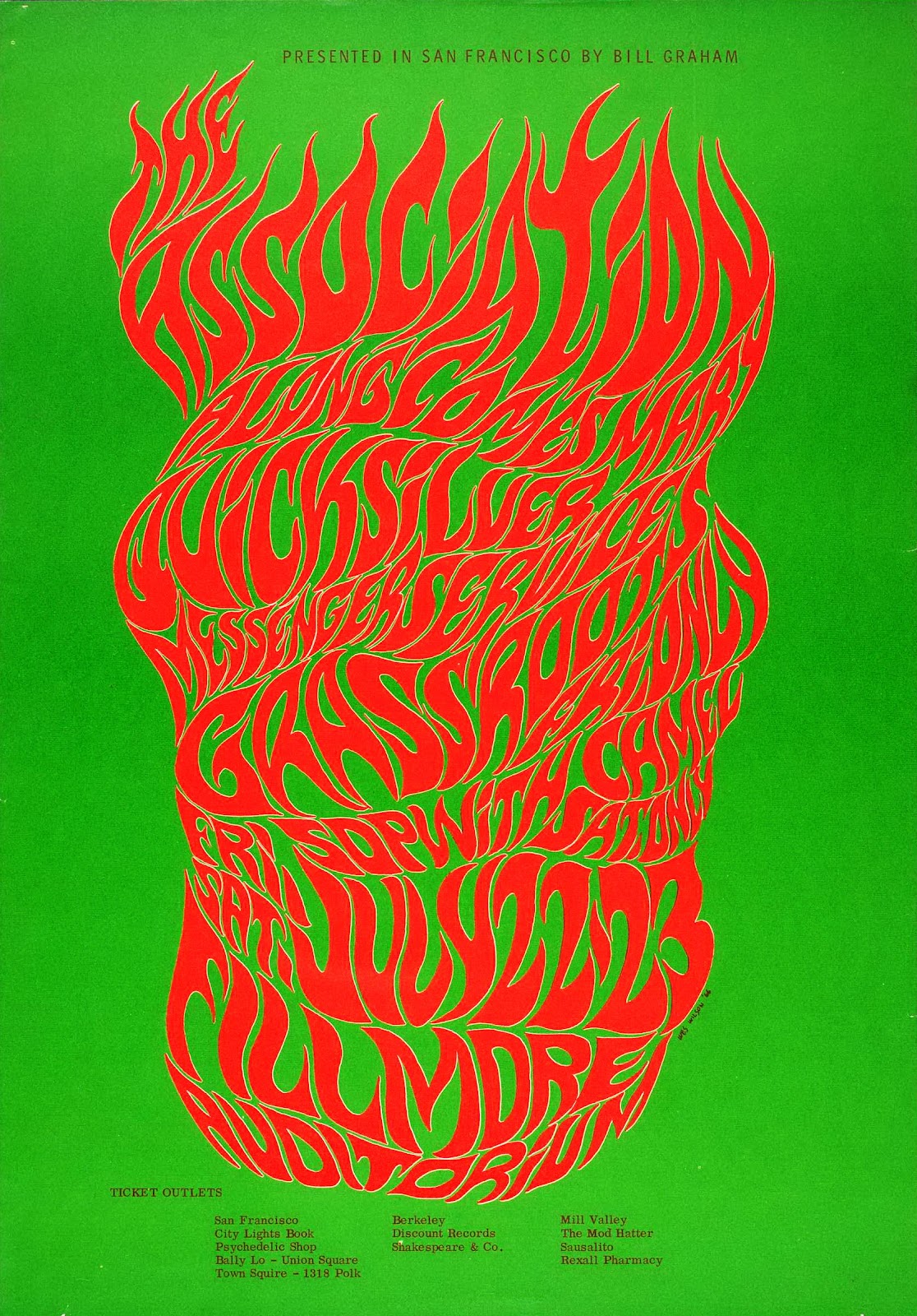
Wilson, W. (1966). BG-18. [screen printed poster] San Francisco
While I could have chosen any number of Wes Wilson concert event posters to make a point of how spirit and sensibility are key to effective graphic design, this one from 1966 perfectly compliments my favourite quote from legend Paula Scher: “Typography is painting with words”. This image embodies what made the psychedelic posters of the 60s and 70s so radical and that is their emphasis on feeling over rational design. As is the case with many of the posters Wilson made for concert promoter Bill Graham as well as with work from his counter-culture contemporaries Victor Moscoso and Rick Griffin, the typography is incredibly expressive, more so than legible. The fiery and free-form lettering evokes a wild sensation and does enough to illustrate the spirit of the advertised concert without any accompanying imagery and that is more important than abiding by traditional design conventions.
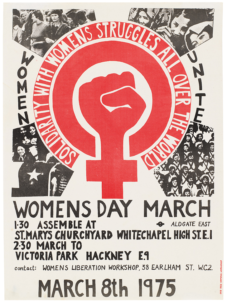
International Women’s Day Poster 1975. (1975). [Litho print poster] London.
This was the first design commissioned by the See Red Women’s Workshop and it boldly champions the grass-roots, populist spirit of the counter-culture movement that was occurring in 1970’s London. It’s imperfect hand-crafted aesthetic is key to it’s benevolent intentions and general sensibility. I believe that if someone sees an image that they believe could have been made by someone that shares their social class or situation then they will feel a natural appreciation towards the work. Though the production values of this poster may not have been a much of a choice at the time, they are what make this poster relevant to me in 2017. The meaning behind the sharp illustration is also a powerful aspect.
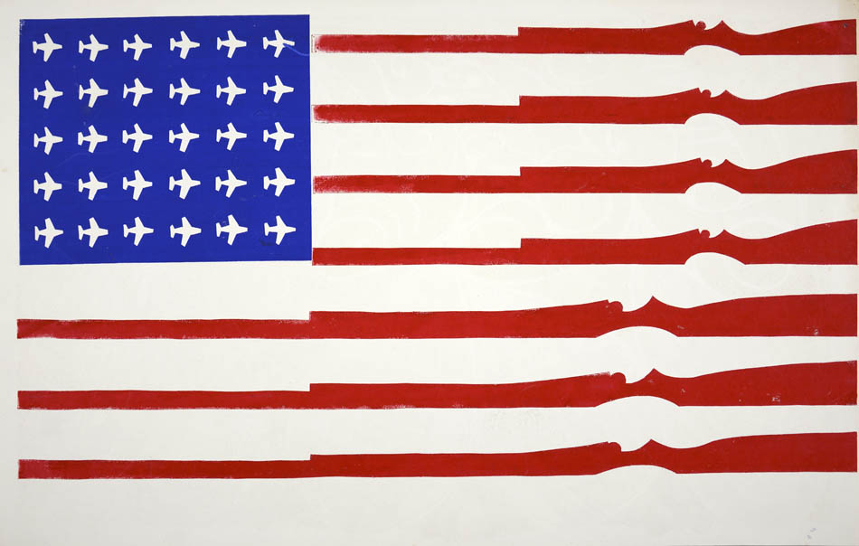
American Flag (untitled). (1970). [Screenprint on recycled calendar] Berkely, CA.
This is a potent image that conveys meaning through little detail and no words. Screen-printed by a student at California’s Berkeley university it conveys their feelings they had towards their country. The artist has vandalised the US flag with American tools of destruction, USAF MiG fighter planes being used in the escalating Vietnam war and national guard rifles, a common sight for many student protesters – “…We would go down to People’s Park and stick flowers in the national guard’s rifles.”
Abstract: The Art of Design, S01E08 – Paula Scher: Graphic Design. (2017). Directed by R. Press. Netflix.
Wes Wilson. (2017). Bill Graham Presents. [online] Available at: http://www.wes-wilson.com/bill-graham-presents.html
Bromwich, K. (2016). Poster power: 1970s anti-Vietnam war art by California students. [online] The Guardian. Available at: https://www.theguardian.com/artanddesign/2016/jan/30/poster-power-anti-vietnam-war-art-berkeley-california-students-exhibition-shapero-modern
