Author Archives: Liberty Hodgson

Task three-

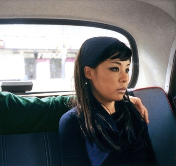
I have chosen to look at a photograph by Nikki S. Lee, a Korean artist who mainly focuses on film making and photography and uses herself for some works. This particular image is apart of a project Lee did called ā€˜partsā€™ which is a series of photographs of her with a male in the imagine but he is always cropped out and not to be seen.The male is always someone she knows and is close with, but taking them out of the picture gives it a whole different feel.
In this photo from the series in particular, even though she knows the person with her Lee still looks very distance and almost like she doesn’t want to be there, like sheā€™s uncomfortable.

Whereas if you could see the whole image, they may be both looking at the same thing, but without being able to see both emotions from people you canā€™t work out what their relationship would be. For these photos Lee had her friends take the pictures on a camera that would make the photos as simple as possible, this gives them all a really authentic feel to them because they donā€™t look forced, just a natural piece of someone’s day.

With that being said, I think the pictures still have a lot of emotion behind them regardless of if itā€™s good or bad, they still make you feel something because of Leeā€™s facial expression. The way Lee is holding her body also has a large impact on the way you can portray the image because she has kept her arms to herself and she is enclosed just to one space, rather than having her hand on the male next to her or just having any interaction with him, which adds to the feel she isnā€™t close with him even though she is.


https://alchetron.com/Nikki-S-Lee

Task One

I drew/painted this piece in the past week in my spare time, I may be using it for a project Iā€™m currently doing but I didnā€™t create it with that intention. I started off by drawing a very simple face in fine liner, mostly just shapes and adding in extra lines where it needed to be more interesting. I then added block colour (using watercolour) to some parts, which is different for me as I usually use watered down paints which makes it quite subtle, whereas this time itā€™s very bright. After doing so I went over the lines again with pen as the paint had faded them and it didnā€™t look as bold, because the colours are so eye catching I felt like the rest of it had to be otherwise some parts may have looked better than others.


Next I still felt like something was missing from my work so I decided to try and add something a bit more abstract which again isnā€™t what I normally do, so I drew lines in different parts around the face, some squares but mostly triangles and they are all scattered around in clumps. I started to add colour to them and was using a variety so that it wouldnā€™t look plain or just have one tone to it, as I went to different shapes and carried on filling them in I realised that I didnā€™t want them all to be filled as it could be overpowering as all of the colours are so strong and vibrant, so left a few blank just to show of the structure of the shapes. In the future I may develop it further by adding more colours if I change my mind and think it needs it, I think thatā€™s the only change or development I would consider. IMG_2615