Author Archives: Kane Lewis

summary of rcs

To be completely honest I can say I didn’t enjoy this at the beginning I found the researching tedious and in some cases irrelevant. I have never been the biggest writer so it was quite difficult to get into as well. Some weeks were definitely easier than others as I found the topics more interesting therefore it was easier to express my views and opinions and I feel this will be evident in my previous posts.

One of my least favourite is most likely evident as the Authenticity post. I did not enjoy this one at all it dragged out and was extremely boring to research. And as admittedly I don’t have the longest attention span this one was hard to complete.

On a more positive note one of my favourite posts would have to be the Publish or Perish. I enjoyed this one I’m not 100% sure I done it right but nether the less it was interesting to me to look at and express my opinions on some very interesting pieces of published media especially when I spoke about the comic ‘Batman: Hush’. I was able to speak about this with fondness as I very much enjoy the book.

Image result for martin luther kingThe Publish or Perish lecture was also one of my favourites for another reason. I found the section on Dr. Martin Luther King and Malcom X extremely interesting as I have looked into this a little myself and it was very insightful into the black history in America. This is a topic I find engaging as a young black man myself this relates to my history also.

Overall I did like the way we explored into each of the pathways throughout the course of the lectures. They are not all going to apply to me but I did get the much needed insight in order to help me make a decision for which I am going to choose. I do feel like the lectures were a bit too long on some days though. I feel as though there wasn’t enough information given to justify two hours of lecture. Especially with the Netflix show ‘Abstract: the art of Design’ don’t get me wrong I enjoyed watching the show but on occasion it wasn’t completely relevant and sections could of easily been skipped.

My personal take aways from the research and communication lectures are the ability to reference. I have never used this form of referencing before so it was a change but I see its importance to see where the information has been sourced from. Also the ability to find these sources that give valid information that I need. I will definitely be using these skills to improve my research in future projects making sure to use correct referencing.

Website title: Upload.wikimedia.org
URL: https://upload.wikimedia.org/wikipedia/commons/8/84/Martin_Luther_King_Jr_NYWTS.jpg

publish or perish

Starting off strong with one of my first and favourite ever graphic novels Batman: Hush. It was published Image result for batman hushissue by issue from December 2002 to November 2003. The award winning story was written by Jeph Loeb and brought to life by the amazing pencil work of Jim Lee which was then inked by Scott Williams and finally coloured by Alex Sinclair. Jim Lee alone is one of my favourite comic book artists with his amazing renditions of the characters. Besides the beautiful artwork the story and narrative is gripping throughout the entire novel with intense action sequences and compelling backstories to lesser known characters. Also the way the Williams has introduced so many characters into  the plot with out it seaming like to much each having just the right amount to make them relevant to the continuation of the story. To prove my point further here is one of the first lines in IGN’s review  “there are books that offer significant changes in the status quo, good or bad. In either case, fans are certain to go absolutely f—— nuts. That’s what happened when fan-fave writer Jeph Loeb teamed with Jim Lee for the year-long “Hush” storyline. It didn’t just alter the status quo, it destroyed it.”


Image result for avengers infinity war magazine cover


next on my publication list is the more recent Avengers Infinity war covers to well know magazine Vanity Fair. these covers were published in late November of this year in order to further hype the already massively anticipated 2018 release of the movie. Vanity Fair writes about how marvels decade long story is coming into its final chapters with Infinity war. they interview many of the actors from the MCU one being The Hulk played by Mark Ruffalo who said to Vanity Fair “All good things must come to an end.”


Image result for posters 2017


And finally moving away from the comic theme slightly and into the realm of popular television show we have the second season of the smash hit Netflix original Stranger Things. This latest addition to the Duffer brothers show was another hit and a great addition. Both seasons are jam packed full of pop culture references to the era that its set in. That era being the 80’s. The second season scored an impressive 94% on rotten tomatoes                         ” Stranger Things‘ slow-building sophomore season balances moments of humor and a nostalgic sweetness against a growing horror that’s all the more effective thanks to the show’s full-bodied characters and evocative tone.”


Article title: Batman: Hush Review – IGN
Website title: IGN
URL: http://uk.ign.com/articles/2005/06/16/batman-hush-review
Author Joanna Robinson
Article title: Avengers, Assembled: Feast Your Eyes on All Four of Vanity Fair’s Marvel Covers
Website title: HWD
URL: https://www.vanityfair.com/hollywood/2017/11/all-four-vanity-fair-marvel-covers
Website title: Rottentomatoes.com
URL: https://www.rottentomatoes.com/tv/stranger_things/s02/

postmodernism

The post modernism movement is a rebellious movement against the increasingly more modern forms of art. “It opposed the Modern art’s emotional and spiritual detachment from society. This gave rise to the two distinct schools of Postmodern art theory, Deconstructivism and Constructivism.”   It spans all the way from the 1960s to the 1980s.

postmordernist art is split into a few sub movement that are quite well know such as Pop art, conceptual art and installation art just to name a few.

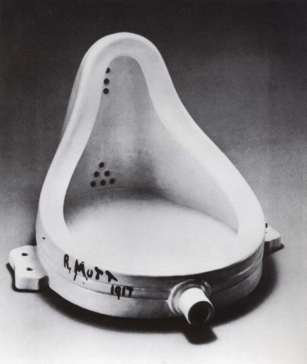
Image result for the fountain marcel


One of if not the most famous conceptual artist was Marcel Duchamp. With one of his most famous pieces titled “fountain” originally made in 1917. This famous piece by Duchamp was iconic for its time as it was simply a urinal signed R.Mutt. “Fountain” was highly controversial for its time as no one wanted to consider something so ugly and grotesque as a piece of art. This piece was later joined by more replicas of the “fountain” commissioned by Duchamp himself.


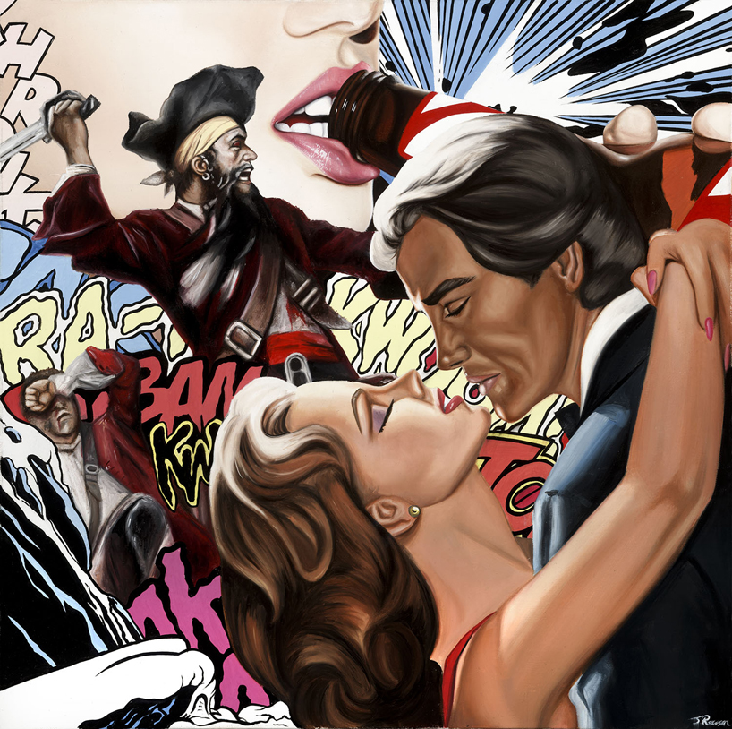
Next on my list is this image titled      “bitches love cake” by James Rawson. his art fits well with the pop art movement of which the most well known artist is Andy Warhol with his famous prints. Rawson however uses a mix of collage and painting to create his bold pieces. This piece stood out to me for its use of bright colours and the text in the background which is contrasted by the people in the foreground.


Image result for dan flavin


Finally i have a piece here from artist Dan Flavin it doesn’t have a title as he has quite a few similar to this all of which use fluorescent, long neon bulbs in a variety of colours. I like his pieces mainly for the colours in them being colourblind these installations mess with my mind making the whole scene become sort of distorted which i believe give me a unique insight to his pieces.


Article title: james rawson visualizes pop culture through painting + collage
Website title: designboom | architecture & design magazine
URL: https://www.designboom.com/art/james-rawson-visualizes-pop-culture-through-painting-collage-01-13-2014/
Article title: dan flavin Archives | Soho Grand
Website title: Soho Grand
URL: http://www.sohogrand.com/tag/dan-flavin/


Article title: POSTMODERN ART
Website title: pdaayushi
URL: https://pdaayushi.wordpress.com/2015/09/16/postmodern-art/

Authenticity

if something is authentic it is genuine and real, not a fake or a copy. Relating this to my own practice any original piece that I create would be ‘real’ and therefore can be seen as authentic and genuine

Artists and designers take inspiration from everything around them including other current artist and art that came before them, all tweaked and updated to fit modern standards and culture. Can it then be said that no art today is authentic. As we are merely adapting old concept or upgrading old techniques to fit our needs in the ever moving world of art.

In art I believe something’s authenticity relies more on it being created by who it says it was. Forgery in the art world would be an example of this. If I created an exact replica of the ‘Mona Lisa’ it would both be inauthentic because it would not be the original created by Leonardo da Vinci in 1503, however it would be authentic as a real piece of my own work as long as I didn’t try to make it seem as if it were the original. A real life example of this is referenced in Denis Dutton’s discussion on authenticity in art                                                                                               “A forged painting, for example, will not be inauthentic in every respect: a Han van Meegeren forgery of a Vermeer is at one and the same time both a fake Vermeer and an authentic van Meegeren, just as a counterfeit bill may be both a fraudulent token of legal tender but at the same time a genuine piece of paper.”

Some people do not share this opinion. Believing that no art today can truly be authentic because in everything made there is at least one aspect that is copied from somewhere.


Article title: Denis Dutton on authenticity in art
Website title: Denisdutton.com
URL: http://www.denisdutton.com/authenticity.htm

Counter Culture

Counter Culture in the 1960s came about through the frustrations of a post war generation.

Image result for 1960s counterculture

The world still struggling with racism, sexism and other political issues the youth rebelled. And the tools of their rebellion were sex, drugs and music.

the publication ‘Zap Comix’ was created  in late 1967 by R. Crumb. The first few issues were described as “rowdy documents of the 1960s counterculture” NyTimes.com they also went on to describe how “it set off legal battles and conversations over censorship, brought attention to cartoonists as artists, and set an example for generations of alternative comics creators” which just shows the influence this comic series had over the generation being able to legal battles by simply stirring controversy within its pages. Touching on important subjects that spurred serious conversations that helped define the era.

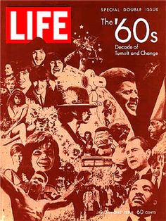
Life magazine is still a ongoing magazine today in America and just as it was back then its still tackles important issues.

Image result for 1960s counterculture album covers

this particular image is of the cover of the magazine published on December 26, 1969. so this issue was a culmination of all the major topics the happened the the previous decade. As you can see from the cover it has images such as JFK, The Beetles, Dr Martin Luther King, Marilyn Monroe and Snoopie just to name a few. Each of these individuals helped to define the 1960s.

JFK was the president of America at the time of the Vietnam war and during the cuban missile crisis. The Beetles and Marilyn Monroe were pop culture icons of the time.

In my personal opinion the most important there is Dr Martin Luther King as he fought for equality of black people in America. With peaceful protests and speeches he inspired not just people across America but across the world to stand up and fight for their rights and it worked. this forever changed the lives of black people in America, yes there is still racism in America but the impact he had on it cannot be ignored.


Image result for 1960s counterculture photography

Lastly this photograph is of the famous musician/guitarist Jimi Hendrix an important symbol of the rock and roll movement. in my opinion Hendrix is a symbol of Counter culture itself. he embodies the the phrase “sex,drugs and rock and roll”


Author Dana Jennings
Article title: Zap Comix, Now in a Coffee Table Boxed Set
Website title: Nytimes.com
URL: https://www.nytimes.com/2014/11/02/arts/design/zap-comix-now-in-a-coffee-table-boxed-set.html
Article title: LIFE Magazine December 26, 1969 @ Original LIFE Magazines.com, Unique Gift Idea, Vintage LIFE Magazine, Classic LIFE Magazine
Website title: Originallifemagazines.com
URL: http://www.originallifemagazines.com/LIFE-Magazine-December-26-1969-P2077.aspx
Website title: I.pinimg.com
URL: https://i.pinimg.com/736x/e7/c1/07/e7c107587aa3898b72e0e240a33e95a1.jpg

“Technology is the mortal enemy of art”

Rodchenko’s manifesto of the constructivist group states that “Technology is the mortal enemy of art”. I believe this statement to be untrue my main reasons being.

“Where would impressionist be without the invention of portable paint tubes that enabled them to paint out doors? Who would have heard of Andy Warhol without silkscreen printing? the truth is that technology has been with new ways to express themselves for a very long time.”

This quote I feel sums up my views against Rodchenko’s. That the continual invention of newer technologies can only open up new pathways to explore in the world of art. New forms of camera allow for higher quality photographs letting us see in more detail, new computer software’s allow us to edit in new before unimaginable ways. technology creates new tools for artists to utilise into their own craft.

So in short I don’t think that technology is the enemy of art. I think it is the friend to art. Technology helps to push and drive art into the future guiding it to unforeseen destinations, making it constantly up to date and exciting. Also the more new technology over takes the old forms of art the more it is appreciated as a craft. Older art is still marvelled at in today’s society so I believe they will never lose their shine.

    Bibliography

  • Website

    @randyrieland, F.

    7 Ways Technology is Changing How Art is Made

    Bibliography: @randyrieland, F. (2017). 7 Ways Technology is Changing How Art is Made. [online] Smithsonian. Available at: https://www.smithsonianmag.com/arts-culture/7-ways-technology-is-changing-how-art-is-made-180952472/ [Accessed 20 Oct. 2017].

Comparing

pulp fiction


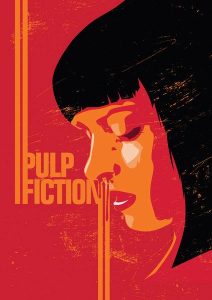
for my comparison I will be starting with this illustration on the right. It is a fan made poster for one of my favourite movies ‘Pulp Fiction’. The way this illustration is done is in a very minimalistic style. Although I couldn’t find the artist behind this particular piece it looks and feels very similar to the style of Craig Drake as he also creates movie posters in a minimalistic way. This piece uses a handful of colours to create the image which is a notable scene from the film.


black and white photoThe piece of Photography on the left is a black and white image of a mixed raced girl. This is a high quality detailed image. It perfectly captures both the softness of her skin and the frizziness of her hair without needing the use of colour. Each highlight and shadow is emphasized by the use of the black and white photography making this a very strong image


although both pieces are of a woman’s face they are quite drastically different from each other  with the most notable difference being the detail or lack there of. The photography captures the realistic details of the face whereas the illustration is abstract giving just enough detail for you to see what it is portraying. Another key difference would be the colour in the illustration being vibrant and eye catching utilising bold blocks of colour to draw attention to itself. On the other hand the photography’s  use of black and white make it more subtle.

Terminal Bar

The short film/documentary Terminal Bar (2002) directed by Stefan Nadelman follows a ten year period in which the directors father (Sheldon Nadelman) took photos of customers that entered the bar that he owned, Terminal Bar. The Terminal Bar is located on eighth avenue in New York and was named so as it was across the road from the bus terminal.  These photos stretch from the year 1972 to 1982. Each portrait Is numbered and is black and white. The film is narrated by Sheldon Nadelman as he commentates on different situation that are happening behind the scenes of his photos. The way this film is laid out is very interesting as it is mainly made out of still images which move in various way to the beat of the backing track and the narration. Sheldon’s narration is an in depth look into the lives of his customers for this ten year period . From gays to junkies, pimps to prostitutes. Some of his customers were even in the bar everyday until they died which is probably why Sheldon seems to remember so many of them as he saw them so often and heard all of there many stories.  In the end of the film they take a trip to where the Terminal Bar used to be and get some final shots of what is now a video store. In some of the final minutes Sheldon says the reason he took all these photos is because if he didn’t who would? all these memories would be lost into the city.

In order to recreate a film like this it would take a fair amount of time to gather the right amount of photos to fill the allotted time. Not only the photos but the stories behind all of them.