
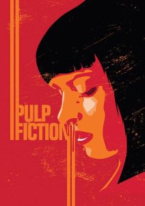
for my comparison I will be starting with this illustration on the right. It is a fan made poster for one of my favourite movies ‘Pulp Fiction’. The way this illustration is done is in a very minimalistic style. Although I couldn’t find the artist behind this particular piece it looks and feels very similar to the style of Craig Drake as he also creates movie posters in a minimalistic way. This piece uses a handful of colours to create the image which is a notable scene from the film.
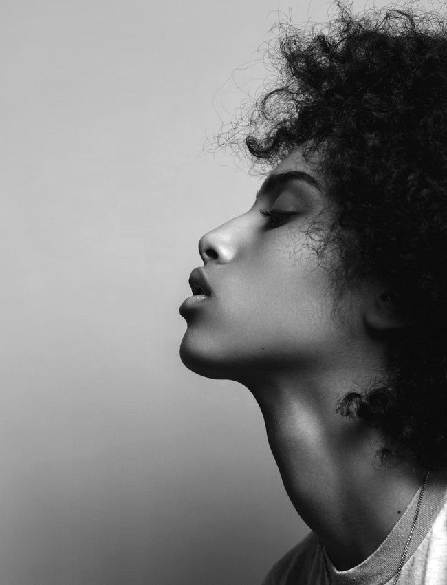 The piece of Photography on the left is a black and white image of a mixed raced girl. This is a high quality detailed image. It perfectly captures both the softness of her skin and the frizziness of her hair without needing the use of colour. Each highlight and shadow is emphasized by the use of the black and white photography making this a very strong image
although both pieces are of a woman’s face they are quite drastically different from each other with the most notable difference being the detail or lack there of. The photography captures the realistic details of the face whereas the illustration is abstract giving just enough detail for you to see what it is portraying. Another key difference would be the colour in the illustration being vibrant and eye catching utilising bold blocks of colour to draw attention to itself. On the other hand the photography’s use of black and white make it more subtle.