
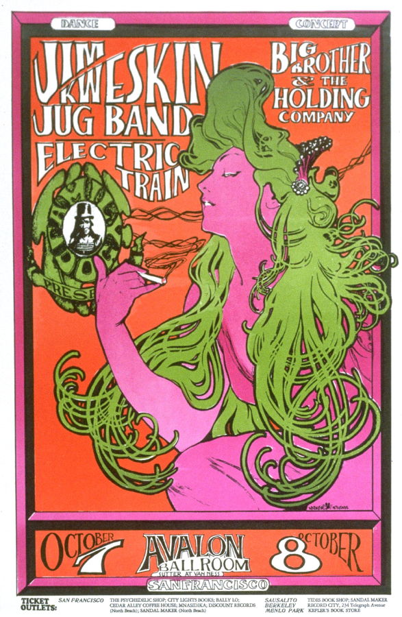
The three counter culture images I selected were illustrations, one from an underground magazine covers and two from music posters. The first one (Wilson, 1966) drew my attention due to the fact it features a well known artwork from Alphonse Mucha, where the only thing changed is the colours. This is odd to me because even though the use of it applies well to the poster and the era (heavy drug use) due to the colour changes, making her a symbol for marijuana rather than tobacco cigarettes, the artwork retains much of what makes it identifiable. The poster is overall easy to look at because it has 3 colours, in addition to black and white which create contrasts in all of the areas the creator would want you to look while having a spirit in line with the activity.
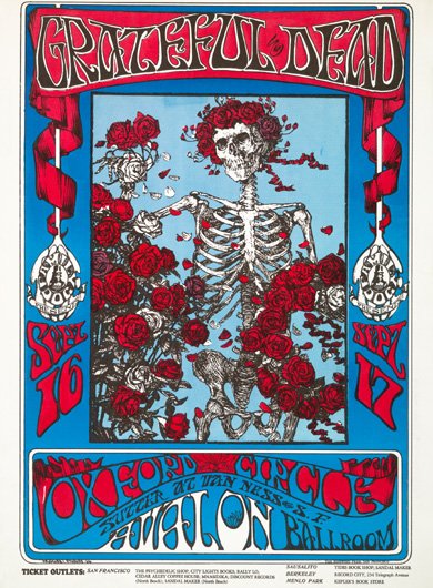
The second image (Kelley, 1966) drew my attention because of the illustration. The intricacies, detail and selective use of colour make it really appeal to me. The serene aspect to the skeleton with the living flowers (and flower crown,) gives a sense of calm which the band’s music mostly holds. The less psychedelic colours also aid the spirit of tranquility because though they are bright, they don’t scream LSD and drugs like the first image, they are simple primary colours. The skeleton gifting flowers help to give meaning to the event making it seem welcoming to all, and that there is a lot to go around.
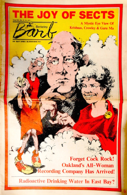
The third image (Berkeley Barb, 1977) drew my attention again because of the limited colours. Though for this underground magazine cover, it would have been more of necessity to keep costs down. From what was available, the overall cover is very well drawn and colourful- while having depth and interest. I like the white space in contrast to the other two images because it is much less over-the-top in terms of font choice, giving the illustration more chance to portray the meaning, as this takes up a vast majority of the page. I think this can be attributed to the higher quantity of white and using colour sparingly which is something I can bring into my own work.