In this module I have learnt about the way art has changed through time. I have been able to see how changes in different socio-political concepts throughout the period also alter the art. I have learnt to see the value in all of the art throughout all of the period and to see how the period before can change the ones after. Most notably, modernism made the crucial move from religious art into art they, the creator, wanted after WW2. This resulted in the Bauhaus (On left below, Bayer, 1925) which still holds up today. The concepts created at this time have impacted more recent art, such as Wolfgang Weingart’s collages (Wolfgang, 1975) created in the post modernism period. He removed the colours of the Bauhaus but much is visually similar between them. This shows to me how important it is to learn from things made in the past, combined with the current socio-political atmosphere, to create good work- as both examples’ are in response things of the past.
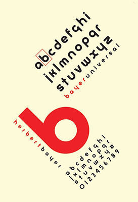
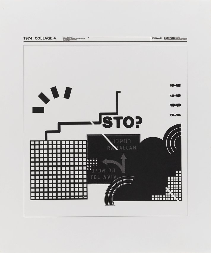
However, it is easy to see how these things with such a time difference relate. Although the newer one by Wolfgang Weingart (on the right) is my favourite, I can see how the past has influenced it to make it a better piece of work (making it vertical, with a minimal diagonal streak rather than focusing the whole piece around this) and I wish to implement this idea into my own research for studio work. However, this also shows the concept of modernism being repeated- changing the way you work to be different to what other people would want- though this is more prevalent in other works- it is still current between this example. This is because Weingart has made choices to be different to the work of the Bauhaus, while also being similar in terms of simplicity. This makes modernism my favourite theory because it allows you to look to the past and learn from it to take the best bits, but also to be totally different and grow as a practitioner.
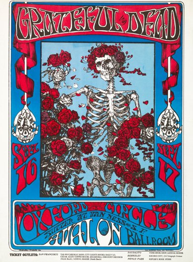
Where I have done a similar thing, applying a theory to my own work, has been in the motion graphics aspect to the course so far. I have found myself being drawn to the colours prevalent in the Counter Culture. The bright blues and reds because of the contrasts and the way they stand out yet somehow harmonise together- I have applied this into my studio work. Although more specifically, I like the Grateful Dead poster (Below, Kelley, 1966). I like how the simple light blue and the more complication illustration come together. The border which surrounds it is a concept I like too, however I would not decorate so flamboyantly because I feel as though the illustration conveys this idea enough. The union of flat colour, complex details and a plain background is something I admire in the illustration and would love to bring into my own work, also featuring a similar bright colour scheme augmented with black and white.