
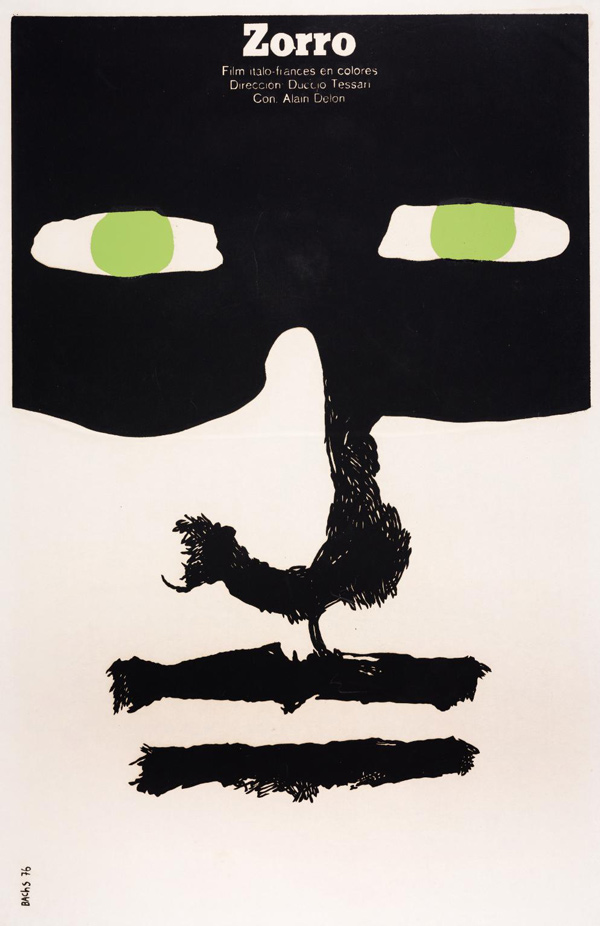
The first image (Bachs, 1976) is a movie poster for the film Zorro. It is mostly black and white except for the pale green in the eyes. The rough way the eyes are drawn, the negative space that surrounds them, coupled with the green, draw attention to the eyes. This connects the viewer to the art and you get the feeling he is not messing around when you see how serious he looks from the poster. This is a commercial poster so it is intended to draw in and connect a consumer so that they want to see the movie and I feel it has done this successfully. I like very minimal colour palettes, where negative space has been used effectively as it has been here.
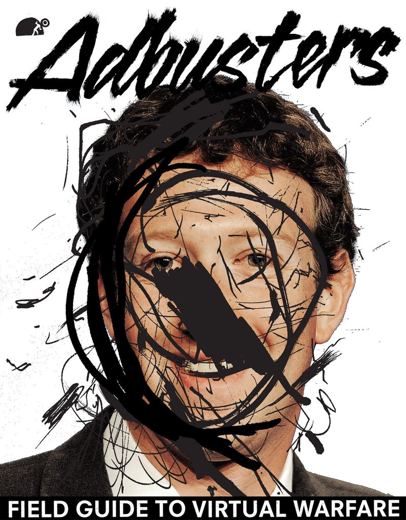
The second image (Adbusters (2015) is of Mark Zuckerberg, creator of Facebook. Facebook is among the largest social media sites and the creator is well known so defiling the creator forms associations with defiling the things he has created. The photograph has been covered by scribbles and shapes focused around Zuckerberg’s face, this draws attention to him and so does the white space which surrounds him so there is no question who it is about. I think that this is suggesting to the viewer to question him and not take it all for granted, to fight back as the magazine has done.
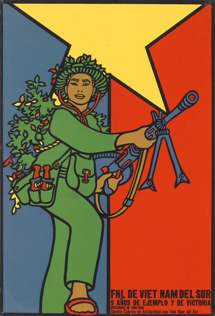
The final image, (Mederos, 1969) is a part of a series of work by Mederos, assigned by the Cuban Government, in which he is trying to inspire the Cuban people during the Cold War to act as the northern Vietnamese did during the Vietnam war (Onion, 2015) against the Americans. The colours combine the Cuban and Vietnamese flags, and the green (with the grass on their back) of the person simulates the guerrilla warfare of the Vietnamese and it inspires the people of Cuba to act in a similar resilient way against the same enemy. This shows the story of Cuba at the time, and without any prior knowledge it is easy to see that the focus is on war and stepping up, as the figure is literally stepping up and looking confident. I like the very graphical approach to the figure where the simple colours and the bold lines make sure the message is not lost in translation. This is helped in addition by the small amount of text in the bottom right hand corner.