
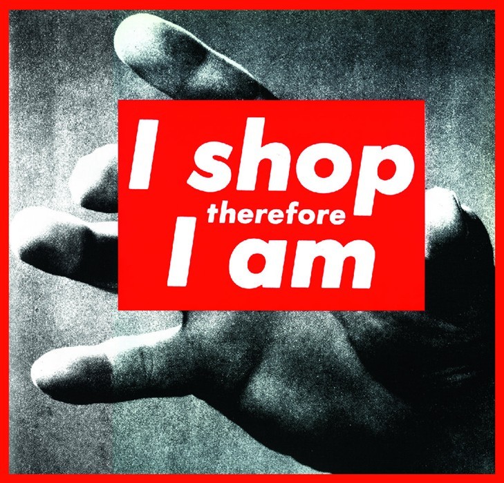
The aim of Graphic Design is to convey a message to an audience through the use of typography and image. I have chosen this piece by Barbara Kruger, as I believe she successfully accomplishes this. Kruger is well known for her ‘photo-based images overlaid with blocks of text in a signature color scheme of black, white, and red’ (Wye, 2004 p.244). This piece in particular tells the story of capitalism and consumption, by explaining how we now define ourselves by what we purchase. This piece interests me as I feel as though our society is heavily involved in consumer culture, where it is a ‘norm to enter debt’ (Lury, 1996).
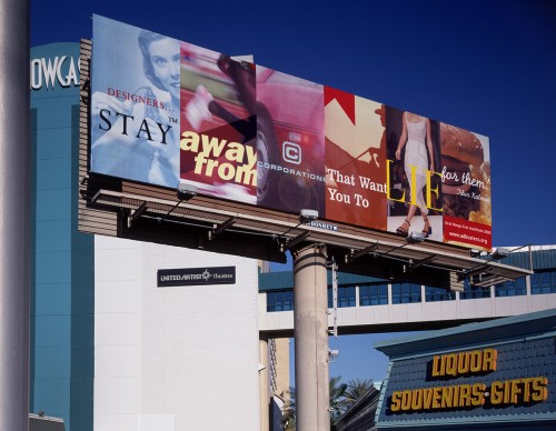
This second image was created by graphic designer and typographer, Jonathon Barnbrook. The image is based on Tibor Kalman’s quote ‘designers, stay away from corporations that want you to lie for them’. Barnbrook has used a range of different advertisements to create a montage, reading the statement. By using a variety of advertisements, the audience believes there are a large range of companies who are lying to us. The work was ‘designed for a billboard…near the 1999 AIGA Las Vegas conference’ (McCarthy 2010), which is obviously a controversial position as many designer’s would see the poster. I think this work is powerful as it enforces the ideology that corporations should not lie to their customers, in order to gain wealth and profit.
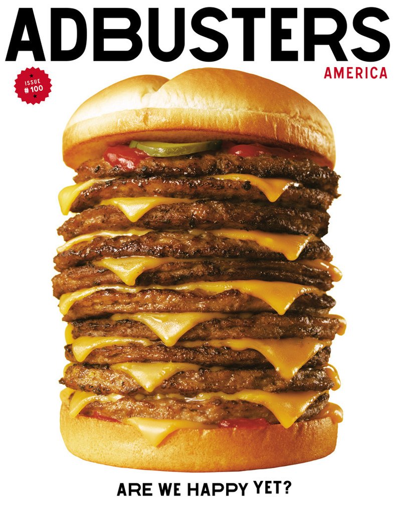
My last image is the cover for the magazine Adbusters, who are a ‘not-for-profit, pro-environment organisation’, (Wikipedia 2017). The magazine has connections with culture jamming, which is a ‘tactic used by many anti-consumerist social movements…to disrupt mainstream values’ (Wikipedia 2017). This magazine cover is not a direct culture jam itself, however aim’s show the audience how a company can influence them. For example, the image of the stacked up burger with the question ‘are we happy yet?’, is conveying the message of how much more will we want to consume to make us happy. It makes the audience think about what really makes them happy in life. As quoted by Klein 2000, ‘a good jam…is an X-ray of the subconscious of a campaign, uncovering not a opposite meaning but the deeper truth hiding behind the layers of advertising’, which I believe is successfully shown by this cover.
-Wye, D (2004) Artists and Prints: Masterworks from The Museum of Modern Art, New York: The Museum of Modern Art
-https://www.smithsonianmag.com/arts-culture/barbara-krugers-artwork-speaks-truth-to-power-137717540/?page=1(Accessed on 28th November 2017)
-Lury, C (1996) Consumer Culture, Polity Press
-IMAGE 1 – Kruger, B 1987, I shop therefore I am. Available at http://ucresearch.tumblr.com/post/47883063847/untitled-i-shop-therefore-i-am-barbara (Accessed on 28th November 2017)
-McCarthy, S (2010) We need to redefine the ethical implications of design. Available at http://www.eyemagazine.com/blog/post/whos-responsible (Accessed 28th November 2017)
-IMAGE 2 – Barnbrook, J 1999, Designers Stay Away. Available at http://www.jonathanbarnbrook.com/work/first-things-first/ (Accessed on 28th November)
-https://en.wikipedia.org/wiki/Adbusters ((Accessed on 28th November 2017)
-https://en.wikipedia.org/wiki/Culture_jamming (Accessed on 28th November 2017)
-Klein, N (2000) No Logo. Great Britian; Flamingo.
-IMAGE 3 – Adbusters, Issue 100. Available at https://subscribe.adbusters.org/collections/back-issues/products/ab100 (Accessed on 28th November 2017)