
Authenticity, ‘of undisputed origin and not a copy; genuine’, (https://en.oxforddictionaries.com/definition/authentic, 2017).
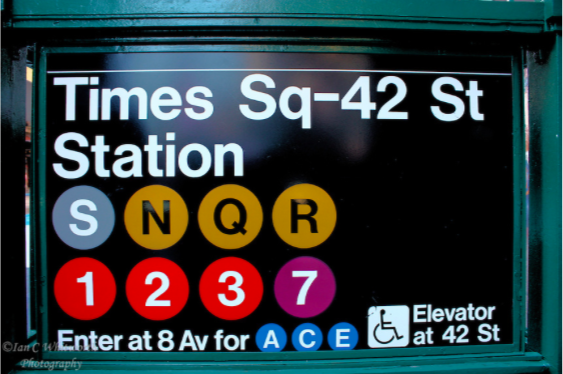
Modernism in graphic design can be seen through the creation of the International Typographic Style. This style focused on ‘a high standard of printing’ and ‘a clear refined and inventive lettering’ (Terror, 2009). Helvetica is a typeface designed by Swiss designer Max Miedinger in 1957. This sans serif font is a prime example of how the modernist principles of a clear, readable typeface being the best choice are still held in todays society. Helvetica is a globally known typeface, seen in everyday life from car logo’s to the NYC Subway. Many more companies use Helvetica within their branding, meaning that their logo’s will not be truly authentic.
As clearly seen in the International Typographic Style, Grid Systems also led the modernist movement in graphic design. Grid systems help create ‘meaningful, logical and consistent organization of information on a page’ (Terror, 2009), which was favored by Swiss designers at this time.
Josef Muller Brockmann released ‘Grid Systems in Graphic Design’, sharing his knowledge of grids with the industry.
“Nowadays grid systems are an established tool that is often used by print and web designers to create well-structured, balanced designs”, (Terror 2009). This quote shows how the principles of modernism have left an everlasting mark on graphic design, as grids are a main tool used in industry today, for example in the layout of a magazine.
In the digital age, designers have access to a huge amount of inspiration from external sources. Therefore, it is possible there could be an element of their work that is not an entirely new idea or of undisputed origin.
-https://en.oxforddictionaries.com/definition/authentic (2014) (Accessed 29 October 2017)
-Terror, D (2009) Lessons From Swiss Style Graphic Design. Available at https://www.smashingmagazine.com/2009/07/lessons-from-swiss-style-graphic-design/ (Accessed 29 October 2017)
-http://typedia.com/explore/typeface/helvetica/ (Accessed 29 October 2017)
-IMAGE 1 – Ian C Whitworth, The Times Square subway sign at 42nd Street. Available at https://icwphotography.photoshelter.com/image?&_bqG=38&_bqH=eJwz8kn0CnVxNMnM8rUwCEk1dwrzKzY1C81w9Ay1MjWxMjKwMjQAAivPeJdg53hHPxfbEjUw29Yv0lkbyAwNdg2K93SxDQUp8ypNjDLJ8y_M8DVRi3d0DrEtTk0sSs4AAKHeHTM-&GI_ID= (Accessed on 30 October 2017)
-IMAGE 2 – Jeep [Logo], (2017) Available at https://www.webdesignerdepot.com/2009/03/40-excellent-logos-created-with-helvetica/ (Accessed 30 October 2017)