Over the last ten weeks I believe my research skills have improved immensely. This is the first time I have used Harvard referencing, which I found difficult to get used to at first. However, with practice during the task of completing this blog, I have got used to the system. From the bibliographies at the end of each of my blog posts, it is clear to see that my research has improved. This is due to the number of references increasing, meaning that my research is more in-depth and considered.
I began to feel more interested and involved with the task’s when we started to study the history of graphic design. I enjoyed learning how the traditions and trends within graphics have changed, from the minimalism of Swiss type such as Helvetica of Modernism, to the bubble lettering technique in Counter Culture. I have noticed clear differences in these periods of time, which have all given me inspiration and opened my eyes into what style of graphics I am most interested in and what I would like to emulate in the future. This includes, bright colours and large compositions of type, such as those seen in the Counter Culture period.
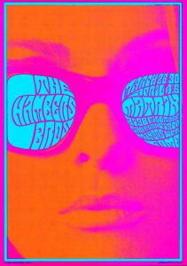
This piece of work by graphic designer Victor Moscoso caught my eye due to the use of bright colours and large scale image of the womans face. This is a poster created to inform the audience about a concert for The Chambers Brothers. However, during my research into counter culture I found type was not clearly readable as it is up to the audience to interact with the artwork if they feel interested enough to read it, instead of the type clearly showcasing the information. I liked the psychedelic feel to the images, which not only represents the time period of the artwork, but also created exciting and new visuals for the audience. People where not used to seeing these crazy shapes and colours, but instead used to seeing grid structured simplistic work. This shocked a culture and created excitement.
A key task I enjoyed was week 7, Publish or Perish. Whilst completing this task I found it related to my A Level Sociology work, which motivated my research further. The idea of consumer culture and globalization is one that fascinates me. I am interested in graphic design that showcases the idea that as a society we are obsessed with materialism. Social graphic design is one that I wish to look into more as it is a way of sharing an important message or an ideology in a way that captivates an audience.

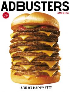
The Adbusters front cover for the 100th issue particularly stood out to me as the idea behind the cover has a lot of meaning. The idea behind the cover is that as a society we always want more. The image portrays a fast food company burger with extra layers. The image is supported by the phrase ‘are we happy yet?’. This displays how we live in a generation of always wanting more and never being satisfied. Being able to convey such a strong message and story with simple imagery and typography is a skill I wish to develop within these next few years.
-IMAGE 1 – Moscoso, V 1967, The Chamber Brothers Poster. Available at https://www.grafik.net/category/archive/victor-moscoso (Accessed on 5th December 2017)
-IMAGE 2 – Adbusters, Issue 100. Available at https://subscribe.adbusters.org/collections/back-issues/products/ab100 (Accessed on 5th December 2017)

