
Counter Culture (1960s-1970s), was a “subculture that rejects and opposes significant elements of the dominant culture” (Crossman 2017). Designers decided to break away from the mainstream values that were currently held in Modernism.
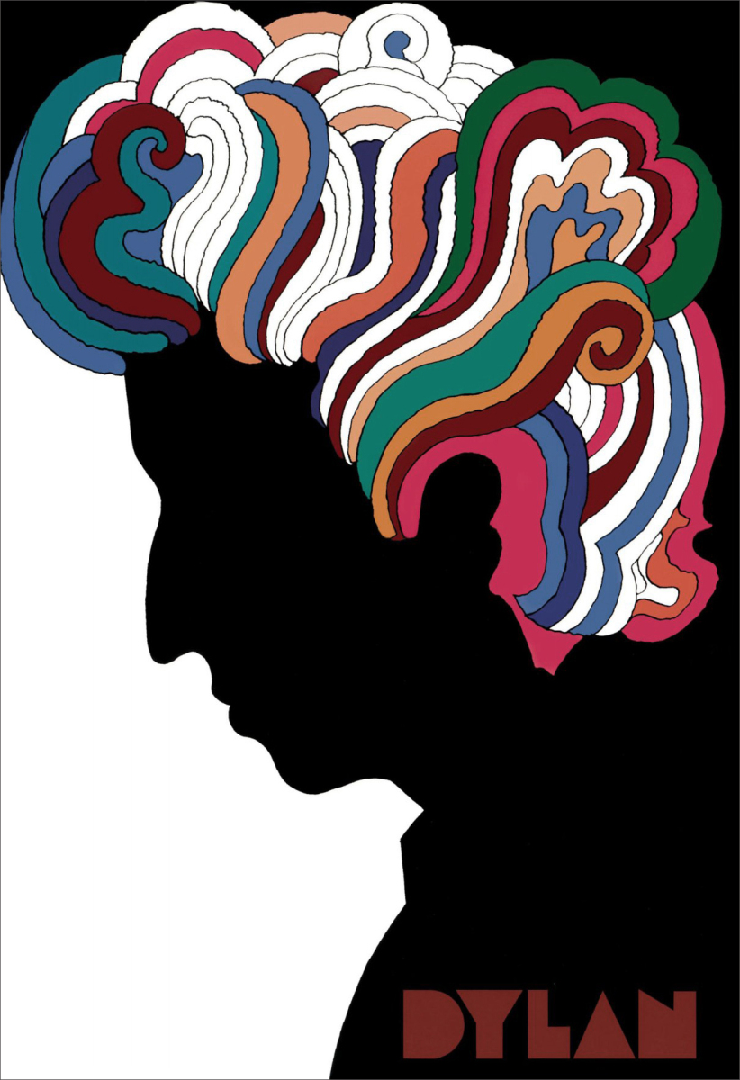
Milton Glaser’s DYLAN poster is one of my favourite pieces of Graphic Design. I enjoy the splash of colour against the contrasted silhouette, and the use of his font ‘Babyteeth’. The meaning behind this poster is to showcase the emotions created by Dylan’s music. “The blended colors create vibrancy as they reflect Dylan’s music to his fans” (Errington 2014), this quote displays why Glaser used bright colours against the black silhouetted figure; in order to demonstrate Dylan’s artistic sound. “Glaser’s vibrant style is not only evident in DYLAN but it also evokes the 1960s counter-culture” (Errington 2014), this quote also expresses how the poster is included in the new, forward thinking time in design.
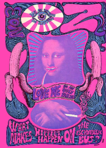
Underground is a term used to describe “publications produced without official approval, illegally or against the wishes of a dominant group” (Wikipedia 2017). Oz is a successful underground magazine, with editor Martin Sharp ‘responsible for art and graphic design’(http://ro.uow.edu.au/ozlondon/). I chose the No.3 May 1967 cover designed by Sharp as I feel it embodies the spirit of Counter Culture. The Mona Lisa painting has been defaced within this cover, creating controversy whilst also giving the audience something they recognize and can familiarize within the cover, maybe creating interest. At the bottom of the poster it reads ‘What makes hippies happen on the psychedelic bus?’. The counter culture scene was linked to the use of psycheldic drugs, and posters etc that had been made within this style tended to give the effect of being under the influence, or had the idea of the image coming to life if looked at whilst under the influence.
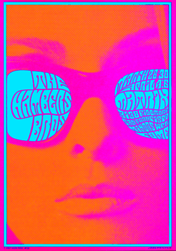
Lastly I studied “The Chambers Brothers poster” by Victor Moscoso, one of the big 5 within counter culture. The bubble lettering technique has been used, creating hard to read interesting shapes. In terms of sensibility, I chose this image as I believe the bright colours are influential on the time period. The bright colour’s where used in the postwar years to brighten the city and peoples spirits. This is relevant to my interests as I appreciate the use of bright, contrasting colours within design to gain attention.
-Crossman, A (2017) Counterculture. Available at https://www.thoughtco.com/counterculture-definition-3026160 (Accessed 5th November 2017)
-Errington, R (2014) The Art of Milton Glaser: To Inform and Delight. Available at https://the-artifice.com/milton-glaser-art/ (Accessed 5th November 2017)
-IMAGE 1 – Glaser, M 1966, DYLAN. Available at https://rightearleft.wordpress.com/2015/03/09/milton-glaser-designing-dylan/ (Accessed on 5th November 2017)
-https://en.wikipedia.org/wiki/Underground_press (Accessed 5th November 2017)
-http://ro.uow.edu.au/ozlondon/ (Accessed 5th November 2017)
-IMAGE 2 – Sharp, M 1967 Issue 3 of OZ Magazine. Available at http://ro.uow.edu.au/ozlondon/3/ (Accessed on 5th November 2017)
-https://www.grafik.net/category/archive/victor-moscoso
-IMAGE 3 – Moscoso, V 1967, The Chamber Brothers Poster. Available at https://www.grafik.net/category/archive/victor-moscoso (Accessed on 5th November 2017)
-https://www.theguardian.com/artanddesign/2016/sep/04/revolutionary-artists-60s-counterculture-v-and-a-you-say-you-want-a-revolution (Accessed on 5th November 2017)