Author Archives: Bryony Thompson

Task 12:

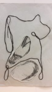
This is a large piece of work I created based on the human form, I made it out of string, and charcoal.
I firstly drew the piece with charcoal over ten times on separate pieces of A1 paper, all with different layers and pressures.
And on a separate piece of paper I drew the outline using the yarn and then used sellotape to stick it down in the position I wanted it in. I then cut out a section in the middle of the piece and placed one of the pieces I created with charcoal underneath it and looked at what section looked best.
Then I decided it needed another charcoal section in it, so I cut a piece out and placed it in the bottom section of the yarn. I like how this collage mixed media piece turned out and it was one of the larger pieces I have created so far. The charcoal sections and especially the one at the bottom, shows the human form as it highlights the curve on the upper leg.

If I created this on a smaller scale it would be a lot harder to do as Iā€™d have to find thinner yarn and find another way to hold it down that still would keep feel and 3D aspect to it, as sellotape would cover too much of the yarn and hide the detail. If this didn’t work I could look into pen to simplify it to still give it this bold look but not have the issue of not bing able to control the yarn at such a small scale snd keep it in place successfully.
I would also have a different effect of the charcoal as the lines would have to be thinner and not have as much detail on them, therefore taking away the tonal effect, which I liked in the larger scale.
Overall I believe this is achievable but Iā€™d have to experiment into what would work best to recreate what I have already created and how to get the result I want on a smaller scale.

Task 11:

Iā€™ve explored a lot of new ideas I normally wouldnā€™t have tried without this blog, it has allowed me to be more creative and experimental. Especially with the task of appropriating an image, I really had to think about what I wanted to change and how Iā€™d want to change it and I took me a while to get into this because Iā€™m normally used to doing my own work inspired by artists and their practise.
I wouldn’t have thought of using bright vibrant circles with such an old painting but the task made me explore into new ideaā€™s. Before the blog I hadn’t thought about touching another artists work and appropriating it. This has given me new ideas that in the future I hope to explore.
I have also learnt a lot about other artists and it has allowed me to look into there works what I thought the meaning behind them was. Exploring into them I found they had deeper meanings but I opened my mind up to these and have expanded my knowledge on new topics.

Task 10:


1.Curious
2.Abstract
3.Bright
4.Experimental
5.Fluidity
6.Bursting
7.Conflicting
8.Colourful
9.Conceptual
10.Bold

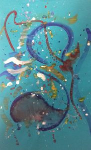
I have used the words ā€˜colourfulā€™, ā€˜brightā€™, and ā€˜boldā€™, because in most of my work I like working with a wide range of colour. Iā€™m always happy to try and mix colours that normally would be ā€˜conflictingā€™ put them together and find a way of making them work well together. I really enjoy working and painting in an ā€˜abstractā€™ form as they could have hidden meanings and images in, that the audience wouldn’t initially see.
I thought of the word ā€˜burstingā€™ because the piece to me seems to have a lot of information in it from the simple and experimental brush strokes, almost as if it is bursting at the seems with detail.
A lot of my practise is also ā€˜experimentalā€™ based trying something that I haven’t tried before to see if I like it and how I could evolve it on further. So I want to start trying out new painting mediums and techniques and ways of mixing mediums together to create new and exciting mixed media pieces that shall have a lot of conflicting colours and textures in them.

Task 9:

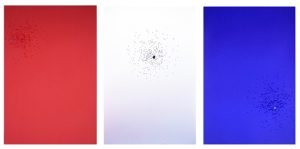
Jenny Balisleā€™s piece America Red, White and Blue explores the subject of legalised gun use in America, which has been a problem for many years and still is now, worryingly in todays society.
To create this piece she has used colorplan paper, 25×38 inches and shot at them with a Mossberg 500 shotgun, with the paper on a target of 7 yards away. She has used the gun to create lots of different sized marks on the paper, to catch the eye and I think this is effective more so in the white piece of paper because the other two are too dark to see the smaller details.
The use of the gun marks being all over the American flag is very effective as it is showing the damage guns can create but also highlighting how they are legalised in America. Putting it on the American flag is very effective as it is the best known symbol or image to show the piece is about America. So a large part of the audience should understand that the piece is talking about America and they’re use of guns. This also shows how easy it is to get and use a gun in the country, as a use of a gun was created in the making of this art. This piece will always be effective until if there is such a day when guns are not legal anymore in America.

Sources:
https://www.huffingtonpost.com/amy-pleasant/artists-as-activists-purs_b_11783614.html
http://lawrencemigration.phillipscollection.org/immerse-yourself/your-panel61/jenny-e-balisle

Task 8:

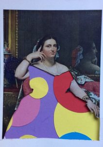
I brought this postcard with the image Madame Moitessier Seated, painted by Jean-Auguste-Dominique Ingres (1780-1867). I really like this style of painting, it looks like a normal historical painting. In the image she had a delicate and detailed dress, so I decided I wanted to try and make the dress stand out in a modern way. So I cut out the dress using a cutting knife and a mat, I then looked at using pens to redraw the dress on a separate piece of paper. I used bright colours to make it more modern and vibrant, but I didn’t like how these turned out. I then looked at using bright vibrant circles like I did in my film project. I layered up circles that I cut out of card and then positioned them in a way that meant they were evenly spread out and then moved the rest of the image over it to reveal what part of the circles I liked the dress cut out to show.
I like how this turned out, it is eye catching and really makes the audience look twice and think about how it isn’t a typical historical painting anymore. I have changed the whole meaning of this painting simply from the colours and patterns I have replaced. Before I appropriated the image it showed a rich lady posing to be painted in a dress that was made in that time. With the changes I have made it now catches the eye more and the bright colours really play with the rest of the image that is in dark and neutral tones.

Task 7:

In Leo Steinbergā€™s essay ā€˜(b.1920) from Other Criteriaā€™ he discusses modest art from the 19th century to the present ā€œcontesting Greenbergā€™s account over a broad front, and relating Modernist work to changing continuum of self-reference and representation of the world going back to the Renaissanceā€.
Leo Steinberg then goes on to talk about how we change art to suit the human posture as ā€˜The top of the picture corresponds to where we hold our heads aloft; while its lower edge gravitates to where we place our feetā€.
He then goes on to explain how this applies to Jackson Pollock ā€™s drip paintings where the pigment is poured and dripped on canvases that are laid on the ground and then they are tacked to the wall after the first colour skeins. ā€œHe lived with the painting in its uprighted state, as with the world confronting the human postureā€. And this leads Steinberg to believe that the Abstract Expressionists were still nature painters.
Whereas Robert Rauschenbergā€™s works are still hung up and displayed this way today, and Steinberg goes on to say that ā€œThey no more depend on a head-to-toe correspondence with human posture than a newspaper doesā€.
Leo Steinberg describes the shift in approaches by artists as new mechanical printing methods arouse such as the Flat bed press, by stating ā€œthe painted surface is no longer the analogue of a visual experience of nature but of operational processā€. So this leads me to believe that Steinberg doesn’t like the thought of art being mass produced and easy to recreate, I think he liked that art used to be only one of each piece and if something was tried to be recreated it would be hard to make something look completely similar to the original. Whereas it would’ve been a lot easier to make more prints and recreate pieces using a flat bed press.

Richard Serraā€™s essay ā€˜(b. 1939) from The Yale Lectureā€™ explains how his work is site specific because of the ā€œscale, size and locationā€, if the art was moved away from its intended viewing point this would take some of the context and meaning away from it. So the art work must stay in the space it was initially created to be viewed in for it to have the full effect on the audience.
This is different to what Steinberg was saying about the works being made and then being fit in around the human posture, I believe that they are both right in what they are saying. But when making a piece of art you firstly have to think about where it will be viewed and if this should play a part in the meaning of the work or not.

Sources:
Art In Theory 1900-1990
An Anthology of Changing Ideas
Edited by Charles Harrison & Paul Wood

1. Leo Steinberg, “From Other Criteria”, Pg. 948
2. Richard Serra, From the Yale Lecture, Pg. 1124

Task 6:

I would like to evolve my painting skills and start using glaze to see what effect it could give my paintings, but I also want to experiment with different textures in my paintings. This would help with my knowledge of using mixed media and creating a wide variety of different outcomes to anything I have tried before.
So using other materials such as crinkled/folded paper like I experimented with in my contemporary project. I then could paint on lots different textures including crinkled/folded paper and use this like I would normally use a paintbrush and transfer the colour and marks onto other surfaces. This is a great way of moving away from the traditional painting tool, the paint brush and started to invent and experiment with new tools I can create.
I could also use low cost materials such as string, yarn, fabric samples and incorporate these into my work to make mixed media pieces and to highlight the different textures from the new painting technique. I could use imagery and collage them together incorporating these different multi medias to create a new fixture of techniques that might not have been experimented with yet.
This project is feasible for me as I have some of these materials ready to start with, and if I find it successful and interesting I can continue exploring further into the practise and source new materials to try and experiment with.

Task 5:

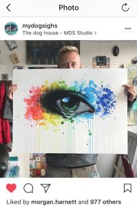
From the open studio exhibition I went to I really liked a piece that was hand painted by the artist My Dog Sighs, as it is a 2D piece but the way it is painted makes it look more 3D and very realistic.
Seeing it in the flesh really showed me how vibrant the colours are which you don’t appreciate from viewing the images online. From viewing online I always thought that the colours could be extenuated, but when I did see it I realised that the colours really are that bright and vivid and not edited online. I also found that looking at it in the flesh really made me appreciate the small intricate details that are the main focus of the work, the eye. I could get close and look at the use on tone and shadows and reflections painted on to make it look as realistic as possible. I also could appreciate the amount of techniques of painting within it and how the artist managed to make them all work so well together to create on great piece of work. In comparison to viewing the image online wouldn’t give it justice after being able to look at it that closely in the flesh.

Image source:Ā Ā 

Task 4:

I recently went to an exhibition that was held by a local artist in his studio called My Dog Sighs. I really liked this exhibition, it was very interesting as it had a lot of different pieces made by the artist in different mediumā€™s and styleā€™s ranging from paintings to 3D pieces. This kept the audience busy walking around looking at all the large pieces that were obvious to the eye and all the smaller pieces placed around the room so there was always something new and different to look at. There was a lot to look at and although he has different styles you could tell it was all made by the same person as it had his personality in the pieces. The exhibition was based in his studio so it also gave me and all the other viewers a look into how he works and creates his pieces. I think is a really good and different way to display work and gives an insight into the process behind the pieces. In a gallery with plain white walls it doesnā€™t tell a story of how the art was made. Also as he is a local artist and he does large scale paintings on public buildings and bill boards around the local area. After visiting his studio I travelled around the town looking at some of the larger paintings he had done on buildings so this was also a very engaging exhibition. Overall I would definitely go back to this exhibition and any others like it that are based in peoples studioā€™s as this really gives you more of an insight into the artist and how they like to work.

Task 3:

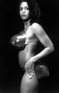
RenƩe Cox
Hot-en-tot Venus, 1994
[photograph]

In this photograph I see the artist RenƩe Cox standing naked in what another artist has created to show her representation of her body.
I believe this image is about self confidence in your body and being proud of how you look. I also think that in this photograph RenĆ©e Cox is looking into the camera lens and considering the views of her audience. In her face it seems to me that she is ready to be judged, as if she knows some people wonā€™t like this art and wonā€™t have a positive response towards it. But she did have the confidence to publish this art and I think that is a great thing, because sometimes you need to not think about what negative comments you can get but what positive comments and support you could receive. I think this piece is really good at portraying the message of self importance, confidence, and belief and not being influenced with other peoples negative comments.
This photograph is supposed to impact the audience by showing how Cox can refine her own identity as a black female artist and other artists like her. This piece in particular shows how Cox has love for her own body, and she portrays her body however she wants to and this then liberates her.
Source: https://artintheblackdiaspora.wordpress.com/2014/05/01/renee-cox-hot-en-tot/