Publish or Perish!


Tim McDonagh is a freelance illustrator that I connected with after attending a presentation by him in my foundation art course. My interest started with his ink pen and digital techniques that produced an amazing colourful style.
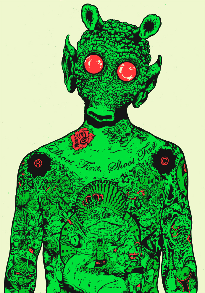
 

Greedo.jpg

“Greedo” Pen ink on paper,2015. Illustrator: Tim McDonagh[6]

“Greedo” is a unique piece of work; rather than for a client this illustration was made out of his own interests – the story being his love of Star Wars. It was from this image that he was noticed by Egmont uk to create illustrated STAR WARS: GALACTIC MAPS. His advice to aspiring illustrators was to “be sure to create work that you love and that you enjoy working on.” The work and clients will come later on” as an aspiring illustrator I connected with this because there is usually such heavy focus on tailoring style and design to a brief(or client) where developing my style should also have more emphasis.[2]

 

Image result for david foldvari witches liberia

“Witchcraft in Liberia”, Animation, 2016. Illustrator: David Folvari.[3]

David Foldvari is another illustrator I find relevant to my interest in illustration and in developing my own style; this image was from an editorial for the Telegraph on child witches in Liberia that was about the unfortunate story of a child accused of witchcraft.[5] Foldvari’s saturated black ink on a white background is an example of how style can influence the feeling of the subject; his style can cover darkly political subjects with its dark appearance. I also connect with his concern “that we’re going to go back to the ’80s and people are going to think illustration is nicey-nicey and not saying much”[4] I think its important that illustrations say something in order to help educate and communicate, Foldvari does this though editorial illustration that articulates news articles, issues and viewpoints from just an image, otherwise why have an illustration?

"Stadt Theater Basel" offset lithograph,1963. Designer: Armin Hofmann

“Stadt Theater Basel” offset lithograph,1963. Designer: Armin Hofmann[1]

I am interested in the manipulation of photography with typography and one of my favourite graphic designers Armin Hofmann does just this. This poster shows how condensing simple visual elements (in very much Swiss design style) can be incredibly effective for communication. For me it gives the feeling of movement and performance like shadow puppets which is fitting for message of Basel theatre. It is also a good example of how effective photography can be without the clearest resolution. “Sensible and meaningful form of advertising can be achieved by simplification of the formal language and by restraint in the treatment of the verbal message” I connect with this because in a world bombarded with colour, imagery and information it is important to remember sometimes simplification is most effective to communicate graphically.

References

[1] AIGA | the professional association for design. (2011). 2011 AIGA Medal: Armin Hofmann. [online] Available at: https://www.aiga.org/medalist-arminhofmann [Accessed 3 Dec. 2017].

[2] Floyd, J. and Floyd, J. (2017). Star Wars: Galactic Maps Illustrator Tim McDonagh Interview | StarWars.com. [online] StarWars.com. Available at: http://www.starwars.com/news/charting-the-galaxy-an-interview-with-star-wars-galactic-maps-illustrator-tim-mcdonagh [Accessed 2 Dec. 2017].

[3] Foldvari, D. (2016). Witchcraft in Liberia. [Blog] davidfolvari. Available at: http://davidfoldvari.blogspot.co.uk/2016/08/witchcraft-in-liberia.html [Accessed 3 Dec. 2017].

[4] Ideastap.com. (2016). David Foldvari: Illustrator. [online] Available at: http://www.ideastap.com/ideasmag/the-knowledge/david-foldvari-interview [Accessed 3 Dec. 2017].

[5] Rowley, T. (2016). The child witches of Liberia. [online] S.telegraph.co.uk. Available at: http://s.telegraph.co.uk/graphics/projects/child-abuse-witches/index.html [Accessed 3 Dec. 2017].

[6] TIM MCDONAGH. (2017). PORTFOLIO. [online] Available at: https://www.mcdonaghillustration.com/#/greedo/ [Accessed 2 Dec. 2017].

Week 9 – Own

– Give some examples where you see games being clearly influenced by other work?


In the survival horror game, Resident Evil 7, it is clear that the movie Texas massacre chainsaw had an influence on the production of the game. The dysfunctional, inbred family in the Texas massacre chainsaw movie live in an isolated, derelict house and have scattered idols of human bones around different locations just as the Baker family’s rotting mansion. The Baker family dinner scene in Resident Evil 7 borrowed heavily from the scene in Texas chainsaw massacre, as both introduce the disturbed minds and sadistic nature of the family members, that the protagonists and player would have to escape from.In the action role-playing game, Dark Souls, designs of characters, tombs and monsters resembled many of those from the Anime Berserk. Siegmeyer from Dark Souls is a large character, his bulkiness and round shaped armour is almost identical to Bazuso from Berserk as he shares the same proportions and round onion-like shapes.   

Task 11/12-Summary

Task 11/12- Summary

I have thoroughly enjoyed the Research and Communications module and looked forward to attending the lectures each week. I find them incredibly informative and have encouraged me to consider going on to study fashion from a more academic perspective in the future.

Throughout the tasks that we were asked to base our writing on a topic of our choice (tasks 1 to 6) I purposefully based mine on something I had previously had very limited or no knowledge on. Although this did make completing the tasks more of a lengthy process than necessary it has resulted in me having a much greater general knowledge of fashion, designers and artists. I have really enjoyed this aspect as I know feel better prepared in all areas of Fashion and Textiles. One of my favourite discoveries is the well known Japanese designer Issey Miyake – I now know far more information about the designer behind iconic designs.

While I have found hurdles to jump during some tasks I have learnt a great deal throughout.

Although I had learnt to reference correctly previously I found going through it and properly understanding the method broken down very useful during the tasks three and four. This was also very useful for when researching for my projects in practical areas.

I’ve found that my range of types of sources has grown throughout the module. While I do still use the internet predominantly I use it to find reliable sources in the form of journals, archives, online magazines and newspapers. I have also increased my use of research through using books. I had previously found this time consuming and tedious however I now know how to use the library effectively through Webcat. I also know that in many cases the information provided  through books is in great detail and reliable so it is worth going through the process.  Research and Communications has led me to gain confidence in using the library so I have also used it to order a book from the Hartley library for one of my practical projects.

Despite enjoying the module there are areas I have struggled with and would like to improve in the future. The most prevalent being my time management, this is an aspect I find challenging in all subject areas. I enjoy writing and am able to do it to a standard I am proud of when I have the time to do so. For this reason it is a shame that at times I have had to do tasks within a limited time and I am concerned that the quality of the writing may have been compromised.

I have also struggled with staying within the word count limit provided per task, I find choosing the most salient points and disregarding others difficult. I believe this also means that the structure of my writing is compromised as I lack the word count to write satisfactory introductions or conclusions. I aim to improve this in the future.

The task I enjoyed most was that based on ethics, particularly as it linked to feminism- a very hot topic with a lot some interesting opinions. As previously mentioned I have found this module extremely beneficial and stimulating and look forward to learning more next term!

Artificial Intelligence

Behavioural modelling is an important part of NPC development for games. Should emotive modelling be part of that development?

Behavioural modelling is an important part of NPC development for games and it has grown overtime. What it does is add character to the game you are playing, behavioural modelling impacts the player experience and how satisfied within the game, behavioural modelling also crosses over with interactive storytelling, the reason why this is that behavioural modelling is mainly focused on giving the NPC high levels of AI. It also creates a basis for game developer to give their game, their own twist on the game.

I do think that emotive modelling should be part of that development process, the reason why I think is that everyone has emotions, that is what makes us human, therefore if I play a game and the character that I playing has not emotion or facial expression what so ever it makes the game really dull and sometimes a chore to play and video games should not do that, as the whole point of video games is to have fun and forget about everything else and be immersed into that game universe that the developers have created. I think emotive modelling is an important part of game design, Game AI agents today do not reflect the affective aspects of human behaviour.  Sometimes games do not reflect the effects of human emotional state on an agent’s decision-making behaviour.  So, I think developers should focus more upon emotive modelling as it could have a bigger impact upon the game that they are creating.

Consider your favourite video game. If it contains AI controlled agents how individualistic are they and their behaviours, and, how might you set about improving them?

One of my favourite video game is The Witcher 3: Wild Hunt created by CD Projekt Red has very connected and complex open world and different elements and it always changes every time that you play the game, and the game revolves around the decisions that your character ‘Geralt Of Rivia’ does and that is all up the player decisions made within the game. The Witcher 3’s AI is very complex and very well done there are monsters in this game and they react to everything that you do, at times if you don not want to face the monster head on its own lair you can always try to lure them into a town/village, but it is extremely difficult and at times monster would know when they are in danger and they tend to flee back, even at times the towns people would also help or some of them would run away, which I think is awesome. There is time even animals and monsters fight each other in the distance and that had nothing to do with the player, the world has a mind of its own and it can sometimes be punishing or rewarding and that is makes the game fun to play, overall, this is a living world, it interacts with itself as well as with the player. One AI element that I would change is the combat between human’s opponents as it is very easy because they always do the same thing and it is very easy to counter, so the way I would change is that the humans adapt and find different ways to kill you rather doing the same thing every battle and making it easy.

The Witcher 3 CM Explains Advanced AI and Why Decapitations Might Not Be Physically Accurate

Week 6 – Artificial intelegence

  1. A) Neural Networks are often used for predictions and/categorizing things. What ethical issues might arise from the use of neural networks when used for decision making in games?

The use of neural networks for decision making in games can lead to the game being quite unfair or one-sided, depending on how the decision making affects the player. For example, if neural networks are used for the programming of an ai boss that can dodge and block attacks, the experience for the player will be unfair. The reason for this is that the boss will have an advantage over reaction time to the player’s attacks, as the neural network will predict and calculate different possibilities of player’s next decision. Another issue the implementation of neural networks in AI has is that the AI could not follow its purpose. If the neural network is programmed to survive and attack the player, the neural network could decide to continuously dodge the player or move away. Neural networks can also make mistakes if it has not gone through cycles of the particular tasks it has been programmed for as it would not fully understand how to achieve its set goal this can also annoy the neural network and cause it to react strangely.

Week 5 – Human Computer Interaction

  1. A) select one example to outline the key concepts of human-computer interaction. Reflect upon the role of the “human”, the “computer” and the “interaction”.

The scientific calculator and user, interact through the user giving the calculator an input in return for an output. The calculator has an interface where the values of the user’s inputs are displayed. Buttons on the calculator indicate that user should press these to solve mathematics on the interface provided. The buttons on scientific calculators are comprehensible to the user as they display standard mathematical symbols. When these buttons are pressed by the human, the calculator registers the value of the button as a code it understands.The calculator will then will display image of the pressed button on the interface for the human to see their input. The layout of the buttons on the calculator separate numbers, functions and symbols in order to be accessible and support the user’s needs efficiently. The scientific calculator’s layout is optimized to cater for different levels of mathematics. Symbols such as minus, plus, times, divide are grouped together as these are commonly used symbols to calculate simple maths. Symbols such as sin, Cos,Tan and pi are grouped together as these are used to solve more advanced mathematics. This layout allows inexperienced and advanced users of the calculator to operate it at ease.   

End of module summary

Through this lecture and research based module I have experienced a number of techniques and concepts which I will continue to apply throughout the rest of my career. This module proved to embody the reasons why I chose this course in the first place, I knew that theory based learning was the foundation of intelligent and effective design practice. One side of the module which is vital is the historical element. Over the course of weeks I sat through a crash-course on the some of the most significant moments in design in the past one hundred or-so years which helped me to better understand – in essence – what it is to be a graphic designer in 2017. I now know a bit more about the innovations, the struggles and the cultural shifts that have occurred in the past so that I can be more aware of why the creative world is the way it is today.

I have been educated on some important tools that are vital to not only researching more effectively to my academic benefit but also to maintain credibility. This term has not been the first time I have had to familiarise myself with the Harvard standard of citation as I previously took an art and design foundation diploma, which eased me into more consistently researching alongside visual practice. However, recently I have been schooled on the importance of avoiding plagiarism and becoming a more ethical designer. The importance of quotes is also reinforced for me as it provides evidence for readers of my writing so that they can take my work more seriously and also understand my ideas and perspectives better.

For me the connection between this theoretical side of practice and the practical side of things handled in the other module is a no-brainer. One must constantly be looking for visual inspiration from all sorts of sources. To explain my opinion of this metaphorically – the way I see it is as my academic vocabulary expands so does my practical vocabulary. By analysing images of existing work I can come up with more ideas that are more carefully considered and also more diverse. Outside of looking at purely visual ideas, exploring the theories and philosophies of artists and designers can better my understanding of what it is to create and what role I play in the world by creating.

Unsurprisingly to myself, the sources looked at over the past weeks that have resonated with me the most have been the episodes of the Netflix documentary series: ‘Abstract: the art of design’. The fact that learning by watching audio/visual works is the most effective for me is something I have made peace with. Information sticks with me more immediately if it is communicated audibly by people who really care and it certainly helps if the film is entertaining. What specifically has inspired my own practice is seeing others actually working, specifically in episode 6 seeing Paula Scher sketch wherever she goes reinforces the importance of experimentation and iteration to me.


Abstract: The Art of Design, Season 1. (2017): Netflix.

Human Computer Interaction

Select one game of your interest and explain why it has a good/bad game UI

One game that I really enjoy is the Witcher 3 The Wild Hunt, When the game first out the game’s UI was not at all bad, but it was not the best the wild hunt had received many updates and patches throughout its life span, but a huge update came about when CD Projekt Red was about to release their final DLC they decided to change the UI. For me a good UI is simple, clean and easy to navigate around they are important to me in game because I do not want to have to spend time learning the way the UI works, that is not the reason why I purchased the game, I purchased the game to play not spend my time in menus, that is why those factors are important to me when it comes to a good user interface, and CD Projekt Red really cleaned up their UI (as seen below) and it made the game much better and you can customise your character to the way that you wanted it to.

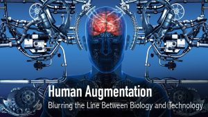
Discuss how technology augments human abilities. Reflect upon the implications of the future of HCI.

HCI is re-examining itself. No longer just about being user focused, it has set its sights on pastures new, grasping a significantly more extensive and sweeping arrangement of interests. From passionate, eco-accommodating, encapsulated encounters to setting, constructivism and culture, HCI explore is evolving apace: from what it takes a gander at, the focal points it utilizes and what it brings to the table. Some portion of this is as a response to what is going on the planet; pervasive innovations are multiplying and changing how we experience our lives. We are ending up more associated and more subject to innovation. Our reality is getting to be suffused with advances that can possibly significantly change how we live. PCs now barge in on our lives and additionally vanish into our general surroundings; they screen and guide us; and they pressure and additionally help us. They are progressively winding up some portion of our surroundings, out in the open spaces, for example, Airports, car parks, and shopping centres and additionally in the private spaces of our homes and workplaces. As a component of this change, our brains are broadening more into the world. It is typical for individuals to utilize online logbooks to remind them to send a birthday card to a companion and Google data on their portable amid continuous discussions at supper parties. The future has a long way to go, as it will take a long time for humans to fully augment themselves and become an android.

https://www.computer.org/web/computingnow/archive/september2014

Publish or Perish!

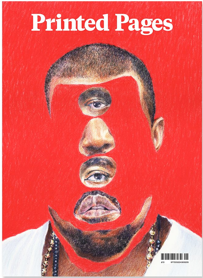
Printed Pages A/W 2015 cover. Original image: Yahnker, E. (2012). Kanye Stack. [coloured pencil on paper].

If this image did not exist physically in the world as it does on the cover of the Autumn/Winter 2015 issue of Printed Pages AKA The It’s Nice That Magazine I would not have chosen it. I like to collect published images in the form of books, albums and magazines as I feel a personal connection with works of design that I myself can own and hold, a sentiment I share with the people behind this magazine: “By name and by nature, Printed Pages has always been a celebration of print”. Outside of being a published image it has a story to tell, one of fame and distortion of perception.


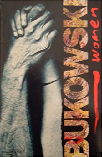
Rozycki, P. and Keates, M. (1993). Charles Bukowski – Women (cover artwork). Virgin Books.

Similarly if I didn’t physically own a copy of the 1993 Virgin Books edition of Charles Bukowski’s 1978 novel, Women, I would not be able to talk about it now. It was a struggle to find an image of it online and the only one I could find is slightly blurred with a level of glare showing up on the glossy cover. It’s a great shame because it’s one of my favourite book covers of all time, that’s why I immediately thought to include it. The bizarre combination of imagery ranging from a scanned photocopy image of a tender embrace between a man and woman rendered through blunt realism and the wild but painterly type helps to evoke some of the feeling that the story is bursting with.


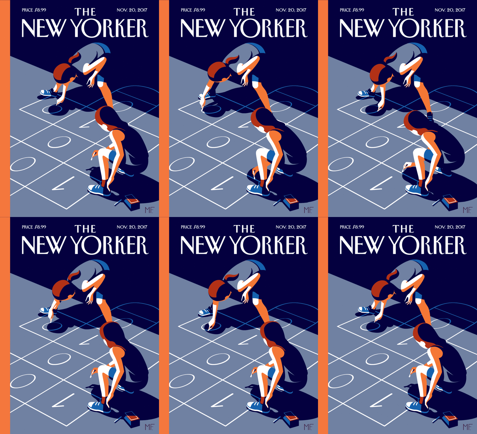
Favre, M. (2017). The New Yorker November 20, 2017 Issue (cover artwork/online animated version).

Seeking out another cover I found something very indicative of the fastly advancing world of publishing supported by technology. Similarly modern was the a New Yorker cover by Christoph Niemann which was featured on the Netflix documentary series: ‘Abstract’ and supplemented by augmented reality technology. The message behind this image that is also supported by the cover story in of the issue has to do with discrimination in the code business and the importance of educating children in an increasingly demanded skill.


It’s Nice That. (2015). Printed Pages AW 2015. [online] Available at: https://www.itsnicethat.com/publications/printed-pages-aw-2015 [Accessed 7 Dec. 2017].

Abstract: The Art of Design, S01E01 – Christoph Niemann: Illustration. (2017). Directed by M. Neville. New York City: Netflix.

The New Yorker Videos. (2017). Christoph Niemann’s Augmented-Reality Covers. [online] Available at: http://video.newyorker.com/watch/introducing-christoph-niemann-augmented-reality-covers.


What I have learnt

In these ten weeks on Research and communication lecture, I have learnt, researched and explored a lot, my idea towards art has totally changed and improved. I was able to identify how I could improve my work by getting an opportunity to explore different kinds of work by various designers. I have obtained a lot pf inspiration by looking at other successful designer’s work. My favourite tasks included the tasks where we had to write about Counter Culture, Publish or Perish and Technology is the mortal enemy of Graphic Design. Through these tasks I was able to find a deeper sense of the types of design techniques I like working with, which are- Typography, Photo manipulation, minimalistic posters etc. I am very sure that now when I will start working on new projects my thinking and creativity would totally be improved. The presentations and videos shown to us in the class have been proved to be very useful for my area of interest. Before this class, my area of interest was only limited to Graphic Design, but by getting to know about other types of art I feel my knowledge and interests towards other disciplines has increased effectively. The relation between the Research and Communication Skills lecture and the studio based lectures is very strong, because by attending the Research and Communication lectures I was able to give a higher and more creative input in my studio skills. The documentary of Paula Scher shows to us in the class was my favourite one, and after that day, I have and referred that documentary to many of my other friends in Canada who are also Graphic Designers. It was very inspiring to watch the documentary and it gave me a new perspective and a benchmark for what I aim to become in future. I have also improved in the area of writing through this module. Now I am confident in exploring other disciplines as well, as I have gained a lot of knowledge about all the four pathways of Graphic Arts. I have totally realized how influential a design, a photograph or a text can be. Through the use of good design we can influence a large number of audience.

This module has proved to be very beneficial for me, I am very inspired by each lecture providing the opportunity to explore different fields which earlier I was not familiar with. I had no interest in Illustration, but after this module, I have gained a lot of knowledge about this pathway which has made Illustration one of my pathway choice. I am sure that after getting the opportunity to enhance my knowledge in all the four pathways I have become a better designer and my approach towards designing and way of thinking/creating has totally improved.