Category Archives: Uncategorized

Do not use, you should categorize each and every post.

Week 5 – Human Computer Interaction

  1. A) select one example to outline the key concepts of human-computer interaction. Reflect upon the role of the “human”, the “computer” and the “interaction”.

The scientific calculator and user, interact through the user giving the calculator an input in return for an output. The calculator has an interface where the values of the user’s inputs are displayed. Buttons on the calculator indicate that user should press these to solve mathematics on the interface provided. The buttons on scientific calculators are comprehensible to the user as they display standard mathematical symbols. When these buttons are pressed by the human, the calculator registers the value of the button as a code it understands.The calculator will then will display image of the pressed button on the interface for the human to see their input. The layout of the buttons on the calculator separate numbers, functions and symbols in order to be accessible and support the user’s needs efficiently. The scientific calculator’s layout is optimized to cater for different levels of mathematics. Symbols such as minus, plus, times, divide are grouped together as these are commonly used symbols to calculate simple maths. Symbols such as sin, Cos,Tan and pi are grouped together as these are used to solve more advanced mathematics. This layout allows inexperienced and advanced users of the calculator to operate it at ease.   

End of module summary

Through this lecture and research based module I have experienced a number of techniques and concepts which I will continue to apply throughout the rest of my career. This module proved to embody the reasons why I chose this course in the first place, I knew that theory based learning was the foundation of intelligent and effective design practice. One side of the module which is vital is the historical element. Over the course of weeks I sat through a crash-course on the some of the most significant moments in design in the past one hundred or-so years which helped me to better understand – in essence – what it is to be a graphic designer in 2017. I now know a bit more about the innovations, the struggles and the cultural shifts that have occurred in the past so that I can be more aware of why the creative world is the way it is today.

I have been educated on some important tools that are vital to not only researching more effectively to my academic benefit but also to maintain credibility. This term has not been the first time I have had to familiarise myself with the Harvard standard of citation as I previously took an art and design foundation diploma, which eased me into more consistently researching alongside visual practice. However, recently I have been schooled on the importance of avoiding plagiarism and becoming a more ethical designer. The importance of quotes is also reinforced for me as it provides evidence for readers of my writing so that they can take my work more seriously and also understand my ideas and perspectives better.

For me the connection between this theoretical side of practice and the practical side of things handled in the other module is a no-brainer. One must constantly be looking for visual inspiration from all sorts of sources. To explain my opinion of this metaphorically – the way I see it is as my academic vocabulary expands so does my practical vocabulary. By analysing images of existing work I can come up with more ideas that are more carefully considered and also more diverse. Outside of looking at purely visual ideas, exploring the theories and philosophies of artists and designers can better my understanding of what it is to create and what role I play in the world by creating.

Unsurprisingly to myself, the sources looked at over the past weeks that have resonated with me the most have been the episodes of the Netflix documentary series: ‘Abstract: the art of design’. The fact that learning by watching audio/visual works is the most effective for me is something I have made peace with. Information sticks with me more immediately if it is communicated audibly by people who really care and it certainly helps if the film is entertaining. What specifically has inspired my own practice is seeing others actually working, specifically in episode 6 seeing Paula Scher sketch wherever she goes reinforces the importance of experimentation and iteration to me.


Abstract: The Art of Design, Season 1. (2017): Netflix.

Publish or Perish!

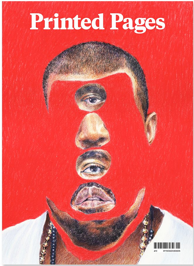
Printed Pages A/W 2015 cover. Original image: Yahnker, E. (2012). Kanye Stack. [coloured pencil on paper].

If this image did not exist physically in the world as it does on the cover of the Autumn/Winter 2015 issue of Printed Pages AKA The It’s Nice That Magazine I would not have chosen it. I like to collect published images in the form of books, albums and magazines as I feel a personal connection with works of design that I myself can own and hold, a sentiment I share with the people behind this magazine: “By name and by nature, Printed Pages has always been a celebration of print”. Outside of being a published image it has a story to tell, one of fame and distortion of perception.


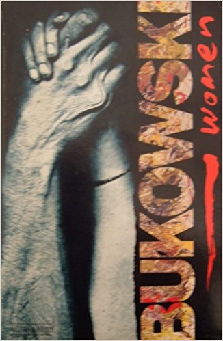
Rozycki, P. and Keates, M. (1993). Charles Bukowski – Women (cover artwork). Virgin Books.

Similarly if I didn’t physically own a copy of the 1993 Virgin Books edition of Charles Bukowski’s 1978 novel, Women, I would not be able to talk about it now. It was a struggle to find an image of it online and the only one I could find is slightly blurred with a level of glare showing up on the glossy cover. It’s a great shame because it’s one of my favourite book covers of all time, that’s why I immediately thought to include it. The bizarre combination of imagery ranging from a scanned photocopy image of a tender embrace between a man and woman rendered through blunt realism and the wild but painterly type helps to evoke some of the feeling that the story is bursting with.


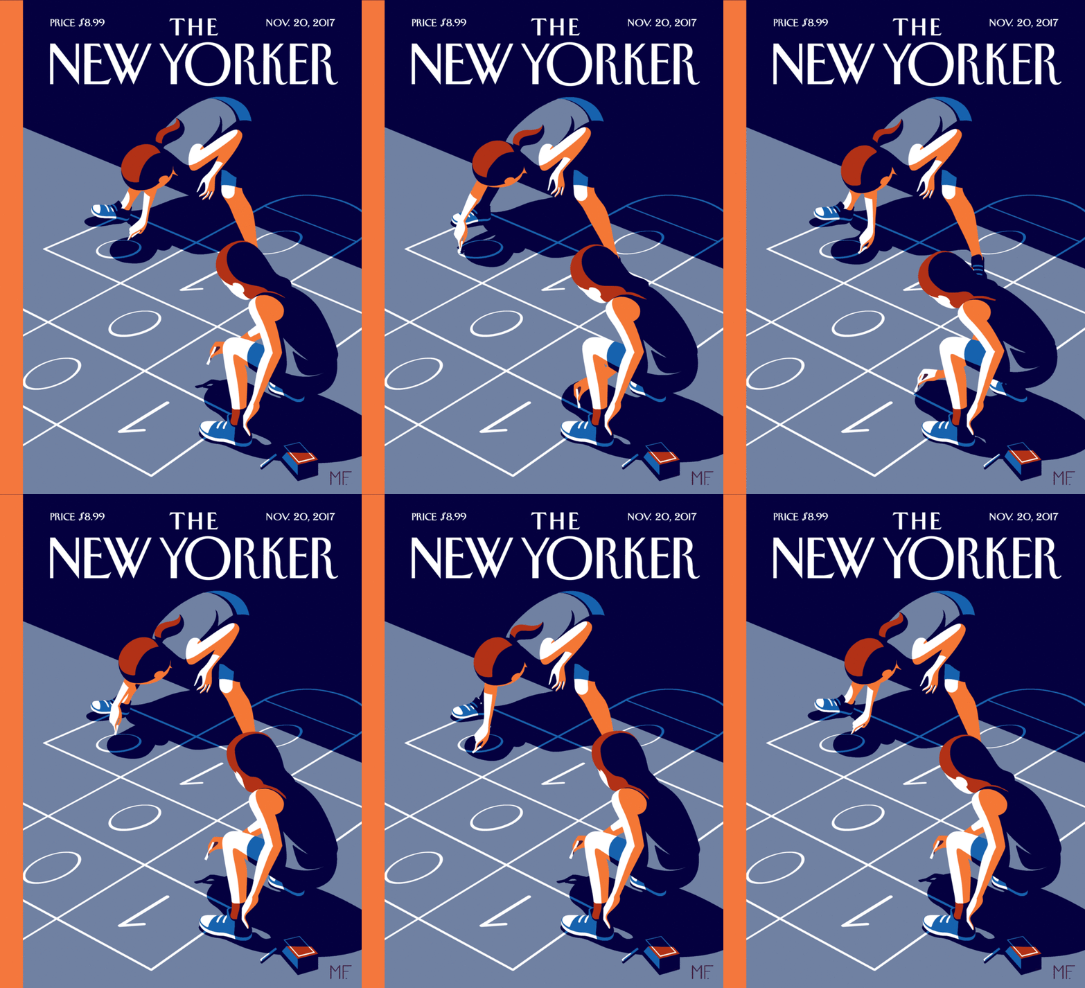
Favre, M. (2017). The New Yorker November 20, 2017 Issue (cover artwork/online animated version).

Seeking out another cover I found something very indicative of the fastly advancing world of publishing supported by technology. Similarly modern was the a New Yorker cover by Christoph Niemann which was featured on the Netflix documentary series: ‘Abstract’ and supplemented by augmented reality technology. The message behind this image that is also supported by the cover story in of the issue has to do with discrimination in the code business and the importance of educating children in an increasingly demanded skill.


It’s Nice That. (2015). Printed Pages AW 2015. [online] Available at: https://www.itsnicethat.com/publications/printed-pages-aw-2015 [Accessed 7 Dec. 2017].

Abstract: The Art of Design, S01E01 – Christoph Niemann: Illustration. (2017). Directed by M. Neville. New York City: Netflix.

The New Yorker Videos. (2017). Christoph Niemann’s Augmented-Reality Covers. [online] Available at: http://video.newyorker.com/watch/introducing-christoph-niemann-augmented-reality-covers.


What I have learnt

In these ten weeks on Research and communication lecture, I have learnt, researched and explored a lot, my idea towards art has totally changed and improved. I was able to identify how I could improve my work by getting an opportunity to explore different kinds of work by various designers. I have obtained a lot pf inspiration by looking at other successful designer’s work. My favourite tasks included the tasks where we had to write about Counter Culture, Publish or Perish and Technology is the mortal enemy of Graphic Design. Through these tasks I was able to find a deeper sense of the types of design techniques I like working with, which are- Typography, Photo manipulation, minimalistic posters etc. I am very sure that now when I will start working on new projects my thinking and creativity would totally be improved. The presentations and videos shown to us in the class have been proved to be very useful for my area of interest. Before this class, my area of interest was only limited to Graphic Design, but by getting to know about other types of art I feel my knowledge and interests towards other disciplines has increased effectively. The relation between the Research and Communication Skills lecture and the studio based lectures is very strong, because by attending the Research and Communication lectures I was able to give a higher and more creative input in my studio skills. The documentary of Paula Scher shows to us in the class was my favourite one, and after that day, I have and referred that documentary to many of my other friends in Canada who are also Graphic Designers. It was very inspiring to watch the documentary and it gave me a new perspective and a benchmark for what I aim to become in future. I have also improved in the area of writing through this module. Now I am confident in exploring other disciplines as well, as I have gained a lot of knowledge about all the four pathways of Graphic Arts. I have totally realized how influential a design, a photograph or a text can be. Through the use of good design we can influence a large number of audience.

This module has proved to be very beneficial for me, I am very inspired by each lecture providing the opportunity to explore different fields which earlier I was not familiar with. I had no interest in Illustration, but after this module, I have gained a lot of knowledge about this pathway which has made Illustration one of my pathway choice. I am sure that after getting the opportunity to enhance my knowledge in all the four pathways I have become a better designer and my approach towards designing and way of thinking/creating has totally improved.

Reflection


The good and the bad

Researching and communicating my ideas has helped me to expand my thinking beyond the small pops on inspiration in my mind. Rather than just a thought, I have had to explain my thoughts and feelings in detail, fitting to the length of a blog post. I have also thought about how my writing can be interesting to the reader.  Some of the question pairs made me think creatively about how to express my research, and I visualised dieter rams 10 principles of good design which is still very memorable to me because of that.

I enjoyed coming to these presentations as it woke me up and inspired me for the rest of the day. I would say that the history of indie was my favourite presentation. It was colourful, it had multiple videos and it had a nice timeline which I was able to jot down for reference in the future. There was also lots of researchable slides containing artists and developers that I could look at later on.

I feel like I could have used the sources in a more viable way rather than just aiming to get the blog posts complete. I have a short memory but want to re-visit some of these ideas somewhere that is accessible and organised. My time management of this module could have been better as I had to post some blogs before the hand in, so I feel like I didn’t spend as much time on them as I probably should have. I also enjoyed the blogs more when I was taking the time to research different parts and explain thoroughly.

“Every duty that is bidden to wait comes back with seven fresh duties at it’s back” – Charles Kingsly


What I learnt

This module has taken my research down avenues I have not thought to explore when working on projects, Specifically taking my target audience’s thoughts and understanding into consideration.  I have learnt that using interactive ideas can really help me to engage my audience in new ways. I have also learnt different ways to remember information, as I am a visual learner. Also, on the other side of the module I have learnt how a presentation can be interesting and keep an audiences attention.

Throughout my previous projects I have not researched and explored as many avenues as I would like to and I think this module has definitely opened my mind to different areas, as well as teaching me the basics in game design, design in general and technology.I will definitely be looking back at some of this research for  future game design projects.

Suggestions for future:

In the future I will make a separate document on the slides noting the information that is not written so I can look for it again in the future. I should also be using the time allocated after these lectures to create a portfolio of research I can access at any time.


Task 8

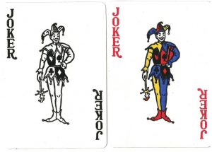
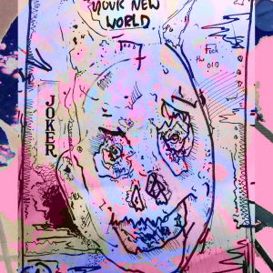
For the appropriation task I wanted to take this sinister looking drawing and include words that could truly lift this drawing to new atmospheric heights, by including the lettering found on ordinary playing cards around the globe. The typographical face is such a common thing that by introducing it to my own work and appropriating as such, it lends it’s meaning to my work and allows my own to grow from it’s archaic themes. I have included the two images, one quite obviously being the Joker from a deck of cards, whereas the other is a drawing i’ve done which includes the signature ‘JOKER’ lettering.

While appropriation in art has been around for ages, it began to gain popularity in the 20th century. Most notably with “Dada” artists like Marcel Duchamp, who championed the art of the “ready mades”. Andy Warhol continued the tradition of appropriation, but the times were changing, and borrowing images to create new ones became more controversial with the onset of consumerism.

Consumerism is the bane of society, it’s most probable everyone has owned such deck of cards in there existence, so it could certainly be said that by appropriating these ready made exerts into my own work that I’d be relinquished of my newly produced work immediately. I think that by indoctrinating such work into my own, it adds to the overall quality and due to it being so commonly found it’s therefore directly in our mass consciousness.


Revolver Gallery. 2017. Andy Warhol and the Art of Appropriation. [ONLINE] Available at: http://revolverwarholgallery.com/andy-warhol-art-appropriation/. [Accessed 06 December 2017].

Reflective statement

After having completed the 6 tasks, I have learnt much about how I approach questions and my thinking process.

Something I realised almost straight away was that I have too much of a reliance on using my own knowledge to answer questions. I examples I wanted to include were all experiences of my own, which I now realise is quite a narrow-minded approach to answering a task. I believe I amended this when answering the question “Is it still possible to be truly Avant Garde?”, in which I used the book “How Game Move Us” by Katherine Isbister to research potential games that showed evidence of innovation and original ideas. It was through her analysis of Waco Resurrection that I chose that particular game, as she mentions that it “exposes the potential of games to reopen problematic cultural episodes, towards deeper understanding and continuing conversation.”. Through this experience I better see the importance of research, as it better helped to bolster my argument.

A positive experience I gained from the tasks was looking deeper into the games I already play, and through questioning elements of these games I discovered things about them I had never thought about. For example, researching about the UI of Hearthstone, specifically from Derek Satamoto’s talk at GDC 2015 made me see the game for the first time as a designer, not a player. Understanding how important UI is to make a smooth and enjoyable experience for the player has made me question design choices more often when playing games, and has already impacted my thought process for the current HitchBrick project. As the designer of the team, I have considered carefully every aspect of the UI, designing it in such a way as to not break the player’s immersion from the game, and to make it as accessible and easy to figure out as possible.

Another example that made me look deeper was analysing the AI for the guards in Dishonored. From reading “Human Behaviour Modelling in Games using Agents” by Susantha Andradi, Asoka Karunananda, and Romesh Ranawana, I learned about how incorporating real human behaviour into NPCs can create more immersive and engaging experiences. Transferring that knowledge to Dishonored made me see flaws in the AI I had never considered before, for example, the lack of variety of personalities between guards.

After reflecting back on my work, an improvement I could make for the future would be to give more evidence to back up my arguments. I feel that for many points I’ve made, they are simply backed up by my own opinion, which is not optimal for a thorough investigation into these tasks. Next time I will find more sources that either agree with my arguments or offer a different insight, which I could make judgements on.

http://www.gdcvault.com/play/1022036/Hearthstone-How-to-Create-an

Click to access 3408E0314005.pdf

Reflective Summary

Over the course of the past few weeks of researching different topics and creating a blog in response to questions asked of me, I’ve learnt a great deal and had my perspective changed on quite a few issues. Looking back to the question about should emotive modelling be included for NPC’s, I realise I found myself struggling quite a lot. It wasn’t just a matter of difficulty understanding the question as it turned out to be an issue of whether or not it is suitable and how specific people would view it. I began by trying to research behaviour modelling and how that linked to emotive modelling but felt like I was getting nowhere. It was quite difficult to find information on at first as I found that I was being too specific with my searches. This is when I decided to change my research method and search for any work related to AI and emotions.

I found that the answer I gave in response to the question was pretty open about how I would personally consider emotion modelling in NPC’s for games. I found that the longer I researched into the topic the more fascinating it became and was very interested in the stories of how developers had input emotion into some characters.

By changing how I researched I found that I could get to my answer a lot easier as I was thrown down a path which led to different perceptions that I may have never even considered. This broader view on the situation really helped me to see that by changing the nature of the question slightly whilst researching, we can still come to a conclusion for our original question that was put before us. I know now that in future when i am researching, I will adopt this new method of distorting the question to gain different perspectives on how the question can be answered. So i am sure this will affect all future work.

Another example of my overall experiences with this module is how I took to completing the first question pair. I chose to look into Dieter Ram’s 10 Principles of good design because it interested me that these 10 principles still help guide creators in developing new items for consumers. It baffled me at first and I was confused on how I would visualise these principles in a relevant way. I mentioned in the blog post about how these principles don’t just apply to physical items such as radios but how they also apply to digital work such as websites. “Dieter Rams 10 principles aren’t just applied to physical objects though. Looking at a toaster you know what you’re doing, and this should be the same for a webpage.” This really fascinated me as it gave me an insight into how web developers have to consider so many different possibilities when creating a new website.

Overall I would say that through the module my research methods have slightly changed for the better and will help me to improve upon my work in the future and assist me when I’m feeling stuck on a particular topic.


Task 6

Firstly, we’re on the verge of becoming swallowed up by our own greed and consumerist attitudes. Rubbish, is a major problem in todays society, the whole reuse, recycle and reduce headline has been well overspent. On the horizon, is a wave of trash that we will eventually consume us all.

It is therefore essential for us to develop a means of using trash as a way of symbolising our own consumerist attitudes. My practice, would involve building sculptures/installations from our own trash, which would allow us on a more personal level to understand just how much we use as a group or as an individual. We must consume less and live more! By taking all this trash, it is highly likely we could build from this a detailed image, which when produced would not only highlight our own downfalls, but on a wider scale, on an international level.

It’s a way of taking junk and creating a process which responds to our consumerist ideology, now this could be done as a community project, you could accumulate a months worth of trash and allow everyone to take part in creating a tall sculpture of a human being standing tall. As the light breaks, a shadow could be cast, now this could show how we’re being progressive in such dire times, but it also leaves room for us to question exactly what sort of future we want to have as the human species moves forward into climatic times.


What do you see as the positives and negatives around copyright?

The main purpose of copyright law is to protect new creative works from being duplicated without permission. One of the main strengths of this is that any published creative work is automatically protected, with no registration of the work needed for this to happen. Copyrights also give creators the exclusive right to profit from their work, which can really help musicians, artists and writers for example. Also, breaches of copyright are usually dealt with in a very straightforward manner, as only the burden of proof that copyright was infringed needs to been shown, as opposed to proof beyond a reasonable doubt that is needed in criminal proceedings.

However, there are negatives about the system. While in one aspect creativity is encouraged, as creators know their works are protected, in another aspect creativity is restricted, as profit cannot be made from a work that derives something from another. What makes this worse is how vague copyright law can be, especially in terms of fair use, which includes using someone else’s work for commentary, criticism or reporting. This is a fairly large problem on YouTube as each case is interpreted different; there are no set rules. One huge example is a channel called H3H3 Productions, a channel consisting mainly of commentary on other videos. In one video they parody and criticise a video from another YouTuber, something many would assume is under fair use. However, the owner of the original video filed a lawsuit against them, accusing them of reproducing too much of the original video, which led to H3H3 having to spend hundreds of thousands of dollars fighting the case, not to mention the emotional stress they must have been going through. While they did end up winning the lawsuit, the ambiguity of copyright law meant the process was long, painful and uncertain, and could have been avoided if there were set rules on fair use.

Image result for copyright

Is it possible to make anything new?

Absolutely, although that does not mean it isn’t a challenge to make something new. Recent indie games show that it is very possible to come up with successful new ideas, such as Undertale, a pixel game created by Toby Fox in 2015.

Undertale is not your typical RPG; it constantly surprises you with quirky mechanics such as the battle system, in which you move a dot around a playing area to avoid enemy attacks. The mercy feature is similarly fresh, as you don’t get a reward for not killing enemies, while in games like Bioshock for example, there is much to gain from saving the Little Sisters. In Undertale, you can choose not to kill anyone simply because it is the right thing to do. Undertale is an example of a game that takes influences from other games but uses them to create fresh and inventive ideas. This means that you don’t need to necessarily copy other works to create something new; you can always take influences from them to create your own.

British Library (n.d.).Fair use copyright explained. Retrieved from British Library:  https://www.bl.uk/business-and-ip-centre/articles/fair-use-copyright-explained

Schnotz, W. (n.d). Pros & Cons of Copyright Laws. Retrieved from Az Central: https://yourbusiness.azcentral.com/pros-cons-copyright-laws-5170.html

http://smallbusiness.chron.com/pros-cons-copyright-laws-52554.html

https://kotaku.com/h3h3-productions-win-lawsuit-against-youtuber-they-paro-1798386207

https://www.reddit.com/r/Undertale/comments/3wpnd6/what_makes_undertales_mercy_mechanic_unique/?st=javearup&sh=bb0ce03d

https://www.gamefaqs.com/boards/180989-undertale/72981369/839030619

Image 1: http://www.finearttips.com/wp-content/uploads/2011/02/copyright-.png
Â