Category Archives: Uncategorized

Do not use, you should categorize each and every post.

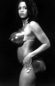
Task 3: Ways of seeing – Renee Cox ‘Hot-en-tot Venus’ (1994)

There are a number of things which make this image captivating – the black and grey filter, the extensions of the body and the fact that the woman is black.


The plastic bottom and breasts act as an extension of Renee Cox’s natural form. They draw attention away from the rest of her body and might be the artist’s way of making a statement about the media and how they portray women.


The rise of celebrity culture has meant that more and more people are being exposed to airbrushed images of what a woman should look like – skinny, with large breasts and large bottoms. Women are going to great lengths to achieve this image through plastic surgery in a hope that it will fill them with confidence and belonging.


The black and white filter that has been used on the photograph reminds me of an advertisement in a magazine. The artist’s pose also reminds me of a modelling photo. It is almost as if the artist is modelling her own insecurities to the rest of the world.


Renee Cox is of African descent and I feel that this is something that has influenced this image a lot. African women are portrayed to have voluptuous figures and sometimes the media will try and draw attention away from their skin colour – this is the media trying to whitewash their advertisements. The black and white filter makes Renee’s skin colour less noticeable and the fake breasts and bottom draw attention from her as a person – her body is basically just there to support these 2 features, who she is as a person doesn’t matter to the journalist.


Post Modernism

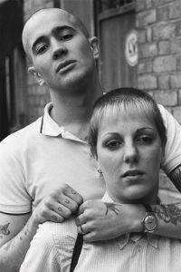
This photo taken by Nick Knight for a series titled ‘skinhead’ shows two young people with their heads shaved or partly shaved to be a “skinhead”. This was a part of a subculture in the late 60’s in London which later grew worldwide in the 1980’s, motivated by it being something that wasn’t in the mainstream. Knight photographed this culture movement and created a book from it (1994) to reveal the people involved with the subculture, in particular showing how they dress as part of a fashion photography series. The book captures their behaviour, fashion and their attitudes towards the police, government and school.

http://showstudio.com/project/nick_knight_image/skinheads

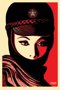
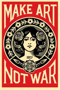
The piece above is by the street artist, illustrator and graphic designer Shepard Fairey. When creating his pieces, he very heavily uses stencils and layers to deconstruct the image into a select palette of colours of usually red, black and either a pale yellow or white. Deconstruction is something very typical in the field of graphic design and illustration as it allows us as designers to create new shapes from images like the one above Shepard has created. Through my own practice this can also be achieved through typography to give the text depth and perhaps emphasize the meaning of the text. When fairey creates his work, he uses limited colours and keeps his work consistent to show which colours are the foreground and background.

Mujer Fatale Offset

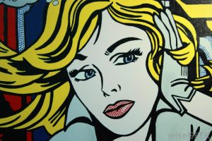
Roy Liechtenstein’s work is often considered postmodern as it includes features of modernism, full of colour and shapes and heavily using primary colours, focusing on foreground and background details. Post modernism is shown through subverting something away from its original purpose to help us understand it more. Roy’s work shows this through this piece above as showing a scene of a woman however he uses different shapes to create texture and create a sense of misdirection of the piece’ meaning and show the painting for what it is. Through my own practice I can apply this way of thinking when creating images to show what the piece is as an object and make the audience question the meaning of it.

http://www.wisegeek.com/what-is-postmodern-art.htm#pop-art-in-the-style-of-roy-lichtenstein

Week 7

This is a photo montage by Peter Kennard which depicts the MP/former prime minister of the United Kingdom Tony Blair holding a mobile phone up to take a selfie of himself with an explosion in the background whilst laughing. The photo shows a connection between the artists feelings about politics and his feelings towards Tony Blair and the then current issues within the government and bombings in Afghanistan. Overall the image creates a feeling of mixed emotions as it is meant to be humorous however it has a serious meaning to it that Tony Blair was dropping bombs left right and centre to take out the Taliban in Afghanistan at the time.

Photo Op

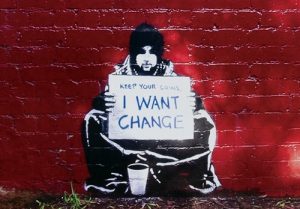
This is a piece by the mystery artist Banksy which shows a homeless man sat with a cardboard sign saying ‘keep your coins, I WANT CHANGE’. Again, this piece is about connecting the artists feelings towards politics and communicating his message through graffiti on walls. Banksy is very mysterious and no one actually knows his true identity, in comparison, he likes to create a feeling of questioning his work so the viewer leaves thinking about his statement within his piece, more often than not a political issue, more recently he produced a huge wall mural in response to Brexit which evoked lots of issues as it shows someone removing a star from the EU flag as we prepare to leave the EU.

Keep Your Coins, I Want Change


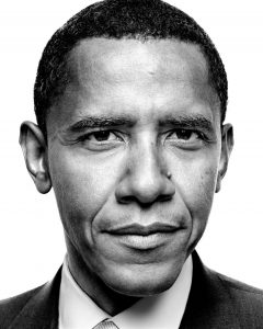
This is a picture of the Former US president Barack Obama, taken by the famous photographer Platon who takes Images of celebrities and people with power in the government. He does this to capture their personalities through the lens by using very close up images with a 35mm film camera. The amount of detail produced by using this method of photography makes Platon able to produce very large-scale photos/murals. Platon likes to tell a story through his photos, for example in the Netflix series Absract, he visited a hospital with lots of women who had all gone through a sexual trauma of some kind, creating lots of feelings to the viewers of the photos to capture their message.

http://platonphoto.com/gallery/portraits/politics/barackobama/

Two photo comparison


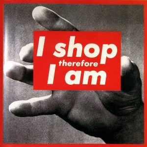
This is a piece by Barbara Kruger, I have chosen this piece as it includes two things I am particularly interested in; photography and graphic design/typography. Barbara often uses found imagery from magazines and layers over small phrases of text often ironic to the photo behind it, she uses the typeface Futura Bold for her works. To show her expression of the text, Kruger uses a white typeface inside red boxes almost showing anger through the use of the colour to express her opinions. The phrase shown in this piece communicates a post modernistic approach as the audience won’t understand the meaning at first glance however the photo behind works with the text to show someone holding the piece of text, this could connote someone holding something whilst shopping.

http://www.arthistoryarchive.com/arthistory/feminist/Barbara-Kruger.html

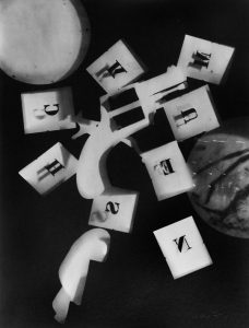
Man ray is a photographer and painter, being a huge part of the Dada and Surrealism movements, also the only American artist to take the lead in launching those movements. This photo is a piece titled ‘Rayographs’ which he has used a darkroom to produce photos using found objects, in this photo he has used 3d blocks with letters cut out of them. These letters don’t typically spell anything in particular, however the style is similar to that of Barbara Kruger. They aren’t influenced by one another in any way, although the way a letter is shown inside a box works quite well as it gives quite an informal representation of the text for the audience to understand it.

http://www.all-art.org/history658_photography13-16.html

Reflective Writing

After reading a chapter from ‘Fashion and a Communication’, by Malcolm Barnard one of the ideas that stood out to me the most is how it made me realise how much fashion affects and is affected by our society, “people have to be both part of a larger social group and yet not bound up in that group that they posses no identity” (M. Barnard ,2002). He continues to discuss that fashion wouldn’t exist if it wasn’t for these two factors as those societies not in the western world do not have fashion because their clothing suits the environment they live within not to represent identity and the need to belong.

In my opinion I do agree with the points that were made within ‘Fashion as a communication’ as I believe that consumers including myself have a desire to be individual in order to represent themselves but also do not want to stand out too far from the crowd. This is a significant aspect of fashion to me, as I feel being aware of these factors will allow designers to focus on a particular target market of pulling out the individuality of each customer but at the same time keeping a one constant identity within their products which the consumers aim to achieve and what will create their brand.

Another text I read which supported this argument was from the ‘Psychology of Fashion’ written by Michael. R. Solomon, as it had similar points that fashion is how ‘we discover new, different aspects of our personality every time we try on a new garment’ (M.R. Solomon, 1985). I agree with this point and feel that is also agrees with the points of Georg Simmel that Barnard uses as when trying on the garment it allows the individual to discover something about themselves and still stay part of the union as they will be buying clothes from retail stores that suits the majority, therefore staying within the union. Solomon also makes the same point of the consumers wanting to be part of a union which contributes the creation of fashion within a society, “staying in the race” (M.R. Solomon, 1985).

I then referred to another text ‘Adorned dreams’ which states that the self promotion which is now used within fashion in the western world to show wealth and identity happened after the industrial revolution when there was enough wealth and people could afford to consume more therefore “dress became a vehicle for the display of the unique individual personality” (E. Wilson, 2009). I believe that this change is what led to the fast fashion of today, as increase and efficiency of production within the industry, led to products becoming cheaper and consumers having a constant change of identity and as they have the ability to represent themselves differently all the time.

In conclusion, I believe that after reading these books it will change the way I move forward as a designer as although being a consumer myself I did not realise my own behaviour when buying clothes or any product at all. Therefore, I will aim to design products that can represent multiple personalities.

Barnard,M. (2002) Fashion as a Communication, New York, Routledge

Solomon M.R. (1985), The Psychology of Fashion, Massachusetts, Lexington Books

Wilson, E. (2009) Adorned in Dreams: Fashion and Modernity, London, Virago


Post-modernism

Shepard Fairey

Fairey’s work is world famous, with it being printed on t-shirts, mugs and posters, you can’t escape his artwork. It’s unique with it’s bold use of reds and creams and backs. The use of a minimalist colour palette shows how impact images can be even with the littlest of colour. Within Fairey’s manifesto he describes his movement as an attempt ‘to enable people to see clearly something that is right before their eyes but obscured; things that are so taken for granted that they are muted by abstract observation.’ which in a sense encompasses what postmodernism’s about, looking beyond what you are used to seeing and searching for a deeper meaning. His art inspires a lot of my own especially the way he shades and uses colour and lines in his own work.

Keith Haring

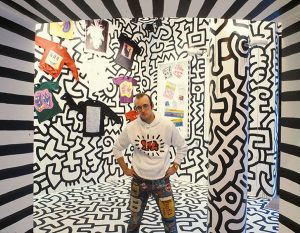
Haring is an iconic artist within the post modernism who wanted his artwork to be widely available to the people, even creating a pop up shop which ‘Haring considered the shop to be an extension of his work and painted the entire interior of the store in an abstract black on white mural, creating a striking and unique retail environment. The shop was intended to allow people greater access to his work, which was now readily available on products at a low cost.’ Haring wanted his artwork not just to be for the elite but for everyone, which is why his artwork is so recognisable.

Jean-micheal Basquiat

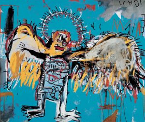
Basquiat’s work isn’t a well known as the other two artists yet he has still impacted our world and especially postmodernism, his work is inspired ‘from his urban origins, and in another a more distant, African-Caribbean heritage.’ which can be seen in the use of vibrant colours and the designs of his figures. Basquiat rose to fame quickly within the art community, his work is both a live and intricate and although his painting can come across as messy they are well thought out, intricate as well as being expressive, he used his work to speak out against racism, he also collaborated with Andy Warhol on multiple painting.

Reference:

Jean-Micheal Basquiat. 2017. Jean-Micheal Basquiat. [ONLINE] Available at: http://basquiat.com/. [Accessed 5 December 2017].

Keith Haring. 2017. Keith Haring – pop shop. [ONLINE] Available at: http://www.haring.com/!/pop-shop. [Accessed 5 December 2017].

Keith Haring. 2017. Keith Haring Bio. [ONLINE] Available at: http://www.haring.com/!/about-haring/bio#.Wiiaj0pl9PY. [Accessed 5 December 2017].

Shepard Fairey. 2017. make art not war. [ONLINE] Available at: https://obeygiant.com/prints/make-art-not-war-offset/. [Accessed 5 December 2017].

Shepard Fairey. 2017. Manifesto. [ONLINE] Available at: https://obeygiant.com/propaganda/manifesto/. [Accessed 5 December 2017].

Jean-Micheal Basquiat. 2017. Jean-Micheal Basquiat. [ONLINE] Available at: http://www.theartstory.org/artist-basquiat-jean-michel.htm. [Accessed 5 December 2017].


Task Eleven: Summarise Your Blog

My blog is a collection of my artwork, ideas and concepts that I have developed this past semester. It ranges from showing and sharing pieces of art I have created, to explaining the processes in which I took to make them, and how these processes have changed and evolved, to explaining and expressing my opinions of different art theories and artists work.

I have discovered that my blog shows how my work has changed and developed from when first writing about previous work I had made (in task one) to works that I have recently created and how my ideas, skills and methods have changed, developed and evolved. It has also given me the chance to have and create an insight on many different artists/ art theorists and their views and has allowed me to develop my own opinions and share these views on them through this blog.

Task Six: Modes Of Practice

Task Six: Modes Of Practice

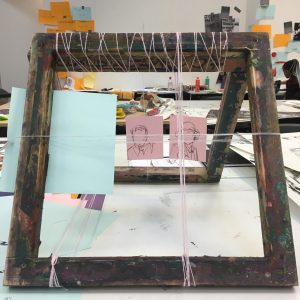
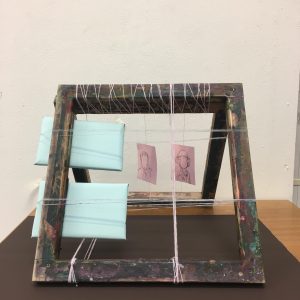
Following the given task I experimented with developing a new way of working, a new mode of practice. I initially started by drawing a simple line drawing of a house without looking. I chose to draw a house by just picking a piece of my previous collage work at random. I then translated this drawing into a sculpture using inspiration from artists I spontaneously found by opening pages of a selection of art books at random. This initial process was very quick, spontaneous and free- very unlike how I usually work. However, it created a direct instant flow of thinking and making and allowed me to generate a lot more work than I usually would in the short time frame I had.

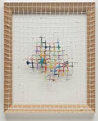
I was inspired by Dianna Molzan’s delicate framed pieces. Following this inspiration I found two old, used frames and wrapped thread around them, connecting them, creating a triangular shape- like the roof of a house. I found this play on using a fragile, delicate material (thread) to stabilise and secure a structure very interesting as it created the question of doubt whether it would stay secured, generating a feeling of tension and unease.  It also allowed me to experiment and discover different ways of manipulating different materials in order to create my desired form and outcome. Choosing to create a sculpture in itself was a new mode of practice for me as I never work in this medium. However I felt it was a good experience to widen my skills and practise of the methods of sculpture.

Dianna Molzan, Unititled. Artist inspiration for sculpture.


Task Ten

“In exactly ten words. Write
a commentary to reflect on your choices.

  1. Manipulate

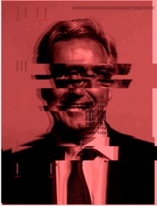
    Mark Garnier- The ‘Parliamentary Under Secretary Of State for International Trade’.

  2. Glitch
  3. Discomfort
  4. Unease
  5. Obliterate
  6. Regression
  7. Reveal
  8. Disturb
  9. Digitial
  10. Political

I chose this image to represent my work as I feel out of all the images I digitally manipulated of the MP’s with sexual accusations against them, this one was the most effective in creating the feeling of discomfort. The blood red colouring and the strong glitches and the shadow of the glitches creates a sense of movement- like the photo has glitched right in front of you. Also the phrase/ words I used to suggest the background story are most powerful and suggestive in this piece.

On the 29th of October Mark Garnier- The ‘Partlimentary Under Secratary of State for international Trade’ admitted to calling his assistant “Sugar Tits” mulitple times and also admitted getting her to buy two vibrators for his wife from a sex shop in Soho.

By transforming and regressing his smiling headshots, taking them from something they should be proud of as they show who they are and their position in politics and their authority and obliterating them, completely disturbing them, using these headshots to reveal, not only an unprofessional, but darker, negative side of the person and the bad actions they have committed.  By printing ‘Sugar Tits’ by his mouth and repeating it and overlaying it (like another glitch) like it is stuck on repeat creates the idea that this should not just be ignored, this is something he said and it  should be revealed.


Task Eight: The Birth Of Couleé

The Birth of Coulee

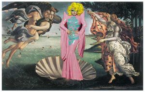
Photoshopped image replacing Venus with Shea Couleé

In my art I have discovered an interest in modern day society’s perception of women and how beauty has changed in comparison to  high renaissance art and how women were perceived. By replacing the image of Venus from ‘The Birth of Venus’ by Botticelli in 1484-86 with Shea CouleĂ©- a drag queen from the TV show ‘RuPaul’s Drag Race’ I am implying that modern days society’s idea of what is beautiful has widened and a lot more is being expressed and accepted now.

I chose to replace a drag queen with Venus as drag queens are very concerned with the idea of beauty and show it through their emphasized makeup and their curvaceous figures through eccentric outfits.  They are also very expressive and glamorous when it comes to sex, desire and victory (as well as beauty)- all of which Venus is the goddess of. Therefore creating a connection between Venus and drag queens.  I also found that the image of Shea Coulee fitted perfectly as she is standing in an S-curve pose, which is a typical feature of high renaissance paintings and sculptures of figures. The impression that the drag queen is being ‘birthed’ and presented also fits as if it is a stage or a catwalk where a drag queen would normally present herself. I like this composition and the idea of glorifying the acceptance of drag queens and transgender people and how it is relatable to a lot of people as the subject is very big in today’s society.