
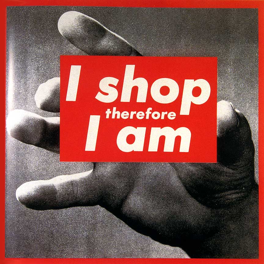
This is a piece by Barbara Kruger, I have chosen this piece as it includes two things I am particularly interested in; photography and graphic design/typography. Barbara often uses found imagery from magazines and layers over small phrases of text often ironic to the photo behind it, she uses the typeface Futura Bold for her works. To show her expression of the text, Kruger uses a white typeface inside red boxes almost showing anger through the use of the colour to express her opinions. The phrase shown in this piece communicates a post modernistic approach as the audience won’t understand the meaning at first glance however the photo behind works with the text to show someone holding the piece of text, this could connote someone holding something whilst shopping.
http://www.arthistoryarchive.com/arthistory/feminist/Barbara-Kruger.html
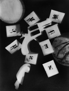
Man ray is a photographer and painter, being a huge part of the Dada and Surrealism movements, also the only American artist to take the lead in launching those movements. This photo is a piece titled ‘Rayographs’ which he has used a darkroom to produce photos using found objects, in this photo he has used 3d blocks with letters cut out of them. These letters don’t typically spell anything in particular, however the style is similar to that of Barbara Kruger. They aren’t influenced by one another in any way, although the way a letter is shown inside a box works quite well as it gives quite an informal representation of the text for the audience to understand it.
http://www.all-art.org/history658_photography13-16.html