Category Archives: Uncategorized

Do not use, you should categorize each and every post.

Postmodernism

The first image I wanted to talk about is from Shepard  Fairey, who makes powerful, bold pieces. ‘While Fairey does not necessarily label himself as a postmodernist, it is evident that these stickers are highly influenced by postmodernism.’ (Design DiALOGUE, 2017). Being anti-authoritarian by nature, postmodernism aligns nicely with the political stir that this piece made, and I think that is really interesting. Fairey admits that he was just messing around making stencils when making this piece and as not trying to include a meaning, yet the act of spreading them round the city caused a public movement. The simple black and white design means that you take in all the visual information from the piece quickly and the rugged, unpolished effect gives a threatening effect.
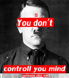
This piece by Barbara Kruger, in my opinion, embodies postmodernism, it speaks out through those bold red boxes about not being a sheep, comparing whatever governing body to Adolf Hitler. ‘Postmodernism was a drastic departure from modernism’s utopian visions, which had been based on clarity and simplicity. The modernists wanted to open a window onto a new world; postmodernism’s key principles were complexity and contradiction.’ (Vam.ac.uk, 2017) This piece actively encourages us, the audience, to reject any authority and to think for ourselves, and I think this is an interesting concept to try and deconstruct authority entirely. The message cant be made clearer with such a recognisable figure as a black and white background with her own bold red additions laying over the top.
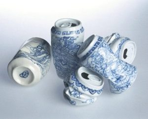


I like this piece from Ai Wei Wei showing crumpled, porcelain cans. This could be considered postmodern in effect as he brings together two very different classes of object, the ‘useless’ crumpled can, but created with a very fine-painted porcelain. Depending on your views he has either vastly increased the importance of the can, or made the fine china valueless, which is a very postmodern approach to value and wealth in the same vein as the use of distressed material. ‘The Modernists’ ceaseless urge to create something new and the artistic means employed in that effort are regarded from the Postmodernist perspective as automatized, established and obsolete. The fundamental principle that there is nothing new to create
’ (Hatjecantz.de, 2017) shows evidently in this piece, it is recycled subject matter and form, and I find it really intriguing to see porcelain crafted into the sharp, angular shapes of a crumped can, it is a rejection of the norm and a display that rather that work towards reusing empty cans, he’s attaching value to them, against the utopian future of the modernists.

Design DiALOGUE. (2017). Shepard Fairey and Postmodernism. [online] Available at: https://wordpress57027.wordpress.com/2017/04/06/shepard-fairey-and-postmodernism/ [Accessed 3 Dec. 2017].

Vam.ac.uk. (2017). Postmodernism – Victoria and Albert Museum. [online] Available at: http://www.vam.ac.uk/content/articles/p/postmodernism/ [Accessed 3 Dec. 2017].

Hatjecantz.de. (2017). Postmodernism | Art Dictionary | Hatje Cantz. [online] Available at: http://www.hatjecantz.de/postmodernism-5051-1.html [Accessed 5 Dec. 2017].

Emotive AI

A) Behavioural modelling is an important part of NPC development for games. Should emotive modelling be part of that development?

I think for some games emotive modelling is very important, especially in storytelling games and interactive games; where your actions matter. Characters emotions are a part of their personality and could influence your decisions. Until dawn had really good emotive characters that kept you guessing about who the ‘killer’ was and may convince you to kill off certain people, affecting the way you play and remember the game.

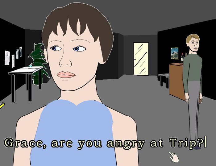
When you have set decisions this works very well as they have already thought about the AI’s reaction, however in real play-time with too much options the programmed response would try to find something it recognised and build a reaction from that; not completely understanding what you was trying to do. A good example of this is Facade. The story is based on your communication with the AI and you get to decide what you talk about. The design of the game is very simple apart from the facial expressions of the AI and this is to try and mimic the response from human beings when they understand something. Cleverbot is another good example as it picks up on most of the language used but doesn’t understand more complex language and so can repeat itself or start another conversation.

B) Consider your favourite video game. If it contains AI controlled agents how individualistic are they and there behaviours, and, how might you set about improving them?

Final fantasy would be one of my favourite games, and I feel like you don’t impact the story at all through gameplay. If I was able to communicate with the characters and get response I feel it would be very minimal but could still be a cute idea. For those that love finding out the backstory through exploring it could be a new avenue of the game to enjoy. If the game was to include as much detail it would deter the players from the concept of the game which is battle tactics.

if all the characters were to have individualistic behaviours it would be overlooked by the amount of other aspects the game has. for a lot of work it would be dismissed within a minute so the user can progress to other aspects. I would however improve some of the characters dialect, if they had mentions of locations or people I think it would help me to imagine the world and sense of civilization that the game was set in. Other than this, the main characters have unique personalities and behaviours which are shown throughout the game and I think that the focus works better on them.

I think unless the game is solely focused around the interaction with AI its unnecessary and deters the players attention.


Sources:

https://www.investopedia.com/terms/b/behavioral-

modeling.asphttp://www.interactivestory.net/screenshot5.html

http://www.cleverbot.com

Human-Computer Interaction.

A) select one example to outline the key concepts of human-computer interaction. Reflect upon the role of the “human”, the “computer” and the “interaction”.
One of the key examples that stand out to me is Nintendos Wii.
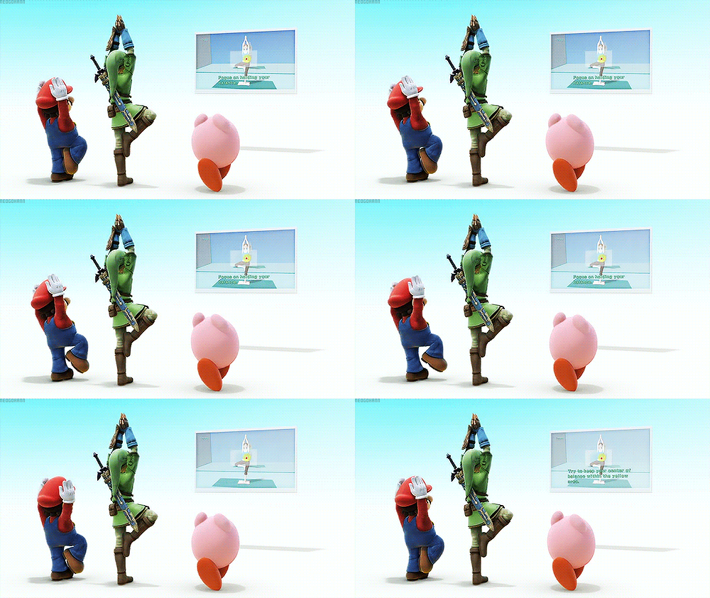
The Wii’s innovations come from the wireless controllers that use motion sensors as well as input from the buttons. This opened up thousands of possibilities to do with sport and recreational activity games, which is why the game coming with the console has multiple sports which all tested the controllers in different ways. The physical activities brought people together like in real life. Of course there would be AI’s to compete against but it’s much more fun with friends. Many family party games were created, as well as quiz games. The best multiplayer games turned out to be the most popular games, like Just Dance and Mariokart. They became famous on this platform and have evolved on to Nintendo’s new Wii-U console in different ways.
The wii was also one of the most memorable  game consoles to promote healthy lifestyle with games like wii-fit. Extensions like the balance-board controller were a revolution, opening up possibilities with physical skills combined with digital skills. After this, many other games included calorie loss counts into their UI. After while, other consoles had integrated this concept into their design. Xbox decided to have a hands free motion sensor with infrared generator that senses depth, Playstation used a strange-looking controller. Both consoles ideas were implemented quickly and i don’t think were thought out very well as both flopped and were not nearly as popular as Nintendo wi, which has already built up a solid game library around the
idea.
Wii fit introducing Super Smash bros – Nintendo
B) discuss the relationship between games design and human-computer interaction
When designing games, user interaction HAS to be considered, the same as mobile apps. If a button is too small, they can’t press it, If it is too large, it will be the main focus. The only difference is that games are suppose to be fun. As they need to entertain the audience it needs to be easy to use and the concept needs to be easily interpreted for the player to progress.
Humans are naturally physical; we turn right on a racing game and our body automatically leans to the right as we understand how the use of gravity will make us go faster, even if that is not implemented in the game.
Kids toys have also started using digital connections as kids are adapting to learn these things faster and it interests them more. Physical toys can be used to connect to a online game for example. There are also slightly less extreme versions; toys being placed in their own consoles so they can interact with other people’s toys and such. I think a good example of physical/digital kids toys would be the famous tamagotchi (which nearly everyone in that age bracket owned in 2009) and pixel chick which was more focused on a girl audience.
Tamagotchi 1997
Sources:
https://www.britannica.com/topic/Nintendo-Wii
https://www.livestrong.com/article/344104-what-are-health-benefits-from-wii-wii-fit/
https://www.pcmag.com/article2/0,2817,2372244,00.asp
https://gizmodo.com/5681078/how-motion-detection-works-in-xbox-kinect

Week 5 – Human Computer Interaction

A) select one example to outline the key concepts of human-computer interaction. Reflect upon the role of the “human”, the “computer” and the “interaction”.
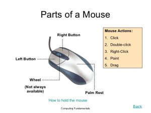
HCI is the study of the interaction/relationship between human and computer with the intention of designing something efficient and usable which resembles that of human interaction. The computer mouse is one of the most famous forms of HCI as it acts as the human hand/finger on screen, allowing us to click on something when we move the cursor to it just as we would if we were to point or grab something in real life. Having designed this aspect with the natural way humans use their hands to interact, the computer element becomes more efficient, easier to grasp and easier to understand.

Lacasamorett.com, 2017

As well as the actual purpose of the mouse, the design of the mouse itself allows for the hand to rest easy on the device as it glides along the surface to where its most comfortable for the user. Where the fingers rest on the mouse is where the clickable buttons are placed, this could be at the top of the device or the side. Having the buttons thereto click, which is the motion that enables the cursor on the screen to act as a finger, means that the user does not have to stretch ridiculously far or do anything too complicated that it could end up in finger/hand ache or physical inability to use.
 
B) Discuss the relationship between games design and human-computer interaction
As the popularity of games has increased massively in the last two decades, it has become more apparent to researchers, game designers and computer scientists of the need to have perfect HCI when designing games to improve player experience. An example of an HCI development in games design is the use of the steering wheel as an aid to racing games. The steering wheel is an improvement upon the analog stick which itself is an improvement upon the arrow keys. This progression has been due to the understanding of what would enforce a higher quality user gameplay and experience as the analog stick offered more control and a change in the everyday use of the keys but the steering wheel offers a more like-real-life experience as it relates to everyday driving. Further developments have led to additions such as pedals, a seat and a gear stick. These additions come in many different ways and development can be seen it its design in regards to player comfortability.

Team Shmo, 2017

Initially it was just a steering wheel on a box but now designers have thought of what feels most natural for the player (and possibly as a real life driver) and so have designed the steering wheel as seen in the inserted image.  It seems that set up could feel like the ultimate experience and designers would have to ensure that the game and the use of a steering wheel (plus additions) can work in the game world, as of course, the user is not driving a real car. It is understanding the relationship between HCI and designing adaptations like these which make the experience a greater one and further closes the gap in interaction between human and computer.
References

Barr, P., Noble, J. and Biddle, R. (2007). Video game values: Human–computer interaction and games.

Carroll, J. (2015). Human Computer Interaction – brief intro. [online] The Interaction Design Foundation. Available at: https://www.interaction-design.org/literature/book/the-encyclopedia-of-human-computer-interaction-2nd-ed/human-computer-interaction-brief-intro [Accessed 5 Dec. 2017].

HCI Games. (2017). Welcome to the HCI Games Group – HCI Games. [online] Available at: http://hcigames.com [Accessed 5 Dec. 2017].

Lacasamorett.com. (2017). Image Gallery of Computer Mouse Parts And Functions. [online] Available at: http://www.lacasamorett.com/foxgallery/computer-mouse-parts-and-functions.html [Accessed 5 Dec. 2017].

Nguyen, H. (2012). HUMAN COMPUTER INTERACTION IN GAME DESIGN. [online] Pdfs.semanticscholar.org. Available at: https://pdfs.semanticscholar.org/4869/a9cc94292332faee0b9e741bc93419d155a5.pdf [Accessed 5 Dec. 2017].

Perez, D. (2017). What Is the Function of a Computer Mouse? | Techwalla.com. [online] Techwalla. Available at: https://www.techwalla.com/articles/function-computer-mouse_ [Accessed 5 Dec. 2017].

Popyack, J. (2010). Cite a Website – Cite This For Me. [online] Cs.drexel.edu. Available at: https://www.cs.drexel.edu/~introcs/Fa10/notes/04.3_HCI/sample.html?CurrentSlide=2 [Accessed 5 Dec. 2017].

Team Shmo. (2017). BEST Steering Wheel Stands – Team Shmo. [online] Available at: http://www.teamshmo.com/more/reviews/best-steering-wheel-stands/#.Wiao_62cai4 [Accessed 5 Dec. 2017].

Terms, M. and Hope, C. (2017). What is a Computer Mouse?. [online] Computerhope.com. Available at: https://www.computerhope.com/jargon/m/mouse.htm [Accessed 5 Dec. 2017].

My Indie Inspirations

A) Choose one of the indie designers / developers and outline why there work and approach is of interest to you.

Jason Rohrer’s work is very different and you can see the level of progression he has made through his work. From shooting geometrical shapes on a grid to hand-drawn life stories Rohrer’s work is always changing and has unique ideas that have never been done before.  He uses wide ranges of inspiration to create ideas for his games which he sometimes posts on his personal website. Using simple programs like MS paint and gimp he has created story games, apps and multiplayer games

One of his games interests be in particular, called ‘Sleep is Death’. This was his seventh game produced. The concept is very unique. Kids play and make stories with their imagination. Recently sandbox games have become more popular (Garry’s mod for example) which allow people to make their own games within a game. I’m in love with this idea as the possibilities are endless and make memories. Of course, this is always way more fun with other people. Rohrer included these different elements to make a story based sandbox game where players get to decide what the story is, what visuals to include and how well they role play.

His newest game idea; One hour One Life, is also a very different idea that I will definitely be following and taking inspiration from.

‘Header’ For Sleep Is Death, by Jason Rohrer

B)  What do you think could be the most exciting indie projects that are in development

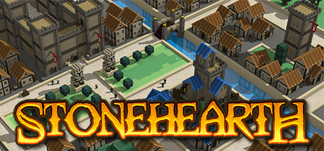
The most exciting project to me is the development of a game called ‘Stonehearth’, founded by Tom and Tony Cannon. Originally, the demo was used to start a Kickstarter which originally asked for $150,000, however they ended up making $751,920 and gaining 22,844 backers. overwhelmed by their support, they make sure to post weekly development blogs to let players know of the updates they are working on.

Started in 2013 it is still being updated and pushing the boundaries now in 2017. controlling villagers became popular after the make of ‘virtual villagers’ in 2011. To this day, people still play this classic game as it comes out on different platforms. I think this was an inspiration to many games including Stonehearth.

The developers of stonehearth have however taken many different ideas to make their game modern and exciting. one of the most interesting concepts to me is that you can create your own buildings and control your military. The game is very in depth and lets you control the whole creation of your town/village. At the very start of it’s creation; the developers talked about wanting to incorporate a multiplayer aspect that has never been done before with this kind of game.  On 21/11 the weekly blog was about testing their multiplayer idea, and included a video of some of the developers being able to play in the same world. however there was still a lot of problems for actual players regarding this, but i’m very excited whenever I see updates have been made.


‘Stonehearth’ By Radiant

sources:

https://discourse.stonehearth.net/t/stonehearth-steam-grid-icons/7611

http://hcsoftware.sourceforge.net/jason-rohrer/

https://en.wikipedia.org/wiki/Stonehearth

Task 2: Consume a book.

‘Witches and Wicked Bodies’ which was created by the National Gallery looks at the portrayal of witches from the Renaissance period, right up to the 21st century. It features continual speculation throughout about why women may have been demonised like this, whether it be for social, economical or religious reasons.

It is noted within the book that, ‘Witches who fly in hordes to attend Sabbaths are seen as being part of a female collectivity or coven that threatens the social order.” (page 57). This quote is prominent because it specifically mentions that females are the ones being accused, and in particular women that are often seen in groups. This stems back very early on to when King James started his crusade against witches and even paid people to hunt the witches. It is even speculated that ‘Macbeth’ by William Shakespeare was commissioned by King James to spread fear of witches.

Throughout the book, the National Gallery have supplied artwork from various artists that depict witches in contrasting lights. For instance, Paula Rego’s “Witches at their Incantations after Salvator Rosa” (1991) was produced very late on, when witchcraft doesn’t really receive the same fear that it did during King James’ reign. It is interesting as Rego’s piece wouldn’t look out of place with Francisco Goya’s paintings on witchcraft.

However, Edward Burra’s “Dancing Skeletons” (1934) is very brightly painted, and thought to represent Mexico’s Day of the Dead festival. Apparently he was very influenced by visits to Spain in the 1930’s and this played a big part on colour combinations and subject matters. Even though the figures in the painting are dancing, in the background you can see 3 people hanging from the gallows and a face in the moon overlooking the entire performance.


Task 12: Choose a large work and imagine it smaller or choose a small work and imagine it bigger or more or less elaborate.

This is a self portrait that I did as part of the first shared drive project where we sampled different workshops around the university. To create it, I used black acrylic paint and finger painted it. The size of the image is the size of me so roughly 5’1.

If I could recreate this image again I would choose to make it A4/A3 sized. It is very difficult for me to work with really large projects as my height makes it difficult for me to reach the paper. This means that I struggle to get the detail that I’d like to feature in my paintings.

I would also choose to make it more elaborate and in keeping with my own style as an artist. This would mean incorporating lots of blues, purples, pinks and greens into the painting, which would be a lot easier if it was on a smaller scale. However, I do like the black in the painting as it makes it stand out, so maybe I could combine the black paint with the colourful paints.

Due to the size of the painting, it was difficult to get accurate details of my face into it, so I’m not sure that it necessarily resembles me. However, I do quite like the uneven eyes and the blank expression, it is almost a cartoon and perhaps resembles my inner self, rather than my outer self.

Task 11: Summarise your blog and reflect on what you have learned from the process.

Creating a blog has allowed me to reflect on my first term at University and the work that I have been producing. It has also allowed me to focus on specific aspects of the course so far.

The blog forces you to think about your own artwork and the artwork that you are influenced by, which is incredibly useful as otherwise it can be really difficult to reflect on. It is a good way of thinking about the research and communications module as a whole, but it also involves different projects that you are working on.

This process has taught me about the importance of documenting my work regularly. Even if I choose to continue with a blog but it is not electronic or written on specific dates, it is useful to make a blog post every time we are set a new project at least.

In the future, I will try to keep some sort of written documentation of the work that I’ve created and the process that surrounds it. I will also make sure to use the library often because the tasks have really encouraged us as student to use it. The resources are great and cover a wide range of subjects.

Task 6: Modes of practice – the different ways in which artists make work.

Speaking on behalf of myself as an artist, there are a few ways that I make work which I would like to expand on and change. For instance, I prefer to shut myself away on my own to create my work, with background noise from music/film/television as inspiration to convey a mode. Another thing that helps me to create artwork are smells, for instance incense sticks really help to calm me.

In an ideal situation, I would like to be able to produce work this way with some adaptation. It is important to work among your contemporaries. In order to develop my mode of practice I could work in the studio amongst my peers but seat myself in a corner facing the wall or a more empty space to give the illusion of being alone. Although I cannot burn incense in the studio at University, I could maybe buy a reed diffuser to channel calming scents, and buy some headphones so that I can listen to music whilst working, or bring in my laptop and watch films.

My ideal studio would be very quiet, with bare walls that I could hang my artwork from, and this is what I will strive for once I complete my degree.

Task 7: Histories of art.

In Richard Serra’s text, he is saying that the traditional idea of the artist’ studio has been replaced with industrial and urban sites. The way that sculptures were made before the mid-century was manifested through a relationship that the sculptor had with their studio.

Although sculptors may now be mass manufacturing artwork in factories etc., they don’t pay any attention to the habitat where they are creating the pieces or their history, for instance, the industrial revolution. Some artists have based an entire career on mass producing artwork, such as Andy Warhol, and in Serra’s words, ‘by mimicking the strategies of the media, Warhol became the master of art as a commercial enterprise.’

In the 1990’s when this piece was written by Serra, some of the most famous artists were Damian Hirst and Rachel Whiteread. This article could’ve been aimed at them as sculptors, with Serra implying that artists don’t have a relationship between the site where the piece was created and where they may have been relocated.

In “From Other Criteria” by Leo Steinberg, he is very focused on how artists compose their pieces in relation to the natural human form. He states that ‘It is not the actual physical placement of the image that counts.’ This is because in his mind, the piece is positioned as portrait or landscape due to how the artist created it in terms of their form.

Art in 1970’s New York was changing and performance art was becoming very popular, which explains why Steinberg decided to write about the human form in relation to artwork. The way that art was rapidly changing and adapting meant that critics were struggling to determine what was art and what wasn’t.