Category Archives: Graphic Arts

This Category should be selected if you are a Graphics Arts student.

Three Published Images

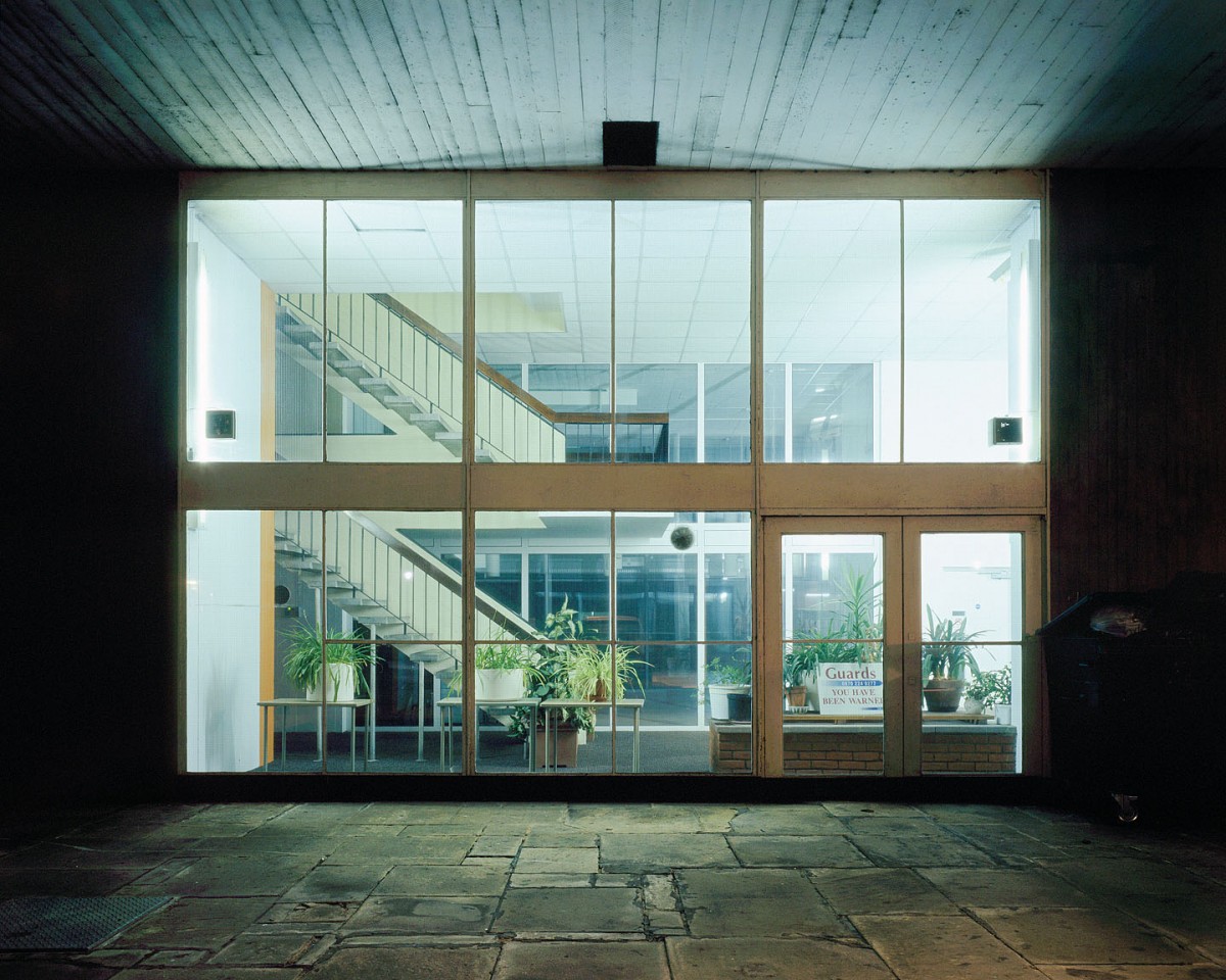
William Eckersley in his project “Dark City” captured the connection people have to the city of London during the day creating a new feeling and story along the way. “The stage is devoid of its human players and seems to showcase the scenery’s forgotten beauty, revealing a stark and otherworldly aesthetic in a city drained of its occupants” (Williameckersley.com, 2017). This shows us that Eckersley is painting a picture of how the passer can view London, by highlighting the things that are typically shadowed when the sun is out. Taking away the sprawling human community that would typically pollute vision, allows for us to see deeper into the visuals that the city provides us. We can see the detail in each slab of stone on the floor, the dirt that contaminates the frames on the windows and highlights all of this with the inorganic lights producing cold blues and warm oranges all creating a different feeling and connection to the city.

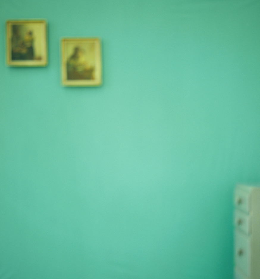
Uta Barth on the other hand detaches us from the safety of seeing what is around us. Instead we are left to interoperate what is there, to really think about what it is why see and not only that think about the feelings that it provokes. “The primary effect of the blur in her photographs is to make a specific image generic” (Tate, 2017). In doing this Barth makes the image more about making the viewer more aware of the conscious activity of looking. Instead of using a camera to take a sharp and crisp image she has used it to create an almost Abstract Expressionist painting.

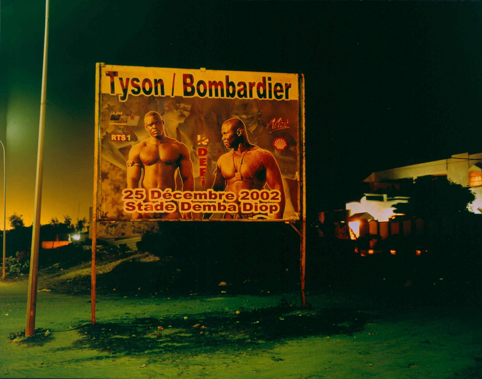
Rut Blees Luxemburg similarly to Eckersley captures during the night, but in her instance focussing on “that which is slightly on the side and on the margins” (Mint Magazine, 2017). In doing this Luxemburg produces a story for a particular thing that the details of which would typically be looked over or ignored. This creates a new connection to the subject that the viewer may not have had before seeing the images she captures.


References


Williameckersley.com. (2017). WILLIAM ECKERSLEY » Projects / Dark City (2011). [online] Available at: http://www.williameckersley.com/projects/dark-city/ [Accessed 21 Dec. 2017].

Eckersley, W. (2011). Dark City. [image] Available at: http://www.williameckersley.com/projects/dark-city/ [Accessed 21 Dec. 2017].

Barth, U. (1997). [image] Available at: http://utabarth.net/work/ground/#image-4 [Accessed 21 Dec. 2017].

Tate. (2017). Uta Barth born 1958 | Tate. [online] Available at: http://www.tate.org.uk/art/artists/uta-barth-2678 [Accessed 21 Dec. 2017].

Mint Magazine. (2017). An Interview With Photographer Rut Blees Luxemburg. [online] Available at: http://www.mintmagazine.co.uk/art/an-interview-with-photographer-rut-blees-luxemburg/ [Accessed 21 Dec. 2017].

Luxemburg, R. (2003). Tyson/Bombardier. [image] Available at: http://www.tate.org.uk/art/artworks/blees-luxemburg-tyson-bombardier-p20267 [Accessed 21 Dec. 2017].

Counter Culture Images

With the prominent counter culture movement in the 1960’s and 1970’s the arts were exposed to an era of works with a whole new meaning and purpose to the medium that brought new spirit and sensibilities along with it.


Artists like William de Kooning and Jackson Pollock introduced the world to abstract expressionism “characterised by gestural brush-strokes or mark-making, and the impression of spontaneity” (Tate, 2017). This flew in the face of previous ideologies in which paintings where designed as illustrations designed to represent ideas. This new wave created work that would have painters expressing themselves by attacking “their canvases with expressive brush strokes” (Tate, 2017) to illustrate the raw physical passion that they are designed to convey with splatters and splodges unique to the style. Looking at Kooning’s “The visit” we can see these sensibilities being applied within the painting with the organic looking brush strokes and scratches of paint strewn across the canvas.


In development of Abstract Expressionism came Colour Field Painting in which artists like Mark Rothko and Barnett Newman led the field. In the work “untitled” we can see Rothko’s dramatic use of block colours used in a similar way of expressionism but with “compositions and thinly layered colours” that where “planned deliberately to induce powerful, even spiritual feelings in viewers” (Hodge, 2012). It is with these colours and tones that produce a new spirit to evoke the human psyche to open up and really question its meaning.


Howard Hodgkin’s “Girl on a Sofa” mixes these ideas abstract expressionism with old fashioned values of modernism. Here we see Hodgkin use the sensibilities that come with the Abstract via his mixture of expressive form of the girl that is on the sofa that makes it hard to make out where exactly it is or how the girl is sat. “this is part of Hodgkin’s objective: to inspire recollections, feelings and sensations rather than solid ideas” (Hodge, 2012).


References


Tate. (2017). Abstract expressionism – Art Term | Tate. [online] Available at: http://www.tate.org.uk/art/art-terms/a/abstract-expressionism [Accessed 20 Dec. 2017].

de Kooning, W. (1966). The Visit. [image] Available at: http://www.tate.org.uk/art/art-terms/a/abstract-expressionism [Accessed 20 Dec. 2017].

Hodge, S. (2012). Why Your Five Year Old Could Not Have Done That. London: Thames & Hudson, p.81.

Rothko, M. (1968). Untitled. [image] Available at: https://www.worldgallery.co.uk/art-print/mark-rothko-untitled-orange-and-yellow-1956-206317 [Accessed 20 Dec. 2017].

Hodge, S. (2012). Why Your Five Year Old Could Not Have Done That. London: Thames & Hudson, p.85.

Hodgkin, H. (1968). Girl on a Sofa. [image] Available at: http://www.tate.org.uk/art/artworks/hodgkin-girl-on-a-sofa-p02300 [Accessed 20 Dec. 2017].

A Look At Three Postmodern Images

The way in which Postmodernism poses interest to me is that of its revealing nature that can only be accessed upon the deconstruction of the work one may be looking at. Robert Smithson’s “Map of Broken Glass” can be seen from one angle to just be a pile of fragmented shards piled neatly in the middle of the room. But if one took the time to gain an aerial perspective of the piece it becomes clear that “As the glass glittered under gallery lights, the work appeared like a magical relief map” (Hodge, 2012). This new perspective allows for the viewer to see this mythical island that is in fact not just a pile of shattered glass but a doorway revealing a magical sight.

Jeff Koons had a different approach to revealing ideas and concepts to the viewers of his work. In his piece “New Hoover Convertibles, Green, Red, Brown, New Shelton Wet/Dry 10 Gallon Displaced Doubledecker” Koons exposes to us the psyche of the consumer. “Referred to broadly as ‘The New’ these works explored the way our fantasies and desires are transferred on to ordinary objects” (Tate, 2017). This showing us a way in which we as consumers work, we can almost see ourselves using the equipment within the Plexiglas cases.


Damien Hirst’s more provocative “Away from the Flock” shows us a more visceral conceptualisation within postmodernism. The Tate describes this work as a combination of “the pure clean lines of classic Minimalist sculpture, with the uncomfortably eviscerated flesh of a portrait by the painter Francis Bacon” (Tate, 2017). This is an immense clash of both modern and postmodern values in which the minimalistic straight white frame is caging this lifeless corpse within.


This idea of Postmodernism “deconstructing authority and the established order by engaging in the ideas of fragmentation, incoherence and the plain ridiculous” (Ambrose and Harris, 2010) truly resonates with me as it is almost a smidgen of what is implemented into my own work. I am passionate about deconstructing media and art as I feel it leads to the reveal of many fantastical and fresh ideas from other artists that can help me develop forward as a practitioner in the field of the arts.


References

Hodge, S. (2012). Why Your Five Year Old Could Not Have Done That: Modern Art Explained. London: Thames & Hudson, p.153.

Smithson, R. (1969). Map of Broken Glass (Atlantis). [image] Available at: http://pictify.saatchigallery.com/137012/robert-smithson-map-of-broken-glass-atlantis [Accessed 20 Dec. 2017].

Tate. (2017). ‘New Hoover Convertibles, Green, Red, Brown, New Shelton Wet/Dry 10 Gallon Displaced Doubledecker’, Jeff Koons, 1981-7 | Tate. [online] Available at: http://www.tate.org.uk/art/artworks/koons-new-hoover-convertibles-green-red-brown-new-shelton-wet-dry-10-gallon-displaced-ar00077 [Accessed 20 Dec. 2017].

Smithson, R. (1969). Map of Broken Glass (Atlantis). [image] Available at: http://pictify.saatchigallery.com/137012/robert-smithson-map-of-broken-glass-atlantis [Accessed 20 Dec. 2017].

Tate. (2017). ‘Away from the Flock’, Damien Hirst, 1994 | Tate. [online] Available at: http://www.tate.org.uk/art/artworks/hirst-away-from-the-flock-ar00499 [Accessed 20 Dec. 2017].

Hirst, D. (1994). Away From The Flock. [image] Available at: http://www.tate.org.uk/art/artworks/hirst-away-from-the-flock-ar00499 [Accessed 20 Dec. 2017].

Ambrose, G. and Harris, P. (2010). The visual dictionary of pre-press & production. Lausanne: AVA Academia, p.197.

Authenticity, Is It Still Possible?

Society is constantly exposed to new things all of the time; through media, art, technology or even music. Things are so new that companies hold them back because they have already created something “better” (N4g.com, 2017). So is it still possible to be authentic, “Of undisputed origin and not a copy; genuine” (Oxford Dictionaries | English, 2017)?

If we look at Modernism, “A rejection of history and conservative values, innovation and experimentation with form with a tendency to abstraction” (Tate, 2017) we can decide what an authentic piece of work is. Apply these values to mobile devices with the edges merged with the screens or films that have shared universes. Ten years ago these things where something un-heard, because they weren’t old or traditional ideas. Just these two ideas can show us that we in fact do live in a world where, actually authenticity is possible.

“Inspiration is for amateurs — the rest of us just show up and get to work. And the belief that things will grow out of the activity itself and that you will — through work — bump into other possibilities and kick open other doors that you would never have dreamt of if you were just sitting around looking for a great “art idea”.” (Fig, 2009) This quote emphasizes this concept of just creating an idea with no inspiration of past ideas and purely developed from what is in your head only, what you then create is solely your own.

That creation, by definition, is Authentic.


References,


N4g.com. (2017). New Sony laser technology 20 times better than Blu-Ray. [online] Available at: http://n4g.com/news/568528/new-sony-laser-technology-20-times-better-than-blu-ray [Accessed 19 Dec. 2017].

Oxford Dictionaries | English. (2017). authentic | Definition of authentic in English by Oxford Dictionaries. [online] Available at: https://en.oxforddictionaries.com/definition/authentic [Accessed 19 Dec. 2017].

Tate. (2017). Modernism – Art Term | Tate. [online] Available at: http://www.tate.org.uk/art/art-terms/m/modernism [Accessed 19 Dec. 2017].

Fig, J. (2009). Inside the painter’s studio. New York: Papress, p.42.

Research and Communication Overview

Throughout the duration of the Research and Communication module exposed me to many different ideas, theories and historical movements that have moulded the way that art is today. The segment I took the most from was within week two during a lecture with Dr Callum Kerr. This is because of the many ways that he presented ideas about critical thinking and critical theories, and how exactly they can be applied to our research and practice as artists or writers. Attending the lecture made me realise this is something I have always attempted similar practice within my work personally. This had begun within my studies in Media as that had exposed me to ideas such as Feminism, Marxism, and Gender Theory. These Theories became the foundations for the concepts of my art projects, be it a political opinion I want to poke fun at or create a humanisation of shunned away masculinity. Dr Kerr’s talk opened up for me the idea that when doing research for my projects I should maybe apply the theories more directly to my work.

 One of the ways I have attempted to connect critical theory to my practice would be when a project was completed designed around a list of words. With these words I wanted to capture the least literal explanation for why these words had anything to do with the photographs that where captioned with them. For this project I had tried to apply the Thing Theory, my photos where more about investigating the objects caught in the shot to decipher the connection to the word. I wanted to get the viewer to interoperate a narrative for themselves within the photographs. Infused with inspiration of works from Uta Bath and Rut Blees Luxemburg, I created work that brought more attention to the minor details on the photo that may explain the narrative I am trying to communicate. For example one of the photographs “Kiss” I did not want to take a picture of a literal kiss but capture a romantic location in which both I and my partner shared. The photo was the view of the city of Southampton from the top floor of her accommodation complex through a small narrow corridor with a window leading out to a dark but beautifully lit landscape of the dockland city.

 With all of this I do believe that the Research and communication module has helped me see a new realm of different concepts and theories to add to my practice that can only help strengthen my work into something more conceptual and relevant to current society. I believe that each of these lectures helps in many ways such as the Terminal bar lecture. Upon researching into how this film was made I discovered how we as practitioners of art should be more open and vigilant on keeping our eyes and ears open so we do not lose any strand of inspiration that could provoke a completely new project all together.


summary


In this module I have developed my research skills, extended my understanding of art history and pushed myself to analyse further details in my work.

Through out my research I have discovered how valuable researching art movements and not just individual artists is. This has allowed me to discover new artists with ease, reading about artists and then about artists involved in similar work at that time. Researching art movements has also allowed me to discover artists across a variety of mediums that all work to the same ideals and themes. This means that I have been broadening my field of research across different time periods, medium and values, giving me a wider variety of references to call upon in my practical work.

In my opinion, the authenticity task was one of favourite, because I found it highly interesting researching a variety of opinions towards the matter of artwork being truly authentic. This has allowed me to think about my own work and what and where I draw inspiration from, as well as looking at other practitioners work and how they have found their inspiration. Tasks where we had to analyse three images and relate them back to our own work I also found highly interesting as I thought it helped me make more connections between my work and other artists’, as well as improving my knowledge of other artists and how I evaluate their work. I also thoroughly enjoyed researching into how technology has impacted art, I liked forming an opinion towards the matter and voicing it in way that included research to help back up points made.

However, the Publish or perish! Task was one my least favourite. I have missed the lecture on that day due to my appointment. I have vised the blackboard to catch-up with work and to complete my task but I did not understand as much. I felt this was due to fewer detail about the artist in the PowerPoint. In this module I have developed my research skills, extended my understanding of art history and pushed myself to analyse further details in my work.

In conclusion, I have enjoyed the last ten weeks of research and coummunications, it has allowed me expended my knowledge and opened my mind to different artistic movements, I realized that artist work has a great impact on the society and in our day to day life. This blog has inspirited me to do further research on artiste work and always use referencing to show my researching skills, this has improved my analysing skills,

FINAL

After the attending ten weeks of research and communication skills lecture and writing responds to each lesson, I found that my research skill and reference skill have approved a lot. I became able to think more deeply and objective while comparing and narrating.

Starting from the first task, we were shown a show film—Terminal Bar, and we need to analyse it after watching. This was the first time for me to watch this kind of documentary film, unlike some perfectly made documentary video, this one is made in a more simple way. However, I think this style fits with the image of Terminal Bar and I found out sometimes imperfect can make something perfect.

In Task 2, we were told to compare two select work by ourself. Since I always like to search for interesting graphic art on the internet like Instagram and Pinterest, so I choosed two art work from this two social media and try to compare them. Even I love to look at those beautiful art work, I do not really think deep when I look at them, through this analyse process, I paid more attention on the values and the way how the artist produce the work and I think the way how I look at an art work is changing.

In Task 3 and 4, we were asked two theoretical question, the first one is asking about the influence of internet on art and the second one is about the possibility of being truly authentic. This two issue has always been an unsolved problem in the art world, everyone has their own points of view and while I am doing the research, I can see there is always different voice from different groups of people so I think having an ability of respect others’ idea.

In Task 5 to 7, we watched a Netflix documentary video on each lesson and I really love those videos and got so many inspiration from each of them. The artist in each series having a strong personality and showing their confidence through their work and I think this is what made them became successful and special. Moreover, the way that Netflix made the videos also impressed me a lot, they group the information with a lot of visual effect and made the videos very compact.

Overall, I have tried and learnt a lot of new things from this first semester RCS lecture. I can really push myself to look and analyse things more deeply and also learnt different issue and style in the art world, so I found I really did improved in my research and communication skills.

Task 8

This is the end of Research and Communication Skills module. After doing every task during 9 weeks, I have learned a lot in some aspects.


Start from making appreciation of the short film the Terminal Bar I learned about the importance of combination between background music and handover from a frame to another another frames. The photos in this film are changing-over, appear and go following the beat of background music. What impressed me most was that at the last part of the film, the photos appear in a form which is like a phantoscop. It is really interesting.


I learned about what I can use for reference through the comparison of two artworks from task 2. Because work to find the similarity and connection between two artworks can inspire me to get a new point. Furthermore, the designers working method is like a guide which I can follow by.


The research of counter culture from the 1960s to the 1970s bring a great impact to me, because I have never known about this period of history before. The The scope of knowledge is expanded. I realized that artworks are link with everything in our lives. It can relevant to politics or other problem in society and influent the development of society. The posters about counter culture used the bright, vivid color with exaggerate collocation. That remind me how powerful the color composition is and push me to deep think it again.


What is more, I am quite interested in a part of postmodernism which is the visual culture of hip pop. One of the typical method for creat this style of artworks is collage. It remixed many kind of elements in an image. I have created an artwork about hip pop before, now I have more developing idea after research.


The most enjoyable task is task 7 Publish and Perish. Because compare with dry facts of history, this task allowed me to do some research that I want to do. During looking at a lot of interesting works, it helps me found my favorite discipline which is graphic design. These beautiful design bring me visual enjoyment. Gunter Ranbow also impressed me in the way he works. He finds inspiration of artworks in life and takes some common themes in his life as creative elements, plus artistic treatment, so that he has some other symbolic meanings. I would like to catch the useful points if the special personal style of work for those designer which I have researched.


The most important factor in working is critical thinking. It pushed me to constant reflection and exploration through a series of researching and the ability of critical thinking is improved gradually. It is positive. I realized that a graphic designer is that kind of occupation workers, they will be some social things condensed into a visual symbol by morphological changes, marking and code, which has become a kind of political, economic, religious and cultural movement value of things, and in order to show any subject.

Publish or Perish!

Printed Pages A/W 2015 cover. Original image: Yahnker, E. (2012). Kanye Stack. [coloured pencil on paper].

If this image did not exist physically in the world as it does on the cover of the Autumn/Winter 2015 issue of Printed Pages AKA The It’s Nice That Magazine I would not have chosen it. I like to collect published images in the form of books, albums and magazines as I feel a personal connection with works of design that I myself can own and hold, a sentiment I share with the people behind this magazine: “By name and by nature, Printed Pages has always been a celebration of print”. Outside of being a published image it has a story to tell, one of fame and distortion of perception.


Rozycki, P. and Keates, M. (1993). Charles Bukowski – Women (cover artwork). Virgin Books.

Similarly if I didn’t physically own a copy of the 1993 Virgin Books edition of Charles Bukowski’s 1978 novel, Women, I would not be able to talk about it now. It was a struggle to find an image of it online and the only one I could find is slightly blurred with a level of glare showing up on the glossy cover. It’s a great shame because it’s one of my favourite book covers of all time, that’s why I immediately thought to include it. The bizarre combination of imagery ranging from a scanned photocopy image of a tender embrace between a man and woman rendered through blunt realism and the wild but painterly type helps to evoke some of the feeling that the story is bursting with.


Favre, M. (2017). The New Yorker November 20, 2017 Issue (cover artwork/online animated version).

Seeking out another cover I found something very indicative of the fastly advancing world of publishing supported by technology. Similarly modern was the a New Yorker cover by Christoph Niemann which was featured on the Netflix documentary series: ‘Abstract’ and supplemented by augmented reality technology. The message behind this image that is also supported by the cover story in of the issue has to do with discrimination in the code business and the importance of educating children in an increasingly demanded skill.


It’s Nice That. (2015). Printed Pages AW 2015. [online] Available at: https://www.itsnicethat.com/publications/printed-pages-aw-2015 [Accessed 7 Dec. 2017].

Abstract: The Art of Design, S01E01 – Christoph Niemann: Illustration. (2017). Directed by M. Neville. New York City: Netflix.

The New Yorker Videos. (2017). Christoph Niemann’s Augmented-Reality Covers. [online] Available at: http://video.newyorker.com/watch/introducing-christoph-niemann-augmented-reality-covers.


What I have learnt

In these ten weeks on Research and communication lecture, I have learnt, researched and explored a lot, my idea towards art has totally changed and improved. I was able to identify how I could improve my work by getting an opportunity to explore different kinds of work by various designers. I have obtained a lot pf inspiration by looking at other successful designer’s work. My favourite tasks included the tasks where we had to write about Counter Culture, Publish or Perish and Technology is the mortal enemy of Graphic Design. Through these tasks I was able to find a deeper sense of the types of design techniques I like working with, which are- Typography, Photo manipulation, minimalistic posters etc. I am very sure that now when I will start working on new projects my thinking and creativity would totally be improved. The presentations and videos shown to us in the class have been proved to be very useful for my area of interest. Before this class, my area of interest was only limited to Graphic Design, but by getting to know about other types of art I feel my knowledge and interests towards other disciplines has increased effectively. The relation between the Research and Communication Skills lecture and the studio based lectures is very strong, because by attending the Research and Communication lectures I was able to give a higher and more creative input in my studio skills. The documentary of Paula Scher shows to us in the class was my favourite one, and after that day, I have and referred that documentary to many of my other friends in Canada who are also Graphic Designers. It was very inspiring to watch the documentary and it gave me a new perspective and a benchmark for what I aim to become in future. I have also improved in the area of writing through this module. Now I am confident in exploring other disciplines as well, as I have gained a lot of knowledge about all the four pathways of Graphic Arts. I have totally realized how influential a design, a photograph or a text can be. Through the use of good design we can influence a large number of audience.

This module has proved to be very beneficial for me, I am very inspired by each lecture providing the opportunity to explore different fields which earlier I was not familiar with. I had no interest in Illustration, but after this module, I have gained a lot of knowledge about this pathway which has made Illustration one of my pathway choice. I am sure that after getting the opportunity to enhance my knowledge in all the four pathways I have become a better designer and my approach towards designing and way of thinking/creating has totally improved.