Category Archives: Fine Art

This Category should be selected if you are a Fine Art student.

Task 5:

From the open studio exhibition I went to I really liked a piece that was hand painted by the artist My Dog Sighs, as it is a 2D piece but the way it is painted makes it look more 3D and very realistic.
Seeing it in the flesh really showed me how vibrant the colours are which you don’t appreciate from viewing the images online. From viewing online I always thought that the colours could be extenuated, but when I did see it I realised that the colours really are that bright and vivid and not edited online. I also found that looking at it in the flesh really made me appreciate the small intricate details that are the main focus of the work, the eye. I could get close and look at the use on tone and shadows and reflections painted on to make it look as realistic as possible. I also could appreciate the amount of techniques of painting within it and how the artist managed to make them all work so well together to create on great piece of work. In comparison to viewing the image online wouldn’t give it justice after being able to look at it that closely in the flesh.

Image source:  

Task 6: A new mode of practice

At the beginning of my art exploration during GCSE’s I worked in a very precise and tight manner creating tonal and biro drawings as they were the only two mediums that I felt worked successfully as the tones allowed me to create a 3D realistic still life drawings. I looked into traditional artists including Tamara de Lempicka who creating paintings of women in an Art Deco style to express her ideas on “liberated female sexuality”.

Then when I moved onto my A levels and foundation course, I began to target my work towards the abstract movement and artists such as Jackson Pollock and Mark Rothko as I was fascinated by their use of “gestural brush-strokes or mark-making, and the impression of spontaneity”. I was excited by the idea of being expressive through the use of various tools and creating textures and surfaces due to different paint thickness.


However, I am currently intrigued in evolving Fred Hatts’ figurative drawings and his art style of movement and rhythm through his use of crayons on various surfaces including canvas, cartridge paper and black paper. The style I now work in is very fast and expressive, as I believe this spontaneous way of working allows me to express myself fully through my art work, compared to when I tried to control what I was drawing, it looked too manipulated and planned out. I want to continue creating abstract expressionist paintings and evolve it further by painting it onto various surfaces including walls and metal to steer away from the traditional method of painting.

http://www.theartstory.org/artist-de-lempicka-tamara.htm

Fred Hatt, drawing with energy

http://www.tate.org.uk/art/art-terms/a/abstract-expressionism

Task 4:

I recently went to an exhibition that was held by a local artist in his studio called My Dog Sighs. I really liked this exhibition, it was very interesting as it had a lot of different pieces made by the artist in different medium’s and style’s ranging from paintings to 3D pieces. This kept the audience busy walking around looking at all the large pieces that were obvious to the eye and all the smaller pieces placed around the room so there was always something new and different to look at. There was a lot to look at and although he has different styles you could tell it was all made by the same person as it had his personality in the pieces. The exhibition was based in his studio so it also gave me and all the other viewers a look into how he works and creates his pieces. I think is a really good and different way to display work and gives an insight into the process behind the pieces. In a gallery with plain white walls it doesn’t tell a story of how the art was made. Also as he is a local artist and he does large scale paintings on public buildings and bill boards around the local area. After visiting his studio I travelled around the town looking at some of the larger paintings he had done on buildings so this was also a very engaging exhibition. Overall I would definitely go back to this exhibition and any others like it that are based in peoples studio’s as this really gives you more of an insight into the artist and how they like to work.

Task 3:

Renée Cox
Hot-en-tot Venus, 1994
[photograph]

In this photograph I see the artist Renée Cox standing naked in what another artist has created to show her representation of her body.
I believe this image is about self confidence in your body and being proud of how you look. I also think that in this photograph RenĂ©e Cox is looking into the camera lens and considering the views of her audience. In her face it seems to me that she is ready to be judged, as if she knows some people won’t like this art and won’t have a positive response towards it. But she did have the confidence to publish this art and I think that is a great thing, because sometimes you need to not think about what negative comments you can get but what positive comments and support you could receive. I think this piece is really good at portraying the message of self importance, confidence, and belief and not being influenced with other peoples negative comments.
This photograph is supposed to impact the audience by showing how Cox can refine her own identity as a black female artist and other artists like her. This piece in particular shows how Cox has love for her own body, and she portrays her body however she wants to and this then liberates her.
Source: https://artintheblackdiaspora.wordpress.com/2014/05/01/renee-cox-hot-en-tot/

Task 2:

Buchloh, B. H. D
(Date of publication)
Gerhard Richter : paintings from 2003-2005.
[Name of Publisher]

This book talks about Gerhard Richter’s paintings he created
from 2003 to 2005. It starts off talking about how Richter began his career and how he developed into exploring different techniques and colour schemes within his work. It also explores why there are no words used in his work’s and how this was influenced by WWII. After the war the use of symbols became more common so this influenced Richter’s work as a German artist.
Being a German artist he was hugely influenced by the war. His influences came from other artists before him, such as Jackson Pollock the process painter, because of his use of colour and paints. Richter began his abstract paintings in 1961 which meant he had to challenge its reputation and credibility at the time.
When asked about being a “postwar German artist”, “your experience as a German after the Second World War and after the Holocaust has inevitably concerned you in your work has shaped you deeply?” by Benjamin H.D. Buchloh, Gerhard Richter replied “Certainly, yes the past has been absolutely formative for me.” This shows that he take’s on thing’s that have happened in the past and this effects his work.

Task 1:


I developed this spin painting from a collection of smaller spins made on paper I had been experimenting with. This piece was created on a sheet of wood which I had painted white. I made the spin machine using a router machine with a base piece of wood on the top. In total I used three different coloured acrylic paints, I believe these work well together and draw the eyes attention into the centre of the piece. I layered up the paints to give the piece depth and to make it more intricate.
It took me a long time to develop this technique, as before this I experimented with a lot of different tools to apply the paint, such as needles, syringe’s, paintbrushes and pipettes. To create this piece I used a needle to drop the paint in small droplets from a height. The speed and movement of the spin forces the paint to travel outwards creating the small splatters of paint. I would develop this technique further by experimenting with spin on fabric and incorporate hand or machine stitching into the designs created. I could also explore hanging pieces from the ceiling using fabric, embroidery threads and ribbons to see if it gave the technique of spin painting a different impression on an audience.

Task 5: Single exhibit

Exhibition: ‘More dimensions that you know’ by Jack Whitten (1979-1989)

The single exhibit that I am focusing on is “Ode to Andy: For Andy Warhol”.

When I first came across Jack Whitten’s work in the flesh I was especially intrigued by his acrylic on canvas, mixed media painting which was designed for Andy Warhol. I was absorbed by the bright bold colours emerging through the dark rough surfaces and textures, that are incorporated with various lines and shapes.

The sheer size of the work is one of the first aspects that captivated me, as the large-scale piece controlled most of the white wall space, meaning when you stand back from a distance you can focus on Whitten’s conceived idea of his painting as ‘skin’ and observe the surfaces and textures that he has created through the use of brushes and scalpels, associating these marks with keloids (scarring after skin is cut).

When I studied this design, I was aware that he was trying to recreate an urban landscape, which captivated me because I loved his techniques of using moulds of man-made everyday objects including man-hole covers and car tires to destroy his recreation of a wall. “The matrix of lines and shapes incorporate, and figuratively recover, lived experiences and histories of the urban environment”.

Also, this piece caught my eye because in comparison to the rest of exhibition Whitten’s work is very symmetrical and he uses monochrome colours as he uses his work to design ‘a nuanced language of painting that hovers between mechanical automation and spiritual expression’, therefore the use of bold colours stood out as a powerful piece of work.

Task 7: Comparing two Texts

In the first text by Leo Steinberg, he spoke about how art should be seen in a horizontal way, inspired by the flatbed printing press. He focuses on Rauschenberg and Dubuffet’s work and how they distanced themselves from the old masters way of presenting work from being directly in front of us (the viewer), to presenting work on a flat surface. Steinberg discusses how, in the 1950’s, there was a shift of the way art was seen and created. During this time there was a change in the ideals and views of artwork.

Richard Serra’s lecture included how he is connected with the material as well as the process of creating the piece.  He also talks about how the site and the sculpture have to be a part of each other. They have to work with each other as this changes how people see the artwork. The traditional ways of creating sculptures have been replaced with new technologies and industries. The traditional idea of the artist studio has been replaced, over time, with industrial sites.

The two texts are linked by the way that people view art and create art. How artists are stepping away from the tradition of the old masters and into the new modern way.


Bibliography

Harrison, C. Wood, P (2002) Art In History. 2nd ed. Malden, Massachusetts: Wiley-Blackwell

Steinberg, L. From other Criteria. Pg. 948

Serra, R. From the Yale Lecture. Pg. 1124

Task Five – Maurizio Anzeri

Maurizio Anzeri

In October I visited the Saatchi Gallery to see Maurizio Anzeri’s exhibition. Anzeri creates portraits by taking old vintage photographs and sewing directly onto them creating colourful patterns around the black and white or sepia toned photographs. I feel these patterns suggest almost a psychological aura, and are revealing the persons emotions and deeper thoughts.

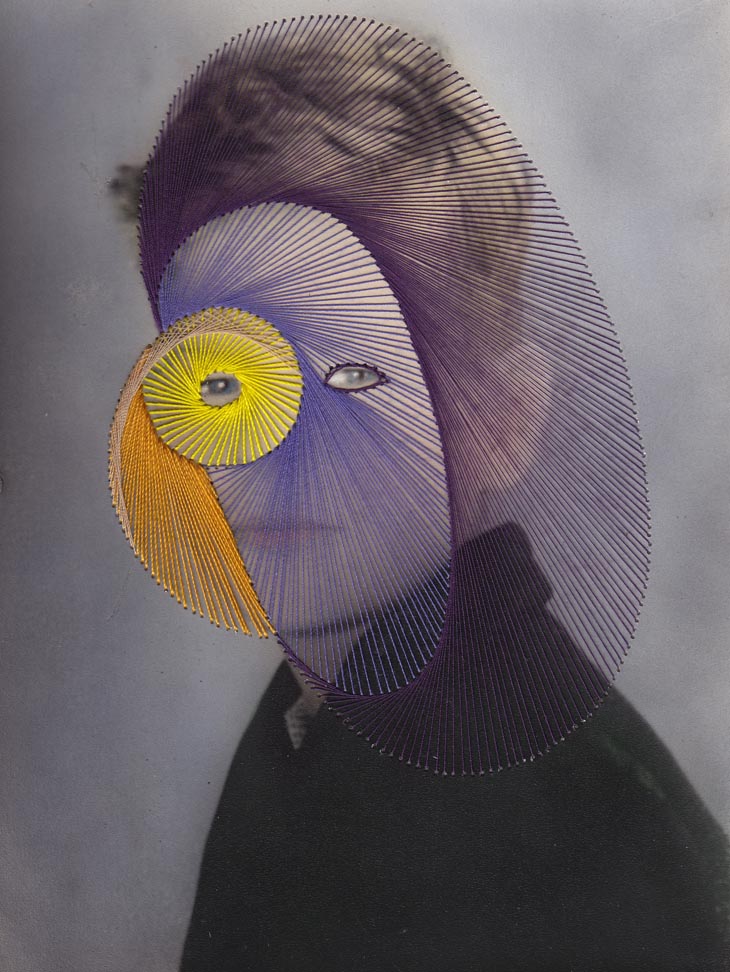
My favourite piece of the exhibition was ‘Giovanni’ (2009) as I feel this piece especially showed this suggestion of revealing his deeper thoughts. The bright yellow spiral starts from his eye and gets darker, to orange, then darkens further to shades

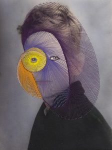
Anzeri, M. Giovanni (2009) Photographic print with embroidery. (51x41cm)

of blue and purple as it spirals out and spreads around his face and head as if what he is seeing is affecting him emotionally, creating dark or sad thoughts in his head.

Anzeri’s use of vintage antique photographs and the sharp, bold lines and the shimmer of the thread creates a powerful contrast. I feel seeing this photograph in the ‘flesh’ the contrast is so much more effective as there are so many elements to the pictures that you can only really experience when viewing the pieces first hand. When  I went to the exhibition I was drawn to go right up close to the photographs in order to see the intricacy and detail which goes into each individual stitch. This, for me, created a new feeling of intimacy between me and the work, that I hadn’t experienced before when just seeing photographs of the pieces, this was due to how close I was to the work and how much attention I therefore paid to it.

In ‘Ways of Seeing’ by John Berger he explains that art has lost its essence through reproduction, that artworks lose elements such as their materiality. Reproduction (photographs) just create a flat, digital image of the artwork, you can no longer or it’s much harder to see and experience the artists brushstrokes, the textures and the shadows of the material in the original pieces.  I feel this is true, especially in Anzeri’s work. In real life you are able to see the different gradients, shadows and textures the thread creates. You are able to go up close to the pieces to see the intricacy and detail that goes into each individual line and stitch. You can experience and realise the delicacy of each work through seeing every tiny hole that the thread goes through and the complexity of the process of piercing and threading through each and every one. In real life you want to  touch and run your fingers along the thread, you want to involve yourself with the art. Therefore I do feel John Berger is right, experiencing the materiality first hand  is so much more effective as it makes the art so much more inviting to the viewer.

Megan Fragopulu – Fine Art // Task 10

Textured, interactive, aesthetically pleasing combination of photographs, sculpture and paintings.

Recently I have noticed that for a lot of projects and in my self directed study I have reached for my camera rather than a paintbrush or a pen. I really enjoy the fact of capturing an ephemeral moment and making that moment last a little longer than it usually would. With my work I prefer to capture and/or create aesthetically pleasing outcomes so that the viewer wants to look at my work. With my finished product I always make sure that there is something pulling me in to look at my work because then I hope it will do the same for others. I have also recently started combining photography with sculpture so that the viewer can connect and interact with my work in multiple ways. Sometimes I like to have a hidden meaning behind my final projects as well, however I don’t think it is a necessary thing to always have a meaning behind it. Or sometimes I create something and then see a meaning behind it or the other way around where I create something and then I can analyse the final outcome and see that there are hidden elements of what I was thinking about or focusing on at the time in the final product.