Category Archives: Fine Art

This Category should be selected if you are a Fine Art student.

Beth Ashford – Task 2

The Descent of Man – Greyson Perry

‘The descent of man’ by Grayson Perry is an overlook at the idea of masculinity and how it effects the way that our society is run. From the start Perry discusses the idea of holding back emotions and channelling them through anger and the brutish nature that a stereotypical man would show off; this one way discussion throughout the entire book gives and insight into the particular views of the author yet are somehow made to appear as though they are fact, due to the fact that the book itself has been written from the perspective of a male.

In relation to the idea of clothing Grayson Perry discusses how the use of suits and ties symbolise power and wealth; “With their colourful textile phalluses hanging round their necks” this quotation gives an air of resentment about it, as Perry seems to be disgruntled with the idea of how such a small community of people can dominate the rest and carry most of the highest paid jobs even though they only represent a small proportion of the population, along with how the majority are white men not allowing for minorities to have the same roles. The tone of this carries on throughout the book covering various different topics such as emotions, stereotypes and mens rights giving a negative but constructive idea of the society we live in today.

Beth Ashford – Task 1

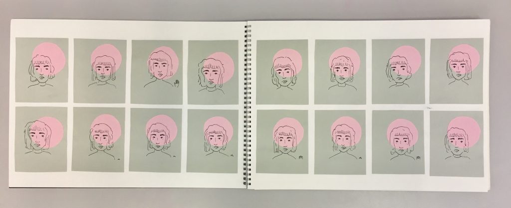
The initial brief for this piece was to create a passport, a document that could give an idea of your character/personality within an inanimate object; I initially wanted to create a flick book, due to the way that they are made this would enable me to create a small animation instead of just trying to use pictures to sum myself up. This idea was a good plan until I realised how much of a perfectionist I had become, creating hundreds of small images to build one scene would not be viable in the time limit given. Working from this information I began to build a large quantity of small individual drawings of myself; these illustrations had many different looks as the task for me was to produce as many as possible instead of trying to get a perfect likeness.
To create a more aesthetically pleasing composition (something that is important within my art style) I began to include small pink circles behind all of my illustrations as the idea of creating a perfect circle by simply cutting it out is not easily done looking further into my perfectionist art qualities.
I built my colour scheme around the idea of minimalism with only three colours used, I liked the tonal qualities that each gave to to final outcome especially the pop of pink that made the images stand out against the simplistic illustrations, without this base of colour the images wouldn’t have stood out as much and looked a lot less refined.
If I were to take this piece further then I would just look into producing a larger selection of portraits as I think the whole outcome would look best if it were on a larger scale potentially filling several walls in order to produce a 360 degree panoramic outcome.

Task 1: Module introduction and developing ideas.

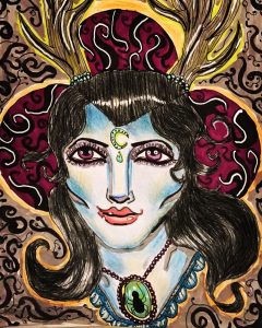
Stag lady – Georgia Weaver

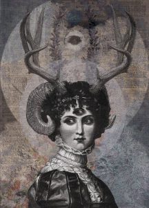
DAN HILLIER -LUNA


The above piece of artwork is something that I began while researching for the contemporary art project.

As part of my research, I began looking at different contemporary artists and identifying themes that they each have that I find interesting. For instance, Dan Hillier’s artwork really appeals to me as it combines mythological ideas along with Victorian imagery. Expanding on this idea, I decided to draw a woman with antlers coming out of her head to show the idea of a half human/half animal.

I gave her skin an unrealistic blue tone to it, and I also gave her purple eyes. The reason I did this was because I wanted her to look like a human but have characteristics that were impossible for a human to have, thus making it seem almost mythological.

The colours that I chose in this drawing are based on colours that I feel celebrate femininity and are present in the majority of my artworks. These colours are: purples, pinks, light blues and greens. I feel that these colours alongside her antlers and glowing complexion gives the woman a mysterious powerful presence. The jewels that she has give the audience an idea of wealth or superiority. I put a spider in the necklace to elude to a darkness or creepiness.

In terms of mediums, I decided to create this drawing with pencils and pens to try and make them contemporary. Artists such as Grayson Perry use marker pens in their work to make their artwork colourful and child like, so I decided to do the same to portray the woman as a mythological and mysterious creature.

In order to develop this piece further, I would like to experiment with different colours, maybe through print making or through digital collage in Photoshop.

Task 9: Philosophy and theory and politics

The artwork of Paul Fryer focuses heavily on aspects of death, religion and the morbid, all themes that are focused on within the symbolist theory.

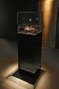
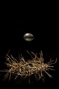
Although a lot of Fryer’s work could apply to the symbolist theory, it is ‘Ecce Homo’ (2006). This is a sculptural installation that features a crown of thorns, with a golden egg seemingly floating above it. One of the main points of symbolism, as expressed by the 5 main points of Albert Aurier, is that the artwork must be ideative, meaning that it has to express an idea. In this case, the artwork expresses an idea of the impossible, by heaving the golden egg floating. It all appears to be in the photography making the audience wonder how it is possible. However, in another photograph you can see reflections in the glass, thus shattering the illusion for the audience.

Other theorists believed that artists had the ability to offer salvation through their artwork, particularly a group called the Nabis. By Fryer focusing on creating sculptures that appear to show impossible miracles and religious iconography, Ryder might be leading his audience to salvation.

Theorists seem to mostly agree that symbolism should keep the audience in mystery; by using photography to his advantage, Fryer is able to make it look as though the egg is actually floating, as well as keeping the crown of thorns also looking relatively simple. This stops the shattering of illusion for the audience. However, in some of Fryer’s photographs you are able to see the reflection in the glass of the egg and crown. This could possibly be an indication about how religious acts seem genuine, but when they are closely inspected the illusion disappears.

Ecce Homo 2006 – Paul Fryer

Ecce Homo 2006 – Paul Fryer

Task 5: Ways of seeing. Write about an exhibition you’ve seen ‘in the flesh.’

‘Door 2’ by Fred Hampton which was exhibited at the Soul of a Nation exhibition really struck a chord with me and is something that will stay with me forever.


the contrasting red and green door, riddled with bullets almost drew me to tears. Without saying anything it said everything. The colours were so bold to this day and draw the audience in, and the bullet holes really brought to life the reality of life for African Americans and the fear that they must have felt at the time.


At the top of the door ‘US approved’ had been written in paint with 3 stars. The colours used were red, white and blue which mimicked the US flag. This was almost a sarcastic comment from the artist, saying that America is not only accepting the death of innocent African Americans but that they also won’t change or do anything about it. Innocent people are being murdered by gangs and police and because of the colour of their skin nothing is done about it.


The thing that really made me emotional is that the door still has the same meaning today and nothing has changed. To this day innocent African Americans are being murdered by gangs and the police, yet the government isn’t doing anything. The fact that this is still happening is awful. ‘Door 2’ by Fred Hampton should’ve memorialised a time in history that was so barbaric we couldn’t imagine it happening today, but instead it stands as a reminder that this is still happening every day and nothing has changed at all really.

Kerry Mercer – Research and communication skills / Task 11

Upon reflection within my blog, I can see how my art took a dramatic turn from more traditional ways to creating work, to more of a new media approach. This was evident from Task 2 where my work was considering Anselm Kiefer and the type of painting/sculptures he creates, compared to Task 8 where I distorted an image through editing software. This distortion is a key theme to my art now which allows me to see how the impact of the blog was more influential than I first thought.

Benefits from doing the blog was that it allowed me to focus on other aspects to art other than my own. Task 3 (analysing NikkI S Lee’s Part 14 photograph) and Task 5 (reflecting upon Bathers at La Grenouillùre seen in the National Gallery) allowed me to think more in depth into other’s artwork and to focus on what I can take from those. In doing this, it inspired me within my own artwork, which also encouraged me to look more closely into other artists to get the same result.

At times the blog also proved challenging, this was most evident in Task 6 when being asked to create a mode of practice. Creating an original technique proved a struggle seeing as there are already so many ways out there. This I adapted and overcame by focusing more on pre-existing processes, pilling them together and placing emphasis on what people can take from the result. This did not come naturally too me, however forced me to focus on an innate original idea that would go on to strongly inspire me in my work to come.

The blog allowed me to focus on elements, concepts and theories to art that I otherwise would not have focused on. Most of these being fundamental to my work and more importantly to the art world around me, thus informing me in more ways I’d like to admit.

Kerry Mercer – Research and communication skills / Task 10

10 chosen words:

Technology, Evolve, Atmosphere, Effects, Distortions, Perspective, Progression, Questions, Exploring, Variety

Although my practice originally started with no connections to technology at all, nor did I aim to explore into it, I find myself centring my work fully around it now. I found this evolved through the Contemporary Project. I begun looking at Monet’s impressionism and seeing how he slightly altered the way we see a scene, which inspired me to do the same using a variety of methods to do so.

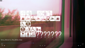
Here I began focusing on creating an atmosphere to my work through using certain types of effects and distortions. I emphasised this in the Film Project where I took ordinary videos I’d captured over time, of both people and places, and edited them using adobe premiere pro (a 21st century piece of technology). This gave a whole new perspective too the videos and completely altered from what they originally showed.

Throughout I found myself asking, although I can make these effects completely change the image which has progressed from years of technology evolving – does this make my artwork any better, than simply viewing it via how it was originally captured? This can also be said in relation to Monet’s work, where you could question whether impressionism really brought something to the world of art, or simply took away what was really there. This kind of question is the main theme around my art, and one I wish to continue exploring.

Captured image from the Film Project titled – Is This Better Now

Kerry Mercer – Research and communication skills / Task 9

Technology and art have always had an intertwining relationship, that has revolutionised one another. So much so that in the 21st century there are endless ways to produce art through technology, this is often categorised under the title of ‘New Media’. This has evolved from simple spouts of mechanical technology used to create art, such as the printing press, which dates back as far as 1440 (1).  To electronical technology or ‘digital electronics’ which made its first appearance from the 1970’s (2). The sweeping change from mechanical to electronical came under the ‘Digital Revolution’ which brought sweeping changes to how an artist created their art during the latter 20th century.

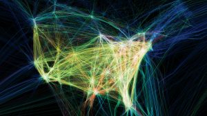
This in-turn has lead up to the creation of Aaron Koblin’s work of Flight Patterns. This is a video that “visualization of airplane traffic over North America during a 24-hour period” (3). Each colour represents a different type of aeroplane that travelled in and across north America on this day in August 2010. This highlights how almost every single bit to his piece of work has originated from some type of digital data. From obtaining the flight patterns, to creating the actual video, Koblin has relied solely on technology to reflect upon how interlinked we are with it and how our lifestyles also reflect this.

I’m inspired from this piece as it show the capabilities of what ‘New Media’ art can involve. It also highlights how using technology is a completely new art form, as “technology in art allows us to stimulate our senses” (4) in ways that might not have been possible one upon a time.

Aaron Koblin – Flight Patterns (2010)


Bibliography


(1)    https://en.wikipedia.org/wiki/Johannes_Gutenberg – reference to printing press

(2)    https://www.barbican.org.uk/hire/exhibition-hire-bie/digital-revolution

(3)    https://www.seditionart.com/aaron_koblin/flight_patterns

(4)    https://makezine.com/2013/11/15/art-technology-new-art-forms-not-just-new-art/

https://www.smithsonianmag.com/arts-culture/7-ways-technology-is-changing-how-art-is-made-180952472/


Task 6

The mode of practice I attempted to develop was one of Salvador Dali’s in which he would put a tin plate on the floor and then sit in a chair beside it holding a spoon over the plate. He would then completely relax his body to the point where he would begin to fall asleep. The moment that he began to sleep the spoon would slip from his fingers and clang on the plate waking him to capture the surreal images. I would like to try this technique because surrealism is one of my favourite art movements and I like to incorporate my subconscious into my own work and ideas.

In doing this myself, I was looking at how I could adapt it in my own way which I found difficult as I struggled to doze off or relax in a chair and I’d drop the spoon without seeing imagery on the few times I did manage to drift off after hours of trying to relax in an uncomfortable chair.

However, I did manage to briefly almost completely sleep on several 4-hour long bus journeys which were impossible to stay asleep on. I wrote some ideas down after being between sleeping and waking, rather than being magnificent drawings of surreal imagery, I wrote down ideas I had and very roughly sketched out what I had thought of whilst in that state. I thought of sculptural ideas, some inspired by works of Dali and Duchamp as that was the book I was reading on the buses and that was the imagery I was seeing.

Task 10

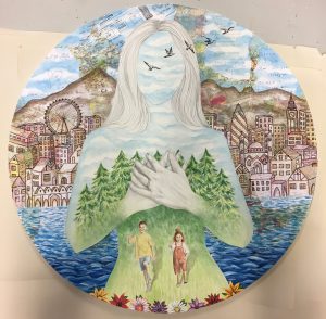
“Our environment and our memories make us who we are.”

My art at the moment is about identity and how one’s memories make up their identity. I want to express that all of life’s experiences, even the smallest ‘insignificant’ ones are what make us who we are. The places and the people that we’ve chosen to surround ourselves with play a role in shaping us into the person we are today. We learn from our past and learn from these memories of experience. Without memories, we have no reason, no emotion, no action and no identity.

I’ve been mainly working in paints but have recently grown an interest in print, which I’d like to develop further. I’ve also taken an interest in expressing the theme of memories through film. I enjoy working with mixed media and layering different materials on top of each other. In the above artwork, I layered birthday cards, postcards, maps, book pages and other documents of significance and painted on top of them, making sure you could faintly see them underneath the paint- like glimpses of distant memories.