With this research and communication skills module I found it very interesting and challenging at the same time. Each week I was given a task which involved research and critical thinking. Once I had analysed the task I could then publish my understanding and knowledge of the given subject onto WSA blog.
Task 1/2 I had to find an image in a book then relate that image to an online article and museum or archive. With this task I wasn’t sure on what subject image I could find and how I could develop from that. But it didn’t take me long to find something I was interested in and could develop my knowledge and understanding of. This task gave me the understanding of how to research with a range of resources. After I could relate the 3 steps of the task I knew how I would work together.
Task 3/4 was looking at plagiarism in the Fashion industry. I felt it was quite interesting to look at as I had to choose a fashion image from a book which I could then relate to an online and article source. This was straight forward for me as I knew what I wanted to consider. But I knew that from doing this task I could understand how to relate sources and reference them so that I and others would know where I got my sources from. Referencing is critical for everything and is something I can always do especially when using others work.
Task 5/6 I had to find a designer collection and research the theme to it, which I could then collect 10 images to create a mood board and pick 1 image to analyse. With this task I decided to pick one of my favourite designers’ Valentino to then analyse and write about. I found this task good to do as it’s sometimes easy to notice where the designers get their inspiration from.
Task 7/8 I had to read a chapter from a fashion book, I then had to look for another 2 books sources which could relate to the original chapter I read. With this task I found it quite hard to know what to write. As I noticed that it took a bit of time just to look for other books and to read them. Majority of the time I wasn’t fully sure what the subject matter was about. And it took me a bit of time to know what exactly I wanted to write about.
After completing these tasks, I realised how important it was to reference everything! Sometimes it’s not always clear where sources come from. I’ve also learnt how to use a range of resources not just online. There’s so much online now that it’s easy to get information. But it’s also good to look at books as there could be more interesting articles. Overall, I found this module very interesting and I now feel more confident in analysing and researching sources.
Category Archives: Fashion & Textile Design
Task 1/2-Online Resources
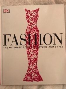
For the first task I looked at a fashion book I had at home, ‘Fashion, The Ultimate Book Of Costume And Style’ by Katheryn Hennessy. The book gave an in-depth look to each era of fashion and styles and how they evolved. I chose to look at the 1930’s. In the book is a picture of 19 year old jean Harlow wearing a tight cut silk dress, in which accentuates her body. I found the 1930’s era interesting as the glamour evening gowns where something I really liked, the chapter gave me more of an incite to how garments where changing and being worn, the fabrics used where not only showing off the female body but adding a glamour and sexy appeal.
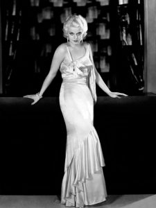
Photograph of Jean Harlow in the 1930’s aged 19, ‘Fashion, The Ultimate Book Of Costume and Style’, chapter ‘1930-1939 Shimmering gowns’ page 275
I then searched online for another source; I searched the V&A for 1930’s garments. I found a 1938, red wedding dress. The dress worn by Monica Maurice in 1938, was made out of red silk gauze, the light and elegant dress is midi length and has a back belt around the waist. The use of the silk gauze and small slip under the dress creates a sexy twist on a white wedding dress showing off the shoulders. I found this piece was interesting as in this era women where starting to dress with more sexy and using elegant materials, allowing the female body to be accentuated and on show.
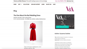
I then went on to research further, I looked into what was going on around the 1930s and how this could of effected or benefited fashion at this time. I found many websites which discussed the great depression. The website I looked at explains the struggles with in the years after and how they got America back on its feet. I found this source helped me understand what was going on in and around the fashion industry at that time.
Bibliography Hennessy K. (2012) Fashion, The Ultimate Book Of Costume And Style. London, Great Britain, Dorling Kindersley Limited.
Cordner S. V&A (2014) The One About The Red Wedding Dress. Avalible from: http://www.vam.ac.uk/blog/here-come-brides/the-one-about-the-red-wedding-dress
6th December 2017
The Great Depression. Avalible from: http://www.history.com/topics/1930s
6th December 2017
task 11 & 12
Reflective summary
From this module, I have explored so much on researching primary and secondary source through different ways from the lectures. It is very useful and I’m sure thus will helps me a lot throughout my study.
At the start I thought that online resources and visual research task were quite easy, however I find myself do not have a wide range of research. I have relied on the internet too much and often forgotten about there are other source like books magazine or even DVDs could be a source of my research too.
As an international student, I have always worry about my writing since I don’t know if other would understand what I want to say about or not. But as the more task I did, I feel easier as I go on once I have clear about my point of view. I have keep my vocabulary as simple as I can so I will not make it too difficult to understand.
Thus, I found out my weakness is to analyse images. as I always feel like I may not have the right understanding of the images, but then I learnt that is not a right or wrong understanding of images, as everyone think differently. So I know as long as I have my own idea to support the images, that will be fine.
Reflective writing is the hardest task for me, as I have to spent a lot of time trying to understand what the essay is about and often I have to translate it into my mother language before response to it.
In conclusion, I find this module very useful. It reminds me to look at library rescores more, and the importance of referencing to support ideas. I really enjoy the lectures and I like the way how our lecturer will help us to digest the task and showing examples before asking us to do it.
task 9 & 10
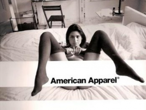
Ethical issues in fashion advertising has always been a huge concern. American apparel is one of the famous brands which is known for its extreme advertisement.
From the picture above, we can see that in this advertisement there is a young lady opened her legs towards to the audience in the setting of her own bedroom. Although there is a white block in the middle to cover the model’s private part, audience could still imagine that the young lady is showing her private part toward us. Clearly, the brand has an ethical issue of sexualizing women through this image. And I don’t really understand why are they trying to create the brand’s image above. It is disgusting to set up the advert in public where children and young generations can see it.
In my point of view, this picture isn’t an advertisement to me. Although she is wearing the tights, it is still not representing any advertisement to me. This image does not lead me to buy those tights which the model is wearing. As the whole image is more like a pornographic. And it doesn’t seem like they are targeting the right audience to advertise. As a young woman which is in their target customer, I would not like to buy clothes from this shop, as from the advertisement I feel like this shop is for sex lover or sex worker.
Also, from the image we can see that the model’s facial expression is serious. It might make people feel she is not happy about opening her lags and might be forced to do it. And this is another ethical issues needs to be concern from this advert. We would not know if the model has been forced to take the picture whether she is willing to do it. She might not be happy to do the job but only because she wants the money or other reasons. And this link to a sense of showing a message of women are not being protected.
However, Marsha Brady, one of American Apparel’s creative directors says: “[when]…there’s a group of people attempting to shame female creativity, female beauty, female pride under the auspices of protecting women, it’s really, really scary.” What Marsha meant is that people are viewing their advert in a wrong way.
Truly, this advert can be view in a different way, such as showing support to feminist.
As we can see from the picture that the model is pulling down her tights by herself. Which refers to women have a choice of showing off themselves, showing off their beauty. And the serious looking of the model may stand for the unbreakable faith of supporting feminist.
But I still do not agree American apparel to use such an extrema advertisement. The reason is they can’t assume that the audience are viewing the advert in the way that how they view. I believe there must be another better way to spread out the message as well as the brand.
Brugnoli-Ensin, Mia. “American Apparel: Sexist Or Liberating?.” Her Campus. N.p., 2017. Web. 29 Nov. 2017.
task 7 & 8
Fashion as communication
Chapter 1 Taste, Fashion and The French Fashion Magazine
Sanda Miller
This chapter is about the philosophical aesthetics, art and the history of how fashion magazine have started in France and the way of how fashion magazine have developed and how it function.
First of all, aesthetics is a very personal thing to me, as different people have different aesthetics and I believe there won’t be other person would have the exactly same aesthetics as you but maybe only similar. From the chapter “philosophical aesthetics as a new branch of philosophy emerged during the enlightenment and to its enquiry was the concept of taste.”, I do agree that aesthetics is basically taste, however I don’t agree that it is a new branch of philosophy emerged as I think that aesthetics is something that is already there in your body when people were born, so I don’t really understand why is it a new thing to philosophy.
Then the writer has stated so much history of when and how the French fashion magazine have started, and how its target audience have transferred from upper class to a wider market where working women are also included. but I think the main thing that relates to fashion as communication is where the writer talks about fashion magazine editors’ aesthetics. They have to have a popular taste as they are the ones who directly affect the group of audience of the magazine. If they don’t have the same taste they may lose their audience but maybe will gain new readers as well. People’s aesthetics can easily affect by other, so fashion magazine’s editor is a very important role who can change people’s view on a garment or art piece. Their job is to lead people to like fashion and so they can help to lead a trend. Basically is something like “KOL” in Hong Kong, which stand for Key Opinion Leader, and they have a similar job as fashion magazine editors. The difference between them are KOL is independent, is like fashion blogger, they don’t publish magazine but facebook or instergram posts, and they earn money base on the number of Likes they get on the post. Fashion blogger do not have to have a common taste, they can have a unique aesthetics, however fashion magazine editor and KOL have to have a popular taste to keep their audience.
In summary, I don’t think that the writer had talk so much on the topic of fashion as communication. He stated too much history background but didn’t really discuss how taste and fashion communicate. As I think fashion can really communicate to other. The clothes or the style of you wear shows your personality. In everyday life, I can say that nearly everyone will judge you base on the clothes you wearing. People wear differently for different occasions. That’s why people will wear formally for interviews. He could have talk about fashion magazine shows different clothes and style, which means, reader can always get ideas and inspiration for their own style, and this is what communicant to others in real life, and not just between editor and reader.
task 5 & 6
Alexander McQueen AW17 by Sarah burton
medieval needlework from 16th 17th century
https://www.pinterest.co.uk/AlexanderMcQueen/alexander-mcqueen-aw17-medieval-embroidery/
“V&A.” Victoria and Albert Museum. N.p., 2017. Web. 7 Dec. 2017.
COULEURS. N.p., 2017. Web. 7 Dec. 2017.
“Attributed To Richard Peake The Elder, Catherine….” Marie Antoinette’s Playhouse. N.p., 2017. Web. 7 Dec. 2017.
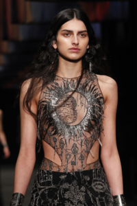
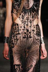
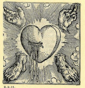
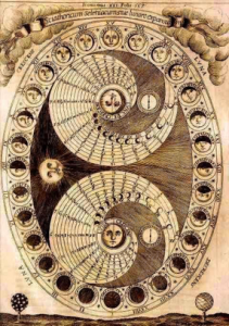
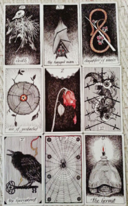
old alchemy illustrations, druid symbols and Cornish wildlife rendered in black and silver beads and glass stones.
https://www.pinterest.co.uk/AlexanderMcQueen/alexander-mcqueen-aw17-mystical-cornwall/
“The Heart In Art.” The Public Domain Review. N.p., 2017. Web. 7 Dec. 2017.
“PAST EVENTS.” The Light & Shadow Salon. N.p., 2017. Web. 7 Dec. 2017.
“Wild Unknown Tarot.” SheWalksSoftly. N.p., 2017. Web. 7 Dec. 2017.
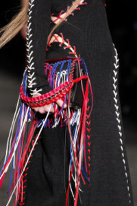
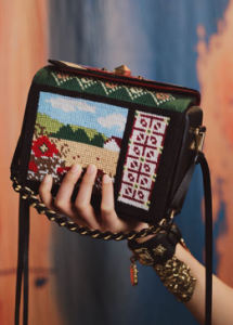
Nodding to the ancient traditions of Cornwall, the new season draws inspiration from pagan landscapes, creative communities and the spirituality of the Cloutie Tree. These trees are places of pilgrimage, where travellers tie colourful ribbons to represent their wishes and dreams
https://www.pinterest.co.uk/AlexanderMcQueen/alexander-mcqueen-the-box-bag/
https://www.pinterest.co.uk/AlexanderMcQueen/alexander-mcqueen-aw17-the-cloutie-tree/
Jones, Tom, and View profile. “Rather English – Visit Madron Holy Well.” Tiredoflondontiredoflife.com. N.p., 2017. Web. 7 Dec. 2017.
“Boscawen Un.” The Megalithic Portal. N.p., 2017. Web. 7 Dec. 2017.
“England | Trotterz.” Trotterz.com. N.p., 2017. Web. 7 Dec. 2017.
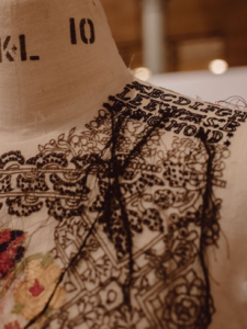
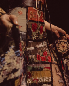
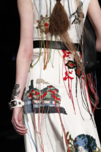
Sarah Burton (designer of Alexander McQueen) has always had an affinity of nature and for tuning into history. This time she took she team to Cornwall. They were inspired by the Cornish wildlife, old alchemy illustration, druid symbols, landscape and Cloutie tree.
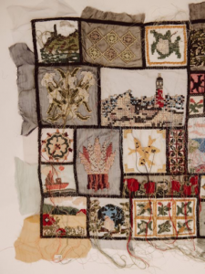
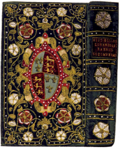
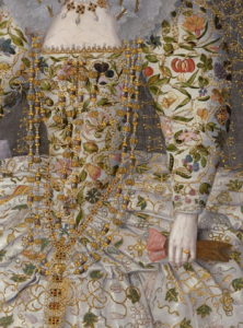
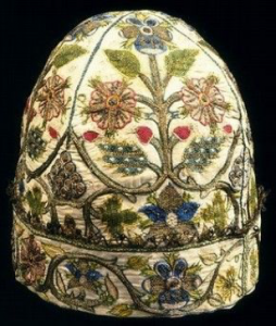
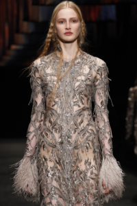
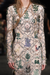
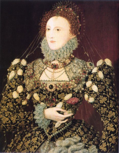
In the collection, a lot of medieval needlework techniques and patterns from the 16th 17th century were used. The garments are very textile based. And I thing this Phoenix portrait of Queen Elizabeth by Nicholas Hilliard could be one of the reference they may have looked at.
As we can see both of the garment have pattern base in diamond shapes and nature element in it. They were both made with similar stitches and techniques. Both with luxury beads and jewels. However, Sarah designed the garment with different nature elements in the diamond shapes, where the Queen’s had a repeated pattern on she dress. Looking both image in detail, you can also find out another common thing of them, which is the model had her hair tighten in the front and I believe that they have this idea from the 16th 17th century fashion. Since I can see from the image, that the queen has heavy jewel on her chest. But a heavy jewel maybe too much for the McQueen’s look so I think that is why they have decided to tight models hair at the front.
From all the things suggested above, I am strongly believing that this image of Queen Elizabeth portrait by Nicolas Hilliard could be one of the reference Sarah Burton and her team have looked at for the Alexander McQueen AW17 ready to wear collection.
Doing this task allows me to have a chance to understand the concept and where the idea comes from for a collection. This make me clearer about the research process of designing, which would help me in the future.
“Portraits Of Queen Elizabeth The First, Part 2: Portraits 1573-1587.” Luminarium.org. N.p., 2017. Web. 7 Dec. 2017.
Mower, Sarah. “Alexander Mcqueen Fall 2017 Ready-To-Wear Fashion Show.” Vogue. N.p., 2017. Web. 7 Dec. 2017.
task 3 & 4
Bullis, Douglas. Fashion Asia. London: Thames & Hudson, 2000. Print.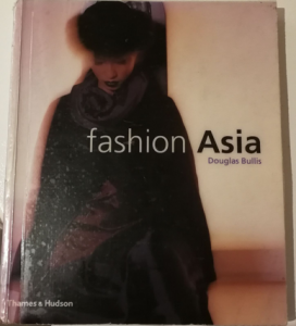
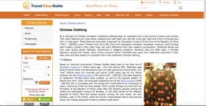
“Traditional Chinese Clothing: History, Types, Features.” Travelchinaguide.com. N.p., 2017. Web. 2 Nov. 2017.
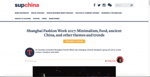
Jiang, Yaling. “Shanghai Fashion Week 2017: Minimalism, Food, Ancient China, And Other Themes And Trends – Supchina.” SupChina. N.p., 2017. Web. 2 Nov. 2017.
This book is about introducing fashion designers in different area of Asia, and as I look through it I found that quite a lot of the designer love to bring in elements of traditional fashion into their designs. As a Chinese myself, I decided to research more about the traditional clothing of China as we have a very rich history of fashion in different dynasty, and although we wear modern clothes in our daily lives, we still wear traditional clothes during certain festival and special event, such as wedding day and Chinese new year.
The most well know fashion are the Chinese suit(Tang Zhuang) and the cheongsam(Qi Pao). I think that the Chinese suit in the first design which has combined the western and the Chinese fashion, as it is based on a western style suit with straight collar and buttons down the front design. It is a really simple design but very elegant as well. For the cheongsam it is originated from the Manchu female clothes, and it is then developed in straight collar, strain on the waist, coiled buttons and slits on both sides of the dress. It is usually made from silk, cotton and linen.
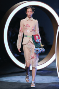
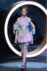
To find out more about fashion designer combining traditional and modern fashion, I found a news article of Shanghai Fashion Week 2017: minimalism, food, ancient china, and other themes and trends. This article introduced Chinese fashion designers who taking over the Shanghai fashion week are those who have been study overseas, but they are not only returning in physical sense, they are returning to the home culture and history. My favorite designer from this article is Kate Han which is the founder of MUKZIN. In the ss2018 collection, it is based on Mukzin imagines world called “Chaos of mountains and seas” where the Chinese classic story Shan Hai Jing meets Jurassic World. The garments have small element of traditional clothes and big parts of 3D prints and textures. I really like this collection as I think Kate have successfully given traditional Chinese costumes a modern twist.
task 1&2
women in garment designed based on traditional style, book chapter “Indonesia”, designer Ghea Panggabean, photographer unknown
Bullis, Douglas (2000) Fashion Asian, Thames& Hudson, London
Alexander McQueen ss2005 collection, Paris, October 8, 2004, source by Vogue, Sarah Mower, photographer unknown.
https://www.vogue.com/fashion-shows/spring-2005-ready-to-wear/alexander-McQueen
primary source found on this VOGUE website of Spring 2005 ready to wear
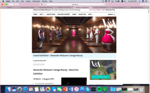
http://www.vam.ac.uk/content/exhibitions/exhibition-alexander-mcqueen-savage-beauty/about-the-exhibition/
information of the Alexander McQueen: Savage Beauty exhibition on the V&A webside
Information of McQueen inspirations of the collection
more detail information of the collection on the met museum website
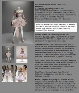
http://blog.metmuseum.org/alexandermcqueen/ensemble-its-only-a-game-2/
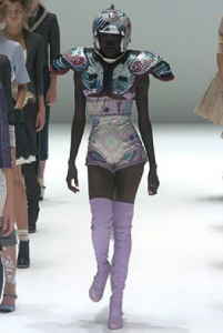
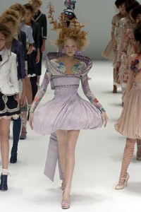
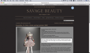
I have found an image of women in garment designed by Ghea Panggabean, which are in pink tone and a sense of tradition feel. This made me think of the McQueen ss2005 “it’s only a game” collection where he has combine Japanese kimonos and American football uniform. They both adapted traditional design into a modern design, however McQueen also mixing two culture together. They have a pink tone in common of the designs. But Panggabean’s designs are more wearable where McQueen’s are more alike a costume or art piece.
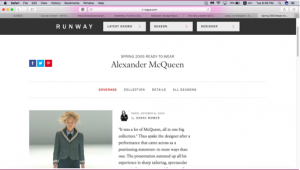
To find out more about the “it’s only a game” collection, I put the name of the collection into google and I found the vogue website has all the image of the collection, but the writer, Sarah Mower comment mostly about the ready to wear collection, not those few garments that interest me the most. So I decided to go onto the V&A website and see if I can find any information about the collection since I have been to the Alexander McQueen: savage beauty exhibition at the V&A. However, there isn’t much detail about it. Then I went on to the met museum website to search for more information as the McQueen’s Savage Beauty exhibit is originally started from the MET Museum. Luckily, I found more information about it and also the concept of the “it’s only a game” collection.
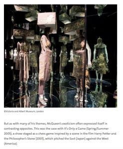
McQueen’s inspirations of the collection are from Edwardian lace, Japanese kimonos, American football and Latin American. The runway show is around the idea of a chess game between America and Japan. Each ensemble corresponded to a particular chess piece. Which this idea of human chess was inspired by the first Harry Potter novel, the Philsopher’s Stone.
In the process of researching, I have started from Ghea Panggabean’s designs to Alexander McQueen’s “it’s only a game” collection. I have discovered how one image can convey to such a wide range of other things can be related or have a link to it. I love how I can think of an object that is related straight away when I saw the first picture, and I think this allows me to have a chance to research more information in depth of something that I’m interested but have not had any chance to know about it.
To find reliable information and useful online resources for fashion, I like to go on museum website, fashion magazine website such as VOGUE and trends website like WGSN. Official site like these will always provide archive and information which are reliable.
Task 11 and 12
The RCS module for me has been beneficial and taught me a lot however, I have not enjoyed all the tasks and have struggled through some.
For our first task we had to collect three images one from different research sources, understanding the difference between primary and secondary sources. I used a book on Steve Tobin, the V and A archives and an image of Philip Tracey’s work from Pinterest. I enjoyed this task as I was able to utilise the library and look through and learn some really amazing things and it wasn’t a daunting first task either. I also used some of the research from this in my studio work too. This task taught me the basic difference between primary and secondary sources which I previously had not even thought about.
Task 3/4 Academic integrity and plagiarism, we needed to choose a topic and use Harvard Referencing looking at a newspaper article, website and book. I looked at the controversial ‘Heroin Chic’ era in the 90’s. I really enjoyed this task because I was already familiar with Harvard referencing and it was good to put to practice using different research methods.
For task 5/6: Visual Research, we needed to choose a designer whose work inspired us and find references that inspired them. With our findings we had to create a moodboard and then write 300 words about one particular image. I chose to look at John Galliano’s fall collection 2009, which was inspired by Russian Folklore. I really enjoyed researching the designer and creating the mood board but found the 300 words difficult as it’s the most writing I have had to do since being at WSA. I had to really use the helping points on the presentation, which were very helpful. This taught me that I need to write down all the elements I could look at in bullet points and then build them up from there.
For task 7/8: Reflective Writing, we were given two essays from books and had to read one and reflect in 500 words. This task was the worst for me, the reading took me a long time and it was hard to understand at points. However once I started writing and the flow took over it was actually really interesting text and really challenged me to push my writing and reflective thinking forward.
For task 9/10: Ethical Issues in fashion/ Textile Advertisement, we had two images to look at and chose one, both were very controversial advertisements, and then write 500 words explaining and arguing the issues which arise from them. This was such an interesting task and even though the 500 words were unnerving, writing about issues that are very close to my heart was liberating. It was great for understanding analysis an image and how society and the media work together.
In conclusion, this module has been difficult in places but rewarding in others, I have learnt more about the way I work and what’s better for me to do but also skills which will help me for the next two years of my degree.
Task 9 and 10
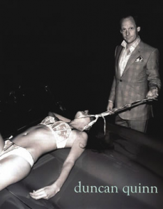
Duncan Quinn is a bespoke tailoring company formed in 2003 in New York city. This photo was the brands first advertisement poster, presented to the world in 2008 and the New York magazine awarded it ‘the most disturbing ad found in 2008 fashion magazines’.
The photo shows a smug and smirking man in a well-tailored suit holding a tie loosely positioned around a seemingly dead woman. The woman looks like she has blood coming from her head and is in her underwear on top of a car in the open. At first glance this picture is disturbing, at second glance its sinister.
This shows the gross, inappropriate, sexual objectification of women in the fashion and advertisement industry; it is utterly sexist and not appropriate for anyone to see. The male is seen to be in complete control and dominating the woman in every way. The woman being in lingerie suggests that this was also a sexual act of dominating. He’s standing, looming over her, like she is an object at his disposal. He’s completely dressed and covered whilst she is near naked in the open for anyone to see, as if she’s not just for his amusement but for others as well, like a show pony. Him using his tie as some sort of leash suggests how little he cares for this other human, treating her as if she were a submissive dog. Even more the woman’s face is not shown, de-humanising her. It’s disgusting. What makes the photo that more alarming is that the woman is shown to be lifeless, suggesting this is an ad condoning rape or necrophilia. There’s some sort of disturbing sexual fantasy being displayed here that involves death and pain.
This advert shows that although the world has improved in the last 80 or so years on the treatment of women, sexism is still present and still objectifying woman in many industries. It is suggesting that if you buy our suits you will also achieve total dominance over women. ‘Women are put on display like pieces of commodities or merchandise…The more nudity or sexual reference depicted, the greater the sales generated in an exploitative and profit-driven media industry’ (Le Mauricien: 2013) this quote explains the derogative depiction of women in the media and what is still being taught to younger generations: that women are objects to be used at a man’s disposal in any way they want. What’s worse is the women who are used in this way are made to ‘feel guilty, inferior, or somehow less than’ (Cortese 75) abused and used.
In conclusion, this ad is promoting that wearing good suits will enable you to dominate and have control over women. For this day and age this is unacceptable, uncomfortable and incredibly alarming.
- Winn S. (2008), Trendhunter, Duncan Quinn Suit Campaign Depicts Strangled Woman, available from: https://www.trendhunter.com/trends/duncan-quinn-suit-ad-depicting-strangled-woman, accessed 6th December 2017
- Oonarizah Peerbux B, (2013), Le Mauricien: Women as sex objects, available from: http://www.lemauricien.com/article/women-sex-objects, accessed 6th December 2017
- Cortese, A, (2008), Provocateur: Images of Women and Minorities in Advertising, available from: https://studiidegen.files.wordpress.com/2009/03/c8_cortese_constructed-bodies-deconstructing-ads.pdf, accessed 6th December 2017

