
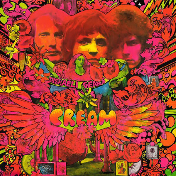
Image Source: Cream: Disraeli Gears, 1967 Private Collection
This is the record cover for Cream designed by the counter culture artist Sharp, who also works for the contemporary and controversial magazine Oz. The illustration very much depicts a psychedelic experience, making use of brightly over saturated colours that comes together almost childishly and wondrously, which greatly contrasts with the seriousness of the geopolitics at the time perhaps as a form of escapism? The infusion of various icons, designs and graphic typography, along with the almost entirely warm colour scheme, suggests an entirely positive and stimulating experience, which is impossible to achieve in real life and sober. The clever use of the black background which shows upon further scrutiny suggest a sense of pain/darkness behind the happiness, which could very well be a metaphor for the use of substances to mask suffering.
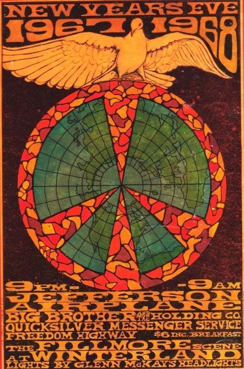
Image source: https://i.pinimg.com/236x/be/b0/03/beb003c0d14a2bbaf57115cac966b00e–rock-posters-concert-posters.jpg
This poster has a grimy look through the use of earthy tones and low saturation. It places the earth enclosed by a peace sign with a dove spreading its wings above it, which really nails home the message of “make love not war”. The entire poster is extremely focused in the subject and the quintessence hippie vibe. The lettering are messy and unorganised suggesting that you should see and feel rather than listen and read propaganda made by the authorities, which is one of the hallmark of the counter culture movement