
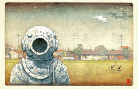
Image Source: [The Visitor by Shaun Tan – Tales from Outer Suburbia ]
This Illustration is for his award winning of-the-walls story book, and I think this shows exactly why. The unusual combination of familiar elements, ie an astronaut and a suburban environment creates a sense of heightened reality to suggest that this is a metaphor as opposed to literal. He uses almost a childlike and storybook style to tell more mature tales, in which I interpret as a sense of solitude and not belonging. He uses a range of colours in a ashy discoloured way that suggests a passing of time, which resembles a 1950’s futurism poster, or perhaps an old children’s novel with the former child owner now grown up, with their former creative mind tarnished?
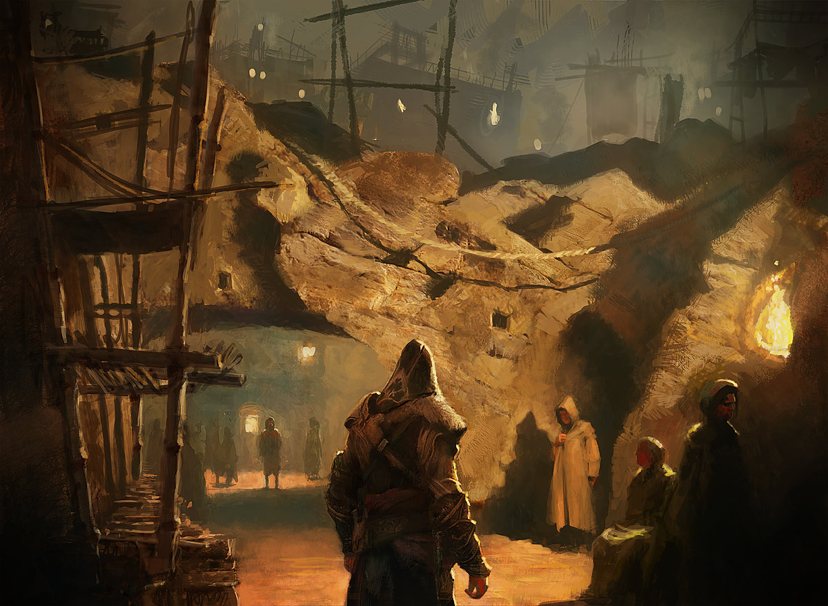
Image Source: Gilles Beloeil [Assassin’s Creed II artbook]
This is a concept art for the game franchise Assassin’s Creed, however unlike other concept art, this is painted in a traditional medium: oil, and the composition resembles that of a Romantic Era painting of an occurring scene. The artist create a sense of realism by choosing to go with a realistic style, but at the same time creating a sense of mystery and wonder by using a singular ashy colour scheme and the play with light and dark. The painting style is reflective of the time setting of the actual scene which allows the viewer to be drawn in to the alternate reality. The plotting of character’s location and position creates a narrative and serves it’s purpose of potential story telling.
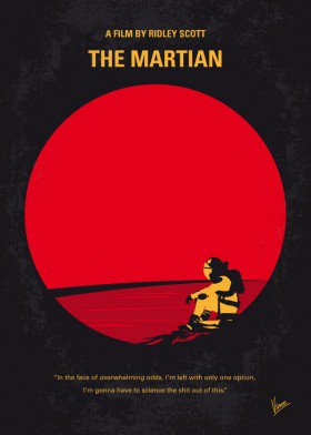
Image Source: Re-imagination of The Martian movie poster by ChungKong Art
I like this poster design because it is a minimalist depiction of The Martian poster. It doesn’t require much graphics to reveal the main plot of the movie. The use of the bright circle both represent the colour and shape of Mars and the lens of a telescope, also the emotional struggle the protagonist is going through. The abundance of space in the frame and the character’s position suggests a sense of solitude and sadness, which is a perfect depiction of the theme of the movie. I really like how the artist use one aspect of the poster to convey multiple ideas and messages instead of making a complex image. This method also adds focus and to the main subject of the film, at the same time still being aesthetically pleasing; this required intricate planning of the poster’s layout.